Delighted by print promotional pieces at WaterFire Providence.
This past weekend, I spent some time at WaterFire Providence, an amazing art installation in downtown Providence featuring more than 80 fire-lit braziers running down the Woonasquatucket, Moshassuck, and Providence rivers.
This is not a promotion for the event (though I suppose indirectly it is), but a nod to a very effective dimensional print piece I picked up during the evening to help navigate my way through the festivities.
Exhibit A
So I was moseying along, trying to make sense of all the amazing stuff going on around me wondering things like “Where can I find a boat ride? Where are the craft vendors? What should I eat?”
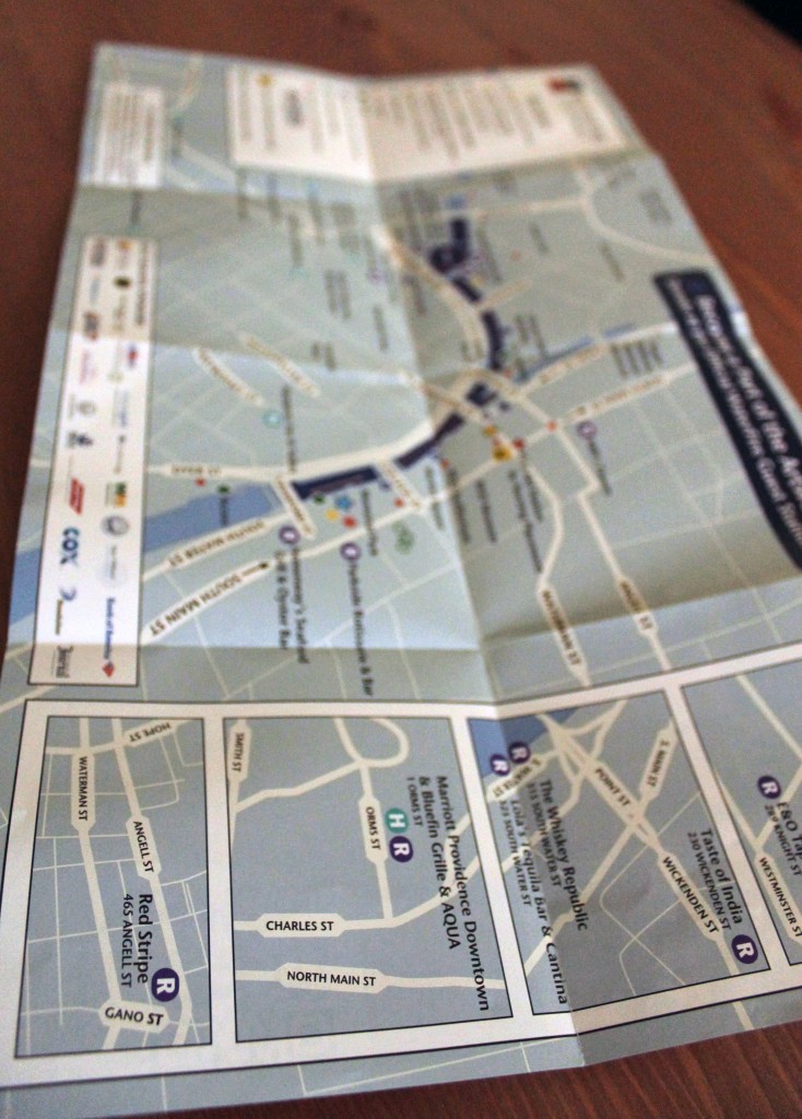
Cue map.
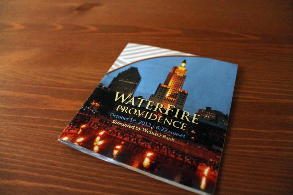
When the volunteer at the info booth handed this map to me, I was surprised. It was tiny. No hulking, I-obviously-don’t-know-where-I’m-going colossus to unfurl while walking.
This thing was sophisticated, sleek and most important: functional.
Which leads me to Exhibit B.
(Are these supposed to be different items? Oh well. I’m obviously not a detective).
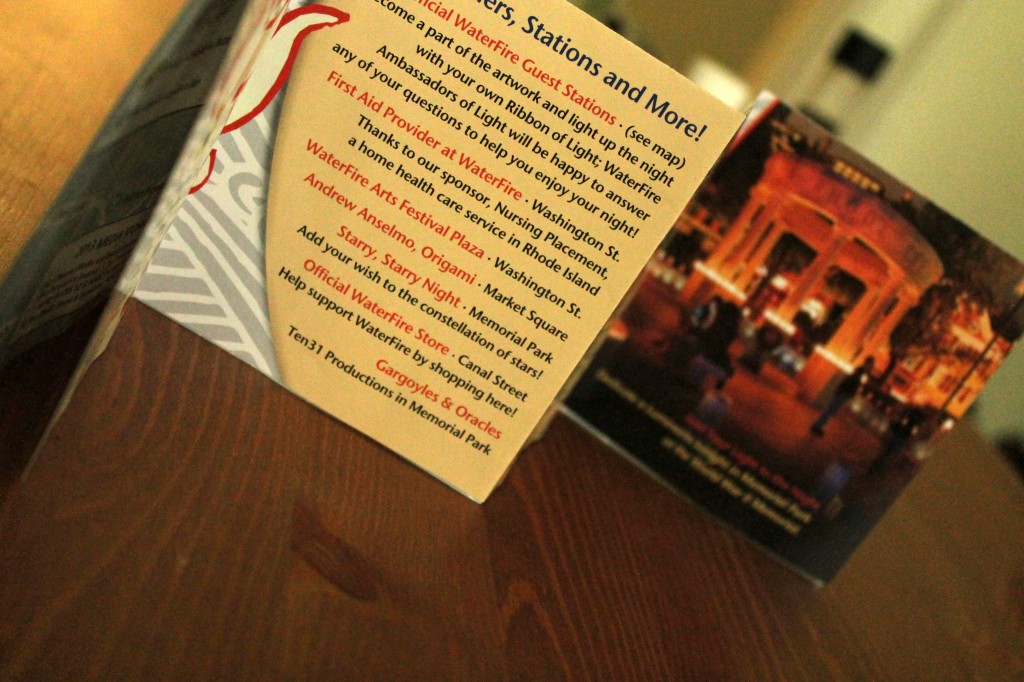
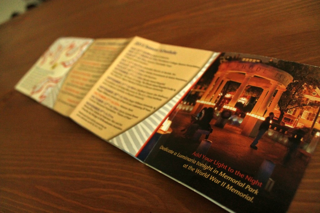
Four panels chock full of information about the event like the season schedule with dates, times and locations; a list of performers; updates, news and did I mention– gorgeous pictures?
And every panel is double-sided. So much space for a marketer to play with.
But wait, there’s more.
Exhibit C
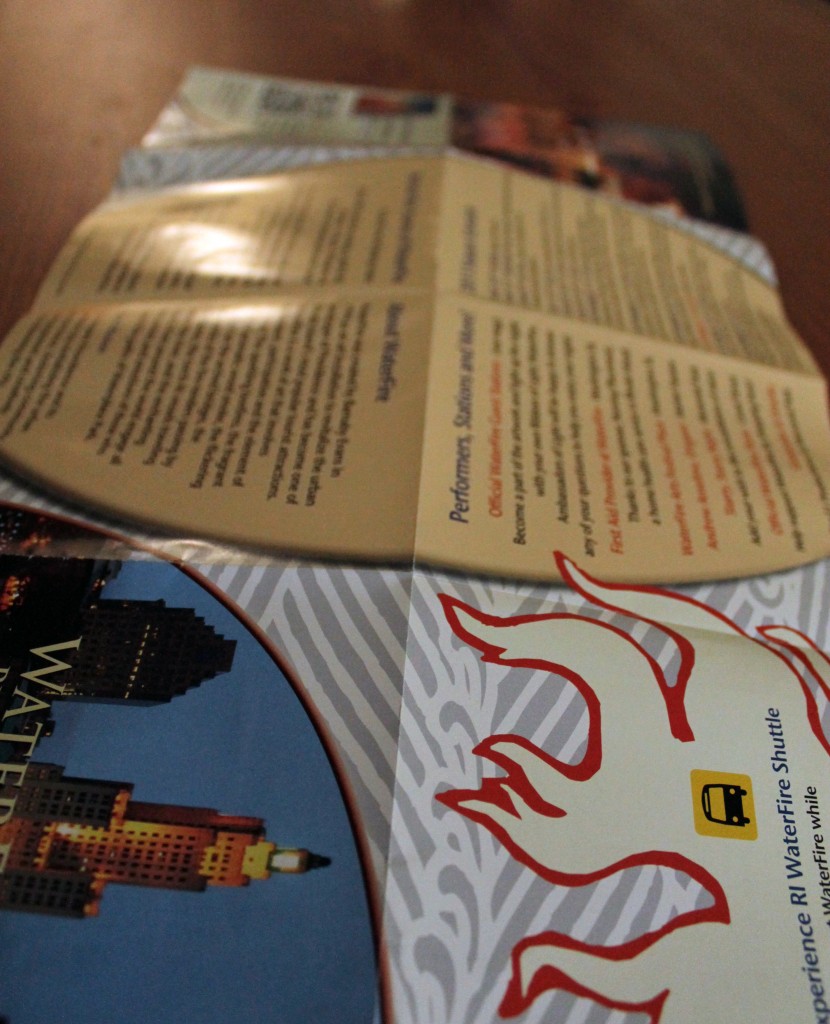
It folded out again–more info, more pictures. Score.
And then,
A PRINT MAP. Just a wonderful, easy-to-read fold-out map. Not the wait-while-I’m-loading, then-try-to-find-east mobile map app. Just me, the paper and a guide for the rest of the night.
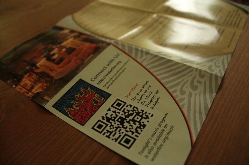
But because I’m a modern-day consumer (a.k.a. glued to my smartphone) I got this too.
Exhibit D
Multichannel, integrated marketing that links to social media and a QR code to navigate me to the WaterFire website.
Case closed.
What do you think of the piece? Would you grab one of these if you were at WaterFire?
