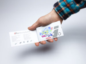
 From Facebook and online ads, to YouTube and digital video, businesses have long had to compete with with the waning attention spans of their audience in the marketing arena. However, a newer technology offered by Structural Graphics and its online division, Red Paper Plane, might’ve just found that sweet spot.
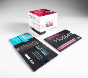
Video in Print combines the detail of print with the emotional reach of video creating a one-of-a-kind multi-sensory experience for prospects looking to forge a connection with your brand, service or product.
 But, just because your print piece has a video, it doesn’t mean that will guarantee its success. Design, message, packaging and production values contribute to the overall experience your customer or prospect has about your business. Here at Structural Graphics, we craft our Video in Print brochures by way of a high-tech, high-touch production process, allowing you to press proof your piece before shipping from one of our North American facilities.
Considering adding a Video in Print brochure to your marketing campaign? Below we’ve compiled a few suggestions to get you started.
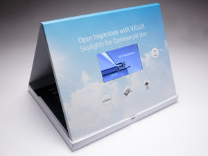 Not all Video in Print players are created equal. Speakers, video screen, battery packs and wiring can vary greatly in quality. Ensure your supplier uses top quality components and has a thorough quality control in place. We proudly have a 10-year relationship with our Video in Print player supplier.
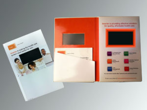 The power is in the playback. Make sure you choose the right file formats and the right settings for your video playback. We typically recommend a MP4, MOV, AVI or WMV video file format and a sound level of 75 to 80 dB. Also, double check that your supplier includes a USB cable for recharging the video brochure.
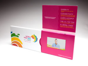 Short and sweet can’t be beat. Again, keep your audience’s attention span in mind. Video is a great way to deliver a 30 to 60 second message, but anything longer than that and you might want to consider breaking it into individual video “chapters”. Don’t forget the call to action so you can track responses.
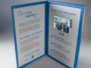 Source global, but inspect and ship local. Because Video in Print players are sourced almost exclusively from the far East, they’re often powered down to 30 percent of rated capacity to meet International Air Traffic Association regulations. This can negatively impact playback quality. At Structural Graphics, we fully re-charge our batteries, then ship them to our customers. Our battery configuration is approved by the US Post Office and is CE ROHS certified, which means that our product has met the standards for consumer safety, health and environmental requirements in the U.S. and Europe.
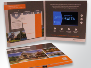 Experience, there’s no substitute for it. For more than 40 years, Structural Graphics has designed, produced and engineered unique, interactive print communications for some of the top companies in the world. Simply put, we know print.
Take a look at our Video in Print portfolio and contact us for more information. We’ll show you how to be distinctively different with Video in Print advertising.
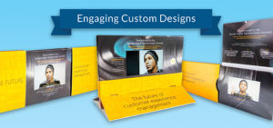 In the world of marketing, you’ve probably heard the old standby, “show, don’t tell”. But what if you could do both?
 Simply put, it’s an effective tool for communication. With VPA, not only do you get the tactile enjoyment of print, but you also get the action. This allows you to create a more holistic experience for your customers and prospects because you are able to provide them with a variety of touch points where they can engage with your brand.
 VPA is an attention-grabber. Capturing the attention of your audience is one of the most important parts of marketing your products and services. But it’s also one of the most difficult. Many of us are so overwhelmed by the volume of emails we receive, as they only add more to the “digital clutter”. If you want to get your audience’s attention, you’ve got to deliver your information in a way that will engage – sending a printed brochure with an embedded video screen is the sure fire way to do just that!
 It pulls at the heartstrings. Fusing video with print opens up more opportunities for your messaging to resonate with your audience and for them to forge a connection with you. The combination of visuals and sound, and copy work together to create a powerhouse emotional experience if done right.
 Video is perceived to be more valuable than text alone. It’s no secret that video is often much more labor intensive and expensive to produce. So, when you decide to share a video, your audience is almost guaranteed to notice. Because of this, people will often give you more time, more contact information and even pay more for your product or service.
 It’s a clear winner. Think for a moment: What kind of learner are you? For most of us, we’re visual learners and then about a third of the population considers themselves auditory. So, why compromise? VPA can ensure that your brand messaging can resonate with all types of learners because the information is simultaneously delivered verbally and visually. Aside from being exceptionally powerful, this also means there’s less chance they’ll misunderstand or misinterpret your message.
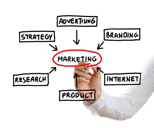
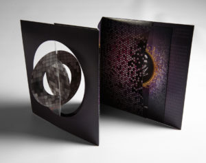
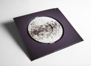
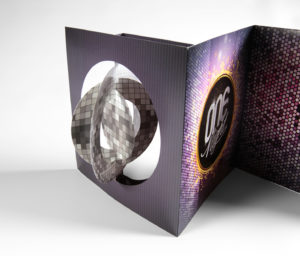
 How does a company stand out at a trade show with a sea of many other vendors to compete with?


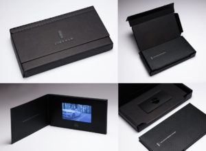
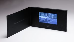 At the National Postal Forum in Baltimore, MD on May 23, 2017, The Lincoln Motor Company’s high-end video mailer, “See it First,” was selected as the Grand Champion Award winner of the “Irresistible Mail” trophy.
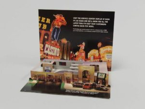 Today’s automotive industry moves fast and furious, so it’s important to showcase your vehicles in new and creative ways. But how do you show change and innovation on paper? You don’t. You show it WITH paper.