Tag Archives: print

Think Outside the (In)Box: 5 Print Trends to Take Advantage Of

Where did January go?

As we continue to execute our 2019 marketing promotions and campaigns, there is no better time to revisit (and rethink!) your business’ print communications. Is your collateral giving people what they want? Does your team have clear priorities spelled out from the beginning?

If you answered “no” to either of these questions, keep reading for some tips on how you can ensure your brand communications aren’t missing any opportunities for business.

  1. Plan, plan plan. Is your warehouse overflowing with inventory? Or maybe you’re nervous to try dimensional print because of the barriers to entry? It helps to have a clear plan. By starting with the end in mind, you’ll be able to print only what your team needs, thus reducing inventory, waste and long-term costs.
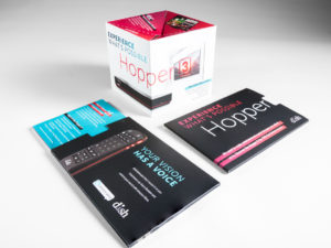
  2. Get physical. Provide your customers with an immersive and interactive experience when they open your direct mail piece, invitation or campus flyer. More and more, the printing industry is getting increasingly creative with everything from packaging techniques to Virtual Reality. Use services like DX Print Group to delineate clearly the details of projects in your prints. Cut through the noise of overflowing inboxes and standard postcard mailers to not only capture your customers’ attention, but their hearts, too. 

  3. Don’t ignore the double dippers. These are the folks who receive both paper and digital communications. Statistically, many of these consumers are younger and, though they’re the most likely to go paperless eventually, are still open to the idea of receiving hard copies and snail mail. Take advantage of this market.
  4. Convenience is key. According to a poll by Keypoint Intelligence-Info Trends, customers said the best way for marketers to improve their print communications is to make them easier to understand. Instead of worrying about providing customers with every detail about your business, consider streamlining your marketing and focusing on one single “story” per piece. Not only does this cut out unnecessary detail, but it also makes your marketing easier to digest. Oh, and please, please remember to include a clear call to action.
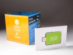
  5. Prioritize, then execute. Perhaps a complete overhaul of your marketing strategy is in order, or maybe it just needs a fresh pair of eyes. Whatever the case, re-positioning your brand strategy allows businesses to start from scratch and execute on your priorities. How do you want customers to feel when they see your marketing communications? What action should they take after receiving it? These are all great questions to ask yourself and your team (if you’re not doing so already). They’ll encourage you to set clear goals for the year and inspire more detailed, thoughtful game plans to achieve them.

Can Seasons Affect Your Business’ Direct Mail Responses? We Think So.

Here in New England, we eat, sleep and do business based on the seasons. But many marketers, specifically those who utilize direct mail, tend to focus so much on the whats and whos of their strategy, and lose sight of when to actually send their pieces.

Do you know what time of year is best for your company to send mailings? If you’re in an industry like retail or travel, then maybe. However, if you’re operating in a space like manufacturing, commodity or design, you might not. What’s more, do you know those weeks or months – when your response rates plummet – to avoid?

Here’s an example: Financial planners get the worst response rates during November and December, when many people are spending time with their loved ones to celebrate the holidays. Other days, like Memorial Day, Labor Day and Independence Day are also notoriously low for response rates. January, though, is just the opposite. While individuals are evaluating their finances and planning for the year ahead, the first quarter of the year is generally best for CFPs to remind clients that they’re a valuable resource.

Similarly, the holidays may be a perfect time for retailers to target consumers looking to purchase food, clothing or toys for their families, friends and mailpersons. By mailing at just the right times, we’re able to make the best use out of our direct mail pieces and provide the most valuable to those receiving them.

Experiment with small mailings and compare your business’ response rates over time. In weeks or months, you’ll be able to identify the appropriate cadence for your mailings and be efficient with your advertising budget at the same time!

Popeyes is Offering Emotional Support (Chicken) this Holiday Season

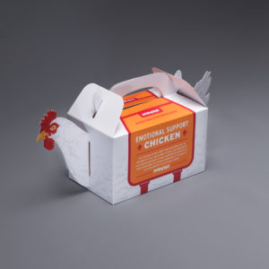
A common topic of discussion in the news lately has surrounded the idea of allowing animals on airplanes to provide emotional support for travelers during the holiday season, as well as the restrictions for the types of animals that should be allowed. When GSD&M, Austin, TX had a buzz-worthy idea and design for a campaign for their client, Popeyes, to get holiday travelers talking (or should we say “squawking”) they contacted Blanks Printing, & Digital Solutions and the design and assembly teams at Structural Graphics to help bring this project to life!

The solution? “Emotional Support [Fried] Chicken”. For a limited time, those travelling in Terminal C of the Philadelphia Airport during the 2018 holiday season can now pick up the box which contains a 3-piece Chicken Tender combo meal from Popeyes.  Why the Philadelphia airport? Because it was named one of the most stressful airports in the United States.

“We know holiday travel can be frustrating, and there’s no better way to ease stress than with a box of delicious Popeyes fried chicken and a good laugh. We appreciate how comforting emotional support animals are and wanted to create our own version,” stated Popeyes CMO, Hope Diaz via news release.

The best part is, Popeyes is guaranteeing that their Emotional Support Chicken is “permitted to fly without any restrictions”, helping ease some of the worries for those crazed travelers this holiday season.

Blanks Printing & Digital Solutions, Dallas, TX printed this project on the new HP 12000 Digital press. Structural Graphics proudly engineered the design for function, created several rounds of full color test prototypes, and then hand assembled for the launch in the Philadelphia airport on Tuesday, December 18th.

7 Steps Chrysler Took to Promote Their Business at the NADA Convention

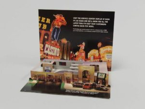
Today’s automotive industry moves fast and furious, so it’s important to showcase your vehicles in new and creative ways. But how do you show change and innovation on paper? You don’t. You show it WITH paper.
Like Chrysler did here.

The automotive company was looking to encourage people to visit their service center display at the National Automobile Dealers Association’s Las Vegas convention in 2003. To do this, they cleverly employed several marketing techniques that can apply to any brand or industry.

  1. Stay true to your roots. Chrysler, which has a strong brand identity, chose to showcase a miniature version of a Chrysler dealership right down to the cars, service desk and employees.
  2. Never underestimate the ‘WOW Factor’. Pop-up mailers are a really unique way to capture the attention of your audience. This particular one ships flat but, because of its interactivity, detail and uniqueness, it also surprises and delights.
  3. Less can be more – when it’s done right. Sometimes it’s just better to get to the point. To really maximize the space on this mailer, Chrysler chose to include short bursts of essential information instead of paragraphs of marketing speak. Rather than trying to convince attendees to visit its display, the team chose to let the excitement of the mailer speak for itself.
  4. Include a call to action. In this mailer, Chrysler is up front about what it wants – for people to visit the company’s service center display at the conference.
  5. Offer an incentive. We all know that people generally love to win free stuff. So, instead of just asking conference attendees to visit Chrysler’s display, they wanted to make the visit worthwhile. To make their call to action even more powerful, the company also advertised that they would be offering a chance to win a free year of ServiceVision.
  6. Don’t forget the basic information. Between the bells and the whistles, it’s easy for marketers to get caught up in the excitement of a piece and forget the most basic of information. Always include the date, time and location (if applicable) of any event you or your business are/ is attending.
  7. Catchy openings are key. Embracing the convention’s location, Chrysler took inspiration from Las Vegas’ neon lights and showgirls. The mailer’s cover is colorful and hints at the purpose for sending it out. It also beckons the recipient to open it up to see what’s inside.

8 Stats that Prove Print is Anything but Dead

For years we’ve been hearing it: print is dead. With more and more people heading online to get their news, research products and read reviews, it may seem that way to some. But, not according to savvy marketers. Businesses and marketers should continue investing in printed collateral, viewing it as a worthy and profitable way to promote a brand and stay top-of-mind.

Here’s why:

  • 66 % of millennials are more likely to remember to use a voucher if they have a physical copy to carry around.
  • 23% of millennials bought or ordered something as a result of receiving direct mail in the last year.
  • Retailers have seen a $21 million dollar difference in online sales per million site visitors between those who had received a catalog at their home address and those that had not.
  • 92% of shoppers say they prefer direct mail for making purchasing decisions.
  • Direct mail household response rate is at 3.7% (compared to .2% mobile, .1% email, .1% social media, and .02% internet display).
  • 91% of mail is picked up by the same person each day; 80% of them are women.
  • Bobonos customers who received a catalog spend 1.5 times more than new shoppers who didn’t receive a catalog first.
  • Boden customers spend up to 15 to 20 minutes with their catalog, vs. an average of 8 seconds for an email and 5 minutes with their iPad app.

Statistics were compiled by Compu-Mail. To view their entire list, please click here.

Structural Graphics Celebrates 40 Years of Innovation in the Interactive Print Marketing Industry

sgs-40th-anniversary-party-21

Structural Graphics, the pioneer of the dimensional print marketing industry is celebrating its 40th anniversary. The company introduced the world to dimensional print marketing in 1976 and continues to lead the interactive print marketing industry today.

Over the years, Structural Graphics has created more than 40,000 interactive paper designs for clients in almost every industry and holds many U.S. Patents. For more than four decades, the company has helped some of the world’s most influential brands reach their audiences with high-impact and multisensory marketing campaigns. Brands such as Samsung, Google, Whirlpool, Coca Cola, Lincoln, Land Rover, UPS, American Express, Nationwide, Victoria’s Secret, Calvin Klein, Leading Hotels of the WorldNabisco, AstraZeneca, The Hartford and Prudential, just to name a few.

As the world changes, Structural Graphics’ capabilities and service offerings have continued to evolve. Building on the company’s success in the insurance sector, The Lift Factor was established to deliver fully integrated marketing solutions utilizing print and digital executions for the nation’s top insurers. The Red Paper Plane division was created to provide a fast turnaround, do-it-yourself platform to buy Structural Graphics’ top selling formats online.

“The vast majority of companies never make it to see their 40th anniversary. The fact that we are celebrating this milestone here at Structural Graphics is a testament to the innovative products and services we offer, and our wonderful clients and suppliers. But most importantly, it’s a reflection of the creative, hardworking and talented employees that have walked through our doors over the past 40 years. Our people are truly our greatest asset,” stated Mike Maguire, CEO.

Structural Graphics markets its products and services nationally and in Canada, with its design and paper engineering, production management, marketing and administrative offices operating from the corporate headquarters in Essex, Connecticut. The company has sales and production operations throughout the U.S. and Mexico.

For more information or to view some of Structural Graphics’ work, please visit www.structuralgraphics.com.

Drink Me: Marketing in the Alcohol Industry

A few tips (on the house).

“Marketing” is a broad term that embodies a wide range of activities and disciplines that promote and sell a product. It casts a wide net that is open to interpretation; and when you throw alcohol into the equation, well things can get a little crazy.

(Wait, what happened last night?)

Cheers!

First thing’s first. When you are marketing in the alcoholic beverage industry, the same basic marketing rules still apply.

Your 4 P’s: Product, Price, Place, Promotion

So, how exactly do these relate to alcohol beverage marketing? Let’s break it down.

Product

At the risk of stereotyping, there are certain alcohols that appeal to a younger crowd that do not appeal to older folk, and vice versa. My dad loves his tried and true Tito’s (really, Tito’s, my dad is your biggest fan – going on 10 years strong which is some serious brand loyalty).  I, on the other hand, the millennial in all of my glory, am more likely to try something different simply because the packaging catches my eye.

It’s no secret that our generations shop differently: my dad has been going to the same mechanic for years, whereas I go wherever the deepest discount is, or wherever the most convenient location is.

A study in Australia determined that adolescents were more likely to gravitate towards ‘alcopops’, a.k.a. booze-y drinks that have very little actual booze in them – malt beverages, wine coolers, etc. – because the packaging is designed to look like a soft drink.

Colorful-Cans

Price

Everyone loves a good discount. It is common knowledge that if we will get a discount on buying more, we will buy more (see Sam’s Club, Costco, etc.) whether we really need it or not. And not to much surprise, when we buy more, we consume more. Shots, shots, shots shots, shots, shots, shots shots…

Price discounts and promotions can have a huge impact on volume of alcohol purchases. They can be a key marketing tool for producers and retailers.

A study conducted by Alcohol Focus Scotland found that supermarket promotions and discounts on alcohol increased sales by 20 – 25%. 

Place

Location, location, location. Anyone who has ever been in a liquor store knows that those places can get pretty crowded. So many brands are trying to promote their products on the shelves or even at the register, so it can be hard to stand out and get the consumer to pay attention and make them want to buy. Did you know that companies pay top dollar for prime shelf space in the stores?

But once you have that spot, how do you stand out among the rest of the bottles of the shelves surrounding it?

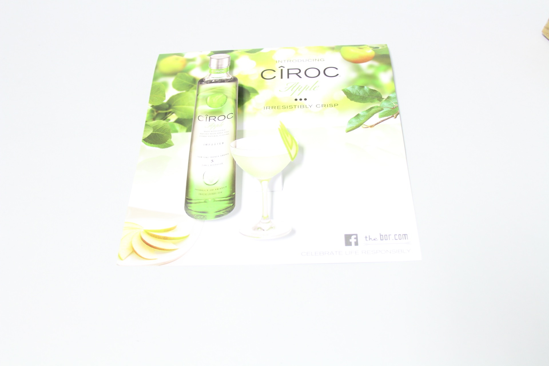
Diageo was wondering the same thing, so their agency came to us looking for new ideas of how they could boost sales in stores. This was the first time they have ever done anything like this – and viola, they were so successful, that they have already placed their second order!

Ciroc Case Tucker
Diageo/Marketing Agency & Structural Graphics // Ciroc Case Tucker

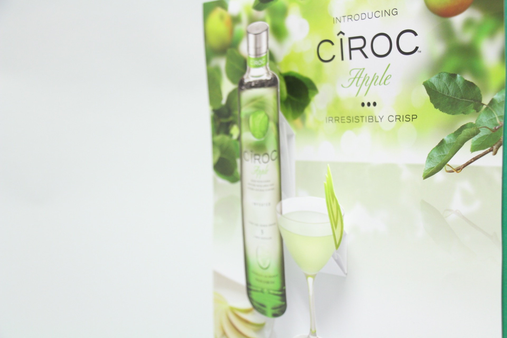
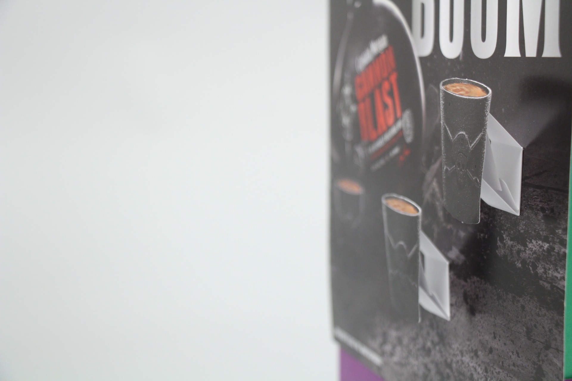
How exactly do they work? These case tuckers were tucked in between the shelves in between the bottles, promoting and drawing attention to their products.

Case Tuckers5
Diageo/Marketing Agency & Structural Graphics // Ciroc Case Tucker

Case tuckers are a unique way to sell your customer directly while they are shopping, begging for customers attention. These most certainly trump the Sharpie and neon signs you see on every shelf promoting cheap liquor and practically screaming, “DON’T DRINK ME.”

Case Tuckers3


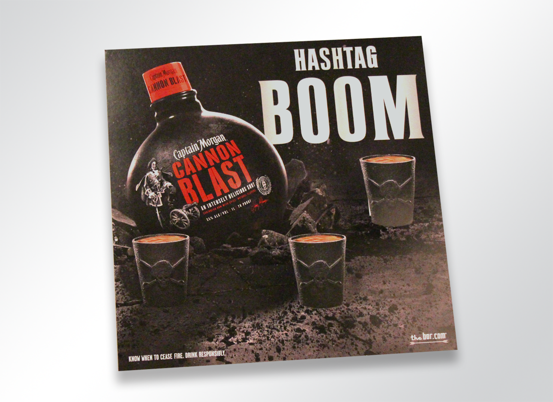
2415-1266-captainmorgan-popup

Promotion

Alcohol promotions are everywhere. Sponsorships, advertisements,  commercials, events, the list goes on. Increasingly, alcohol is being promoted more and more via social media.

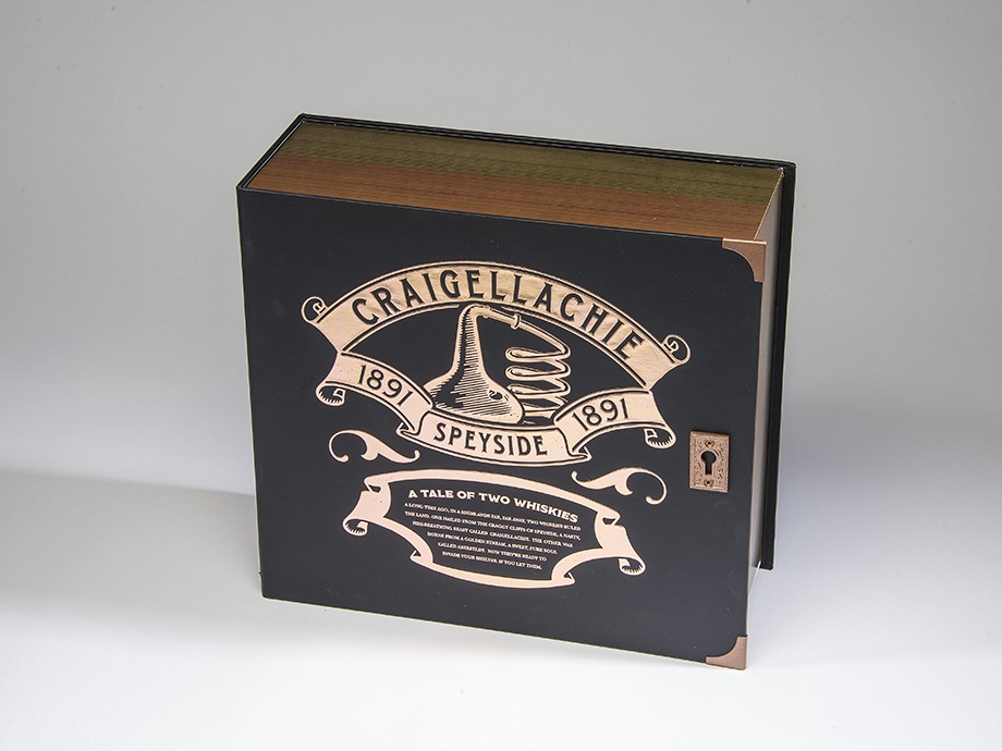
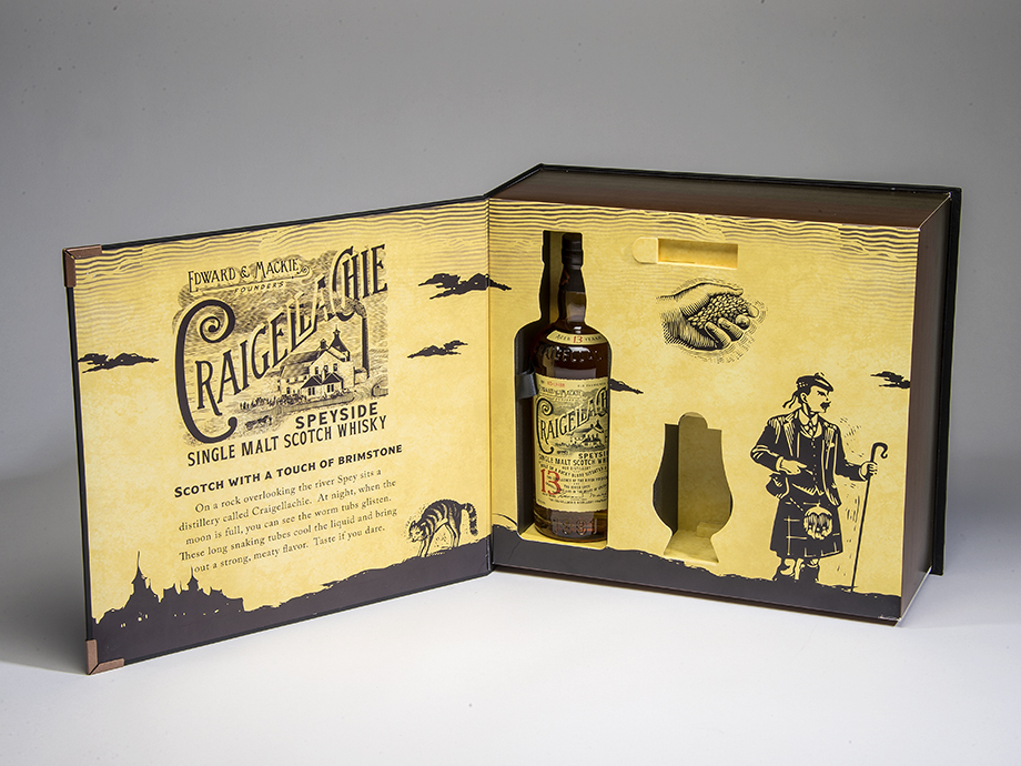
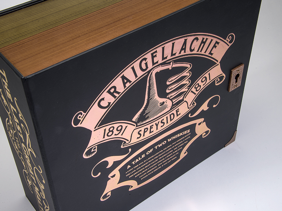
Do you need to promote your liquor brand, or unveil a new one? A truly exciting and creative way to do so is to host a PR event. And that’s exactly what Bacardi Brands did with when they came to Structural Graphics to create their Dewar’s Influencer Kit!

See below.

CRAIGELLACHI1_resized

CRAIGELLACHI2_resized

CRAIGELLACHIE7_resized

The Marketing Arm came to us to develop and design this beautiful Dewar’s influencer kit. The kit was for a PR event unveiling two new brands, Craigellechie and Aberfeldy, and showcases each in a storybook format appropriately titled “The Tale of Two Whiskies”.

To read more about this super cool launch, click here!


It’s no secret that no matter what you’re promoting, you need a way to stand out amongst the crowd. Need to reach your audience? Give yourself some height by adding a little dimension to your brand.

It All Began with A Pop-up Book

Most likely, you’ve heard our spiel (and if you haven’t, you’re in luck): “Structural Graphics is the pioneer of the dimensional print marketing industry.”

“Okay,” you might be thinking, “that’s great. But who decided to take a pop-up and turn it into an ad?” Which is a reasonable question — it’s a pretty genius idea.  Although it has been said that digital is taking over the marketing space, it’s undeniable that our work really POPS, gets attention and drives to digital.

Believe it or not, Structural Graphics did not start with an advertisement.  It all started with a fascination of pop-up books and paper that led us to engineer a new medium for the world of advertising.

Paper house in pop-up book

When asked about how the company got started, Ethan Goller, president of Structural Graphics, had this to say:

“Structural Graphics was the first company ever to introduce interactive print collateral for advertising and marketing on a commercial scale, and so can claim having “invented” the medium for use in that space.” he says.

“I’m often asked, ‘how did it all get started?’ Company founder, Chris Crowell, had a background in the graphic arts and advertising. He also had a passion for movable (“pop-up”) books, and the notion struck him:

‘If you could take the interactivity, engagement and whimsy of a pop-up book and apply it to advertising, it would perform better than traditional (“flat”) print collateral.’


That was in 1976! And as we prepare to celebrate our 40th anniversary next year, stronger than ever in a business that has transformed dramatically to be relevant in a digital environment, we are proud to boast about our place in advertising history.”

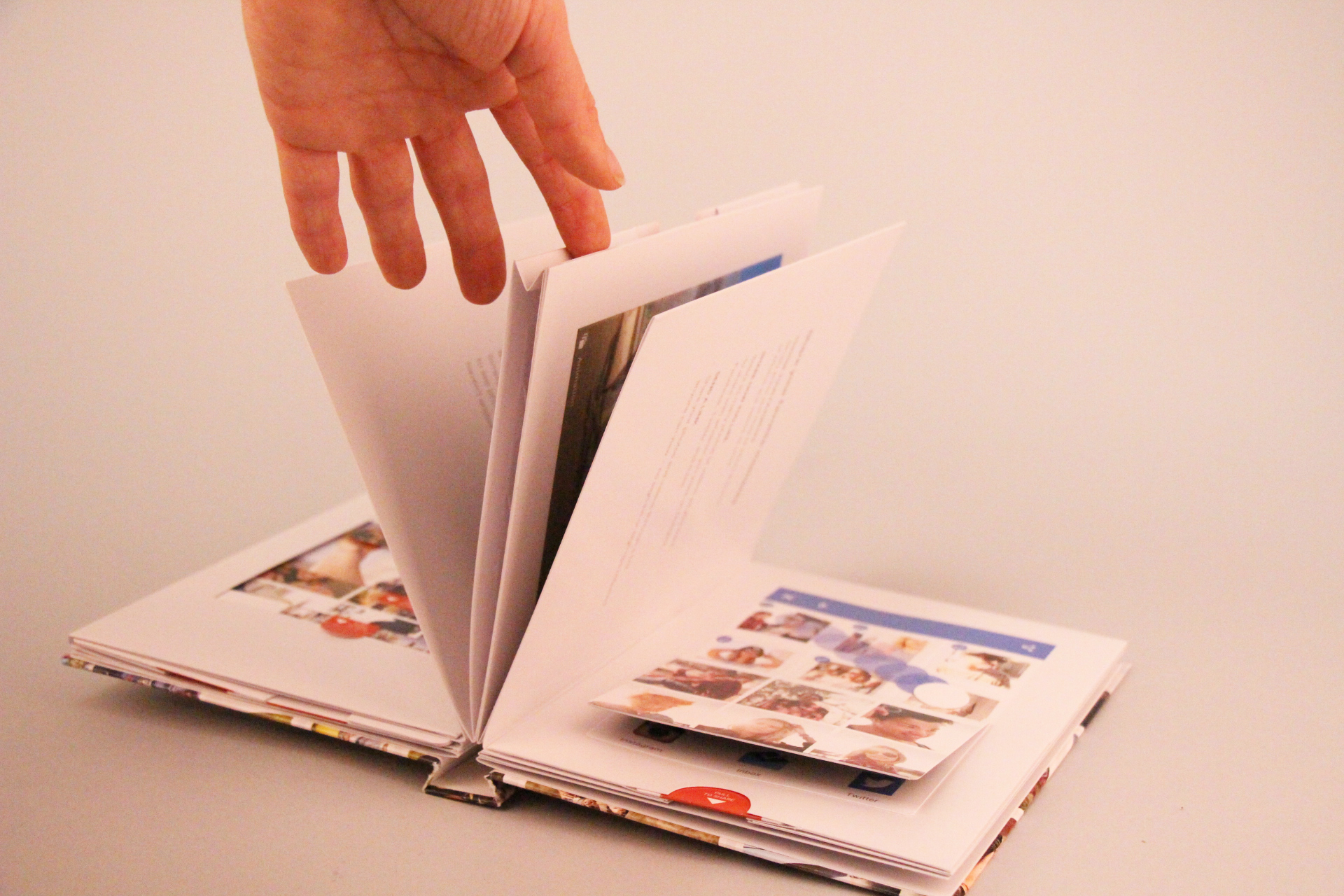
Ethan sums it up perfectly. Times change. So does Structural Graphics.  That’s why we were thrilled when Google came to us to produce a popup book for their new app, Google Photos. We can incorporate technology in print — videos, sound, web keys, NFC, you name it, or take it all the way back to our roots with our love for pop-up books.

Google Popup Book (18)


A Brief History of Packaging

It all began with some twigs and leaves…

For most of us, shopping is an integral part of our daily lives — food for our fridge, supplies for our offices, a new pair of shoes.  Chances are, whatever it is we may need will be wrapped up in a nice little bag or box.

Packaging is everywhere. But do you ever wonder where it all began?

Shopping list


Packaging as we know it today has been the result of a long development process.

Packaging is an industry that has been around since the beginning of man. In ancient times, packaging was used to transport, assist, store or protect items using natural materials such as leaves. In the Middle Age, wooden barrels were the most common way to store goods.  In the 1900’s, paper and cardboard became more important packaging materials.  As our world continued to evolve, so did packaging.

Ancient people

The Industrial Revolution sparked a tremendous change in the way that people lived their lives. Ultimately, hands were replaced with machines in the workforce, which lead to faster and higher levels of product production. This naturally created a higher demand for different types of packaging, such as:

1. Storage and transportation bins

2. Bags

3. Food packaging methods

4. Primary packaging materials

5. In-store packaging options

The Great Depression brought in the rise of the “self-service” culture where people began going to grocery stores more often.  This new trend changed the way that items were packaged.  The use of packaging turned into more of a sales tool, also known as the “silent salesman”, instead of a tool to simply hold items. After World War 2, new materials were explored, such as plastic and aluminum foil.  This offered the convenience of single use and “throw away” packaging, which was highly attractive to the supermarket culture.

In the later half of the 20th century came the rise of digital technologies, and the producing world became more competitive. Businesses now had a way to differentiate themselves on the shelf. The marketplace became more competitive as mass producing allowed businesses to venture globally.

Shopping icons

Today, packaging plays a primary role in consumers buying decision.  It’s a marketing tool that directly impacts point-of-purchase. Packaging is an industry that continues to be sculpted and molded to fit current trends.

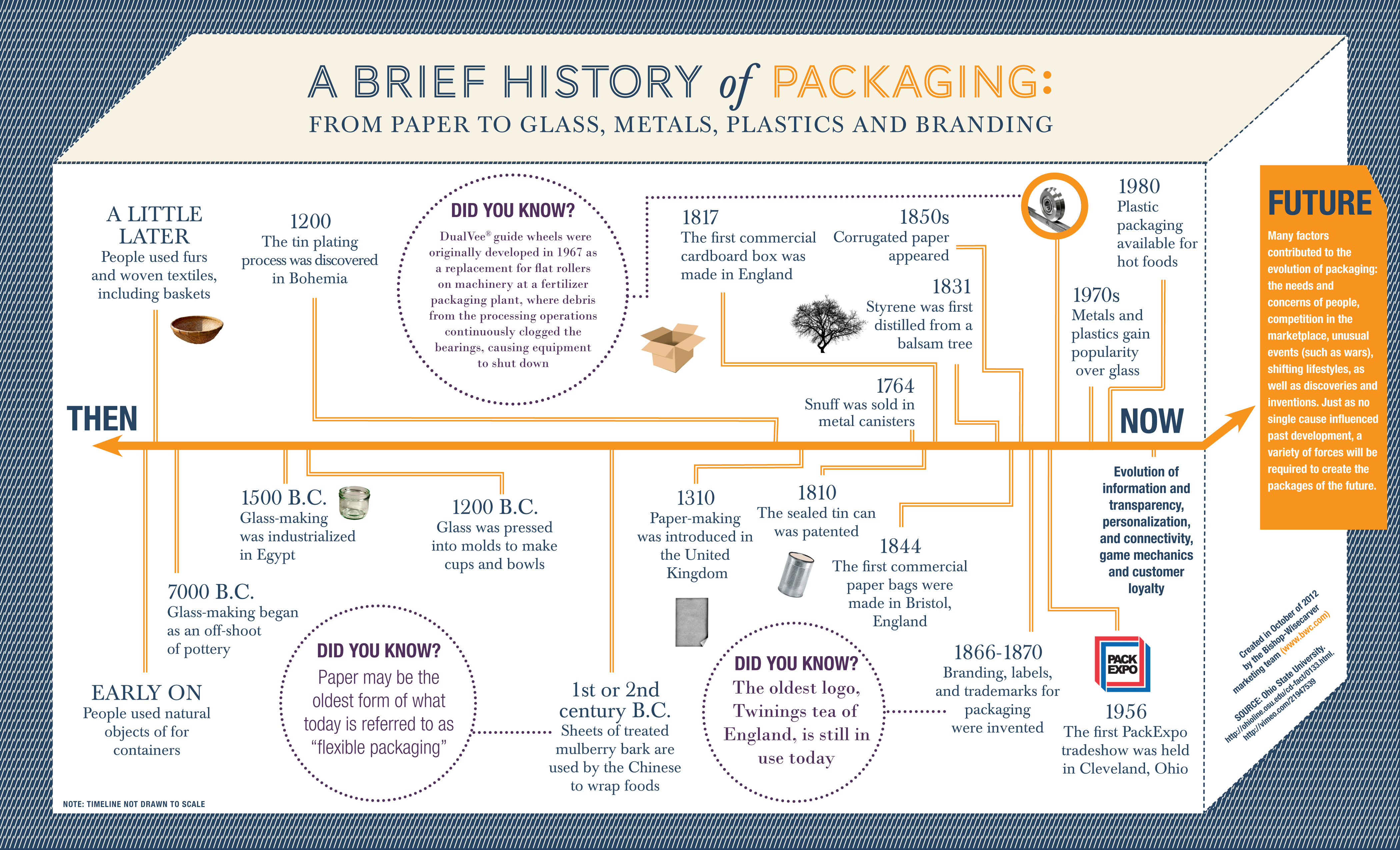
More of a visual person, or just can’t get enough of the history of packaging? Take a look at this infographic:

History of Packaging Flowchart


‘One Channel Never Enough’: Q&A With Margie Dana

Author & print industry expert Margie Dana

Margie Dana — author of three books on printing and print buying and an industry veteran with more than 15 years of experience — recently chatted with Structural Graphics to help inform our audience about different ways marketers can extend their brand’s influence through integrated print campaigns. Continue reading