Tag Archives: Dimensional Print

5 Reasons Why You Should Be Using Video in Print

In the world of marketing, you’ve probably heard the old standby, “show, don’t tell”. But what if you could do both?

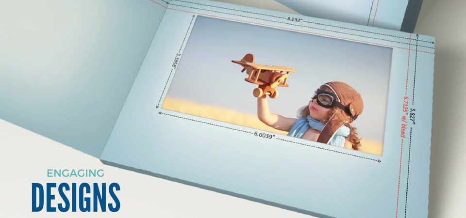
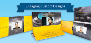
Video in print (VPA) is a powerful marketing tool that allows your brand or business to stand out from the pack. By combining motion, sound, and print into one single piece, you’re effectively creating a multi-sensory experience for the recipient, drawing them in and establishing that initial connection between them and your brand.

Now, that’s a formula for success.

And the benefits don’t just end there. Based on our extensive experience designing and producing unique marketing collateral for brands, we’ve compiled a list of four reasons why you should consider using VPA for your next marketing campaign.

Simply put, it’s an effective tool for communication.  With VPA, not only do you get the tactile enjoyment of print, but you also get the action. This allows you to create a more holistic experience for your customers and prospects because you are able to provide them with a variety of touch points where they can engage with your brand.

VPA is an attention-grabber. Capturing the attention of your audience is one of the most important parts of marketing your products and services. But it’s also one of the most difficult. Many of us are so overwhelmed by the volume of emails we receive, as they only add more to the “digital clutter”. If you want to get your audience’s attention, you’ve got to deliver your information in a way that will engage – sending a printed brochure with an embedded video screen is the sure fire way to do just that!

It pulls at the heartstrings. Fusing video with print opens up more opportunities for your messaging to resonate with your audience and for them to forge a connection with you. The combination of visuals and sound, and copy work together to create a powerhouse emotional experience if done right.

Video is perceived to be more valuable than text alone. It’s no secret that video is often much more labor intensive and expensive to produce. So, when you decide to share a video, your audience is almost guaranteed to notice. Because of this, people will often give you more time, more contact information and even pay more for your product or service.

It’s a clear winner. Think for a moment: What kind of learner are you? For most of us, we’re visual learners and then about a third of the population considers themselves auditory. So, why compromise? VPA can ensure that your brand messaging can resonate with all types of learners because the information is simultaneously delivered verbally and visually. Aside from being exceptionally powerful, this also means there’s less chance they’ll misunderstand or misinterpret your message.

Print marketing already has the proven success to resonate with consumers alike. So, combining a high-impact printed format with a video screen is sure to get the attention  you’re looking for from your target audience.

Visit us online at StructuralGraphics.com to see our Video in Print gallery and to learn more about our formats. In a hurry? We’ve got you covered. Our online ordering division, Red Paper Plane has video in print solutions with a faster turn time of only 7 days. Not to mention, we’re constantly adding new designs as well – so make sure you check out all that we have to offer!
Structural Graphics Featured in Fold of the Week

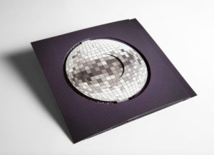
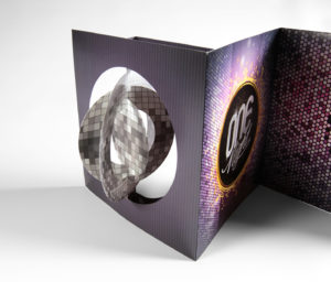
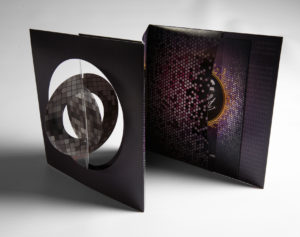
Check it out!  Structural Graphics’ piece was featured as the 60-second Super-cool Fold of the Week.  Trish Witkowski of Foldfactory showcased our “Simply Cool Swinging Disco Ball Accordion Invitation.”

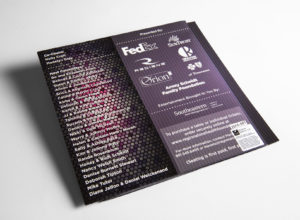
Structural Graphics designed and produced this disco ball invitation for RedRover Marketing in Tennessee for their client, the Regional One Health Foundation. They used this mailer to invite people to their annual ONE Night Fundraiser. The invitation shipped flat, but the paper die-cut spheres on the cover immediately twirl in succession when you open up the mailer to create the illusion of a dimensional disco ball.

Thanks for the shout-out Trish!

PROJECT SPOTLIGHT: Dish Network Uses Pop-Up Cube As Unique Handout

How does a company stand out at a trade show with a sea of many other vendors to compete with?
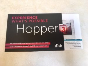
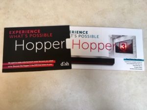
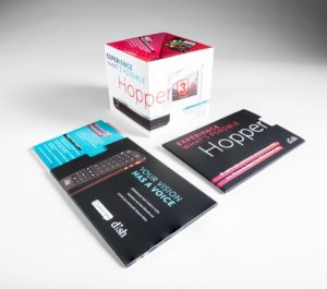
Dish Network used the pop-up cube as a unique handout at the CES Show in Las Vegas. They kicked it up a notch by delivering the cube inside a half-sleeve, giving the recipient a sneak peek of what was on the inside. As the cube slides out, it immediately pops into shape delivering information about Dish Network’s award-winning DVR, The Hopper®.  Click here to see it in action!

Are you ready to generate some buzz and awareness for your company?


7 Steps Chrysler Took to Promote Their Business at the NADA Convention

Today’s automotive industry moves fast and furious, so it’s important to showcase your vehicles in new and creative ways. But how do you show change and innovation on paper? You don’t. You show it WITH paper.
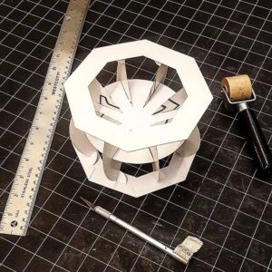
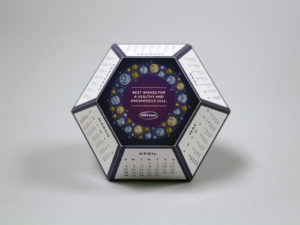
Like Chrysler did here.

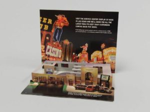
The automotive company was looking to encourage people to visit their service center display at the National Automobile Dealers Association’s Las Vegas convention in 2003. To do this, they cleverly employed several marketing techniques that can apply to any brand or industry.

  1. Stay true to your roots. Chrysler, which has a strong brand identity, chose to showcase a miniature version of a Chrysler dealership right down to the cars, service desk and employees.
  2. Never underestimate the ‘WOW Factor’. Pop-up mailers are a really unique way to capture the attention of your audience. This particular one ships flat but, because of its interactivity, detail and uniqueness, it also surprises and delights.
  3. Less can be more – when it’s done right. Sometimes it’s just better to get to the point. To really maximize the space on this mailer, Chrysler chose to include short bursts of essential information instead of paragraphs of marketing speak. Rather than trying to convince attendees to visit its display, the team chose to let the excitement of the mailer speak for itself.
  4. Include a call to action. In this mailer, Chrysler is up front about what it wants – for people to visit the company’s service center display at the conference.
  5. Offer an incentive. We all know that people generally love to win free stuff. So, instead of just asking conference attendees to visit Chrysler’s display, they wanted to make the visit worthwhile. To make their call to action even more powerful, the company also advertised that they would be offering a chance to win a free year of ServiceVision.
  6. Don’t forget the basic information. Between the bells and the whistles, it’s easy for marketers to get caught up in the excitement of a piece and forget the most basic of information. Always include the date, time and location (if applicable) of any event you or your business are/ is attending.
  7. Catchy openings are key. Embracing the convention’s location, Chrysler took inspiration from Las Vegas’ neon lights and showgirls. The mailer’s cover is colorful and hints at the purpose for sending it out. It also beckons the recipient to open it up to see what’s inside.

Introducing SG Unfolded

Each year, businesses throughout North America choose Structural Graphics to produce thousands of dimensional projects customized to fit their individual needs. But what about the multitude of other designs our paper engineers have created but have never been produced?

Now, you can find them here.

SG Unfolded, which launched this week, is intended to showcase one-of-a-kind inventions born of innovative thinking and precision engineering. We have such a large library of designs, that we wanted to shine a spotlight on some of the amazing work our paper engineers think up behind the scenes, which may have never made it into a client’s hands.

Our hope is not only to show off these designs, but also to help you get to know our paper engineers and their approach to crafting novel pieces for marketing professionals, Fortune 500 companies, universities and the like. Perhaps these pieces will even inspire you!

Currently, we have 16 designs on SG Unfolded (and our related Instagram account, with more queued up and ready to be posted for you to enjoy every week. Multiple images are posted for each design, including a short video to showcase how the mechanism works.

We hope you enjoy!

What it Means to Say I’m A Creative: Isabel Uria

This is the second installment in our “What it Means to Say I’m a Creative” series, meant to focus on the inspiration and drive behind each one of our paper engineers. To read Part 1 of the series, click here.

  1. How did you know you wanted to create (in a professional sense)?
    I think at an unconscious level I always knew I was going to work in the arts. I played piano for five years, and was involved in the school choir, theater, musicals and extracurricular art classes since middle school. Back then, I loved colors and painting, primarily.However, my journey with paper probably goes back to when I was 6 or 7 years old. My older brother had been given origami books for Christmas. I saw how he would make all these little creatures out of paper and neatly display them on his shelf. As any little sister, I idolized my brother. I wanted to be just like him! But he wouldn’t lend me his origami books!So one day, when he wasn’t looking or wasn’t around, I snuck into his room, took the books and started to try to follow the instructions on how to make all these little creatures through increasingly difficult pleats and folds. I succeeded on the beginner’s book but I failed miserably on all the more advanced ones. It took a while before I would understand and successfully accomplish complex paper folding like that. But if I have to look back at where I began with paper, I think that might have been my first experience with this amazing material.
  2. What advice would you give to others who want to work in a creative industry/ position? 
    Work Hard. Work smart. Be true to your passions.

    Be consistent.

    Be persistent (without being stubborn).

    Be confident, but not cocky.

    Dream big, but also keep your feet grounded in reality (or at least keep a toe or two on the ground).

    Stay confident, even when you think you’re wavering at every turn. (We often think we’re not doing well enough, but sometimes that’s a good thing; it keeps us humble.)

    Go forth doing your thing (whatever that may be) with constancy and fortitude!

    I guess much of this “advice” can really apply to any profession. At the end of the day, whatever you do, practice your craft passionately. Wouldn’t that make for a happier you?

  3. What does creativity mean to you?
    Being creative is inside all of us. Creativity is looking at a world of possibilities and acknowledging all the ways a problem can be brought to light and all the ways it could be solved. Creativity opens your mind. It is a path to visualize the past, the present and the future. Creativity is the opposite of war. It is the future. Evolution has happened because human beings have been curious to know and understand how things work and take that understanding to CREATE new developments and innovative things that serve our needs and help us. Creativity makes the world go around!
  4. How do you feel when you tell others you’re a paper engineer?
    It’s always fun to explain what I do. Unless you’re “in” the industry or closely linked to it, people don’t automatically know what a “paper engineer” is.First of all, we have not necessarily studied engineering in school, yet we work with paper as our material of choice in the same way an engineer does. We use the material —cut, fold, and paste it—to create an entirely new construct. The thing about paper engineers is that we can toggle that blurry line between being an artist and being a designer. We can be both! And sometimes, some of us are.Personally, I feel that’s awesome! I also feel very fortunate to be one of the people who makes a living in this profession. There are only so many people that do, and I think we all know each other! Or at least we know of each other.
  5. What does it mean to say that you’re a “creative”?
    There’s a lot of responsibility that comes with being a designer because you’re the one that has to visualize the results, and make sure it works for the purpose that it is needed. As a creative I have to come up with a compelling, grand, aesthetically pleasing solution to the problem at hand. I have to design an eloquent way to express a message in 3D paper shapes and forms. I have to make things unique and innovative. Sometimes that comes easy, but sometimes it doesn’t. And criticism will always be there. Those are the struggles you deal with on a regular basis as a designer, as an artist and as a creative.

To learn more about Isabel, please click here.

Thinking Outside the Inbox: Direct Mail for the Holidays

postbox
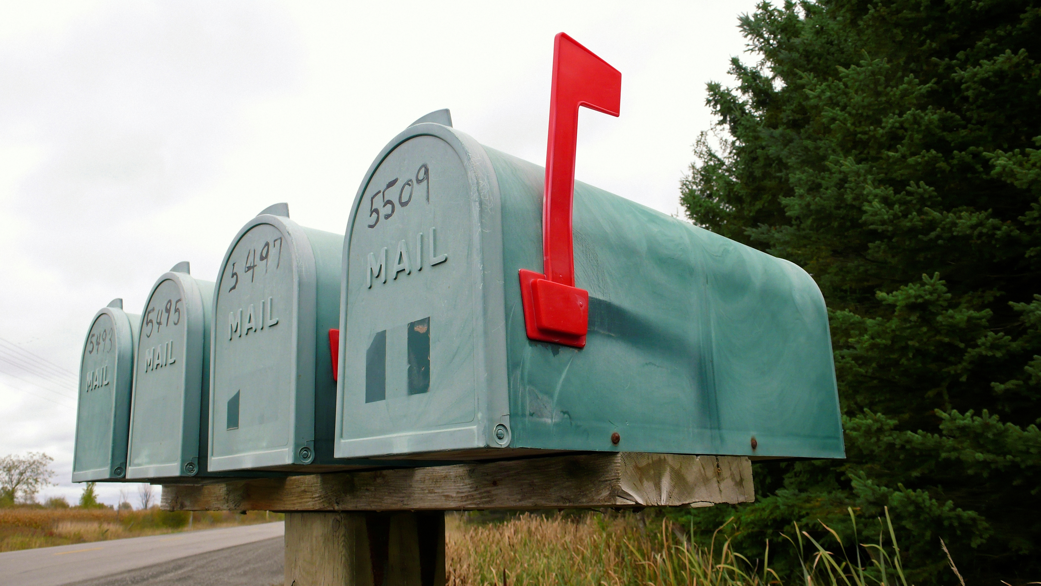
I always get excited when I receive mail.

One glimpse of the mail carrier, donning his USPS garb, and I wait anxiously to see whether there’s anything addressed to me. But on those days when I’ve got more than bills or credit card offers stuffed in my mailbox, that childlike excitement I felt earlier all too quickly disintegrates into something else: disappointment.

There are the flat mailers that have my name incorrectly printed on them. There are the catalogs with promo codes so buried I get exhausted from flipping through before even finding them. And there are the dreaded cards and the postcards that I barely even look at before throwing away.

Sound familiar?

These pieces all have one thing in common (besides meeting my recycling bin): they’re boring. And as businesses increase their efforts to vie for your attention this holiday season, as marketers you want to be anything but. So, if you’re not currently creating (or, at the very least, brainstorming) some ways to set your direct mail apart, you’re already missing out on the opportunity to make a memorable impression.

5

But don’t worry, it’s not too late to get your company or your products noticed in time for the holidays. Here, we’ve curated some of our most helpful tips on how to bring back that “wow factor” during the most magical time of the year.

      1. Go dimensional. Perhaps the easiest way to make a real impact with little-to-no-effort? Incorporate dimension. By incorporating pieces like our 3″ pop-up cube into your marketing, it’s easy to put forth your messaging in a way that takes advantage of 3D (but still ships flat).
      2. Embrace technology. For better or for worse, we live in a digital world and it’s just going to get that much more – er – digitaler. Instead of rejecting this characteristic of modern life, we say embrace it! Want your print advertising to play your jingle? Want to incorporate virtual reality or LED lights into your messaging? Make your customers feel like a kid around the holidays by sending them something shiny AND bright in the mail.
      3. Video is your friend. Did you know that videos increase people’s understanding of a product or service by 74%? In case you’ve been living under a rock, video is super trendy right now. Combine video with one of our high-impact print solutions and you’ve got a powerful marketing tool.
      4. Surprise them. If a consumer is able to predict how a promotional piece is going to look or feel before they even get their hands on it, you can almost bet that it will get lost and maybe even thrown away. Make your brand as exciting as you are – that unexpected element will not only set you apart from your competitors, but it’ll leave a lasting impression in your recipients’ minds.
      5. Think Interactive. Print plays to the human senses in ways that digital tech is hard-pressed to match. By delivering a direct mail piece that recipients can engage with, you’re not only getting their attention, but you’re strengthening your brand’s longevity, too.

Feeling inspired? Have an idea for how your business can target the next generation of purchasers? Contact us to get started.

Structural Graphics Celebrates 40 Years of Innovation in the Interactive Print Marketing Industry

sgs-40th-anniversary-party-21

Structural Graphics, the pioneer of the dimensional print marketing industry is celebrating its 40th anniversary. The company introduced the world to dimensional print marketing in 1976 and continues to lead the interactive print marketing industry today.

Over the years, Structural Graphics has created more than 40,000 interactive paper designs for clients in almost every industry and holds many U.S. Patents. For more than four decades, the company has helped some of the world’s most influential brands reach their audiences with high-impact and multisensory marketing campaigns. Brands such as Samsung, Google, Whirlpool, Coca Cola, Lincoln, Land Rover, UPS, American Express, Nationwide, Victoria’s Secret, Calvin Klein, Leading Hotels of the WorldNabisco, AstraZeneca, The Hartford and Prudential, just to name a few.

As the world changes, Structural Graphics’ capabilities and service offerings have continued to evolve. Building on the company’s success in the insurance sector, The Lift Factor was established to deliver fully integrated marketing solutions utilizing print and digital executions for the nation’s top insurers. The Red Paper Plane division was created to provide a fast turnaround, do-it-yourself platform to buy Structural Graphics’ top selling formats online.

“The vast majority of companies never make it to see their 40th anniversary. The fact that we are celebrating this milestone here at Structural Graphics is a testament to the innovative products and services we offer, and our wonderful clients and suppliers. But most importantly, it’s a reflection of the creative, hardworking and talented employees that have walked through our doors over the past 40 years. Our people are truly our greatest asset,” stated Mike Maguire, CEO.

Structural Graphics markets its products and services nationally and in Canada, with its design and paper engineering, production management, marketing and administrative offices operating from the corporate headquarters in Essex, Connecticut. The company has sales and production operations throughout the U.S. and Mexico.

For more information or to view some of Structural Graphics’ work, please visit www.structuralgraphics.com.

Drink Me: Marketing in the Alcohol Industry

A few tips (on the house).

“Marketing” is a broad term that embodies a wide range of activities and disciplines that promote and sell a product. It casts a wide net that is open to interpretation; and when you throw alcohol into the equation, well things can get a little crazy.

(Wait, what happened last night?)

Cheers!

First thing’s first. When you are marketing in the alcoholic beverage industry, the same basic marketing rules still apply.

Your 4 P’s: Product, Price, Place, Promotion

So, how exactly do these relate to alcohol beverage marketing? Let’s break it down.

Product

At the risk of stereotyping, there are certain alcohols that appeal to a younger crowd that do not appeal to older folk, and vice versa. My dad loves his tried and true Tito’s (really, Tito’s, my dad is your biggest fan – going on 10 years strong which is some serious brand loyalty).  I, on the other hand, the millennial in all of my glory, am more likely to try something different simply because the packaging catches my eye.

It’s no secret that our generations shop differently: my dad has been going to the same mechanic for years, whereas I go wherever the deepest discount is, or wherever the most convenient location is.

A study in Australia determined that adolescents were more likely to gravitate towards ‘alcopops’, a.k.a. booze-y drinks that have very little actual booze in them – malt beverages, wine coolers, etc. – because the packaging is designed to look like a soft drink.

Colorful-Cans

Price

Everyone loves a good discount. It is common knowledge that if we will get a discount on buying more, we will buy more (see Sam’s Club, Costco, etc.) whether we really need it or not. And not to much surprise, when we buy more, we consume more. Shots, shots, shots shots, shots, shots, shots shots…

Price discounts and promotions can have a huge impact on volume of alcohol purchases. They can be a key marketing tool for producers and retailers.

A study conducted by Alcohol Focus Scotland found that supermarket promotions and discounts on alcohol increased sales by 20 – 25%. 

Place

Location, location, location. Anyone who has ever been in a liquor store knows that those places can get pretty crowded. So many brands are trying to promote their products on the shelves or even at the register, so it can be hard to stand out and get the consumer to pay attention and make them want to buy. Did you know that companies pay top dollar for prime shelf space in the stores?

But once you have that spot, how do you stand out among the rest of the bottles of the shelves surrounding it?

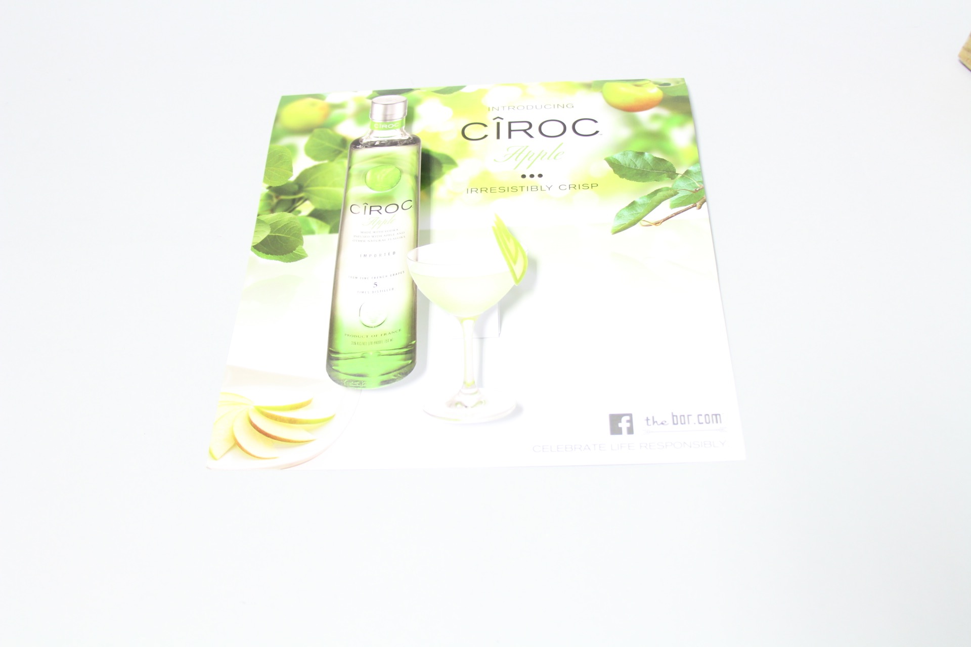
Diageo was wondering the same thing, so their agency came to us looking for new ideas of how they could boost sales in stores. This was the first time they have ever done anything like this – and viola, they were so successful, that they have already placed their second order!

Ciroc Case Tucker
Diageo/Marketing Agency & Structural Graphics // Ciroc Case Tucker

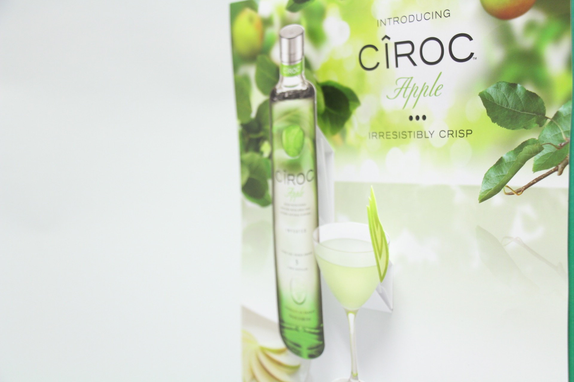
How exactly do they work? These case tuckers were tucked in between the shelves in between the bottles, promoting and drawing attention to their products.

Case Tuckers5
Diageo/Marketing Agency & Structural Graphics // Ciroc Case Tucker

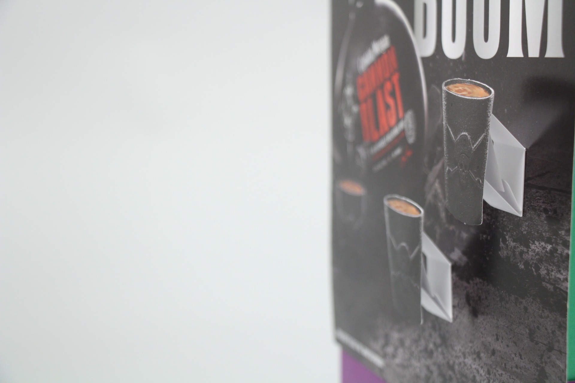
Case tuckers are a unique way to sell your customer directly while they are shopping, begging for customers attention. These most certainly trump the Sharpie and neon signs you see on every shelf promoting cheap liquor and practically screaming, “DON’T DRINK ME.”

Case Tuckers3


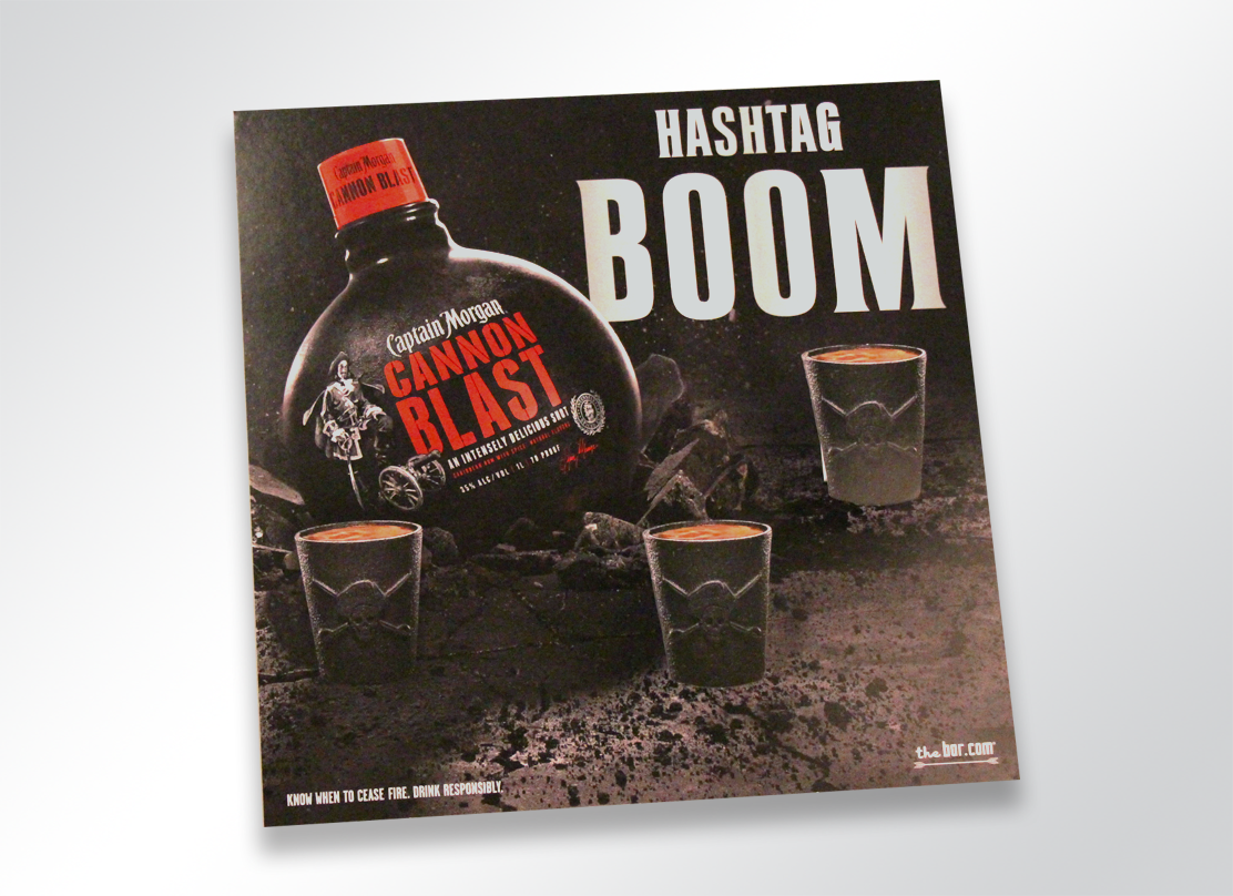
2415-1266-captainmorgan-popup

Promotion

Alcohol promotions are everywhere. Sponsorships, advertisements,  commercials, events, the list goes on. Increasingly, alcohol is being promoted more and more via social media.

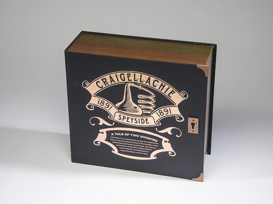
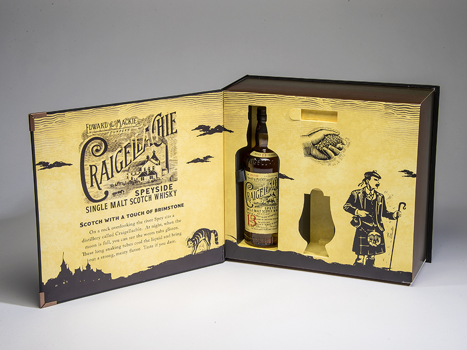
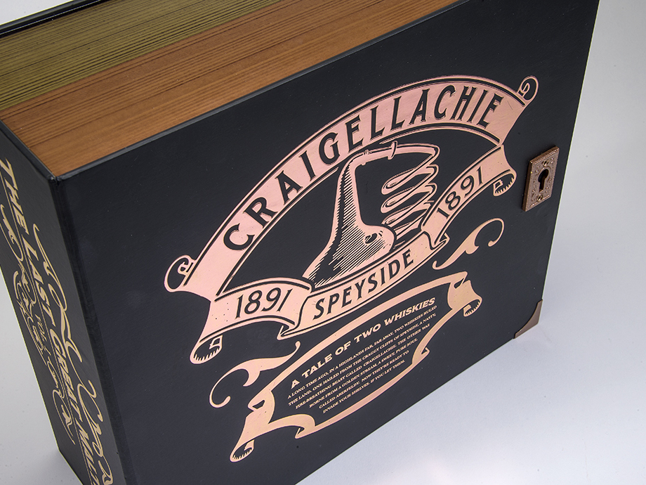
Do you need to promote your liquor brand, or unveil a new one? A truly exciting and creative way to do so is to host a PR event. And that’s exactly what Bacardi Brands did with when they came to Structural Graphics to create their Dewar’s Influencer Kit!

See below.

CRAIGELLACHI1_resized

CRAIGELLACHI2_resized

CRAIGELLACHIE7_resized

The Marketing Arm came to us to develop and design this beautiful Dewar’s influencer kit. The kit was for a PR event unveiling two new brands, Craigellechie and Aberfeldy, and showcases each in a storybook format appropriately titled “The Tale of Two Whiskies”.

To read more about this super cool launch, click here!


It’s no secret that no matter what you’re promoting, you need a way to stand out amongst the crowd. Need to reach your audience? Give yourself some height by adding a little dimension to your brand.

First Class News: Potential Postage Pricing Rollback


Piggy Bank on beach vacation

I think we can all strongly agree on one thing: saving money rocks. Whether it’s a 20% off coupon to J. Crew or a few cents off of a gallon of gas, we are all looking to save a little somewhere.

And if you love direct mail as much as we do, we have some extra good news. The first steps towards a rollback of postage pricing began with the USPS posting the new rates for this spring. While it’s still uncertain around the implementation date, this is awesome for mailers. Most commercial mailers will see rates drop around 4.1%, depending upon class of mail and level of sortation. Woo hoo!

We love direct mail, so, naturally, this gets our stamp of approval. To see a breakdown of the proposed postal rates, visit http://pe.usps.com.


Mailbox copy