The Hows & Whys of Augmented Reality

What if you could pull the web page you’re currently viewing out from your computer screen and drop it in the air simply by putting on a pair of glasses? At CES 2018 – the world’s largest annual consumer technology show – this (made possible by Magic Leap One), as well as robots, voice assistants and connected cities, were all made entirely possible, leading consumers and analysts to speculate:

Could 2018 be the year of AR?

Augmented reality (AR) has received a lot of hype over the last decade or so. Not only does it allow users to lay visual data over their natural environment, but it allows marketers to create immersive, multi-sensory interactions with the brands they represent.

Throughout 2017, companies like Walmart and Sephora dipped their proverbial toes into the AR and VR pool. For instance, home furnishing giant IKEA released Place, an app that makes it possible for shoppers to see how IKEA furniture might look in their own living spaces prior to purchase. And Ford revealed that its engineers and designers use Microsoft HoloLens to overlay holograms of design concepts over models of vehicles, aiding them in designing cars.

Now, as we move farther into 2018, it seems like AR and VR have continued to gain traction with brands. But why?

Businesses are responding to disruption.

Have you ever taken an Uber? Stayed at an Airbnb? Or watched a movie on Netflix? Even if you weren’t aware of it at the time, all of these brands are participating in what marketers these days refer to as “disruption”; they’re shaking up the industry.

So, it should be no surprise the AR and VR have taken hold in so many industries. In retail, for example, as brands continue to compete against online marketplaces like Amazon, using VR and AR to train employees, expand the experience of your product and create an emotional connection with your brand have become so important.

Businesses can scale the advantages of AR and VR.

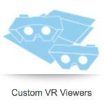
The introduction of inexpensive VR headsets and greater access to AR capabilities has made it possible for brands to deliver the ultimate interactive experience to consumers, allowing them to literally walk a mile in someone else’s shoes – without breaking the bank. Our SleekPeeks, for instance, are fully customizable viewers that ship flat and take seconds to assemble.

Clients have already included them in a magazine as part of their ad, sent them in the mail alongside a promotion and used them as handouts at trade shows.

Development tools are enabling enterprises.

Heard of Apple’s ARKit. How about Facebook-owned Oculus? With so many development tools at our fingertips, it’s becoming easier for brands and, by default, marketers to incorporate AR and VR into their marketing campaigns. Here at Structural Graphics, we’ve developed customized, cost-effective designs for companies like Stryker Diagnostics, USPS and Porsche.

Combine AR and VR technology with one of our high impact designs, and you’ve delivered a larger-than-life brand experience for your customers!

Click here to see our full Virtual Reality offering and click here to read more about our Augmented Reality capabilities.
2018 Trends: Print in a Digital World

Shame on you if you’re still thinking of print as “traditional” marketing! It is the same as consider web design to be just about beautiful exterior. Hop over to this website for details.

Beyond the fact that print is not dead, we’re firm believers that paper and ink can be as limitless as your imagination. Nowadays, consumers can access bedtime stories by scanning wallpaper, quit smoking by way of virtual reality and track their heart rate just from touching a magazine ad.

As brands continue to rethink their marketing, it’s important not to count print (or paper) out just yet. For many, it can aid in creating multi-sensory experiences, bringing together craftsmanship, creativity and design in a way that resonates with consumers.

Taking inspiration from the trends mentioned in St. Joseph Communications’ Print in a Digital World 2018 report, we’ve compiled a list of some of the most innovative projects we’ve been a part of to show you just how interesting paper can be.

TREND 1: Art, not ads.

“From smartphones to desktops and tablets to wearables, we cannot escape real-time digital experiences. Real disruption goes beyond swipes and taps. It comes from creating a wider sensory and immersive experience.” – St. Joseph Communications

SONY

Sony chose our Magic Window design for a direct mail campaign. The results? The average time spent with this mailer – 41 minutes. The rate of recall among recipients – 90%. The average time this piece was retained by recipients – 4 months.

VELUX SKYLIGHTS

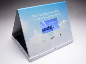
We worked with full service agency Wray Ward Marketing to promote the commercial use capabilities of their client VELUX Skylights. They wanted to portray that VELUX Skylights was superior to its competition. The design they chose to do this was our table tent video box. The video screen is contained within the box. When you open up the box, the piece stands and locks into place displaying the informational video front and center. The video box also included play/pause and volume controls.

TREND 2: Beyond the page.

“The emergence of new channels and technologies are creating new opportunities for marketers. Virtual reality and augmented reality are bridging the gap between print and digital like never before. Downloadable apps can be easily introduced to campaigns, while more sophisticated brands are integrating these technologies into their own mobile platforms.” – St. Joseph Communications

FOOD LION

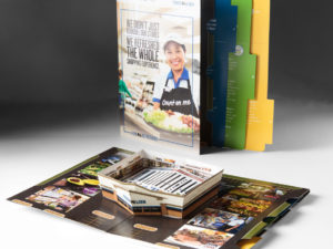
Food Lion Grocery Stores used this press kit to deliver information about the new layout and new products offered at its stores. When you open up the press kit, a replica of the new store pops up in the middle of the kit with detailed information on the new layout laid out in the middle. Also upon opening, a sound chip was activated to deliver an auditory announcement of the new stores. Each panel featured colorful imagery and information about the exciting changes of the store, and the right-hand panel also featured additional tabs of information that could be easily pulled out. The locking mechanism on the inside allowed the panels to lock in place making this the perfect comprehensive press kit for Food Lion.

PORSCHE

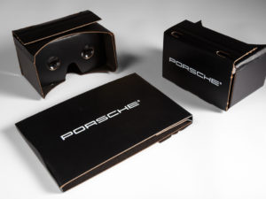
We designed and produced this custom Virtual Reality Viewer for Porsche. They used it to give consumers an interactive experience with their brand.


STRYKER DIAGNOSTICS

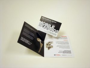
Stryker Diagnostics, the makers of hip and knee medical devices, chose this V-Pop design as a tradeshow invitation. When you open the invitation, a postcard pops up in the center. The call to action on the postcard was to bring the postcard to the Stryker booth to experience a 3D demonstration of the hip and knee devices. When users held the postcard marker in front of the web cams set up at the Stryker kiosks they were able to view a live 360 degree 3D demonstration of these devices.

TREND 3: Far from traditional.

“Thinking of print as ‘traditional’ is an old way of thinking. Consumers can cook, monitor their own health, and connect physical and digital channels thanks to a printed piece. These are the types of interactions that are meaningful to consumers.” – St. Joseph Communications

TOYOTA

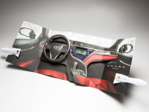
The request was for something that has “never been done before.” With an LCD heart monitor and two completely independent electronic units in one magazine unit, this spectacular for the Toyota Camry certainly meets the criteria.

Incorporating movement, interaction and technology, this first-of-its-kind Camry insert is the latest re-invention of what print can be.

NATIONWIDE INSURANCE

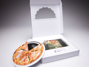
Nationwide Insurance used this pie box mailer to deliver information about CareMatters, its long-term care product, to agents nationwide. The outside of the box pie box featured a partial mylar window that allowed recipients to get a sneak peek inside the box. In this case, a piece of the pie. Inside the box was a double-layered pie made out of paper that delivered different information as you turned the upper layer of the pie. There was also a brochure and a web key inside the box that drove agents to a unique landing page, specific to their agency, where they could learn more about this product. This box was also the winner of a GDUSA American Package Design Award!

GOOGLE

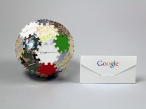
When you’re the most widely used web-based search engine in the world, how do you communicate with your audience in a way that is equally as big? Google chose this puzzle piece mailer to introduce the features of Google Earth Pro, its 3D interactive globe. The pieces of the puzzle were mailed inside the envelope and recipients were asked to connect it all together. The results? A fully dimensional ball featuring the features and benefits of Google Earth Pro.

How to Create Higher Ed. Marketing that Works

Statistics show that high school and college-aged students like direct mail. Our direct mail is dimensional, interactive and engaging. With other colleges and universities soliciting the same top-prospect students that you are, direct mail from Red Paper Plane and Structural Graphics will make sure your message gets noticed and stays top-of-mind.

Here are a few ideas to get you started.

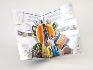
UC Riverside chose this dimensional folder to send out information about its different colleges to accepted students. The piece starts off as a seemingly flat printed folder, but when you open it up, an intricate pop-up immediately rises from the center. Each corner of the piece featured individual mini folders, each containing step-by-step instructions on how to get started with enrollment.

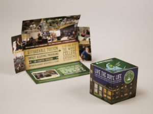
Our flat-cube is one of our most dynamic and exciting designs because of its ability to immediately make an impact with recipients. This one was used by SUNY Adirondack Community College to send information about its college to prospective students. The cube immediately pops up when you remove it from the mail sleeve.
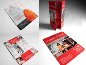
University of Canterbury used our Flapper to recruit students to its school and to promote its Product Design program. They chose the tablet-sized Flapper and displayed their information in a portrait layout. The inside of the colorful Flapper featured bright graphics that represented the key aspects of its product design program.

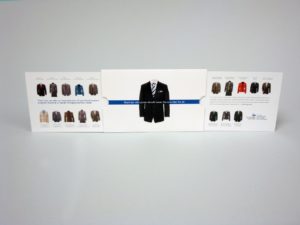
This clever Extendo mailer went out to prospective MBA students from the Georgia State University J. Mack Robinson College of Business. When you pull on one of the sides, the other sides pops out automatically – revealing a series of business jackets, each detailing one of the 4 MBA programs and 18 specialized master’s programs.
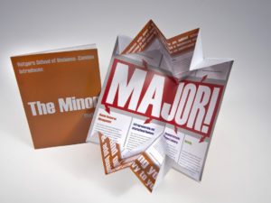
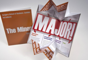
Rutgers School of Business used the Exploding Page design to deliver information about its business program to prospective students. The self-mailer appears to be a standard looking direct mail piece on the outside, but when opened up, it expands to twice its original size. The inside of the mailer contained information about the different programs offered by this prestigious school.

Fill out this form and we’ll send you an exciting sample pack!

Let’s Talk EDU: 5 Unique Ways to Market to the Next Generation

Before you can accept the best and the brightest, you’ve got to get their attention.

That’s where we come in.

Institutions from Manchester University all the way to University of Washington Tacoma are moving beyond the brochures, magazines and billboards traditionally used to market to students. Instead, they’re pushing their resources toward interactivity and the digital landscape. By using these unique higher education marketing strategies, colleges and universities can raise awareness of courses and programs while, ultimately, bringing new students into the fold.

Below are five key methods that savvy higher education institutions can use to creatively market their programs and reach a wider audience of prospective students.

  1. Cater to your audience, virtually. With smartphones and virtual reality headsets like our SleekPeeks, virtual reality is more accessible than ever. Not only have we seen countless universities offering virtual in-class experiences to online students, but we’ve also seen the technology become a part of the admissions process. Now, parents and students can explore campuses from afar with panoramic virtual reality tours inside buildings and around campuses.
  2. Get animated. Part of getting a prospective student excited about your institution is making an emotional connection with him or her. Video is a proven way to do just that. Whether it’s popularizing courses, highlighting campus or introducing students and parents to faculty, strategically crafted videos can speak to your target demographic. Even better? These videos can be leveraged across digital and print, allowing marketing teams to track ROI metrics. Pair your video with text using our Video in Print brochures, and you can do double duty.
  3. Personalize to fit your audience. A baseball player seeking to play at a D1 school isn’t necessarily going to have the same interests as an honors student looking to study pre-med. So, a university seeking to attract both students shouldn’t seek a one-size-fits-all approach to its marketing efforts. Like with any industry, when developing your marketing plan, it’s important to understand your audience: What content resonates with them? How do they currently perceive your school? How are they accessing your current content? Ensure that what you’re producing adds value to each group you want to target.
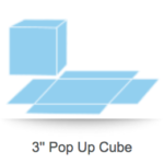
  4. Surprise and delight. Going to college is such a pivotal moment in the lives of so many young adults, yet so much of the higher education marketing we see doesn’t convey that excitement. Our Pop Up Cubes are extremely popular with colleges and universities because of their ability to engage and stand out from other mail. Not only do they ship flat, but as soon as the belly band is removed, they spring into action, showcasing the school in six eye-catching squares.
  5. Don’t forget the alumni! Maybe it’s a holiday card. Or an invitation to an upcoming alumni mixer. Whatever the occasion, the story of your school and the students’ place in it shouldn’t stop once they’ve graduated. Alumni are fantastic: They’re already a captive audience with an emotional connection to the school. Aside from donating real dollars, they can also offer compelling testimonials and clout to a university or college.

The Story Behind InStyle’s Toyota Ad

If you’re one of the 50,000 targeted subscribers who received the March issue of InStyle magazine, there may have been one spread in particular that stood out. And it wasn’t an article.

Rather, it was an ad. A Toyoto ad, to be precise, and it’s being touted as the first-of-its-kind magazine insert.

With a pulse reader, speaker and flashing lights, the insert, created by Saatchi & Saatchi in partnership with Structural Graphics, expertly uses sight, sound, smell and touch, to take readers in an extrasensory tour of Toyota’s 2018 Camry sedan. The insert not only marks the first time an LCD heart monitor has ever been put into a magazine, but also the first time two completely independent electronic units have been combined into a synchronized magazine unit.

“It was something brand new; completely undone ever before,” said Ethan Goller, President of Structural Graphics. “It was RND, new technology.”

According to Creative Director Erik Hluchan, the team at Structural Graphics was approached by Toyota’s agency of record, Saatchi & Saatchi with an idea to create a pop-up based on something they’d seen on the Internet. Together, with the help of Shin Wakabayashi, Paper Engineer, Noel Boland, Director of Design, and Goller, the team was able to engineer a clean, reliable pop-up experience that fit seamlessly into the magazine.

“It’s challenging when it goes into a magazine because of the way it’s treated,” Hluchan said. “Magazines are bent, they’re curved, they’re put into mailboxes, they’re rolled up sometimes. So you have to go through a lot of testing.”

The entire team worked tirelessly for months to turn this dream into a reality. And their testing really did pay off.

The insert helped the publication exceed its March budget, a sales rep. told AdWeek.

To interact with the insert, first, readers grip the door handles, placing their thumbs on clearly labeled, built-in sensors. As they open the “doors” to either side, they’re immediately met with a heart icon on the embedded LCD screen and then a pulse line. A beep keeps time with the pulse line. To fully immerse the reader into the scene, a subtle leather scent was also added.

“In today’s advertising environment, you really need to find ways to break through the clutter and engage consumers,” said CEO Mike Maguire. “This magazine spectacular certainly accomplishes this.”

5 Red Paper Plane Templates to Save You Hours of Work

Here’s the thing.

As a marketing professional, you know that a solid strategy is the key to any successful direct mail marketing campaign. But between the research, meetings with creative, and tracking ROI, it can often feel like there’s just not enough time in the day to think of something truly unique to send to your customers.

Until now.

We’ve teamed up with the experts at Red Paper Plane, Structural Graphics’ online division, to make your life (and your marketing) a whole lot easier. With an assortment of ready-made templates, Red Paper Plane gives marketers like you the opportunity to customize your favorite design at the click of a mouse, no training required.

Think Red Paper Plane might be right for you? Here are some templates to get you started.

The Pop-Up Cube
One of our most loved and most popular formats is the Pop-Up Cube. It’s a customizable direct mail template that ships flat and, when opened, springs to life literally popping up into the air. The high achievers of direct mail, Pop Up mailers are attention grabbing, leave a lasting impression and boost response rates.

The Flapper
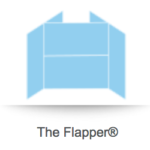
The Flapper, one of Structural Graphics’ exclusive patented designs, is kind of like a book you just can’t put down. What makes it so unique is the way it folds continually into itself, revealing four separate layers of messaging ranging from text, photographs and even QR codes. Choose from sizes ranging from mini (3.5” x 2.5”) to tablet (9.5” x 7.25”).

The Video Brochure
Video in Print brochures offer an effective option when it comes to getting your company noticed. One of the biggest advantages of combining these two mediums is the ability to create a multi-sensory experience around your brand’s messaging. This can translate into better brand loyalty as well as more sales and leads.

The VR Viewer
The introduction of inexpensive VR headsets has made it possible for brands to deliver the ultimate interactive experience to consumers, allowing them to literally walk a mile in someone else’s shoes. With our SleekPeeks, you can fully customize these viewers with your branding, logos and imagery. Not only are they cost-effective, but they ship flat and take seconds to assemble.

The Exploding Page
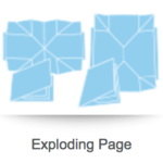
On the outside, the Exploding Page appears to be a standard looking direct mail piece, but when opened, it expands to twice its original size. Aside from creating nearly double the space for your brand’s messaging, the Exploding Page is an extremely powerful mailer which can be designed to incorporate coupons, QR codes and even a hidden pocket to hold brochures or a DVD.

Want to Better Track Your Direct Mail’s ROI? Here’s How.

There’s no denying it.

We’re living and working in an information revolution. Here, content is king and, as marketers, advertisers, PR professionals, and brand managers, if we can’t get the attention of our target audience immediately (often through social media or websites) it’s time for a new plan.

But in our constant pursuit of clicks, likes and retweets, successful marketers must look past relying solely on digital content to deliver their messaging. Instead, this “revolution” creates an opportunity to develop fully-integrated campaigns that blend print and digital.

This is why the web key is becoming a powerful marketing tool.

Web keys are unique in that they link both physical print and digital media. Aside from their size, which marketers can integrate into brochures, mailings or handouts, these small, palm-sized (or smaller) tools allow you to track who is actually interacting with your marketing.

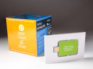
NetApp used the above pop-up cube to deliver information about its Flash FAS product. The bellyband, which held the cube in place, featured an embedded paper web key that users could insert into their flash drive to learn more about the product and to receive a demo.

So, how do they work?

Similar to a USB flash drive, a web key plugs into the USB port of a computer and is able to direct users to a specific landing page or company website, where you have the best chance of turning a prospect into a customer. Web keys are also incredibly cost-effective because they’re already built into your marketing. Plus, at Structural Graphics, we’ll provide you with campaign analytics to help you learn who is visiting your site, for how long and what they’re interested in.

Nationwide Insurance used the above pie box mailer to deliver information about CareMatters, its long-term care product, to agents nationwide. Inside the box was a double-layered pie made out of paper that delivered different information as you turned the upper layer of the pie. There was also a brochure and a web key inside the box that drove agents to a unique landing page, specific to their agency, where they could learn more about this product.

In today’s digital space, there are so many messages competing with yours. Contact us to make sure yours isn’t getting lost.

Enhance Your Marketing with Video in Print

From Facebook and online ads, to YouTube and digital video, businesses have long had to compete with with the waning attention spans of their audience in the marketing arena. However, a newer technology offered by Structural Graphics and its online division, Red Paper Plane, might’ve just found that sweet spot.

Video in Print combines the detail of print with the emotional reach of video creating a one-of-a-kind multi-sensory experience for prospects looking to forge a connection with your brand, service or product.

But, just because your print piece has a video, it doesn’t mean that will guarantee its success. Design, message, packaging and production values contribute to the overall experience your customer or prospect has about your business. Here at Structural Graphics, we craft our Video in Print brochures by way of a high-tech, high-touch production process, allowing you to press proof your piece before shipping from one of our North American facilities.
Considering adding a Video in Print brochure to your marketing campaign? Below we’ve compiled a few suggestions to get you started.

Not all Video in Print players are created equal. Speakers, video screen, battery packs and wiring can vary greatly in quality. Ensure your supplier uses top quality components and has a thorough quality control in place. We proudly have a 10-year relationship with our Video in Print player supplier.
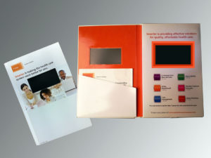
 

The power is in the playback. Make sure you choose the right file formats and the right settings for your video playback. We typically recommend a MP4, MOV, AVI or WMV video file format and a sound level of 75 to 80 dB. Also, double check that your supplier includes a USB cable for recharging the video brochure.
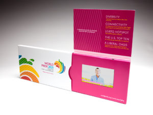
 

Short and sweet can’t be beat. Again, keep your audience’s attention span in mind. Video is a great way to deliver a 30 to 60 second message, but anything longer than that and you might want to consider breaking it into individual video “chapters”. Don’t forget the call to action so you can track responses.
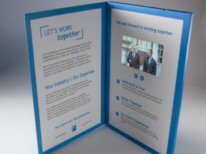
 

Source global, but inspect and ship local. Because Video in Print players are sourced almost exclusively from the far East, they’re often powered down to 30 percent of rated capacity to meet International Air Traffic Association regulations. This can negatively impact playback quality. At Structural Graphics, we fully re-charge our batteries, then ship them to our customers. Our battery configuration is approved by the US Post Office and is CE ROHS certified, which means that our product has met the standards for consumer safety, health and environmental requirements in the U.S. and Europe.
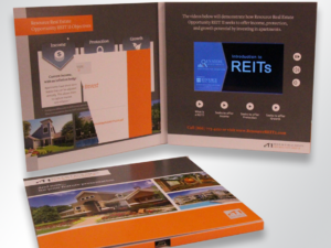
Experience, there’s no substitute for it. For more than 40 years, Structural Graphics has designed, produced and engineered unique, interactive print communications for some of the top companies in the world. Simply put, we know print.
 

Take a look at our Video in Print portfolio and contact us for more information. We’ll show you how to be distinctively different with Video in Print advertising.

Make Your Marketing Explosive: Meet the Exploding Page

Is your marketing team looking for an explosive way to deliver a message, introduce a product or build on its story?

The Exploding Page, one of Structural Graphics’ customizable designs, appears to be a standard looking direct mail piece on the outside, but when opened up, it expands to twice its original size. Aside from creating nearly double the real estate of its closed size, the Exploding Page is an extremely powerful mailer or sales aid which can be designed to incorporate coupons, QR codes and even a hidden pocket to hold brochures or a DVD.

What’s great is that this design still retains that “wow” factor when opened.

Take this piece by Rutgers School of Business. The piece was created to deliver information about its business program to prospective students in a uniquely surprising way.

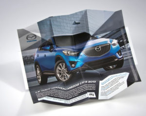
And how about this piece for Mazda? The automotive company decided to use the Exploding Page to introduce its new CX-5 vehicle in Canada. Not only does the image of the vehicle appear front and center, but Mazda’s marketing team was able to promote their Facebook, YouTube and Twitter pages by strategically leading them through the brand’s messaging.

Curious to try the Exploding Page for yourself? Get in touch with us and let’s figure out how to take your marketing to the next level.

The Power of Print Marketing

Written By Isabelle Bowden

The digital revolution has propelled society into a new era of engagement and creativity. This shift has significantly changed the marketing industry. Social media and technological innovation illustrate the power of digital marketing. However, in this fast-paced world of screens and computer chips, high-touch print collateral can, and does, have a surprisingly profound impact.

Interactive print marketing is a powerful tool which allows your brand or business to stand out from the competition. Various colors, dimensions, textures, and even lights, sounds, and video contribute to an effective multi-sensory experience with a lasting impact. Below are four reasons to choose print marketing for your next high-impact campaign:

  1. Effective recipient engagement

Paper has been a valuable resource since the earliest civilizations. The tactile fulfillment and sensory experience associated with print marketing is undeniably effective. The vast amount of online information dilutes the impact of digital messages. Standout from the digital clutter by choosing a dimensional print promotion from Structural Graphics!

  1. Creativity and personalization

With many options for print marketing, your business can stand out with unique and thoughtful designs. Think sizes, dimensions, finishes, and other fine details that will make your creation valuable. Visit Structural Graphics and Red Paper Plane to browse a variety of designs and examples.

  1. Promotes relationships

The value of a handwritten note is undeniable. This same value applies to print marketing which demonstrates an investment in business relations. Dedicating time and resources for print marketing will have more of a lasting impact than an email, already lost in the inbox. In fact, this 2018 FedEx survey reveals that “85% of participants said they were more likely to shop at a small business that had customer printed materials such as business cards, signs, and flyers.”

  1. A more established, unique brand/presence

Print marketing contributes to a more established and unique brand and/or presence in an industry. Consistent aesthetic elements on your print results in instant recognition! FedEx states that “80% of small business owners felt that professional printing services helped their business stand out from the competition.” Now is the time for your brand to be recognized!

Despite the growth of digital marketing, it is evident that print will continue to play a critical role in effective marketing mixes. Visit Structural Graphics online on our website or Youtube channel to learn about and see more of our work. We are constantly adding new designs, so make sure you check out all Structural Graphics has to offer. When it comes to dimensional print marketing, we are the 42 year leaders in the business, and we’re here to make your brand stand out!

Resources:

Fedex Office Survey Confirms that Consumers and Small Business Owners Prefer Print