Category: Marketing Insights

Death of QR Codes Is Greatly Exaggerated

Have you have fallen prey to the urban myth that QR Codes are dead? There are plenty of designers and industry pundits who think these 2D mobile barcodes clunky and out of date, but if you look at the data, the death of QR Codes couldn’t be farther from the truth. Consumers are actively using QR Codes to get coupons, access detailed product information, watch promotional videos, and take other steps that move them toward a purchase. And the companies which are finding the right list of banner sizes and placing their QR-codes on them have seen a constant rise in the chatter and sale of the company product. If you’ve “moved on” from QR Codes, you’re abandoning a critical tool for building your business.

Let’s look at three facts about QR Codes that every marketer should know.

  1. QR Code scanning is on the rise.

According to ExactTarget, 34% of smartphone users in the United States have scanned a QR Code while shopping in-store (ExactTarget Mobile Behavior Report 2014). This rises to 46% of those who own tablets. This doesn’t include people scanning QR Codes on direct mail, posters, in-store displays, packaging, and magazines. In fact, when ExactTarget asked about scanning coupons or QR Codes, it found that 43% of consumers had done so.

Can we quote Mark Twain here? “The reports of my death have been greatly exaggerated.” As you watch the data, sure, the growth rate of QR Code adoption is slowing. But that’s not unusual for a maturing technology.

  1. QR Code scanning frequency is on the rise, as well.

In 2014, Scanbuy data showed 4.0 scans per person. In 2015, this rose to 4.3.  That’s growth of 7.5%.

  1. Among the most common uses for QR Codes are accessing coupons, downloading mobile apps, and accessing product information.

ExactTarget found that 56% of men and 39% of women have scanned QR Codes to gain quick access to information. Scanbuy found that when consumers are interested in a new product, 20% will scan a QR Code.

We could go on and on, but you get the point. QR Codes remain a cost-effective way to reach a high percentage of the mobile population. Here’s how to do it right:

  • Make the code highly visible on the direct mailer, in-store signage, packaging, or other channel.
  • Provide instructions on using the code, and perhaps more importantly, the value the consumer will gain from scanning it
  • Offer real, tangible on the back end.

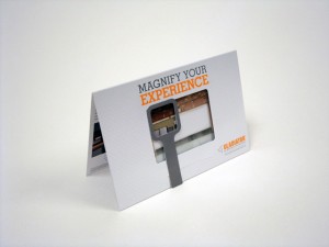
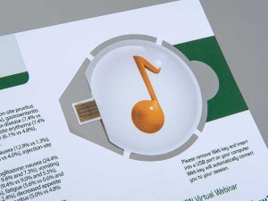
Check out some examples of QR codes in our own clients’ print marketing campaigns.

An Apple A Day… [Healthcare in the Ad Industry]

You know, sometimes the last kid to be picked for the volley ball team isn’t always the worst.


And lately, a similar thing is being said about healthcare agencies at the ad industry’s top award shows. 4A’s Partner Award has pushed healthcare agencies into the spot light. We love you, healthcare agencies! (We even liked you before you became cool.)

As Marylyn Donahue, with PharmExec.com, goes into further detail on the subject:

“While not close enough to rub elbows with the Don Drapers and Peggy Olsons of the ad world, at least they’re being invited. This wasn’t always the case.

Even just in 2013, Advertising Age asked: “Are healthcare agencies and their clients the last group in the ad world not to attend the Cannes Lions International Festival of Creativity (arguably the Oscars of the industry)?”

But times change. And now (drum roll, please) the titular head of the industry itself — the American Association of Advertising Agencies (AAAA or 4A’s), a 98-year old trade association has gone a step further. They’ve added a “Health & Wellness” category to their 2016 Partner Awards.

“And with this year’s Health & Wellness category we have the opportunity to honor the collaboration between agencies and organizations that promote health and wellness. Entries can include campaigns for corporate branding, education and awareness, and OTC, lifestyle, devices and pharmaceutical products.”

It’s a big market. In 2014, healthcare agencies garnered $4.3 billion in revenue up 10.3% from the year before. 

Whoa.

Marylyn goes on, “What doesn’t kill you makes you stronger, and the rebounded agencies were more innovative and more diverse than ever before. In the interim many shops had changed the dynamics of their traditional deliverables, branching out into areas that emphasized collaboration.”

Essentially, healthcare agencies are the underdog.

All-told, it made for a perfect fit for the new 4As’ Partner Awards. The brainchild of the 4As’ Chief Marketing officer Alison Fahey, the Partner Awards were intended to be a reflection of the times. “We realize there are unique challenges that occur when individuals and companies with different personalities and cultures collaborate to achieve a common goal on behalf of a client,” said Fahey. “We wanted to salute those who put their egos aside for the greater good of creating meaningful work. As evidenced by the 4As Partner Awards 2015 winners, the very act of collaborating can elevate creativity to new levels. The jury did a great job of choosing the best creative collaborations in the marketing and communications industry.”


To read more, visit the full post.


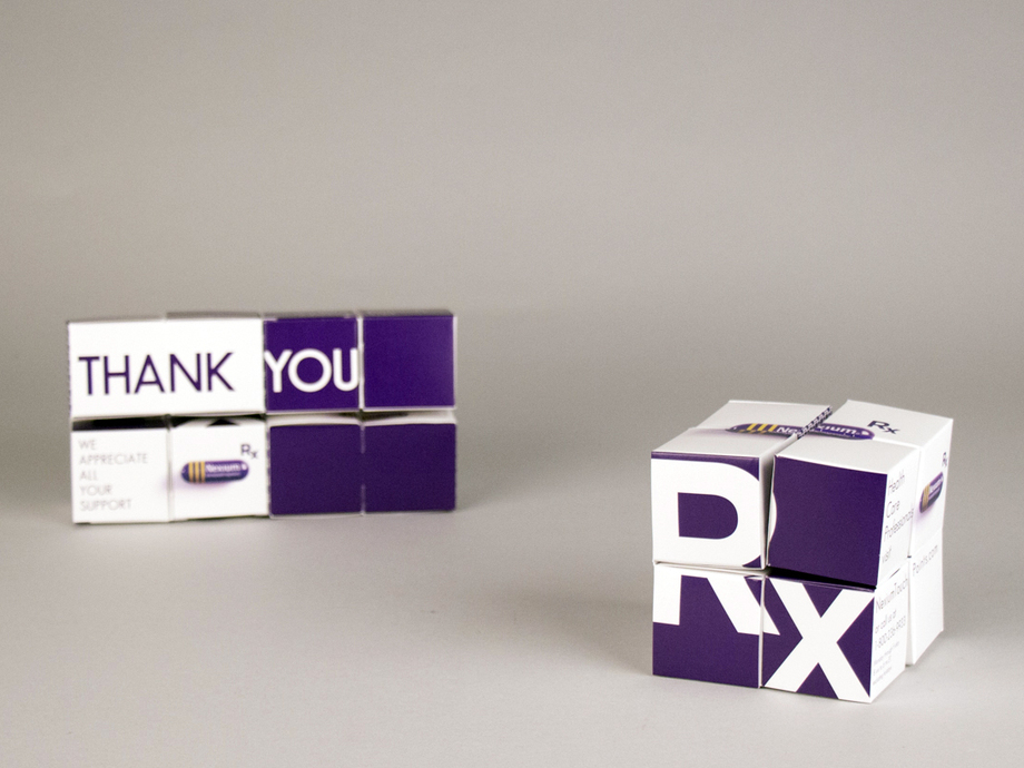
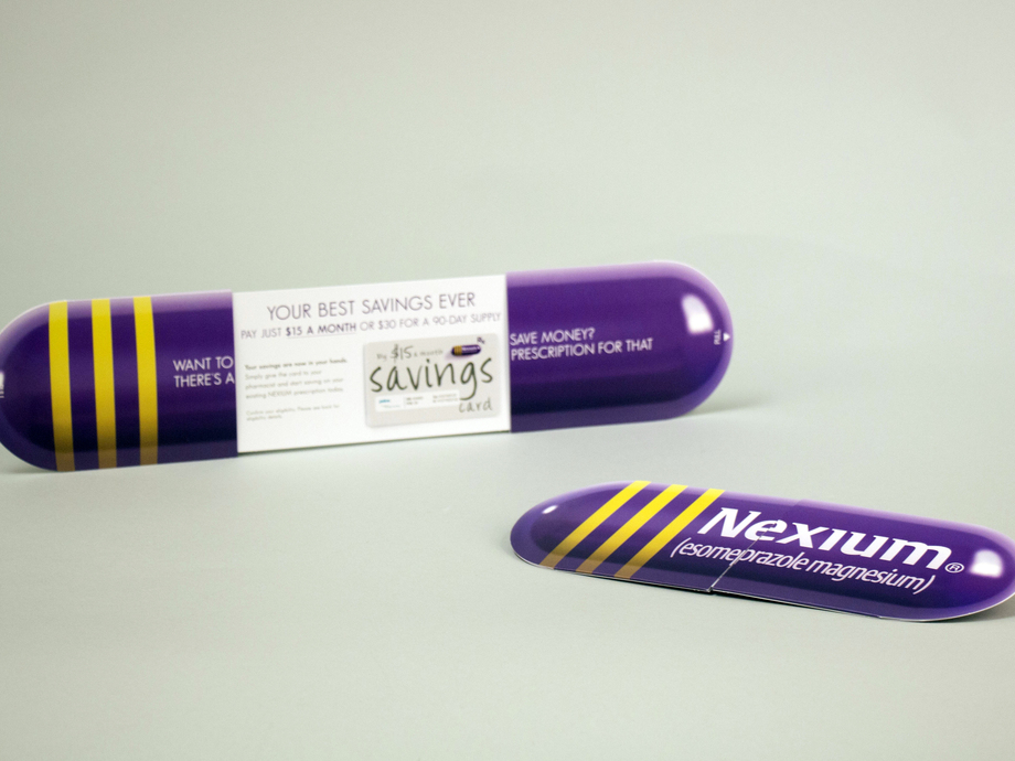
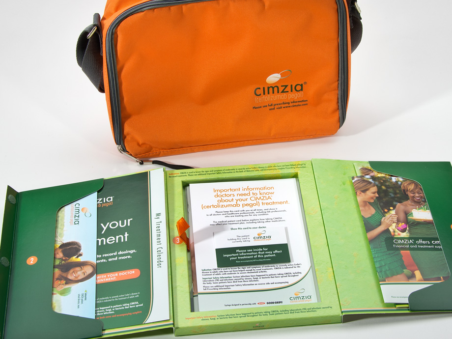
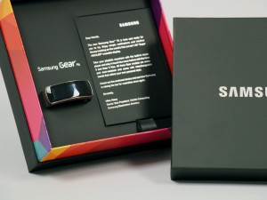
Stated before, we love you pharma, and we’re going to share some of that love. Take a look at some of the work we’ve done in the pharmaceutical industry below, and click this link to download our pharmaceutical success stats (PDF).

4514-496_Astra_Zeneca_Nexium_Rolling_Cube_3_resized

4515-762_Astra_Zeneca_Nexium_Center_Split_3_resized

CimziaKit3__0__136

DSC05784__0__148_resized

To enter the 2016 4A’s Partner Awards submit entries by Dec. 18, 2015. Winners will be revealed at the 4A’s Transformation Conference, March 22, 2016, in Miami, FL. For further details, please visit http://partnerawards.aaaa.org/

Haptic Brain / Haptic Brand

Most of us are lucky enough to know the rush of excitement we get from opening a package.  First, there’s the element of surprise.  But then there’s also that smell of new packaging (you know what I’m talking about), and the *swoosh* sound the box makes when you lift off the lid.  Ahhh.

A light blue box wrapped with a pink ribbon.

This is not a coincidence. Paper quality has been proven to have a significant effect on consumer response. Companies, such as Apple, put as much effort into their packaging as they do into their products.  More than 50% of the human brain is devoted to processing sensory experiences.  Touch, in particular, impacts how we make sense of the world. Therefore, how things feel influences our thoughts and behaviors, our comprehension and retention of information, and our emotional connections.

collection of hand holding paper isolated on white background

We were lucky enough to attend this year’s UCDA Conference in Orlando, Florida.  There were some extraordinary speakers, including Daniel Dejan, a widely respected, award-winning graphic designer, art/creative director, production manager and print buyer. His topic was “Haptic Brain, Haptic Brand”, which focused on communications through the lens of neuroscience.

Capture

Haptic Brain, Haptic Brand

‘Haptic Brain, Haptic Brand looks at communications through the lens of neuroscience, exploring how media shapes the brain and consequently the way a brand is perceived. This book examines haptics — the study of how what we touch shapes what we feel — and explores the science behind why our haptic brains respond so well to haptic brands. Case studies from three of the world’s best-known brands (Apple, BMW and World Wildlife Fund) highlight the communicative power of touch in action.

“Paper matters for brands that matter. The collective power of this research, along with Dr. Eagleman’s expert insights, show why marketing professionals and the publishers of high-end magazines and books continue to rely on paper as a key ingredient of the brand experience. They recognize, as we do, that consumers are wired to interact with paper like no other medium.”
–Jennifer Miller, EVP of Coated Business and Chief Sustainability Officer, Sappi Fine Paper North America.’


[Source – where you can also request a copy for yourself!]

Here are some main points from each of the three case studies presented in ‘Haptic Brain/Haptic Brand”:

Case Study #1 – Apple


Apple’s entire brand has a serene simplicity and elegance about it.  As mentioned in ‘The Communicator’s Guide to the Neuroscience of Touch”, “Critics say Apple’s iPhone seems more like a stone you might find in a stream than a device, similarly, the package it comes in defies traditional notions of what a box can be”.

They also pull a quote from The Gaurdian that makes so much sense, “Apple pays as much attention to its packaging as it does to its products… getting it just right as [an] obsession.”

It’s clear that a brand such as Apple has to be doing something right, and we have a hunch that creating that beautiful experience has something to do with it.

Case Study #2 – BMW


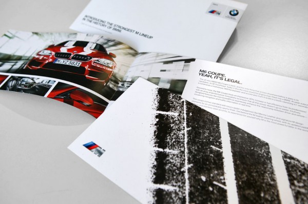
BMW wanted something special for fans if its M6 Coupe, so they had a professional driver take an aggressive, 560 horsepower car and do donuts on paper taped to the road, spraying ink onto the cars rear tires.  They used that paper with the tire marks for their upcoming direct mail campaign.

Manuel Sattig, Manager, Brand Strategy & Communication, said “We said, ‘there’s no way to capture the M performance on paper.’ And then we did it.”

Case Study #3 – World Wildlife Fund

WWF_Covers2

In order to make world’s species and places more tangible, World Wildlife Fund created World Wildlife. This magazine includes thoughtful design, first-class printing, and fine paper to bring images to life. This provides a physical touch point to inspire readers to preserve the planet.


Needless to say, the best communicators incorporate touch into their brand experience.  How are you adding that extra special touch to your brand? To get some ideas, take a look at our packaging options here.

Pop-Up Houses & Dimensional Buildings

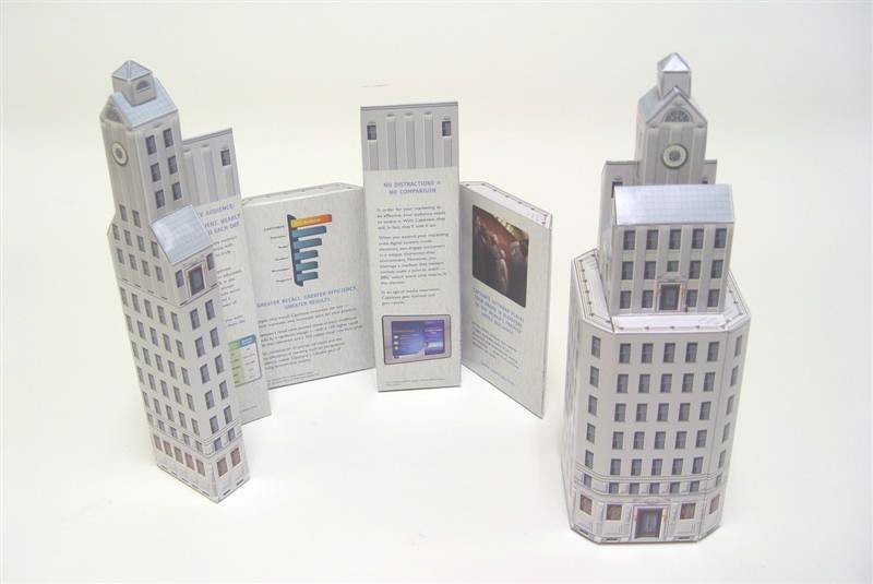
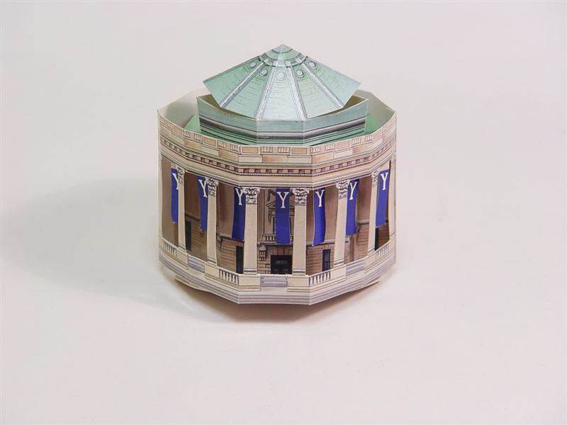
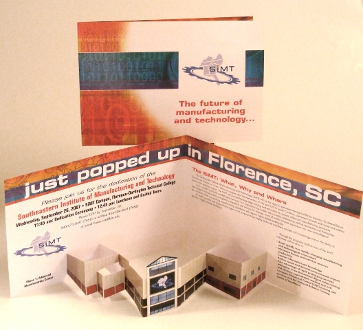
At Structural Graphics, we are well known for creating highly visually appealing, dimensional masterpieces out of paper.  One of our most popular requests are dimensional houses and buildings, which can be great for making an announcement of a new location (restaurant, business, school, etc.), announcing a renovation, creating a cozy holiday scene – the possibilities are endless!

Santa Snack Station


2_4505-537
Boston Group, Captivate Network, Fully Dimensional Skyscraper
2_4506-1039C
Choice Hotel, Fully Dimensional
Woosley Hall
Woolsey Hall
ProSource Popup Page
Fisher Communications, Pop Up Building


Pop Up Campus Layout


Pharmacia, Arthrotec. Fully Dimensional Restaurant.


Intervisual, Target.


A&E, The History Channel.
A&E, The History Channel. Fully Dimensional.
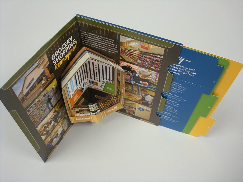
Food Lion, Pop Up store. Fully dimensional with reference guide.

And with the holiday’s quickly approaching, consider the pop-up house format from Red Paper Plane.

Red Paper Plane Pop-up House Format

4 Marketing Trends on the Rise

Do you ever stop and wonder how our decisions are influenced?

Boy holding But why sign


I do, I’m a marketer after all.  These days it seems like we’re being bombarded with trends trying to get us to buy or do something.  We can’t browse our Facebook feed without being distracted by bizarre videos of the Brazilian “burning hair” treatment, the horrifying aftermath of the “Kylie Jenner Lip Challenge,” or the most recent one sweeping Instagram, “Sunburn Art.”  While we do not personally recommend any of these, we’re all about standing out.

How you market your product or idea directly impacts whether or not people will choose it.  So, to help you out, we’ve done a little research, combed thru all the weird stuff on the Internet, and came up with 4 marketing trends that are on the rise.


1. More Personalization

We all know the saying that goes, sometimes through gritted teeth, “the customer is always right.” It’s certainly safe to say the customer is in charge.  When asked to prioritize one capability that will be most important to marketing in the future, one-third of marketers answered: “personalization.” Nearly three-fourths (74%) of online consumers get frustrated with Web sites when content appears that has nothing to do with their interests (CMO, 2015). With all the different benefits technology can provide, personalization is more popular than ever. Targeting your products and ads directly to your customer’s specific needs is a strong marketing trend and it’s on the rise.

2. Multichannel Communications

Business icons flat vector illustration Communication

Print, direct mail, URLs, social sharing, email, mobile app push, SMS… really, the possibilities are endless.  The world is your oyster when it comes to all of the ways you can communicate, and the statistics speak to its effectiveness.

  • 60% of multichannel marketers reported increases of more than 10% in revenue that are attributed to marketing programs. – Forrester (May 2012) “The Multichannel Maturity Mandate.”
  • 86% of marketing professionals agree that successfully integrating multiple channels under a single integrated marketing strategy is crucial to their long-term success. – Forrester (May 2012) “The Multichannel Maturity Mandate.”

Tip: Want to add some extra staying power to the print portion of your multichannel marketing? Use dimensional for your direct mailer.

3. Video

Unify Video Sales Aid, Structural Graphics

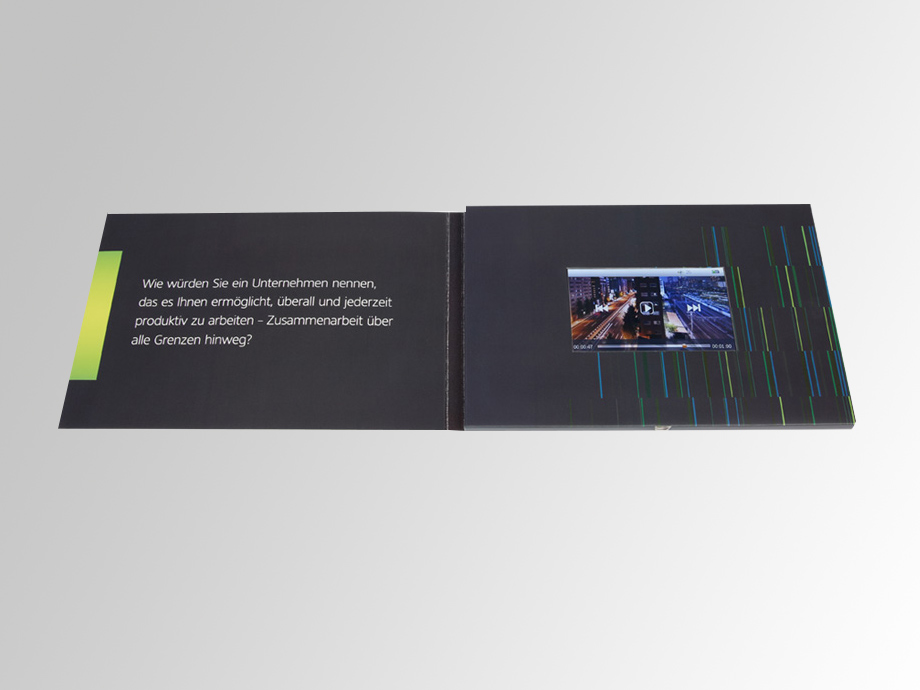
By 2017, video will account for 69% of all consumer internet traffic, according to Cisco. A study done by a company named Eyevie discovered that using videos on landing pages increased response rates by 80%, but why just use them on a screen? At Structural Graphics, we can seamlessly incorporate a video into print for a multidimensional, multi-sensory experience. See it here.

4. Print

There are a lot of comebacks being made recently. Fanny packs, Doc Martens, and my personal favorite – jelly shoes.

But that’s not all. Get ready marketers, because even in this digital age, print is making a comeback – and with a vengeance. Anything can be added to print: lights, sound, video, the list goes on. Print isn’t just paper anymore.  Also, who doesn’t love getting real, tangible, paper mail?  Direct mail marketing yields, on average, a 13-1 return on investment ratio (DMR, 2015).

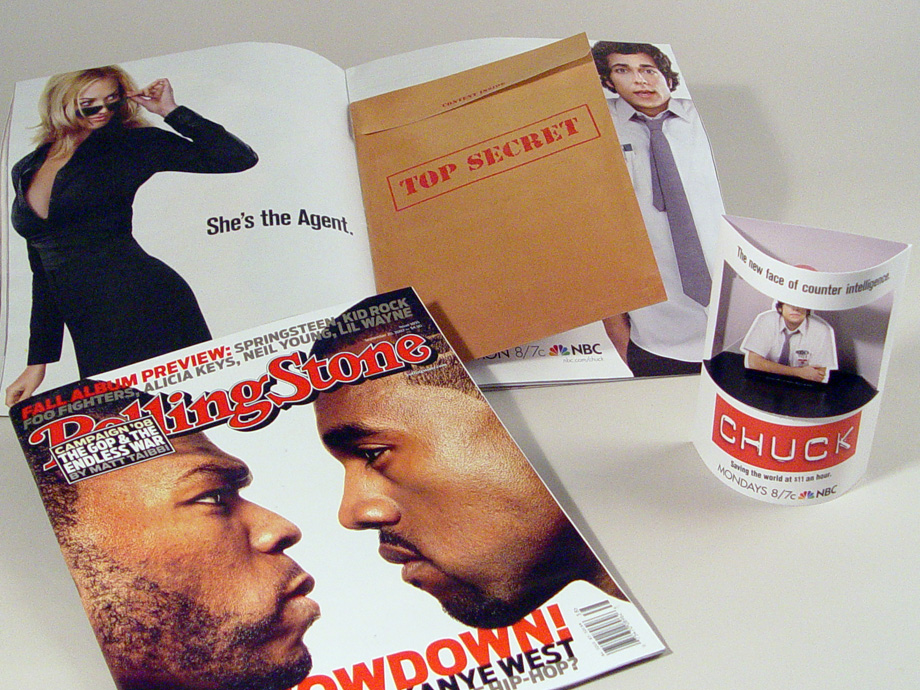
Rolling Stone Chuck TV Show Insert & Kiosk, Structural Graphics

There you have it, 4 marketing trends on the rise — and you know what they say about 2, 3 and 4: two’s company, three’s a crowd and four is a party. Get the party started at www.structuralgraphics.com.

Ads Throughout History: Why Women Want Diamonds

Ever wonder why women want diamonds for engagement rings? Or the man behind Marlboro? So did we — so we did a little research. Brace yourself folks, for a blast from the past (minus the shag rugs and parachute pants) while we take a look at ads throughout history.


Small diamonds on layered coal (differential focus)

The goal of an advertisement is not to make you buy things right in that moment, the goal is however, to make an impression.

If you wear an engagement ring, or have ever bought one, it is because of the influence of an advertisement. We think that we are supposed to buy a diamond ring because it is a tradition — well, that’s because it is. However, this tradition didn’t start until the late nineteen-forties, and it all began with a jewelry ad.

diamonds

In 1948, De Beers Jewelry released an ad campaign called, “Diamonds are Forever.  Believe it or not, before this ad campaign, engagement rings were a very rare thing — and De Beers changed that. By infusing the romantic notion of an engagement, and the eternity that comes with one of the strongest substances on earth, they convinced both men and women that a diamond ring was a necessity to an engagement. Today, engagement rings are a global, multi-billion dollar industry.


Volkswagen is another big name when it comes to “paving the road” of advertising.

Today, we see VW Beatles all over the road.  In 1939, the original Volkswagen Beatle was released, but because of it’s German engineering, it was not appealing to Americans. This all changed in 1959 when Volkswagen released their “Think Small” campaign. Old advertisements typically had the same approach: a cookie cutter style to show customers that a product was “the best.” That is, until the “Think Small” campaign.  For the first time, humor was introduced to advertisements. Volkswagen highlighted the flaws of The Beatle, and used it to their advantage to bring out what was so great about the car. Today, the ad campaign is considered the top campaign in the advertising world.

nobody's perfect


For some (not all) unmarried women, there is a looming fear: “Always a bridesmaid, never a bride.” Ever wonder where that saying came from? Well, in 1924, Listerine first released the line, “Often a bridesmaid, but never a bride,” in an advertisement for bad breath. The quote was basically saying, if you use Listerine products you have a better shot of getting a husband (side note: buy Listerine). Since the ad was released, the phrase has stuck with single women.

Smiling woman
Smiling woman


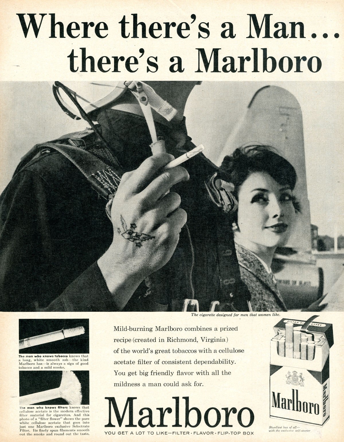
Another “killer” billion dollar industry: cigarette companies.  The cigarette industry often gets a bad rap (for obvious reasons — general PSA: don’t smoke), but one campaign done by Marlboro is considered the third top advertisement campaign in history.

In 1955, the “Marlboro Man” made his first appearance.  Today, when anything is portrayed as masculine or feminine, younger generations find it humorous. The Marlboro Man, however, was incredibly successful. The Marlboro campaign was geared towards men, saying that smoking was a masculine thing to do. Within two years of its release Marlboro, sales spiked 300%.

marlboro


So, even though you might not buy the newest phone every other month, the world around you is continually being shaped by advertisements. At Structural Graphics we want to help businesses build an image that will be part of the next big culture change. Take a peek at some of our classics —  let’s make history together.

Whirlpool’s Marketing Gets the Right People Talking

Whirlpool’s 360-degree approach to marketing, incorporating web, TV and print, has made it’s brand presence more relevant and attractive to consumers in the home appliance marketplace.
Continue reading

Packaging Trends: What Your Consumers Love

“The details are not the details. They make the design.” – Charles Eames, American graphic designer

Structural Graphics takes a special interest in what retail consumers want to see on product packaging, so when we came across Deborah Ginsburg’s article, “Top Packaging Design Trends for 2015” we perked up, eager to see what insights the founder and CEO of Strategia Design had to offer. Turns out, we couldn’t agree more. Continue reading

‘One Channel Never Enough’: Q&A With Margie Dana

Author & print industry expert Margie Dana

Margie Dana — author of three books on printing and print buying and an industry veteran with more than 15 years of experience — recently chatted with Structural Graphics to help inform our audience about different ways marketers can extend their brand’s influence through integrated print campaigns. Continue reading