Category: Design

Marketing ideas for your next campaign: Scrolling images

You know that saying, “a picture’s worth a thousand words?”

Structural Graphics is blowing that old idiom out of the water with a new marketing mechanism created specifically for brand storytelling. Now, SG can help marketers in any industry create compelling visual landscapes with its new See Scroll dimensional design. Continue reading

New Magic X-ray Viewer: 12 IDEAS for Your Marketing Needs

Our NEW Magic X-ray mechanism is a great format to bring to life various types of messaging! Display before and after imagery, old to new restoration, a positive transition, hidden messages, what’s “behind the curtain”… the possibilities are endless!

The Inside Scoop:

Invented in late 2013 by our designer, Rob Kelly, this concept was inspired by his son’s preschool show & tell for the letter “X.” He gave his son paper X-ray specs to wear which were [of course] pretend. He wondered if there was a way he could bring the x-ray effect to life in paper. Energized by the idea, Rob made a working prototype that weekend!

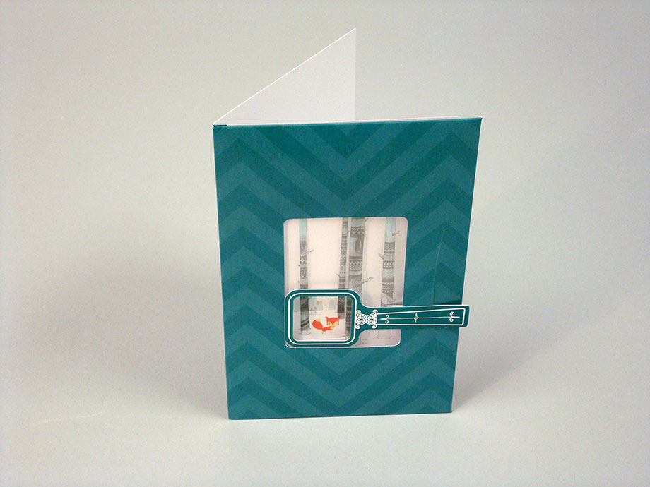
Check out our Structural Graphics 2014 New Year’s card. This card featured a snowy forest scene with some woodland creatures hiding. A fox? The abominable snowman? An owl in a tree? Birds chirping? The only way you can tell who is hiding, is to move the wand around to find them!
2SGHolidayCard2__0__138

Other clients, in addition to Whirlpool, have used this design to bring their messaging to life! See some ideas below to get the creativity flowing…

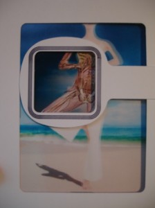
1)  An x-ray of a body part including the benefits of a new medical device produced
4BodyA

2)  A “discover and find” for kids, similar to “Where’s Waldo?”

3)  What is in your wallet? For financial, credit card, insurance card companies, etc.

4)  Before and after restoration, a new car, or feature a car that changes colors with a movement of the “wand” to reveal

6CarRestoration

5)  Curious what’s in your food? Take a sneak peek into what it is made of, including the vitamins and benefits

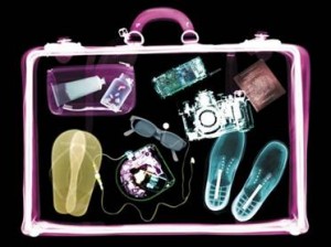
6)  X-ray luggage on an airport conveyor
7Luggage

7)  Motivating customers to travel – a black and white snowy scene transforming into a tropical, colorful beach somewhere exotic!

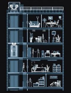
8)  New building design layout, interior views of a building, or everything going on behind the scenes in a home

9Home8Home

9)  Sneak peek “magic reveal” for a new TV or movie premiere!

10)  The magic of a new makeover, anti-aging treatments or simply skin cleansing solutions

10Makeup


11AntiAging

11)  Your brand logo as the showcased image with your services and products magically revealed underneath

12)  A look inside of a gift package – revealing jewelry or an engagement ring, keys to a car, a brand new smartphone, etc.

This Magic X-ray Viewer is new and PATENT PENDING, thus only found through your friends at Structural Graphics!


Your Customer Wants to be Part of Something Bigger

“Value speaks directly to what benefits a product or service adds to a customer’s life. Some smart brands get this and are using packaging, design, sourcing strategies and technologies to entice consumers to get them to open their wallet a bit more, even in these tough times.”

– Maureen Morrison & Matthew Creamer, “How P&G, Ford and Wendy’s Are Redefining Value

For decades, marketers have prodded consumers to associate value with low cost. Today, this strategy is becoming increasingly irrelevant as consumers pay more for the value of peace of mind. As a result, the cheapest and easiest marketing tactics are not always the most effective ways to get your audience’s attention. Today’s marketers must find ways to get consumers to connect with their brands with other factors like convenience, quality, lifestyle and innovation.

In a recent Nielsen report, “Consumers Who Care” 50 percent of respondents reported that they would be willing to pay more for goods and services if the companies they purchased from made a commitment to give back to society.

This sentiment is widely shared among respondents under age 30, although consumers ages 40 to 54 are increasingly agreeing with them – 38 percent more consumers ages 40 to 44 are now willing to pay more for goods and services at companies that give back compared to results just two years ago.

What does this mean to marketers? In an article published Crain’s Chicago Business, Cheryl Guerin, senior VP at MasterCard summed it up well, explaining, “Consumers are very focused on experiences right now. It’s a movement from being a collector of things to being a collector of experiences and stories that last a lot longer than the purchase of an item.”

Increasingly, consumers value brands that have depth and a mission behind their messaging. Dawn dish soap has done a stellar job at communicating its own mission to protect wildlife. In a recent commercial, the brand ditched its usual efforts at promoting soft hands to instead talk about something people can connect to: protecting wildlife. The commercial reminded consumers of its role in helping to save animals following the Deepwater Horizon Spill. The spot features heart wrenching images of oil laden penguins being cleaned with the soap and concludes with an announcement that the brand is donating 1 million dollars to wildlife rescue efforts.

For consumers with a soft spot for animals, there’s an insinuation that their Dawn purchase will become a part of a bigger effort to save wildlife. With messaging like that, consumers will find it hard to scrimp on dish soap.

Dawn is proving that value is not just about cost. As Guerin said, consumers are increasingly looking to become part of an experience that resonates with who they are – or even who they want to be.

Smart marketers understand that purchases are about more than the consumer’s basic need for a product or service. It’s also about how that purchase defines them.

Marketing Trends to Watch for in 2013

Last week, CMO.com posted a slideshare called, “9 Marketing Trends for 2013’s Second Half” with predictions from marketers on what to keep an eye on for the next half of 2013.

marketing trends thebarrowboy resized 600

Among the picks were: interdigital harmony (or the crossover of different digital platforms like social, mobile and web), personalized and fan based marketing along with a new emphasis on multicultural marketing.

SG has a leg up on some of these already, since we’ve been preaching the marriage of direct mail and digital to drive high conversion rates for a while now, including customized PURLs and landing pages to show our target markets that, yes, we’ve been listening to what they want.

The insights are refreshing to read and innovative too – like marketing that reflects multicultural audiences and using kitchen appliances as new venues for digital ad placement.

CMO.com even shares some insight into online video, which we’ve been noticing is a great channel for niche marketing on many levels.

Mosey on over to their website and see the complete presentation here.

Image via: thebarrowboy.

Structural Graphics Unveils Newly Redesigned Website

Structural Graphics new website resized 600The next time you visit Structural Graphics online you’ll discover a hip one-stop design shop with a (big) passion for dimensional paper design.

The company recently overhauled their site with all new designs, images and content. The resulting template is bright, fresh and modern.

“The goal of the redesign was to provide users with ease of navigation, inspiration to our clients and prospects, and to portray a sense of community around our designers, paper engineers and also our community in Essex,” says Heather Ertel, director of marketing.

The niche marketing and design shop is located in Essex, Connecticut, a town noted as “The Perfect Small American Town” in Norm Crampton’s “The 100 Best Small Towns in America”, and listed as a destination in the travel guide, “1,000 Places to See Before You Die”.

The redesign successfully exhibits Structural Graphics’ marketing and design work in a bigger way. Large photographs and image galleries pepper the site – giving users an up-close-and-personal view of the incredible and 3 dimensional design projects Structural Graphics is known for doing.

“We wanted to give people a sense of who we are. Our goal was to portray our work with bigger photography, more image galleries and to categorize our capabilities, not just by application, but by use; so visitors could start to have an understanding of the various ways they can use the work we put together,” Ertel explains.

Structural Graphic’s new website not only shows that they do amazing things with paper design, but that they know how to incorporate that medium with today’s technology – from web keys and personal URLS to QR & AR codes – to drive traffic online too.

Among the site’s new features are in-house designer biographies to help people learn more about Structural Graphics’ creative department, and a new “My Lightbox” application, which allows users to save their favorite products for inspiration or future use. The site also integrates with social media, so sharing is easy on social networking sites like Facebook, Twitter and Pinterest.

For Structural Graphics, the new website is a step towards reinvigorating the beauty of paper design. “All things old are new again. Interesting printmaking techniques are making a resurgence and people are seeing the beauty of [paper again],” Ertel says.

6 Great Tweets From SXSW

Yesterday concluded the five-day interactive portion of one of the biggest technology, film and music festivals of the year: SXSW in Austin, Texas. Twitter has been seriously buzzing with all kinds of awesome SXSW content, so naturally, this week’s post compiles some of the best tweets from business leaders, community managers, marketers, and designers who attended.

These lucky ducks spent the last week immersing themselves in workshops and events that will enhance and change our approach to marketing, design and technology. Here’s what they had to share:


Over the last couple weeks there has been a lot of talk about 3D printing technology, especially since Burlesque dancer, model and actress, Deeta Von Teese stepped out in a 3D printed dress at Ace Hotel in New York and Wobbleworks far surpassed their Kickstarter goal to fund the first-ever 3D pen.

Entrepreneurs and designers are experimenting with print technology in new ways, which has excited buyers and proved that print is still a medium that attracts response. The print industry is resurging and bringing with it some awesome new toys.


Some messages never get old, which is why Heather’s words resonate. Her message is simple: plan, plan, plan. Be organized, coordinate all your efforts thoughtfully, and get social.


Travis’ message addresses why many business owners are afraid to participate in social media: they might lose control. It’s true that by putting your brand out there you’re opening yourself up naysayers, but in reality, you’re actually gaining control because you can quickly respond to any negative feedback you might receive, thereby demonstrating your concern for your customer and the efficiency of your brand. Social engagement gives you a direct connection to your buyers, so you also open yourself up to more good feedback too.


Your advocates are loyal fans, customers, and employees who share your brand with their network. These people extend your audience and shed a positive light on your brand. They are authentic marketers who find value in your products or services and want to share them with their friends because they genuinely believe it will add more satisfaction to their lives. What’s better marketing than that?


Any marketing you put out there should get to the heart of what you do and who you are. It should go back to your brands’ mission statement, and the message you crafted when you created your marketing plan (you did do that, right?). That doesn’t mean that you can’t be clever, creative, or inventive, it just means that what you are saying should not be convoluted, and indiscernible to your buyers.


Good marketing involves some risk. Don’t expect perfection from every idea you have, instead look for ways to learn from your endeavors and to keep striving once you’ve reached a goal. Then, set bigger goals to keep yourself inspired.

Did you attend SXSW? Have you been listening to the discussions about it online? Tell us what you think is cool in the comments below.

Using Eccentricity to Spark Interest

Pigpen Eccentricity can be your best weapon in the Marketing and Promotion War, which for you, is about being heard over the white noise of your competitors.

One of the best marketing books I’ve ever read, Marketing Lessons From the Grateful Dead by David Meerman Scott and Brian Halligan has a chapter dedicated entirely to eccentricity. By embracing their own personal eccentricities (marathon jams, extended mid-show breaks, free recording access at shows), the Grateful Dead became unique among musicians of the time and more relatable to their fans. In fact by being different, the Grateful Dead encouraged their fans to embrace their own personal eccentricities which gave rise to a loyal culture of supporters spanning generations. And it’s still attracting people today.

David Meerman Scott and Brian Halligan put it this way: “In a world of ‘me-too’ products, the businesses that cultivate a strategy of appealing to the tastes of outliers are generating success.”

If you’re a marketer pulling out your hair trying to find new ways to reach your audience, it might pay off to lift the veil and capitalize on the traits that make your company different. It’s scary I know, but if you think about it, those eccentricities are a part of your story and since marketing experts are always saying “build and tell stories” why not tell it like it is. Right? Right.

So this is all great advice, but how do we implement it?

Get to know your customer’s personality. 

“Smart companies understand eccentricities and create a market from them.”
– Marketing Lessons From the Grateful Dead

Get to know your customer. It’s Marketing 101, but it’s easy to forget when you’re juggling a million things. So how exactly do you get to know your customer?

  • Work with your marketing team to gather research on your current customers. Start tracking these statistics to see if you can identify any patterns. Are they mostly male or female? Is there a particular geographic region that most come from? Are they in large or small businesses? A particular industry? Do they follow you on Facebook, Twitter, or LinkedIn? Are they more active on one channel versus another?
  • Think about the personalities behind these traits. If most of your customers come from a particular geographic region, learn about that area. Are there any quirks you can incorporate into your marketing strategy that will help build a connection (i.e. is that area known for exceptionally tasty cheese? The best wings? Awesome coffee)?

Tell it like it is.

“Stop hiding your personality behind carefully scripted announcements, press releases, and events.”
– Marketing Lessons From the Grateful Dead

If your marketing content is full of industry terms and jargon that the average person would have no business knowing than you are thwarting your ability to connect. Your message must be clear and the words you choose to deliver that message should be relatable, simple and action-oriented. Notice how “relatable” is a consistent theme here?

Try new things.

“Marketers today need to experiment in their craft in order to make big breakthroughs. Instead of seeing failure as something to be avoided, CEOs and management teams need to free their marketers to experiment, quickly learn from failure, and experiment again.”
– Marketing Lessons From the Grateful Dead

Amen. Steven Pressfield eloquently says in his book, The War of Art: “The more scared we are of a work or calling, the more sure we can be that we have to do it.” The same can be applied to your marketing tactics. It can be darn scary to try something different, and not really know whether it will connect with your audience. But how can you determine the best way to connect and build relationships with your customers if you stick to the same old thing? You can’t. So toughen up and follow that brilliant, scary idea you had. It could turn out to be the best breakthrough your company has ever seen. And if not? Try again.


Image: Pigpen & Jerry of Grateful Dead in Front of Egyptian Backdrop via dead.net.

Marketing and Hannibal Lecter

Hannibal Lecter: First principles, Clarice. Simplicity. Read Marcus Aurelius. Of each particular thing ask: what is it in itself? What is its nature? What does he do, this man you seek?

Clarice Starling: He kills women…

Hannibal Lecter: No. That is incidental. What is the first and principal thing he does? What needs does he serve by killing?

Clarice Starling: Anger, um, social acceptance, and, huh, sexual frustrations, sir…

Hannibal Lecter: No! He covets. That is his nature. And how do we begin to covet, Clarice? Do we seek out things to covet? Make an effort to answer now.

Clarice Starling: No. We just…

Hannibal Lecter: No. We begin by coveting what we see every day. Don’t you feel eyes moving over your body, Clarice? And don’t your eyes seek out the things you want?

Is your target audience any different? Do they not also begin to covet what they see every day? Don’t their eyes seek out the things that they want?

If you want to know why people aren’t responding to your marketing, take a look at what you are saying, and how you are getting that message in front of them, and how often you are getting that message in front of them.

Your marketing has to be attractive to them.

The benefits have to be in front of them consistently enough for your targets to begin to connect with them.

How do you plan on making this happen?

We’re All Just Kids Stuck in Adult Bodies

One of the reasons I enjoy working here so much is seeing people’s reactions when they first interact with our designs. We had a vendor in the office today, and I thought it would be fun to show them our 3-cube pop-up mailer  – you know, the one where you pull out the sleeve and 3 cubes come flying out? Before I showed them the mailer, I asked, “Are you familiar with what we do?” “Oh yeah, sure,” they responded.  Even though they were very familiar with our work, they still practically fell over from surprise (and near heart attack) when they pulled out the sleeve of the mailer and those 3 little cubes came flying out in every direction.  Seeing that kind of reaction is priceless. In a world where everything is digital and technology has grown leaps and bounds, it is refreshing to see the enjoyment and the delight people still get from our high-impact tactile designs.

I’m a huge fan of Robert Sabuda, and my kids own all of his books.  To see a grown adult react the same way to our direct mail advertising as my kids do to Robert Sabuda’s amazing creations just makes me realize that deep down inside all of us “grown-ups” still lies an innate need and desire to be entertained and surprised. I’m so glad we get to deliver that child-like wonder and surprise to our clients.

Being Different but ending up the same

A few weeks ago, while strolling past the House of Blues in Orlando, I was reminded of an important distinction when it comes to being different. The band playing the night I happened to walk by was Falling in Reverse. The crowd was wrapped around the entire building anxiously waiting for the doors to open. I saw at least a thousand people. Nearly everyone was decked out in full-blown “Goth.” Those of you not familiar with the look need only Google the term to see exactly what I mean. There were so many people sporting black shirts, black or purple dyed hair and painted nails and faces that those more conservatively dressed concert-goers stuck out like a sore thumb.

As we soaked in some of the best people-watching around, I turned to my wife and asked her why she thought people wanted to be so different. She turned to me looking a bit puzzled and replied, “What do you mean, they’re all exactly the same?” She was right; no one in the crowd was being different, at least not in their world.

When it comes to marketing, being different is usually a good thing. However, it’s easy to get caught up in trying to be different, stand out, get noticed, that you end up being exactly the same. I remember when mailers began using “Express Mail” look-alike envelopes for their mailings. Who’s going to ignore an important overnight express envelope? Then, the trend caught on and fizzled out just as quickly. I assume once people got used to seeing fake looking express packages in their mailbox, response rates began to drop.

People I talk to at tradeshows or in presentations want Structural Graphics to help them “do something different.” But, being different should not be the goal of your campaign. The goal is a higher response and return on your investment and to achieve that, you need to engage your audience. To engage your audience you need to be unexpected and relevant; not different.

There is no doubt we help our clients get noticed; sometimes by being different. Many of our packages stand out because they are dimensional and unexpected, but that’s not where all of the marketing magic is. We don’t create our designs just to be different, but rather to engage the recipient and drive a response. The designs we recommend, whether it’s a new custom solution or a proven classic design like the Flapper, are chosen for their ability to deliver your message in an impactful, engaging and relevant way.

For example, Drexel University wanted to capture the attention of college-bound students.DrexelUniversity These students are used to receiving dozens of mailers from lots of different schools, so they knew they had to stand out. But they also had to be memorable and engaging. Drexel achieved this using our Flat Book-Cube design. It shipped flat but when the recipient opened it they were treated to a huge surprise as the piece jumped out at them. It got their attention and the campaign was a great success.

Essilor, the world’s leading provider of eyeglass lenses, was looking to promote a new brand along with a rewards program. They used the Rolling Cube design to grab the recipient’s attention, provide information about the program and drive them to a sweepstakes site. The integrated campaign was a success and garnered a 31% response rate. You can read more about the Essilor campaign in our case study.

My point was not to take you through a list of companies that have used Structural Graphics to build their brands, launch products, engage recipients and produce better ROI. It was to remind you that being different isn’t always that different. Your goal is to be engaging and relevant. When we were in Orlando I probably could have painted my nails black, worn some dark clothes and dyed my hair; and I would have stood out as we walked through Disney’s beautiful Downtown area, but if I had been there to see a concert at the House of Blues that night, I would have only been another face in the crowd.

To learn more about engaging your customers check out our Industry Specific High-Impact Marketing Guide. You’ll be able to download several case studies and learn more about how we serve your industry’s marketing needs.