Category: Design

Structural Graphics Wins Big at 2019 MarCom Awards!

Over our 43 years in business, Structural Graphics has had the honor of receiving top industry accolades in the Marketing, Print, and Design industries, and 2019 is no exception.

We are very proud to announce that, combined with our sister company The Lift Factor, we have taken home (6) 2019 MarCom Awards!

The MarCom Awards have been a prestigious industry honor since 2004. Today, with roughly 6,000 print and digital entries from dozens of countries, it is one of the largest and highly esteemed creative competitions in the world. The categories include Print Media, Strategic Communications, Digital Media, and Audio/Video.

Administered by the international organization, Association of Marketing and Communications Professionals (AMCP), the MarCom awards recognizes creativity and greatness in the Marketing and Communications industry.

Not to mention, the MarCom Awards prides itself in giving back to the community. The AMCP has donated over $250,000 to charitable causes, in just the past few years alone.

Below is a list of the (6) accolades Structural Graphics has received in the 2019 MarCom Awards:

It’s an absolute honor to be recognized by such a prestigious organization, and we are so happy that our submissions are helping contribute to a greater cause through the charitable donations the AMCP makes each year. Thank you to the AMCP and the MarCom Awards for this incredible acknowledgement!

To learn more about the MarCom Awards and their mission, visit: https://marcomawards.com/


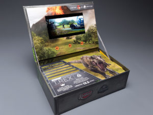
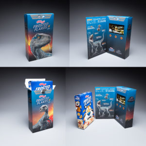
Kellogg’s & Keebler Limited Edition Jurassic World Video Boxes 


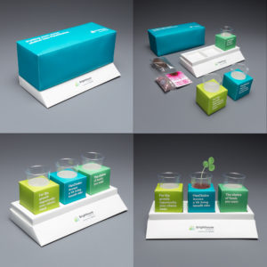
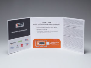
Brighthouse Financial FlexChoice Planter Mailer


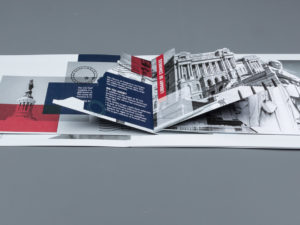
U.S. ARMY SleekPeeks® VR Viewers 


2019 Audi A8 Magazine Insert with LEDs


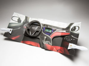
2018 Toyota Camry Magazine Insert 


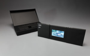
2019 Audi A8 Video Mailer
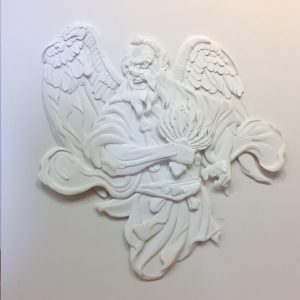
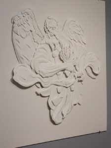
Structural Graphics Paper Engineer Designs Spectacular Paper Sculpture By Hand

At Structural Graphics, we are very lucky to have such talented and creative employees among us. One of them being our very own Paper Engineer, Shin Wakabayashi. We have yet to find out what Shin cannot do. Talented beyond his years and experience, Shin amazes us and our clients with an innate ability to enhance whatever he touches. Ambitious and tenacious, Shin doesn’t approach projects as much as he tackles them, working and reworking their solutions into perfection. A disciplined artist with an engineer’s attention to detail, he is a Renaissance man who can draw, paint, sculpt, invent, cut, fold, assemble, design, and render.

Shin recently attended a week-long paper sculpture workshop at the Marc Adams School of Woodworking in North Franklin, Indiana taught by world renowned artist Jeff Nishinaka. At this workshop, Shin began work on a paper sculpture that he created entirely by hand. At the completion of the workshop, Shin then took his paper sculpture home to complete it. The entire design was completed over the course of 1 month, with hours spent working on the sculpture before and after work.

The sculpture was inspired by Shin’s interest in Japanese mythological creatures and the artwork used to represent them. Shin referenced a statue of a Tengu, a Japanese folkloric being, erected in a mountain in Tokyo, Japan for his sculpture. He first begin with a drawing of the statue and then transferred it to paper. He hand-cut, shaped, scored (using rolling methods) and glued the paper pieces on top of each other.

This spectacular paper sculpture is currently on display at the Fisher Gallery at the Farmington Valley Arts Center in Avon, CT, as part of a larger paper arts show. Those in the Connecticut area are able to see it on display, along with works by other talented Paper Engineers, now through August 31st.

To see more of Shin’s spectacular work, follow him on Instagram at:

shinwaka89

papershin

You’re Not Making These Silly Print Marketing Mistakes…Are You?

Are you a marketer who regularly uses direct mail?

Here at Structural Graphics, we’re big proponents of print marketing and have applauded its ability to generate feedback, loyalty and, ultimately, sales. However, if you’re not using it properly, these pieces – and leads – can end up in the garbage.

To help you better succeed with your direct mail campaigns, we’ve compiled this list of common blunders that can hinder your prospects.

  1. An unclear message: Does your headline match your CTA? Do your graphics tie into your angle or story line? Is your copy clear, concise and appropriate for your audience?  
  2. Wrong audience: Do your research beforehand. Consider not only the age, location and interests of your target demographic, but also the appropriate time of year to contact them. For instance, tax season may not be the appropriate time to contact small business owners, and members of a senior housing community likely won’t respond to real estate marketing. 
  3. Being too self-indulgent: There’s a delicate balance between asserting your strengths and overindulging in them. Recipients don’t want front row tickets to the “Me Show”; they care about “What’s in it for me?” Great marketing always focuses on the recipients, not the business or agent reaching out. Highlight your brand’s value by showing how your product or service can help change people’s lives, making them easier or more fulfilling.
  4. No contact info: Print or digital, your marketing should always have the first and last name of someone for the recipient to contact. This simple touch point creates a connection between the consumer and your business, and saves them the hassle of having to go looking for someone to reach out to.

Popeyes is Offering Emotional Support (Chicken) this Holiday Season

A common topic of discussion in the news lately has surrounded the idea of allowing animals on airplanes to provide emotional support for travelers during the holiday season, as well as the restrictions for the types of animals that should be allowed. When GSD&M, Austin, TX had a buzz-worthy idea and design for a campaign for their client, Popeyes, to get holiday travelers talking (or should we say “squawking”) they contacted Blanks Printing, & Digital Solutions and the design and assembly teams at Structural Graphics to help bring this project to life!

The solution? “Emotional Support [Fried] Chicken”. For a limited time, those travelling in Terminal C of the Philadelphia Airport during the 2018 holiday season can now pick up the box which contains a 3-piece Chicken Tender combo meal from Popeyes.  Why the Philadelphia airport? Because it was named one of the most stressful airports in the United States.

“We know holiday travel can be frustrating, and there’s no better way to ease stress than with a box of delicious Popeyes fried chicken and a good laugh. We appreciate how comforting emotional support animals are and wanted to create our own version,” stated Popeyes CMO, Hope Diaz via news release.

The best part is, Popeyes is guaranteeing that their Emotional Support Chicken is “permitted to fly without any restrictions”, helping ease some of the worries for those crazed travelers this holiday season.

Blanks Printing & Digital Solutions, Dallas, TX printed this project on the new HP 12000 Digital press. Structural Graphics proudly engineered the design for function, created several rounds of full color test prototypes, and then hand assembled for the launch in the Philadelphia airport on Tuesday, December 18th.

The Power of Print Marketing

Written By Isabelle Bowden

The digital revolution has propelled society into a new era of engagement and creativity. This shift has significantly changed the marketing industry. Social media and technological innovation illustrate the power of digital marketing. However, in this fast-paced world of screens and computer chips, high-touch print collateral can, and does, have a surprisingly profound impact.

Interactive print marketing is a powerful tool which allows your brand or business to stand out from the competition. Various colors, dimensions, textures, and even lights, sounds, and video contribute to an effective multi-sensory experience with a lasting impact. Below are four reasons to choose print marketing for your next high-impact campaign:

  1. Effective recipient engagement

Paper has been a valuable resource since the earliest civilizations. The tactile fulfillment and sensory experience associated with print marketing is undeniably effective. The vast amount of online information dilutes the impact of digital messages. Standout from the digital clutter by choosing a dimensional print promotion from Structural Graphics!

  1. Creativity and personalization

With many options for print marketing, your business can stand out with unique and thoughtful designs. Think sizes, dimensions, finishes, and other fine details that will make your creation valuable. Visit Structural Graphics and Red Paper Plane to browse a variety of designs and examples.

  1. Promotes relationships

The value of a handwritten note is undeniable. This same value applies to print marketing which demonstrates an investment in business relations. Dedicating time and resources for print marketing will have more of a lasting impact than an email, already lost in the inbox. In fact, this 2018 FedEx survey reveals that “85% of participants said they were more likely to shop at a small business that had customer printed materials such as business cards, signs, and flyers.”

  1. A more established, unique brand/presence

Print marketing contributes to a more established and unique brand and/or presence in an industry. Consistent aesthetic elements on your print results in instant recognition! FedEx states that “80% of small business owners felt that professional printing services helped their business stand out from the competition.” Now is the time for your brand to be recognized!

Despite the growth of digital marketing, it is evident that print will continue to play a critical role in effective marketing mixes. Visit Structural Graphics online on our website or Youtube channel to learn about and see more of our work. We are constantly adding new designs, so make sure you check out all Structural Graphics has to offer. When it comes to dimensional print marketing, we are the 42 year leaders in the business, and we’re here to make your brand stand out!

Resources:

Fedex Office Survey Confirms that Consumers and Small Business Owners Prefer Print

4 Easy Steps to Design a Piece on Red Paper Plane

Are you a small business or solo entrepreneur? Do you need a marketing piece turned around quickly in order to meet a deadline? Do you want your piece to be of high quality but not for it to cost a fortune?

Have you heard about RedPaperPlane.com?

Red Paper Plane is the online ordering division of Structural Graphics. It provides clients with an easy and intuitive way to design the high-impact formats we’ve become known for, including pop-up cubes, greeting cards and the Flapper. And you don’t need to be a professional designer to do it! Using our online design tool, anyone can customize the direct mail formats with their logo, photos and text in a fraction of the time it used to take to place art to one of our templates offline.

Just follow these four simple steps:

  1. Choose your format.
  2. Download the template.
  3. Upload your artwork.
  4. Proof and order!

Whether you’re an experienced designer, a marketing professional or a small business owner, Red Paper Plane has created an online experience with your needs in mind.

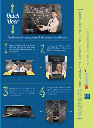
The Flapper How To Guide

The Flapper is one of our most popular and effective designs because of how interactive and engaging it is. Here are some quick tidbits about the Flapper:

  • It has increased campaign results for some clients by over 400% over previous campaigns
  • Gillette and others have used it as part of a magazine ad
  • It comes in multiple sizes
  • It produces mega results

Check out  Susie’s video that shows us just how easy and versatile The Flapper is to use.

You may also like take a look at our Flapper How To Guide.

Are you ready to design yours?

What it Means to Say I’m a Creative: Shin Wakabayashi

This is the first installment in our “What it Means to Say I’m a Creative” series, meant to focus on the inspiration and drive behind each one of our paper engineers.
shin2

  1. How did you know you wanted to create (in a professional sense)?
    I remember since I was around 5 growing up watching cartoons, playing with legos, and drawing especially. My father inspired me since he drew often as a hobby, and I became more interested in pursuing a profession related to art and design during college after learning about its diverse opportunities.
  2. What advice would you give to others who want to work in a creative industry/ position?
    My advice would be to show your work to different people especially those whose work you admire and listen to their critique on your pieces. It’s good to be open to constructive criticism to figure out why some aspects work and why some don’t.
  3. What does creativity mean to you?
    To me, creativity means looking at things in a different perspective or doing something in a different way. It might help to try different hobbies, jobs, sports or artforms to inspire other methods of thinking or finding something relatable to your primary creative activity. I can relate dancing to design in that both forms allow the person to take certain existing moves or elements and his or her own spin on them.
  4. How do you feel when you tell others you’re a paper engineer?
    I feel fortunate when I tell people about my job as a paper engineer because I don’t think there are many companies that have such positions.
  5. What does it mean to say that you’re a “creative”?
    I feel more secure calling myself a production artist or paper engineer because creatives can be seen in most professions or positions in a company. Creativity lives in art, design, education, scientific research and development, politics, etc.

To learn more about Shin, please click here.

Packaging Unboxed: How to Make Your Product Stand Out (In A Good Way)

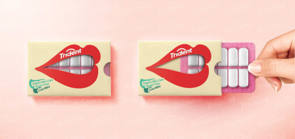
Hani Douaji / Via behance.net
The old adage goes something like this: Don’t judge a book by its cover.
Except when it comes to packaging, that is.
Though packaging been around for generations, in today’s digital-savvy, uber competitive retail environment, first impressions are almost as important as the product itself, with innovative, fun, or even weird packaging helping a product to stand out from its competitors. At times, the way an item looks can actually make or break a sale.
Let me tell you a personal story…
Lots of you have probably heard about or even seen those small, egg-shaped EOS lip balms (yup, those ones). Well, I was recently talking with a girlfriend of mine who pulled one out of her purse and started using it despite the fact that she liked some other brands of lip balms better. So, why did she buy this one? Because it looked cute.
Maybe you’ve experienced this, too? Bueller…? Bueller…?
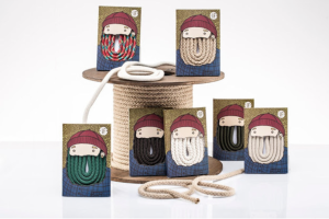
Isabella de Felice / Via lushlee.com

Whether it’s an edgy typeface that gets your customers, some cool pops of color or the versatility of an eco-friendly container, we’ve probably all had a moment like my friend here where we’ve purchased something simply because of the way it looks and, more importantly, for our perceptions of how a product will make us feel. (Here’s an example of how the psychology of packaging applies in the alcohol industry).

That’s the whole point.
Packaging, when done correctly, is ultimately what sells your product in the end. It draws attention, sends a powerful message and elicits a specific response from your customers.
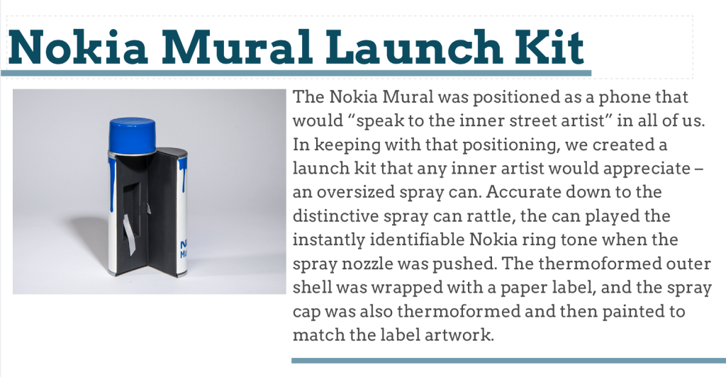
Here’s an example of a packaging design we created for Nokia:
Nokia Mural Launch Kit

Packaging Infographic Marketers
So, what’s a marketer to do to stand out from the crowd?
Well, if you’re a devout believer in creating a branded experience for your customers, making your product relevant and increasing your sales, follow these five Packaging Commandments and you just might create product packaging that will outlive us all.
  1. Thou shalt embrace all manners of colors, patterns, textures and sizes.
  2. Thou shalt never forget to think about the customer’s experience.
  3. Thou shalt utilize all available space to the best of thou’s ability.
  4. Thou shalt be playful, be bold, be simplistic – Thou shalt stay true to him/ herself.
  5. Thou shalt always tell a good, compelling and powerful story.
Feeling insanely creative? Give us a call at 860-767-2661 or shoot us an email. Together we can make your packaging really pop.