Category: Custom Design & Printing

Introducing SG Unfolded

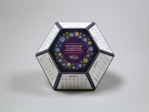
Each year, businesses throughout North America choose Structural Graphics to produce thousands of dimensional projects customized to fit their individual needs. But what about the multitude of other designs our paper engineers have created but have never been produced?

Now, you can find them here.

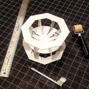
SG Unfolded, which launched this week, is intended to showcase one-of-a-kind inventions born of innovative thinking and precision engineering. We have such a large library of designs, that we wanted to shine a spotlight on some of the amazing work our paper engineers think up behind the scenes, which may have never made it into a client’s hands.

Our hope is not only to show off these designs, but also to help you get to know our paper engineers and their approach to crafting novel pieces for marketing professionals, Fortune 500 companies, universities and the like. Perhaps these pieces will even inspire you!

Currently, we have 16 designs on SG Unfolded (and our related Instagram account, with more queued up and ready to be posted for you to enjoy every week. Multiple images are posted for each design, including a short video to showcase how the mechanism works.

We hope you enjoy!

The Continued Rise of VR in 2017 – And What it Means for You

ford-australia-design-2

If you haven’t heard about VR by now, there’s a good chance you’re living under a rock.

The new technology seemed to really gain traction in 2016 with videos of Lil Wayne and LeBron James wearing Samsung’s Gear VR headsets and this emotional video released by Excedrin, which shows how it feels to experience a migraine — in real time.

But as VR and AR technology continue to gain traction in the new year, what are the implications of these products on marketers, businesses and the public?

screen-shot-2016-12-09-at-11-58-02-amHow are Virtual Reality Headsets Different Today?

Many of you might consider VR headsets to be the latest breakthrough in modern technology. Not exactly. Rather, it’s more like an upgraded gaming system with its 360-degree views and human-like avatars.

And while the original headsets were extremely clunky and not exactly wireless, they also carried a hefty price tag. This had two implications: 1. Developers had no desire to create headsets outside of gaming and 2. They didn’t make sense for businesses or consumers.

Now, nearly two decades later, these bulky, expensive products have evolved. Companies like Samsung and Google now offer their own versions of VR headsets and, here at Structural Graphics, we’ve created cost-effective versions called SleekPeeks that you’re able to customize to fit your business’ logo, color scheme and unique messaging. Plus they ship flat.

sleekpeeks_web_3_resized__3

So, How Exactly are Businesses Using VR to Market Their Products?

For everything from virtual product demonstrations and 360 video tours to training and prototyping. Here are a few examples:

  • Psychiatrists at the University of Louisville use VR to treat patients with social anxieties or phobias during cognitive behavior therapy. Because the patients are in a controlled environment, doctors are able to simulate the patient’s fear of, say, flying, and direct them on how to cope with that fear.
  • Ford currently uses VR in its Immersion Lab to get a better sense of how their customers experience their cars. Using headsets, they view high-def renderings of the interiors and exteriors of the cars before a prototype has been made available. To make this even more realistic, the company has developed prop-like tools like a flashlight that help their employees’ experience feel natural.
  • In an effort to increase bookings, Marriott Hotels created a “teleporter” which encouraged users to step inside a booth, put on a VR headset and visit a dream location. Not only could the wearer see a beach in Hawaii or the London Eye, but they could also feel the wind in their hair and the sun on their faces.
  • The US Postal Service used our SleekPeeks for their “Emerging & Advanced Technology” discount incentive program at the Association of National Advertisers (ANA) “Masters of Marketing” Conference. This piece delivered a powerful, yet lightweight virtual reality experience to conference attendees.

Interested in discovering how virtual reality can work for your business? Click here to request your FREE SleekPeeks sample.

Why Video in Print Can Work for Your Brand

“If a picture paints 1,000 words then one minute of video is worth 1.8 million.”
– Dr James McQuivey, Principal Analyst at Forrester Research

Within the last decade or so, the marketing landscape has changed tremendously. Traditional outreach in the form of catalogues and printed post cards has given way to email blasts and digital ads as consumers increasingly spend their time online.

This change in consumer behavior means that we, as marketers, must also alter the way in which we produce content for the companies and the brands we represent. Not only do we need to be more intentional with the stories we tell, but we must become more strategic in how we tell them.

Research shows that printed collateral continues to be a compelling and successful way to capture the attention of your target audience. However, when coupled with video, print has the capability to not only gain consumers’ attention, but also to hold it.

The statistics are there:

  • 70% of marketing professionals report that video converts better than any other medium (CodeFuel)
  • 90% of customers report that product videos help them make purchasing decisions (HubSpot)
  • On Facebook, video posts have 135% greater organic reach than photo posts (Social Media Examiner)
  • 76% of companies who have used videos in the past year report a direct business impact (AdWeek)

With the blurring pace of modern society, video is one of the few types of mediums that caters to the consumers of today, while still providing the value, relevance and trackable metrics marketing professionals are after. But how can we merge the strengths of print with those of video to create a singular high-impact marketing tool?

Our video-in-print brochures offer an effective option when it comes to getting your company noticed. One of the biggest advantages of combining these two mediums is the ability to enhance your brand messaging through engaging and supporting content. Video is highly visual and auditory, which means it’s easier for people to remember than text-based content. When consumers remember your video content, they, in turn, remember your brand. This can translate into better brand loyalty as well as more sales and leads.
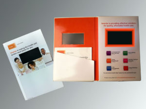
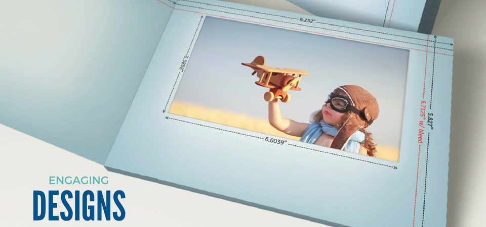
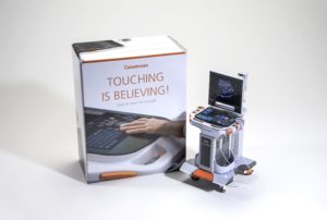
Aetna used this dynamic video brochure to send information about its “smarter” healthcare solutions to consumers. The inside of the brochure featured a video screen with 6 buttons underneath it. By pressing each button, consumers could watch a video and learn more about each of the different solutions offered by Aetna.
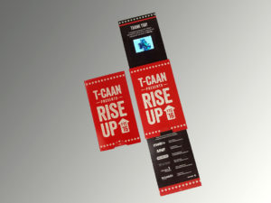
T-CAAN is one of Canada’s oldest and most extensive networks of independent advertising, marketing and communication agencies. Information Packaging of Canada used this video handout at a recent T-CAAN event in Calgary. The mechanism they used was the Extendo. When you pull out the bottom panel, another panel automatically slides out from the top featuring a video about Information Packaging.
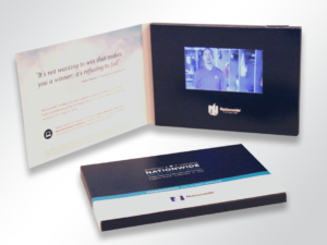
Nationwide Financial went “all out” and used this video invitation for its 2016 Nationwide Sales Invitational, a high-end event that rewards an elite group of advisors for their life and annuity sales volume and sales potential with Nationwide. The inside of this elegant mailer featured a video about the event complete with play/pause and volume controls.

What are you waiting for? Get in touch and let’s figure out how to take your marketing to the next level.
What it Means to Say I’m A Creative: Isabel Uria

This is the second installment in our “What it Means to Say I’m a Creative” series, meant to focus on the inspiration and drive behind each one of our paper engineers. To read Part 1 of the series, click here.

  1. How did you know you wanted to create (in a professional sense)?
    I think at an unconscious level I always knew I was going to work in the arts. I played piano for five years, and was involved in the school choir, theater, musicals and extracurricular art classes since middle school. Back then, I loved colors and painting, primarily.However, my journey with paper probably goes back to when I was 6 or 7 years old. My older brother had been given origami books for Christmas. I saw how he would make all these little creatures out of paper and neatly display them on his shelf. As any little sister, I idolized my brother. I wanted to be just like him! But he wouldn’t lend me his origami books!So one day, when he wasn’t looking or wasn’t around, I snuck into his room, took the books and started to try to follow the instructions on how to make all these little creatures through increasingly difficult pleats and folds. I succeeded on the beginner’s book but I failed miserably on all the more advanced ones. It took a while before I would understand and successfully accomplish complex paper folding like that. But if I have to look back at where I began with paper, I think that might have been my first experience with this amazing material.
  2. What advice would you give to others who want to work in a creative industry/ position? 
    Work Hard. Work smart. Be true to your passions.

    Be consistent.

    Be persistent (without being stubborn).

    Be confident, but not cocky.

    Dream big, but also keep your feet grounded in reality (or at least keep a toe or two on the ground).

    Stay confident, even when you think you’re wavering at every turn. (We often think we’re not doing well enough, but sometimes that’s a good thing; it keeps us humble.)

    Go forth doing your thing (whatever that may be) with constancy and fortitude!

    I guess much of this “advice” can really apply to any profession. At the end of the day, whatever you do, practice your craft passionately. Wouldn’t that make for a happier you?

  3. What does creativity mean to you?
    Being creative is inside all of us. Creativity is looking at a world of possibilities and acknowledging all the ways a problem can be brought to light and all the ways it could be solved. Creativity opens your mind. It is a path to visualize the past, the present and the future. Creativity is the opposite of war. It is the future. Evolution has happened because human beings have been curious to know and understand how things work and take that understanding to CREATE new developments and innovative things that serve our needs and help us. Creativity makes the world go around!
  4. How do you feel when you tell others you’re a paper engineer?
    It’s always fun to explain what I do. Unless you’re “in” the industry or closely linked to it, people don’t automatically know what a “paper engineer” is.First of all, we have not necessarily studied engineering in school, yet we work with paper as our material of choice in the same way an engineer does. We use the material —cut, fold, and paste it—to create an entirely new construct. The thing about paper engineers is that we can toggle that blurry line between being an artist and being a designer. We can be both! And sometimes, some of us are.Personally, I feel that’s awesome! I also feel very fortunate to be one of the people who makes a living in this profession. There are only so many people that do, and I think we all know each other! Or at least we know of each other.
  5. What does it mean to say that you’re a “creative”?
    There’s a lot of responsibility that comes with being a designer because you’re the one that has to visualize the results, and make sure it works for the purpose that it is needed. As a creative I have to come up with a compelling, grand, aesthetically pleasing solution to the problem at hand. I have to design an eloquent way to express a message in 3D paper shapes and forms. I have to make things unique and innovative. Sometimes that comes easy, but sometimes it doesn’t. And criticism will always be there. Those are the struggles you deal with on a regular basis as a designer, as an artist and as a creative.

To learn more about Isabel, please click here.

Thinking Outside the Inbox: Direct Mail for the Holidays

postbox
I always get excited when I receive mail.

One glimpse of the mail carrier, donning his USPS garb, and I wait anxiously to see whether there’s anything addressed to me. But on those days when I’ve got more than bills or credit card offers stuffed in my mailbox, that childlike excitement I felt earlier all too quickly disintegrates into something else: disappointment.

There are the flat mailers that have my name incorrectly printed on them. There are the catalogs with promo codes so buried I get exhausted from flipping through before even finding them. And there are the dreaded cards and the postcards that I barely even look at before throwing away.

Sound familiar?

These pieces all have one thing in common (besides meeting my recycling bin): they’re boring. And as businesses increase their efforts to vie for your attention this holiday season, as marketers you want to be anything but. So, if you’re not currently creating (or, at the very least, brainstorming) some ways to set your direct mail apart, you’re already missing out on the opportunity to make a memorable impression.

5

But don’t worry, it’s not too late to get your company or your products noticed in time for the holidays. Here, we’ve curated some of our most helpful tips on how to bring back that “wow factor” during the most magical time of the year.

      1. Go dimensional. Perhaps the easiest way to make a real impact with little-to-no-effort? Incorporate dimension. By incorporating pieces like our 3″ pop-up cube into your marketing, it’s easy to put forth your messaging in a way that takes advantage of 3D (but still ships flat).
      2. Embrace technology. For better or for worse, we live in a digital world and it’s just going to get that much more – er – digitaler. Instead of rejecting this characteristic of modern life, we say embrace it! Want your print advertising to play your jingle? Want to incorporate virtual reality or LED lights into your messaging? Make your customers feel like a kid around the holidays by sending them something shiny AND bright in the mail.
      3. Video is your friend. Did you know that videos increase people’s understanding of a product or service by 74%? In case you’ve been living under a rock, video is super trendy right now. Combine video with one of our high-impact print solutions and you’ve got a powerful marketing tool.
      4. Surprise them. If a consumer is able to predict how a promotional piece is going to look or feel before they even get their hands on it, you can almost bet that it will get lost and maybe even thrown away. Make your brand as exciting as you are – that unexpected element will not only set you apart from your competitors, but it’ll leave a lasting impression in your recipients’ minds.
      5. Think Interactive. Print plays to the human senses in ways that digital tech is hard-pressed to match. By delivering a direct mail piece that recipients can engage with, you’re not only getting their attention, but you’re strengthening your brand’s longevity, too.

Feeling inspired? Have an idea for how your business can target the next generation of purchasers? Contact us to get started.

Structural Graphics Celebrates 40 Years of Innovation in the Interactive Print Marketing Industry

sgs-40th-anniversary-party-21

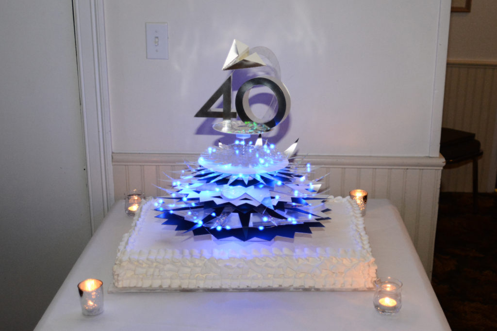
Structural Graphics, the pioneer of the dimensional print marketing industry is celebrating its 40th anniversary. The company introduced the world to dimensional print marketing in 1976 and continues to lead the interactive print marketing industry today.

Over the years, Structural Graphics has created more than 40,000 interactive paper designs for clients in almost every industry and holds many U.S. Patents. For more than four decades, the company has helped some of the world’s most influential brands reach their audiences with high-impact and multisensory marketing campaigns. Brands such as Samsung, Google, Whirlpool, Coca Cola, Lincoln, Land Rover, UPS, American Express, Nationwide, Victoria’s Secret, Calvin Klein, Leading Hotels of the WorldNabisco, AstraZeneca, The Hartford and Prudential, just to name a few.

As the world changes, Structural Graphics’ capabilities and service offerings have continued to evolve. Building on the company’s success in the insurance sector, The Lift Factor was established to deliver fully integrated marketing solutions utilizing print and digital executions for the nation’s top insurers. The Red Paper Plane division was created to provide a fast turnaround, do-it-yourself platform to buy Structural Graphics’ top selling formats online.

“The vast majority of companies never make it to see their 40th anniversary. The fact that we are celebrating this milestone here at Structural Graphics is a testament to the innovative products and services we offer, and our wonderful clients and suppliers. But most importantly, it’s a reflection of the creative, hardworking and talented employees that have walked through our doors over the past 40 years. Our people are truly our greatest asset,” stated Mike Maguire, CEO.

Structural Graphics markets its products and services nationally and in Canada, with its design and paper engineering, production management, marketing and administrative offices operating from the corporate headquarters in Essex, Connecticut. The company has sales and production operations throughout the U.S. and Mexico.

For more information or to view some of Structural Graphics’ work, please visit www.structuralgraphics.com.

Simpsons Virtural Reality | Structural Graphics

The Simpsons Uses VR to Celebrate 600 Episodes

Recently Fox’s The Simpson celebrated their 600th episode. It’s fascinating that a cartoon show about a silly family in a crazy town has managed to stay on the air so long. No doubt, it’s due to the shows innovative writers which parody current events, create satirical story lines and stay on top of pop culture.

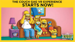
Simpsons Virtural Reality | Structural GraphicsTo help celebrate this achievement the show released a great VR experience with the help of Google Cardboard. Unfortunately, I don’t get to watch The Simpsons anymore, but checking out the VR experience provided a hefty dose of nostalgic relief and a few laughs too.

You don’t have to use Google Cardboard, any VR viewer will work. I used my SleekPeeks® VR Viewer, download the app, then downloaded The Simpson’s “Planet of The Couches”. The experience provides six different fully-immersive scenes with 360 degrees of things to look at. Check it out!

10 Commandments of Direct Mail Marketing

For your pleasure, 10 Commandments of Direct Marketing set in proverbial stone.

  1. Thou shalt include clear calls to action.
    Just as its name implies, it’s important to be extremely direct with direct mail marketing. As a business, your job is to motivate people to do something: visit your company website, request a free sample or even purchase a product you’re trying to sell. It’s important for your call to action to be concise and to the point.
  2. Know thy target like thy know thyself.
    The better you know your prospects – who they are and what they want – the more likely your message will resonate with them effectively. Not only will this help you better tailor your direct mail pieces, but you’ll also increase the likelihood of encouraging your prospects to react to your call to action (see point 1 above).
  3. Thou shalt use responsive design.
    Research indicates that nearly half of mobile phone users feel frustrated when they visit a site that’s not mobile-friendly – and who could blame them? In this day and age mobile phones, e-readers and tablets are the preferred way to access websites and email. So, if you and your business can’t keep up, you’ll probably be left behind.
  4. Thou shalt not fear staying true to thyself.
    How do you make your product or company stand out from the rest? Don’t be afraid to take inspiration from others and to make each direct mail piece your own. Use color schemes and logos unique to who you are. iBeacons, virtual reality headsets, LED lighting and pop-up books are a few ways our clients have set themselves apart in their marketing.
  5. Thou shalt track.
    In order to know which pieces get the best response, it’s essential to track the results from each and every direct mail marketing campaign. Not only will you be able to send your mailers with confidence, but you’ll also know who responds to your marketing and have an opportunity to follow up.
  6. Honor thy needs of thy customer.
    No matter how you spin it, the customer/ prospect’s needs always come first. Are they looking for a new heart medication or an organic make-up line? As a marketer, your job is to solve a problem that your customer has. Remember that.
  7. Thou shalt provide value.
    Can your direct mail piece be multi-functional? A great example of this is our pop-up cube pencil holder. Not only does the piece provide information of what a company is trying to sell or promote, but it also has longevity – recipients have kept these pieces on their desks for weeks or months because of their value. It’s a win for both.
  8. Remember to make mailers creative.
    Here at Structural Graphics and our online offering, Red Paper Plane, we use dimensional print to get people’s attention whether it’s a DIY snowman or an origami gift card holder. No matter what you’re looking to promote, we’ve got a fun, effective and creative way to do it.
  9. Thou shalt use proven techniques.
    Perhaps it’s a unique selling proposition. Or maybe it’s a web key that encourages recipients to visit your website. Whatever has worked for you in the past, use it.
  10. Thou shalt always tell a good, compelling and powerful story.
    Enough said.

Ready to get your direct mail on? Give us a call at 860-767-2661 or shoot us an email. Together we can make your direct marketing really pop.

SG Takes Home Top Honors At The Dieline Awards 2016

Screen Shot 2016-05-19 at 3.29.08 PM


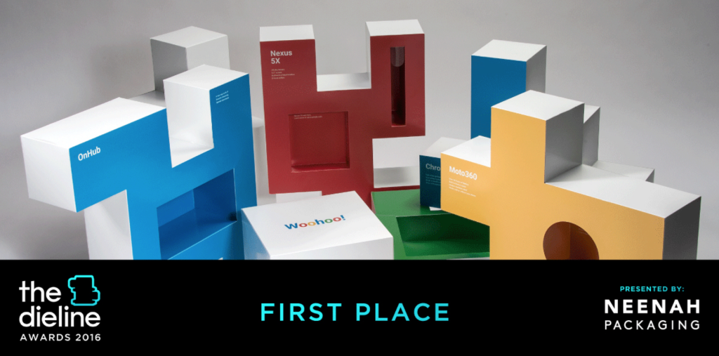
Who designed the most innovative packaging of 2015? The Dieline, the premier website on packaging design, answered that question at their annual conference held May 19-22. This year, The Dieline Package Design Awards received more than 1,200 entries from countries all over the world. Out of those entrants, Structural Graphics took home First Place in Technology, Media, Office and Self-Promotion for the Google Box.


The Box will be on display all week at HOW Design Live’s Exhibit Hall at The Dieline Awards’ exhibit booth.


g box1


“I could not be more proud of the entire team here at SG as well as at Blanks for their tireless efforts in bringing this project to life,” said Alex Bates, VP of Paper Engineering and Design. (For more from Alex, watch our acceptance speech video here.)


The Story of the Google Box:
g box 2
Last year, during the development of the Google Photos app pop-up book, we were asked through a string of emails whether or not we do boxes.


Psht. We practically invented them.


g box 3

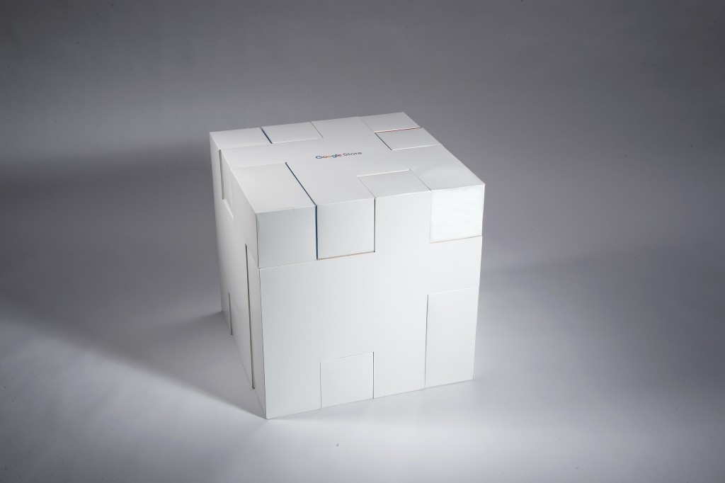
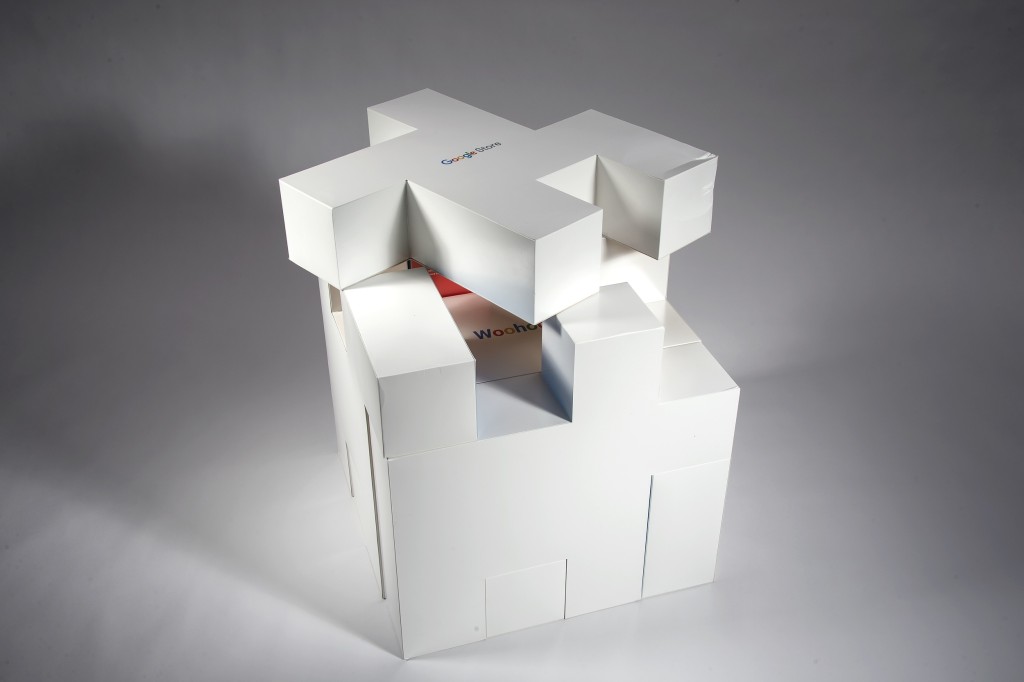
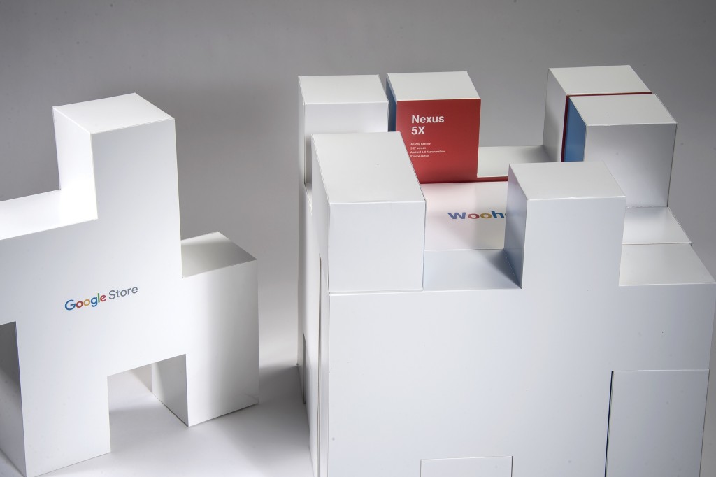
So on September 16, 2015, we kicked off the project with a call to discuss concepts. Google wanted a packaging piece that could hold products that would promote its new store. Collaboratively, what we came up with was a box that fit together like a puzzle. Each of the “puzzle pieces” contained a different product Google was seeking to promote. The entire box was later sent to major influencers who then vlogged and posted videos of the box on YouTube.

Check out this video and this blog post we created for the full story.


The Dieline Awards are an international design competition recognizing the world’s best consumer product packaging design. Now in its 7th year, The Dieline Awards 2016 has gathered a highly esteemed jury of structural packaging, design, branding and consumer product experts. The Dieline Awards names its winners based on three vital design components: Creativity, Marketability and Innovation.