Category: Custom Design & Printing

Best Practices for Marketing in Higher Education

The U.S. has some 20 million+ college students, according to the National Center for Education Statistics. To marketers, this tech-savvy group of twentysomethings is probably more commonly thought of in terms of keg stands, spring break and slim wallets, than as consciously selective consumers.

This is a mistake.

According to Jessica,  understanding how to approach this young market as a college or university involves so much more than your typical marketing approach. As a higher education institution, your marketing must track trends, incorporate digital media and speak to the audience in a “voice” that excites and motivates.

Making sure your school gets noticed is what we do best, so we’ve put together a few tips on how to really get your college or university noticed by the right students.

Don’t Assume Direct Mail is Dead: According to research by mStoner, in partnership with Chegg, 64% of teens say they prefer to consume college website content through text and articles. But what does this mean for your marketing team? The answer: Direct mail pieces shouldn’t be left out of the equation.

Not only can direct mail be cost-effective, but it can also be highly targeted and customized to fit the individual. As many as 55 % of people are eager to read their mail, according to the U.S. Postal Service. Addressing prospective or returning students by name can only enhance the experience and, ultimately, prompt excitement about your school or program.
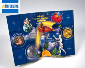
Example: UC Riverside chose to send out a dimensional folder aimed at showing how different college is to accepted students. The piece starts off as a seemingly flat printed folder, but when you open it up, an intricate pop-up immediately rises from the center. Each corner of the piece featured individual mini folders, each containing step-by-step instructions on how to get started with enrollment.

Invest in Video Marketing: The stats are already there: 78% of people watch videos online every week and 55% watch videos online every day, according to research by HighQ. So, while your college or university need not invest in a production company or a cinematographer, it should invest in video marketing to its students.

Here’s how we see it: You have thousands of loyal brand advocates just waiting to share their experiences at your school. So, when it comes to reaching the right audience for your school, it’s smart to empower these people to tell YOUR story in an authentic way. Not only can this humanize your “brand”, but it creates an emotional connection for a generation that relies so heavily on the word of influencers, Yelp and product reviews.

Our video-in-print brochures offer an effective option when it comes to telling your story. One of the biggest advantages of combining these two mediums is the ability to enhance your brand messaging through engaging and supporting content. Video is highly visual and auditory, which means it’s easier for people to remember than text-based content. When consumers remember your video content, they, in turn, remember your brand. This can translate into better brand loyalty as well as more sales and leads.

Track Your Analytics: Today there are so many messages competing with yours on the web. How do you get people to visit your school’s website and click-through your communications? We use various web drivers to help take your prospective student from print to digital. Plus, we’ll provide you with campaign analytics to help you learn who is visiting, for how long, and what they are interested in.

Not only can analytics tell you how successful you’ve been with reaching your target demographic, but it can also help you maximize (and when it comes time, also justify) your paid media budget.

Give Your School Dimension: Your college or university isn’t like any other, so why would you want your student population or, better yet, your marketing to be any different? When reaching out to prospective or returning students, it’s important to stand out from the crowd and deliver your story in a trendy, engaging way.

Our dimensional direct mail formats deliver your message wrapped in an engaging interactive experience. When students are considering their options, the message that was inventive, engaging and memorable will be top-of-their-minds. We can make sure that message will be yours.

Example: Seton Hall University chose our Rolling Cube to deliver information on their university to prospective students. This is one of our most interactive pieces. When you pull the cube from the mailer it keeps unfolding to reveal multiple cubes of information. See it in action below.

For more ideas for how to market in higher education, click here.
Structural Graphics Featured in Fold of the Week

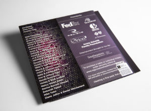
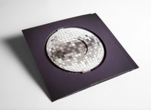
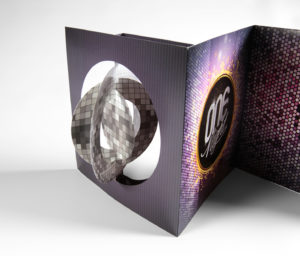
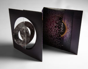
Check it out!  Structural Graphics’ piece was featured as the 60-second Super-cool Fold of the Week.  Trish Witkowski of Foldfactory showcased our “Simply Cool Swinging Disco Ball Accordion Invitation.”

Structural Graphics designed and produced this disco ball invitation for RedRover Marketing in Tennessee for their client, the Regional One Health Foundation. They used this mailer to invite people to their annual ONE Night Fundraiser. The invitation shipped flat, but the paper die-cut spheres on the cover immediately twirl in succession when you open up the mailer to create the illusion of a dimensional disco ball.

Thanks for the shout-out Trish!

PROJECT SPOTLIGHT: Dish Network Uses Pop-Up Cube As Unique Handout

How does a company stand out at a trade show with a sea of many other vendors to compete with?
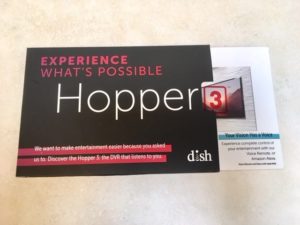
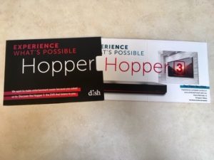
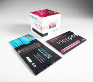
Dish Network used the pop-up cube as a unique handout at the CES Show in Las Vegas. They kicked it up a notch by delivering the cube inside a half-sleeve, giving the recipient a sneak peek of what was on the inside. As the cube slides out, it immediately pops into shape delivering information about Dish Network’s award-winning DVR, The Hopper®.  Click here to see it in action!

Are you ready to generate some buzz and awareness for your company?


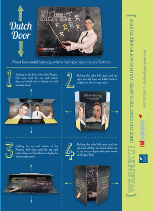
The Flapper How To Guide

The Flapper is one of our most popular and effective designs because of how interactive and engaging it is. Here are some quick tidbits about the Flapper:

  • It has increased campaign results for some clients by over 400% over previous campaigns
  • Gillette and others have used it as part of a magazine ad
  • It comes in multiple sizes
  • It produces mega results

Check out  Susie’s video that shows us just how easy and versatile The Flapper is to use.

You may also like take a look at our Flapper How To Guide.

Are you ready to design yours?

5 Unique (and Budget-Friendly) Ways to Thank Your Customers

It’s happened to all of us: You go to check your inbox and there to greet you are dozens of emails expressing thanks. “Thank you for your purchase.” “Thank you for subscribing.” “Thank you for participating in our event.”

But how effective are these email “thank yous” anyway?

As any good marketer knows, a simple “thank you” is all it takes to set your business or brand apart from the competition. But these days, with the overwhelming amount of digital communication available, saying it through email just isn’t enough. To help you get ahead and stand out from the pack, we’ve compiled some clever ways to thank your customers that are effective, impactful and have nothing to do with clicking send.

  1. Show, don’t tell. Instead of sending out a boilerplate email or even a standard “thank you” card, try showing recipients how much they mean to you by way of video. Not only do videos increase people’s understanding of a product or service, but it also allows you to showcase your brand’s personality and connect emotionally with your audience. Our Video-In-Print Brochures are a great place to start.
  2. Be engaging. Easier said than done, right? At Structural Graphics, we’re all about engagement, whether that means incorporating digital components into your direct mail or simply taking a unique approach to it altogether. From pop-up books and Telescoping Sliders to virtual reality head sets (ours are called SleekPeeks) and our iconic Flapper, we’ve got you covered.
  3. Give them something to remember you by. There’s no use in sending your customers marketing collateral if it doesn’t leave a lasting impression. Why not create a “thank you” that has some longevity by incorporating functional elements into your piece as well? Take this polygon calendar we created for Cars.com or a Pop Up Pen Holder like the one seen here.
  4. Surprise and delight. Emotions drive people to action. Consider including a little something unexpected in your “thank you” that will not only ensure that your brand is memorable to your intended recipient, it will also encourage them to interact with your brand in positive ways. Perhaps they’ll tell their friends about your brand or even read on in your “thank you” to purchase your product or service. Maybe it’s LED lights incorporated into your piece. Or maybe it’s sound to transport the recipient to your location. Interested in seeing some examples? Check out this video we did spotlight SKM Consumers Energy’s Pop Up House.
  5. Don’t stop there. Your thank you note should be more than just an expression of thanks. Think of Calls to Action to get the recipient to interact with your brand, whether that’s encouraging him to visit your website or asking her to share a photo of the piece on social media. This has two benefits: It’s fun for your recipient and it’s trackable for you. Our web keys are a perfect example of how to do this right.

Structural Graphics Video Mail Piece Grand Champion of 2017 US Postal Service Irresistible Mail Award

Some mail pieces are effective, some are engaging, some are beautiful. But very few can be called Irresistible Mail™” – the US Postal Service.

At the National Postal Forum in Baltimore, MD on May 23, 2017, The Lincoln Motor Company’s high-end video mailer, “See it First,” was selected as the Grand Champion Award winner of the “Irresistible Mail” trophy.  The Irresistible Mail Award is a USPS program that highlights mail pieces that increase engagement through innovative design, print or digital technologies.
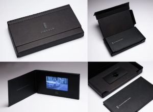
Sharing creative credits on the winning mailer are Structural Graphics who printed and hand-assembled the piece, Lincoln Motor Company, Ford’s ad agency GTB (formerly Team Detroit), Hudson Rouge.

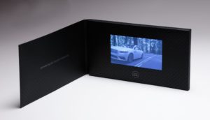
Used to give customers a sneak peek before the vehicle hit showrooms, this mailer presents a video screen embedded on the inside of a display folder.  Activating upon opening, the video delivers a story about Continental’s heritage and features, along with a tri-fold brochure describing the ownership experience, all delivered in a custom box. This piece was one of four finalists recognized at this year’s Forum, having been the winner of the 2nd quarter Irresistible Mail Award.

Additionally, you can find Structural Graphics on the 2017 USPS Irresistible site. Several of our pieces, created in partnership with MRM/ McCann and Sandy Alexander, are featured, including SleekPeeks VR Viewers, and OE, a slider design our paper engineers developed that features Near Field Communication and a “Twister” exploding page.

Be sure to check out Structural Graphics VPA Gallery.

PROJECT SPOTLIGHT: Seton Hall University Stands Out With Rolling Cube Mailer

The competition to increase the admissions yield in higher education is stiffer than ever, according to the University of College Designers Association.  Schools are looking for ways to stand out and differentiate themselves from everyone else.

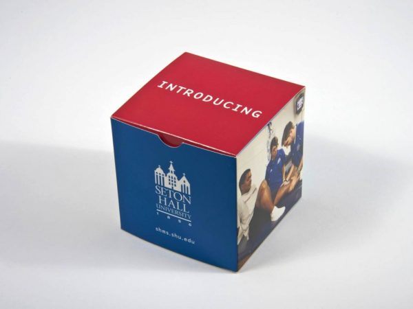
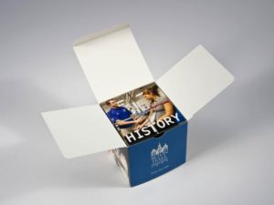
Seton Hall University chose our Rolling Cube to deliver information about their university to prospective students. This is one of our most interactive pieces. When you pull the cube from the mailer it keeps unfolding to reveal multiple cubes of information. Words don’t do it justice – be sure to click on the flash movie to see it in action!


7 Steps Chrysler Took to Promote Their Business at the NADA Convention

Today’s automotive industry moves fast and furious, so it’s important to showcase your vehicles in new and creative ways. But how do you show change and innovation on paper? You don’t. You show it WITH paper.

Like Chrysler did here.

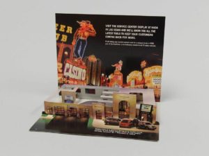
The automotive company was looking to encourage people to visit their service center display at the National Automobile Dealers Association’s Las Vegas convention in 2003. To do this, they cleverly employed several marketing techniques that can apply to any brand or industry.

  1. Stay true to your roots. Chrysler, which has a strong brand identity, chose to showcase a miniature version of a Chrysler dealership right down to the cars, service desk and employees.
  2. Never underestimate the ‘WOW Factor’. Pop-up mailers are a really unique way to capture the attention of your audience. This particular one ships flat but, because of its interactivity, detail and uniqueness, it also surprises and delights.
  3. Less can be more – when it’s done right. Sometimes it’s just better to get to the point. To really maximize the space on this mailer, Chrysler chose to include short bursts of essential information instead of paragraphs of marketing speak. Rather than trying to convince attendees to visit its display, the team chose to let the excitement of the mailer speak for itself.
  4. Include a call to action. In this mailer, Chrysler is up front about what it wants – for people to visit the company’s service center display at the conference.
  5. Offer an incentive. We all know that people generally love to win free stuff. So, instead of just asking conference attendees to visit Chrysler’s display, they wanted to make the visit worthwhile. To make their call to action even more powerful, the company also advertised that they would be offering a chance to win a free year of ServiceVision.
  6. Don’t forget the basic information. Between the bells and the whistles, it’s easy for marketers to get caught up in the excitement of a piece and forget the most basic of information. Always include the date, time and location (if applicable) of any event you or your business are/ is attending.
  7. Catchy openings are key. Embracing the convention’s location, Chrysler took inspiration from Las Vegas’ neon lights and showgirls. The mailer’s cover is colorful and hints at the purpose for sending it out. It also beckons the recipient to open it up to see what’s inside.

5 Ways to Incorporate Video into Your B2B Marketing

Video is one of the most talked-about subjects in the marketing industry right now, and with good reason. Did you know that videos increase people’s understanding of a product or service by 74%?

Everyone from social media strategists and content creators to businesses and brands are all jumping aboard this trend. Why? They all understand how and why video has become such a popular mechanism to win new business and increase audience loyalty.

But despite its growing relevance, one of the questions we get most is: How do I get started with video marketing? Here, we’ve included a few tips to help make your marketing videos even more effective.

  1. Choose the right files. To ensure the quality of your video and sound are exactly where you want it, we recommend using the following: a) video file format: MP4, WMV, AVI, MOV, (Codec: MPEG-4, Divx, Xvid 720P) b) Audio output: Mono speaker c) Sound level: 75-80 dB
  2. Keep it short. Video is a great vehicle for delivering your message, if it’s done effectively. Keep your videos short (30-60 seconds) and entertaining while still delivering on substance.
  3. Don’t forget the CTA. Perhaps it’s as simple as encouraging viewers to visit your website or call a direct line. Whatever the call to action is, don’t forget it. This will help you track responses and, perhaps more importantly, determine the success of your marketing efforts.
  4. Make your messaging digestible. In addition to keeping your content brief, remember to share your messaging in short, potent bursts. Perhaps this means separating your video into “chapters” or creating a YouTube series to really hit home your product or brand. Allowing viewers to enjoy your content in bite-size pieces ensures your audience will absorb more of the information you’re delivering.
  5. Consider Video-in-Print formats. Here at Structural Graphics, we have produced hundreds of thousands of video units for some of the top Automotive, Pharmaceutical, Financial Services, Manufacturing and Entertainment brands in the world. Check out our VPA Gallery here.

PROJECT SPOTLIGHT: History Channel Sox Box

How many of you watch the History Channel?

We created this History Socks Box for A&E so they could showcase, in their words, “some of their best footage ever” with their ad sales clients. Each quarter, A&E chooses two of their hottest shows to highlight. In this case, it’s Join or Die with Craig Ferguson and Vikings.

This box is the first of its kind for the network and was designed to hold three pairs of socks – two inspired by that quarter’s featured shows and a third made up of spares. The box also includes an insert with show descriptions and scheduled airings.  

Interested in learning more about what went into creating this box? Head on over to our website or email us.