Category: Custom Design & Printing

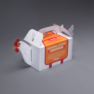
Popeyes is Offering Emotional Support (Chicken) this Holiday Season

A common topic of discussion in the news lately has surrounded the idea of allowing animals on airplanes to provide emotional support for travelers during the holiday season, as well as the restrictions for the types of animals that should be allowed. When GSD&M, Austin, TX had a buzz-worthy idea and design for a campaign for their client, Popeyes, to get holiday travelers talking (or should we say “squawking”) they contacted Blanks Printing, & Digital Solutions and the design and assembly teams at Structural Graphics to help bring this project to life!

The solution? “Emotional Support [Fried] Chicken”. For a limited time, those travelling in Terminal C of the Philadelphia Airport during the 2018 holiday season can now pick up the box which contains a 3-piece Chicken Tender combo meal from Popeyes.  Why the Philadelphia airport? Because it was named one of the most stressful airports in the United States.

“We know holiday travel can be frustrating, and there’s no better way to ease stress than with a box of delicious Popeyes fried chicken and a good laugh. We appreciate how comforting emotional support animals are and wanted to create our own version,” stated Popeyes CMO, Hope Diaz via news release.

The best part is, Popeyes is guaranteeing that their Emotional Support Chicken is “permitted to fly without any restrictions”, helping ease some of the worries for those crazed travelers this holiday season.

Blanks Printing & Digital Solutions, Dallas, TX printed this project on the new HP 12000 Digital press. Structural Graphics proudly engineered the design for function, created several rounds of full color test prototypes, and then hand assembled for the launch in the Philadelphia airport on Tuesday, December 18th.

Is There Still A Place For Holiday Catalogs?

Every year, as the holiday season rolls around, we’re taken back to our childhoods and the stacks of catalogs that would inevitably inform our lists. There was nothing quite as exciting as pouring over those glossy pages. We’d dog ear corners or cut out images of toys we’d later beg our parents to gift us, a reward after behaving  well for the entire year.

However, as we’ve reached adulthood and the “Internet of Things” has exploded, that time spent listing carefully curated items has been replaced by the robotic, instantaneous click of adding a new item to our online shopping cart.

Which begs the question: Is there still a place for the old holiday catalog?

Jeff Bezos thinks so and we’re inclined to agree. These days, it’s easy to assume that print is dying or that it’s antiquated at best. But brands from IKEA to Pier One and magazines like Departures and InStyle can teach us marketers a thing or two about how this “old media” can complement our business’ digital footprints in a well-rounded, well-structured marketing strategy – especially around the holidays.

Print Catalogs: The Beginning

The catalog isn’t a new concept. In fact, it’s a very, very, very old concept. Published in Venice in 1498, the first catalog was essentially a hand-lettered and hand-bound pamphlet including lists of books available for purchase.

In North America, it would take nearly 350 years before the U.S. would see its own version of Europe’s booklets. In 1845, Tiffany and Co. released a piece called the “Blue Book”, which was later followed by “Eaton’s Catalog” in Canada in 1875.

This Medium article by Divya Pahwa does a great job explaining the catalog’s history in more detail.

The Case for Today’s Catalogs

Think of it this way: print catalogs are like any other physical marketing piece.

As with other forms of print marketing, it’s important to recognize that it’s but one part of a wider, overarching marketing strategy for your business or brand. Find and capitalize on opportunities for crossover, including the addition of QR codes, clear CTAs and interactive print to drive readers to microsites and pre-determined landing pages.

Aside from meeting your own business goals, it’s imperative to make sure your audience’s needs are met and that they feel connected to your brand. As Steve Daniels explains for Medium’s The Startup, “Print magazines are no longer about information; the ones that are have become a commodity that is easily replicated online. Today’s print magazines are lifestyle products.”

The takeaway for marketers? Act accordingly.

Holiday Marketing for Procrastinators

The busiest season is now upon us, but somehow it’s almost December and you’ve forgotten to create your holiday greeting card for your clients this year! Don’t sweat it – there’s still time for you to send your clients a Holiday or New Year’s greeting card before 2019.

We’re not lying. With our online ordering division, Red Paper Plane, you can have custom greeting cards on one of Structural Graphics’ bestselling formats in no time, but you need to act fast! Visit redpaperplane.com and add your holiday artwork to one of our easily downloadable templates to create the Holiday or New Year’s greeting card your customers deserve.

Below we’ve compiled a brief list of marketing tips that will help you refine your efforts and ramp up sales during the most wonderful(ly) profitable time of the year (even if you’re  a procrastinator).

  1. Surprise and delight. Instead of hoping customers will receive your marketing and spread the word about your business, why not take it one step further and give them something to talk about in the first place? Consider a paper Gingerbread house that pops up out of its envelope or an Extendo® with your holiday greeting applied that allows you to build on your brand messaging as it extends to triple its size.
  2. Make it easy-to-share. Maybe you can’t guarantee that your holiday marketing campaign will go viral, but you can work to maximize your chances by making it easy to share. Web keys allow you to guide a recipient to a specific landing page, website or PDF with additional information about your product, campaign or service. You can also add social media icons to your print and electronic communications, too.
  3. Add Dimension with an Interactive Format. With over 80 fully customizable downloadable templates on Red Paper Plane, your dimensional holiday greeting card options are endless! Choose from standard formats or our existing holiday designs including the Snowflake Spinner, Pop Up Snowflake, and Snow Scene Holiday Card. Not to mention, we’ve introduced brand-new engaging holiday designs including Birds n’ Branches, the Extendo® Pop Up Cube, as well as the beloved Holiday Globe Greeting Card line. All of these cards mail flat, engage the recipient, and act as great desk-top pieces keeping your brand front and center and top of mind throughout the holiday season and beyond!

Have an idea that’s not mentioned above? Check out our holiday card offering on Red Paper Plane and we’ll see how we can work together to bring your vision to life. The holidays are soon approaching, so make sure you place your holiday greeting card order fast! No need to get caught up in the last-minute holiday stress – we’ve got you covered.

The Story Behind DEPARTURES Magazine’s Audi Insert

How do you showcase a symphony of lights from a beloved brand using paper?

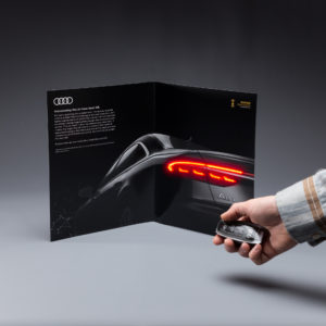
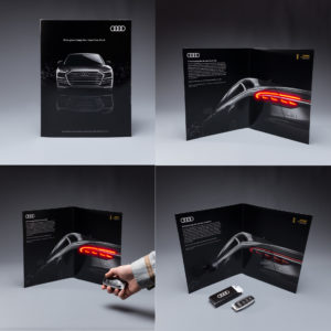
That was the riddle presented to Structural Graphics earlier this year when Audi of America’s agency of record, PHD Media, tapped Meredith Corporation to create a truly unique magazine insert in DEPARTURES Magazine. According to Don Stone, Meredith Corporations’ Senior Operations Manager and lead for this project, the Structural Graphics team “immediately came to mind.”

Not only did the insert need to excite and grab the attention of Audi’s target consumers; it also needed to highlight the “innovative and elegant” lighting experience of the new Audi A8.

“We designed the lighting package around the photography from Venables Bell & Partners, the creative agency for Audi,” said Ethan Goller, President of Structural Graphics. “We used 49 LEDs firing in exactly the same sequence as the A8.”

Readers of the magazine also receive a faux key fob, which has functioning lock and unlock buttons.

“By clicking the key fob lock or unlock button, you could experience the incredible A8 lighting sequence greeting you as you approach the car,” Goller said. “Great photography, combined with an elegant print treatment, high-end paper stocks and the lighting package we created, Departures Magazine gave the luxury and premium feel the Audi A8 demands.”

The record-breaking number of LED’s SG developed to mimic the Audi A8’s unique lighting design animation, along with producing the remote control faux key fob used to trigger the display lights is a one-of-a-kind experience that has never been done before.

Structural Graphics, which has been in the business for more than 42 years, is no stranger to using cutting-edge technology in its clients’ interactive print designs. In fact, this past summer, an ad in Instyle Magazine for Toyota created by Saatchi & Saatchi in partnership with Structural Graphics featured a heart rate monitor, sound module and pulsing lights. Another ground-breaking, never been done before technology.

Shin Wakabayashi, one of the paper engineers who worked on the Audi insert, talked about how he and his team help to enhance client print communications through the use of paper.

“Experimenting with it, whether it’s drawing on it or cutting into it or folding it, that’s when I start to see possibilities,” he said. “There’s a million different ways to create something, whether it’s flat or it’s dimensional. There’s a lot of shapes and forms and movements that you can make out of paper.”

Give Your Brand the Edge with Dimensional Print

Imagine for a second: You open up a seemingly ordinary envelope and a 3D cube pops out at you. Or a video, housed in a paper brochure, begins playing at the touch of a button. How about a printed paper jukebox that actually plays music.

These are just a few of the things we do at Structural Graphics that re-define print.

Dimensional print is a unique and effective way to tell your brand’s story by capitalizing on marketing that surprises and delights. Pull a tab and things move. Open a direct mail piece and have it pop out at you.

Three Reasons to Consider Dimensional Mail:

Appeal: The magic of dimensional mail lies in its uniqueness. Not only will your intended recipient open it, but in most cases, he or she will likely pass it along to friends, family and colleagues, who can also share in on the excitement.

Response: Dimensional mail has proven to be about three times more effective than traditional flat print. In fact, our direct mail designs break through the clutter and deliver average response rates of 8.5%.

Longevity: In many cases, dimensional mail pieces are kept to be used over and over again. For instance, Montana’s Fish, Wildlife & Parks recently designed a Pop-up Pen Holder for staff members that showcased the agency’s four guiding principles. Because of the unique functionality of the piece, many have elected to keep it on their desks, thus keeping the brand top of mind each time they see it.

Structural Graphics introduced the world to dimensional print marketing in 1976 and has been leading the charge ever since. And as the world changes, our capabilities and service offerings continue to evolve.

For over four decades, we’ve helped market many of the most influential brands. And we’ve done this by delivering attention-getting solutions that stop people in their tracks.

The Hows & Whys of Augmented Reality

What if you could pull the web page you’re currently viewing out from your computer screen and drop it in the air simply by putting on a pair of glasses? At CES 2018 – the world’s largest annual consumer technology show – this (made possible by Magic Leap One), as well as robots, voice assistants and connected cities, were all made entirely possible, leading consumers and analysts to speculate:

Could 2018 be the year of AR?

Augmented reality (AR) has received a lot of hype over the last decade or so. Not only does it allow users to lay visual data over their natural environment, but it allows marketers to create immersive, multi-sensory interactions with the brands they represent.

Throughout 2017, companies like Walmart and Sephora dipped their proverbial toes into the AR and VR pool. For instance, home furnishing giant IKEA released Place, an app that makes it possible for shoppers to see how IKEA furniture might look in their own living spaces prior to purchase. And Ford revealed that its engineers and designers use Microsoft HoloLens to overlay holograms of design concepts over models of vehicles, aiding them in designing cars.

Now, as we move farther into 2018, it seems like AR and VR have continued to gain traction with brands. But why?

Businesses are responding to disruption.

Have you ever taken an Uber? Stayed at an Airbnb? Or watched a movie on Netflix? Even if you weren’t aware of it at the time, all of these brands are participating in what marketers these days refer to as “disruption”; they’re shaking up the industry.

So, it should be no surprise the AR and VR have taken hold in so many industries. In retail, for example, as brands continue to compete against online marketplaces like Amazon, using VR and AR to train employees, expand the experience of your product and create an emotional connection with your brand have become so important.

Businesses can scale the advantages of AR and VR.

The introduction of inexpensive VR headsets and greater access to AR capabilities has made it possible for brands to deliver the ultimate interactive experience to consumers, allowing them to literally walk a mile in someone else’s shoes – without breaking the bank. Our SleekPeeks, for instance, are fully customizable viewers that ship flat and take seconds to assemble.

Clients have already included them in a magazine as part of their ad, sent them in the mail alongside a promotion and used them as handouts at trade shows.

Development tools are enabling enterprises.

Heard of Apple’s ARKit. How about Facebook-owned Oculus? With so many development tools at our fingertips, it’s becoming easier for brands and, by default, marketers to incorporate AR and VR into their marketing campaigns. Here at Structural Graphics, we’ve developed customized, cost-effective designs for companies like Stryker Diagnostics, USPS and Porsche.

Combine AR and VR technology with one of our high impact designs, and you’ve delivered a larger-than-life brand experience for your customers!

Click here to see our full Virtual Reality offering and click here to read more about our Augmented Reality capabilities.

2018 Trends: Print in a Digital World

Shame on you if you’re still thinking of print as “traditional” marketing! It is the same as consider web design to be just about beautiful exterior. Hop over to this website for details.

Beyond the fact that print is not dead, we’re firm believers that paper and ink can be as limitless as your imagination. Nowadays, consumers can access bedtime stories by scanning wallpaper, quit smoking by way of virtual reality and track their heart rate just from touching a magazine ad.

As brands continue to rethink their marketing, it’s important not to count print (or paper) out just yet. For many, it can aid in creating multi-sensory experiences, bringing together craftsmanship, creativity and design in a way that resonates with consumers.

Taking inspiration from the trends mentioned in St. Joseph Communications’ Print in a Digital World 2018 report, we’ve compiled a list of some of the most innovative projects we’ve been a part of to show you just how interesting paper can be.

TREND 1: Art, not ads.

“From smartphones to desktops and tablets to wearables, we cannot escape real-time digital experiences. Real disruption goes beyond swipes and taps. It comes from creating a wider sensory and immersive experience.” – St. Joseph Communications
SONY

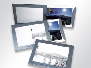
Sony chose our Magic Window design for a direct mail campaign. The results? The average time spent with this mailer – 41 minutes. The rate of recall among recipients – 90%. The average time this piece was retained by recipients – 4 months.
VELUX SKYLIGHTS

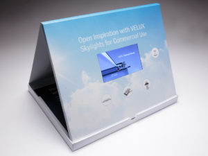
We worked with full service agency Wray Ward Marketing to promote the commercial use capabilities of their client VELUX Skylights. They wanted to portray that VELUX Skylights was superior to its competition. The design they chose to do this was our table tent video box. The video screen is contained within the box. When you open up the box, the piece stands and locks into place displaying the informational video front and center. The video box also included play/pause and volume controls.

TREND 2: Beyond the page.

“The emergence of new channels and technologies are creating new opportunities for marketers. Virtual reality and augmented reality are bridging the gap between print and digital like never before. Downloadable apps can be easily introduced to campaigns, while more sophisticated brands are integrating these technologies into their own mobile platforms.” – St. Joseph Communications
FOOD LION

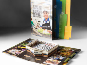
Food Lion Grocery Stores used this press kit to deliver information about the new layout and new products offered at its stores. When you open up the press kit, a replica of the new store pops up in the middle of the kit with detailed information on the new layout laid out in the middle. Also upon opening, a sound chip was activated to deliver an auditory announcement of the new stores. Each panel featured colorful imagery and information about the exciting changes of the store, and the right-hand panel also featured additional tabs of information that could be easily pulled out. The locking mechanism on the inside allowed the panels to lock in place making this the perfect comprehensive press kit for Food Lion.
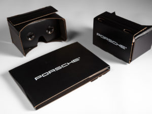
PORSCHE

We designed and produced this custom Virtual Reality Viewer for Porsche. They used it to give consumers an interactive experience with their brand.
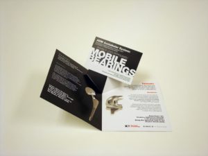


STRYKER DIAGNOSTICS

Stryker Diagnostics, the makers of hip and knee medical devices, chose this V-Pop design as a tradeshow invitation. When you open the invitation, a postcard pops up in the center. The call to action on the postcard was to bring the postcard to the Stryker booth to experience a 3D demonstration of the hip and knee devices. When users held the postcard marker in front of the web cams set up at the Stryker kiosks they were able to view a live 360 degree 3D demonstration of these devices.

TREND 3: Far from traditional.

“Thinking of print as ‘traditional’ is an old way of thinking. Consumers can cook, monitor their own health, and connect physical and digital channels thanks to a printed piece. These are the types of interactions that are meaningful to consumers.” – St. Joseph Communications
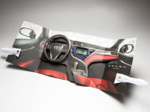
TOYOTA

The request was for something that has “never been done before.” With an LCD heart monitor and two completely independent electronic units in one magazine unit, this spectacular for the Toyota Camry certainly meets the criteria.

Incorporating movement, interaction and technology, this first-of-its-kind Camry insert is the latest re-invention of what print can be.
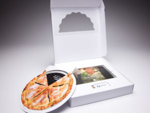
NATIONWIDE INSURANCE

Nationwide Insurance used this pie box mailer to deliver information about CareMatters, its long-term care product, to agents nationwide. The outside of the box pie box featured a partial mylar window that allowed recipients to get a sneak peek inside the box. In this case, a piece of the pie. Inside the box was a double-layered pie made out of paper that delivered different information as you turned the upper layer of the pie. There was also a brochure and a web key inside the box that drove agents to a unique landing page, specific to their agency, where they could learn more about this product. This box was also the winner of a GDUSA American Package Design Award!
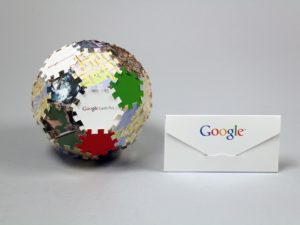
GOOGLE

When you’re the most widely used web-based search engine in the world, how do you communicate with your audience in a way that is equally as big? Google chose this puzzle piece mailer to introduce the features of Google Earth Pro, its 3D interactive globe. The pieces of the puzzle were mailed inside the envelope and recipients were asked to connect it all together. The results? A fully dimensional ball featuring the features and benefits of Google Earth Pro.

How to Create Higher Ed. Marketing that Works

Statistics show that high school and college-aged students like direct mail. Our direct mail is dimensional, interactive and engaging. With other colleges and universities soliciting the same top-prospect students that you are, direct mail from Red Paper Plane and Structural Graphics will make sure your message gets noticed and stays top-of-mind.

Here are a few ideas to get you started.

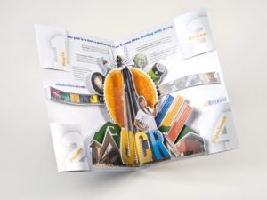
UC Riverside chose this dimensional folder to send out information about its different colleges to accepted students. The piece starts off as a seemingly flat printed folder, but when you open it up, an intricate pop-up immediately rises from the center. Each corner of the piece featured individual mini folders, each containing step-by-step instructions on how to get started with enrollment.

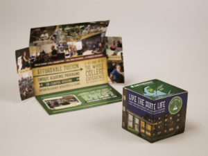
Our flat-cube is one of our most dynamic and exciting designs because of its ability to immediately make an impact with recipients. This one was used by SUNY Adirondack Community College to send information about its college to prospective students. The cube immediately pops up when you remove it from the mail sleeve.
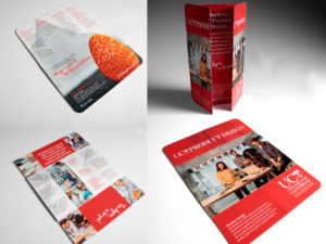
University of Canterbury used our Flapper to recruit students to its school and to promote its Product Design program. They chose the tablet-sized Flapper and displayed their information in a portrait layout. The inside of the colorful Flapper featured bright graphics that represented the key aspects of its product design program.

This clever Extendo mailer went out to prospective MBA students from the Georgia State University J. Mack Robinson College of Business. When you pull on one of the sides, the other sides pops out automatically – revealing a series of business jackets, each detailing one of the 4 MBA programs and 18 specialized master’s programs.
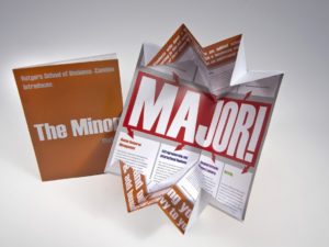
Rutgers School of Business used the Exploding Page design to deliver information about its business program to prospective students. The self-mailer appears to be a standard looking direct mail piece on the outside, but when opened up, it expands to twice its original size. The inside of the mailer contained information about the different programs offered by this prestigious school.

Fill out this form and we’ll send you an exciting sample pack!

Let’s Talk EDU: 5 Unique Ways to Market to the Next Generation

Before you can accept the best and the brightest, you’ve got to get their attention.

That’s where we come in.

Institutions from Manchester University all the way to University of Washington Tacoma are moving beyond the brochures, magazines and billboards traditionally used to market to students. Instead, they’re pushing their resources toward interactivity and the digital landscape. By using these unique higher education marketing strategies, colleges and universities can raise awareness of courses and programs while, ultimately, bringing new students into the fold.

Below are five key methods that savvy higher education institutions can use to creatively market their programs and reach a wider audience of prospective students.

  1. Cater to your audience, virtually. With smartphones and virtual reality headsets like our SleekPeeks, virtual reality is more accessible than ever. Not only have we seen countless universities offering virtual in-class experiences to online students, but we’ve also seen the technology become a part of the admissions process. Now, parents and students can explore campuses from afar with panoramic virtual reality tours inside buildings and around campuses.
  2. Get animated. Part of getting a prospective student excited about your institution is making an emotional connection with him or her. Video is a proven way to do just that. Whether it’s popularizing courses, highlighting campus or introducing students and parents to faculty, strategically crafted videos can speak to your target demographic. Even better? These videos can be leveraged across digital and print, allowing marketing teams to track ROI metrics. Pair your video with text using our Video in Print brochures, and you can do double duty.
  3. Personalize to fit your audience. A baseball player seeking to play at a D1 school isn’t necessarily going to have the same interests as an honors student looking to study pre-med. So, a university seeking to attract both students shouldn’t seek a one-size-fits-all approach to its marketing efforts. Like with any industry, when developing your marketing plan, it’s important to understand your audience: What content resonates with them? How do they currently perceive your school? How are they accessing your current content? Ensure that what you’re producing adds value to each group you want to target.
  4. Surprise and delight. Going to college is such a pivotal moment in the lives of so many young adults, yet so much of the higher education marketing we see doesn’t convey that excitement. Our Pop Up Cubes are extremely popular with colleges and universities because of their ability to engage and stand out from other mail. Not only do they ship flat, but as soon as the belly band is removed, they spring into action, showcasing the school in six eye-catching squares.
  5. Don’t forget the alumni! Maybe it’s a holiday card. Or an invitation to an upcoming alumni mixer. Whatever the occasion, the story of your school and the students’ place in it shouldn’t stop once they’ve graduated. Alumni are fantastic: They’re already a captive audience with an emotional connection to the school. Aside from donating real dollars, they can also offer compelling testimonials and clout to a university or college.

The Story Behind InStyle’s Toyota Ad

If you’re one of the 50,000 targeted subscribers who received the March issue of InStyle magazine, there may have been one spread in particular that stood out. And it wasn’t an article.

Rather, it was an ad. A Toyoto ad, to be precise, and it’s being touted as the first-of-its-kind magazine insert.

With a pulse reader, speaker and flashing lights, the insert, created by Saatchi & Saatchi in partnership with Structural Graphics, expertly uses sight, sound, smell and touch, to take readers in an extrasensory tour of Toyota’s 2018 Camry sedan. The insert not only marks the first time an LCD heart monitor has ever been put into a magazine, but also the first time two completely independent electronic units have been combined into a synchronized magazine unit.

“It was something brand new; completely undone ever before,” said Ethan Goller, President of Structural Graphics. “It was RND, new technology.”

According to Creative Director Erik Hluchan, the team at Structural Graphics was approached by Toyota’s agency of record, Saatchi & Saatchi with an idea to create a pop-up based on something they’d seen on the Internet. Together, with the help of Shin Wakabayashi, Paper Engineer, Noel Boland, Director of Design, and Goller, the team was able to engineer a clean, reliable pop-up experience that fit seamlessly into the magazine.

“It’s challenging when it goes into a magazine because of the way it’s treated,” Hluchan said. “Magazines are bent, they’re curved, they’re put into mailboxes, they’re rolled up sometimes. So you have to go through a lot of testing.”

The entire team worked tirelessly for months to turn this dream into a reality. And their testing really did pay off.

The insert helped the publication exceed its March budget, a sales rep. told AdWeek.

To interact with the insert, first, readers grip the door handles, placing their thumbs on clearly labeled, built-in sensors. As they open the “doors” to either side, they’re immediately met with a heart icon on the embedded LCD screen and then a pulse line. A beep keeps time with the pulse line. To fully immerse the reader into the scene, a subtle leather scent was also added.

“In today’s advertising environment, you really need to find ways to break through the clutter and engage consumers,” said CEO Mike Maguire. “This magazine spectacular certainly accomplishes this.”