Category: Luxury & Specialty Packaging

The Story of the Google Unboxing Launch

Screen Shot 2015-12-03 at 11.40.42 AM

The holiday season is in full swing, and hand-in-hand with that comes gift-giving fever. That fever has spread from our holiday hearts all the way to YouTube, with the increasingly popular unboxing videos. According to ThinkWithGoogle.com, 

Unboxing video views have grown 57% over the past year, and uploads have grown more than 50%. But it’s not just the growth in the unboxing genre that’s impressive—it’s the sheer volume, too. It would take more than seven years to watch all the videos on YouTube with “unboxing” in the title that have been uploaded so far just this year. And those videos have more than a billion views in this year alone.

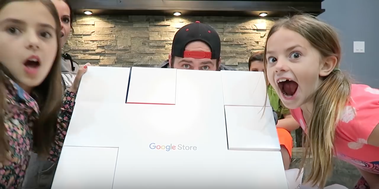
Thank you, ThinkWithGoogle. That’s just what we did – we “thunk with Google”, to design and produce their Unboxing box. This was sent to hand-selected YouTube celebrities to promote the Google Store, and designed to have an element of surprise when unveiling each featured technology product. And the response was simply outstanding:

4 million views, with 11 million projected by Christmas.


And also, some sweet comments straight from the Unboxing YouTube celebrities themselves:

 “That’s the best part, the packaging. ‘Gavin came in, and he’s like “This packaging is legit.’ And you know when Gavin thinks your packaging is legit, you’ve got a great product.”

Thanks, Gavin & Shay fam! And from Captain Sparklez…

“What?! This is the coolest packaging I’ve ever seen in my entire life. I don’t even want to disassemble this.”

We’re blushing! That’s the highlight, but let’s backtrack (spoiler alert: here’s where we start to talk about ourselves, boxes, and Google, a lot)…

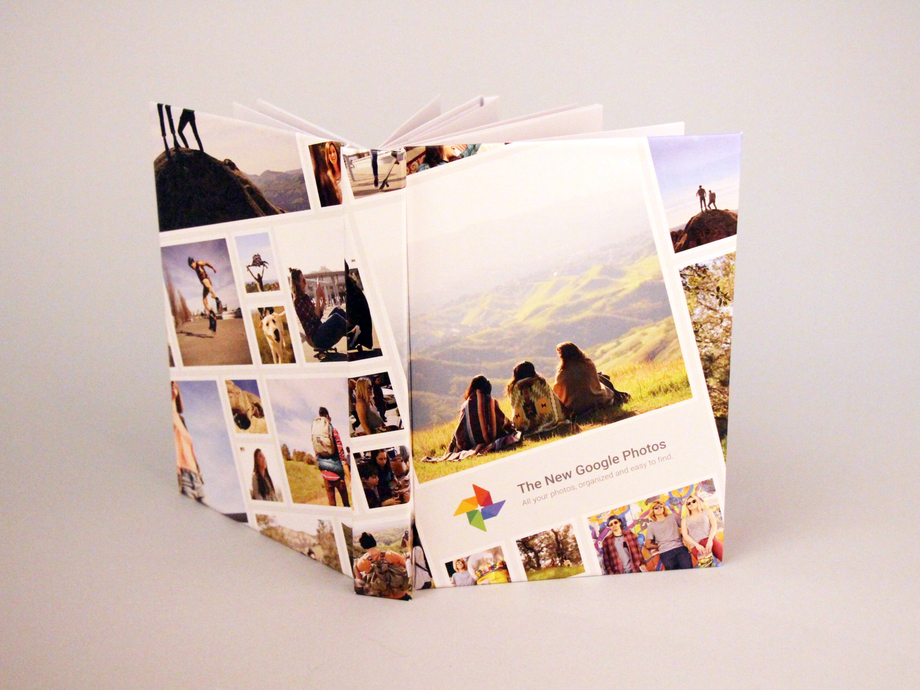
A few months back, during the development of the pop-up book with the agency Toaster for their Google Photos app, we were on a string of emails with Google brand. (NBD.)

Google_Popup_Book_12_resized

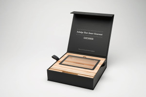
Fast forward to September, when it came time to develop the box for their Google Store Unboxing Launch, they asked us whether or not we do boxes. (Answer: look here, or even here for a bit more luxury.) I mean this is Google, and we’re Structural Graphics, so naturally, we said yes. We practically invented boxes.*

Open Gift Box - Top View

(That may or may not be true.)*

On September 16th was the initial kickoff call to discuss concepts. At first, the sole and simple goal we had to accomplish was, “we need a box to hold products”.

Originally, we started with a white box with clouds. All of these 7 technology products, which can be seen in the Google Store, could have easily been thrown into any old, standard, 8-sided-vanilla-box. But that’s not really our style.

We then started with what any sensible person does in this day and age: we Googled it. We googled the Google products to get grasp on what it would need to hold, specifically the size, and how we could package that up.

As time went on, the inspiration developed. We were given a few more things to chew on:

1. Google presented us with a ‘Mood Board’, basically a brain dump of what it needed to include, and 2. What not to do: not a traditional printing press or corrugate. I mean, let’s be honest here, creative freedom + super cool client = any designer’s dream. Our brainstorm session produced a list that looked like this: Rubik’s cubes, puzzle, with the idea to create more of an ‘experience’ than anything.

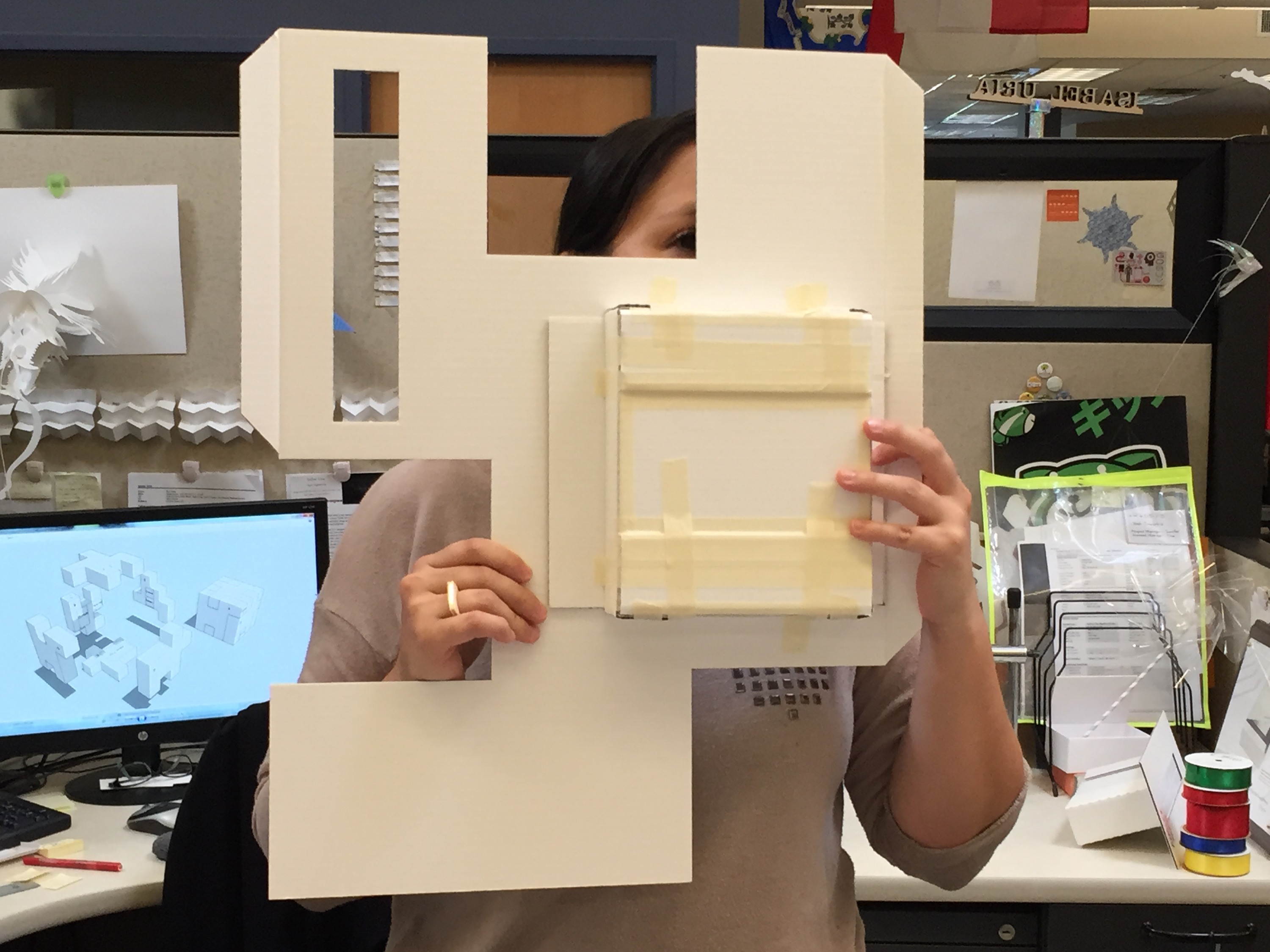
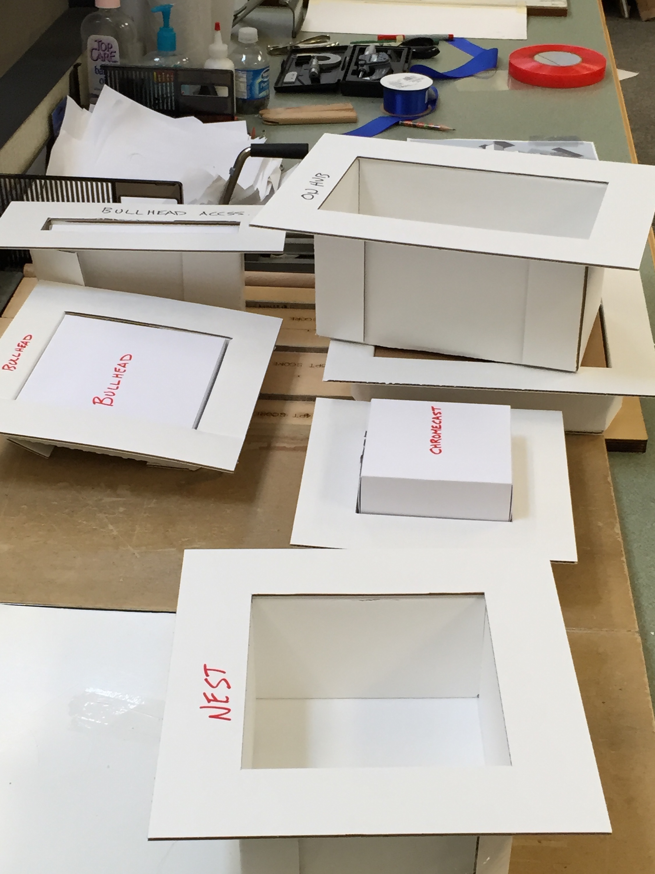
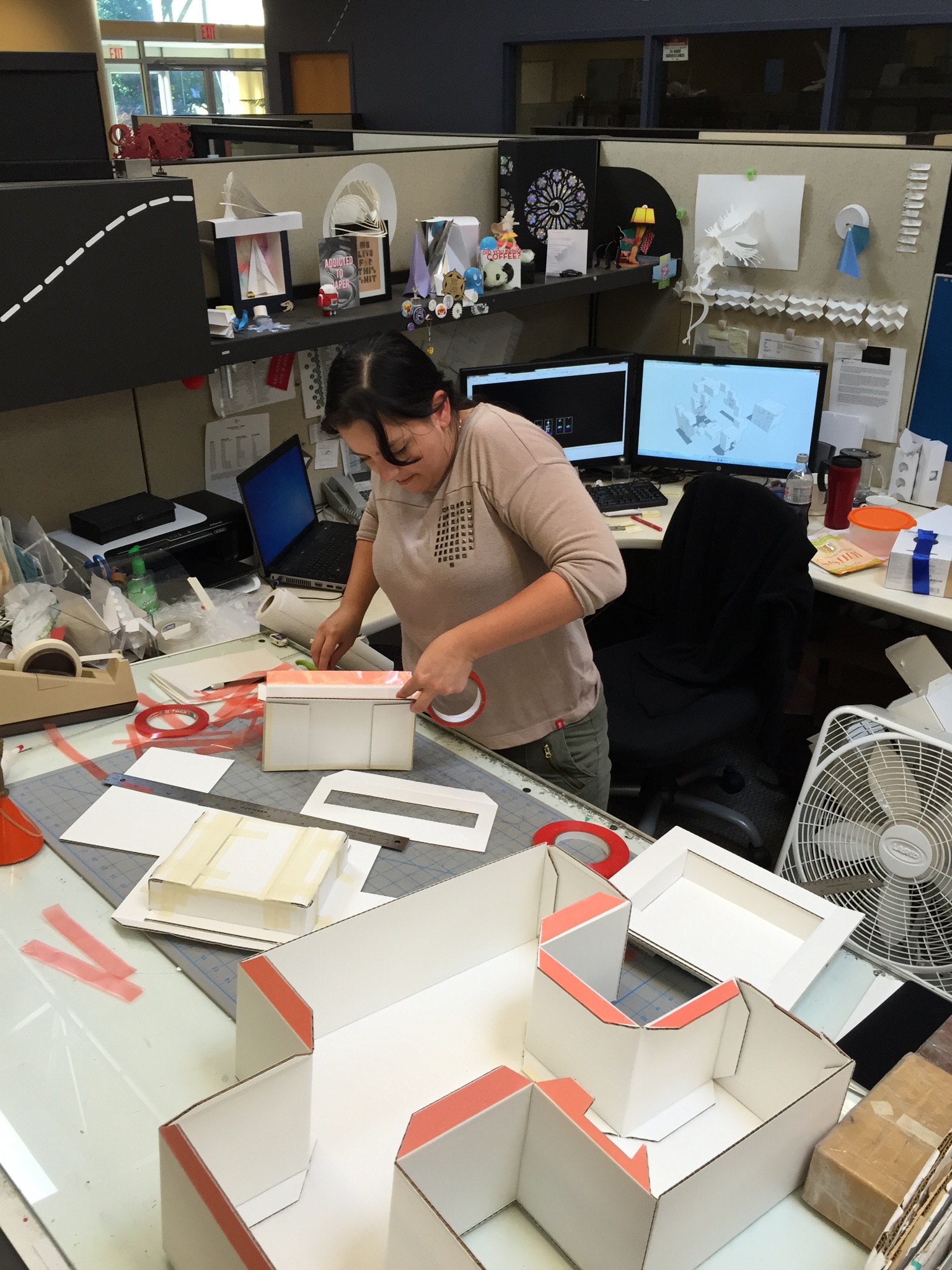
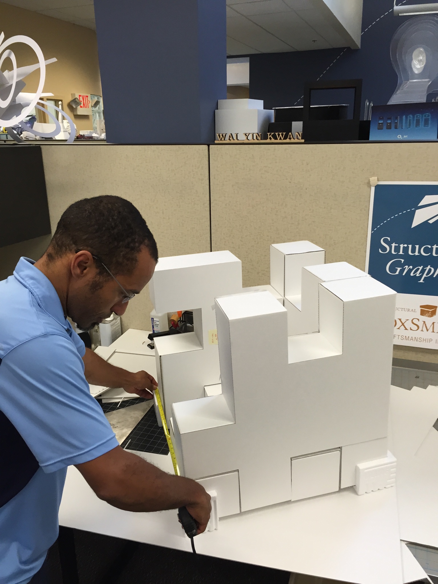
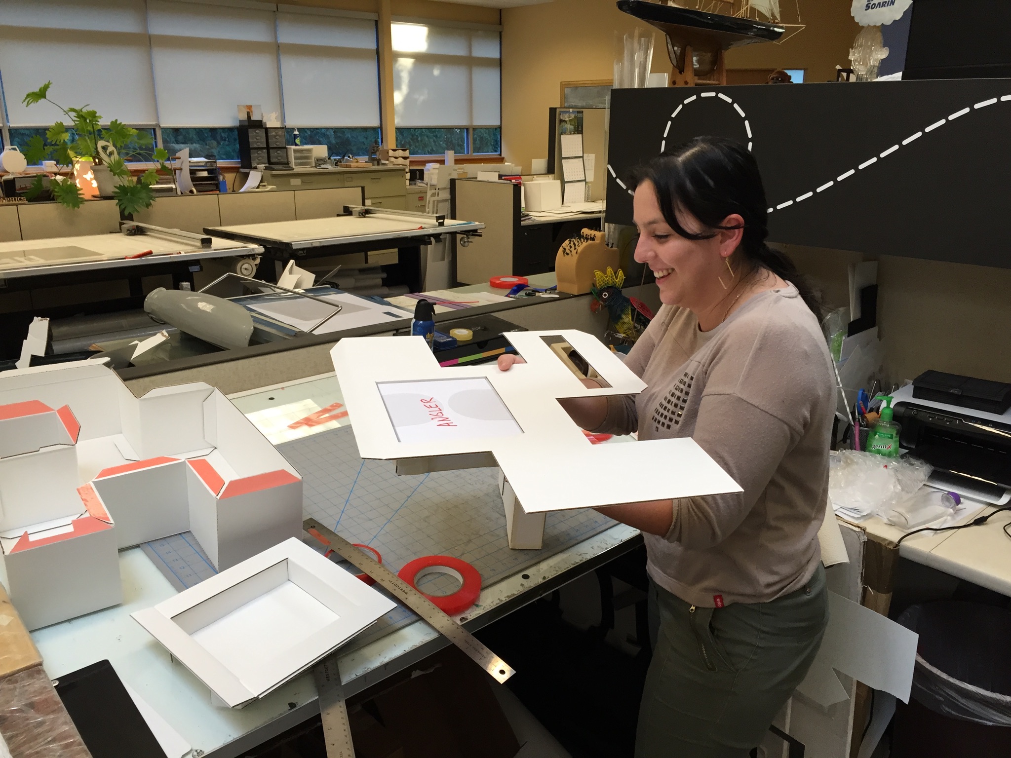
Mission: possible. Erik, one of our paper engineers, came up with the puzzle box concept, and that’s when things with the entire team really took off.

IMG_5070


IMG_5072


IMG_5073


IMG_5075


IMG_5076


IMG_5077

IMG_5079


IMG_5080


IMG_5093

As you can see clearly, it was all hands on deck! From a design and materials standpoint, this box was pretty far out of the comfort zone for our group. The materials and scale of this project was foreign. Typically, we deal with folding cartons, but every single person had hands on this project in order to turn around 2 sets of comps and “push the limits of design & engineering”.

On November 6th, upon assembly of the puzzle box, this was their reaction:

“Hubba, hubba!”

“Sweeeeeet, it’s really coming along nicely!”

“Woohoo!”


Of course, we echoed that.

So, the design was complete, but the job wasn’t over. Once these people receive it, what was the user experience going to be like?

There were a few small, yet critical details. First, was a card insert from the Google brand team, personalized & hand done with black Sharpie. Second, there was a little issue with the puzzle pieces, they didn’t quite stay together during shipment. Okay, thought our design team: how can we fix this? Why don’t we put it in gift-wrapping paper? Develop custom Google wrapping paper, which was actually functional. Genius.

Timing was a huge component for this project, considering it needed to drop by Black Friday. The second comp turn-around time was 3 days, and because of timing, we sent a template without sending a second comp. They never received a final produced prototype (only the press proof) before shipping to the influencers.

The night before delivery was crunch time. Gustavo, Vice President, Operations, and Teresa, Director of Business Development, left Mexico at 1:45am for delivery. They had 2 hours and 15 minutes to make it. From there, it was Fed Ex same day shipped, with critical care, and a contract with independent TSA couriers. Anddddddd, *sigh* just in time.

You might notice, if you’ve been paying attention to the timeline, that one of the most impressive parts of this story was the timing it took from concept to influencer delivery: 7 weeks.

“Amazing work under a brutal timeline.”

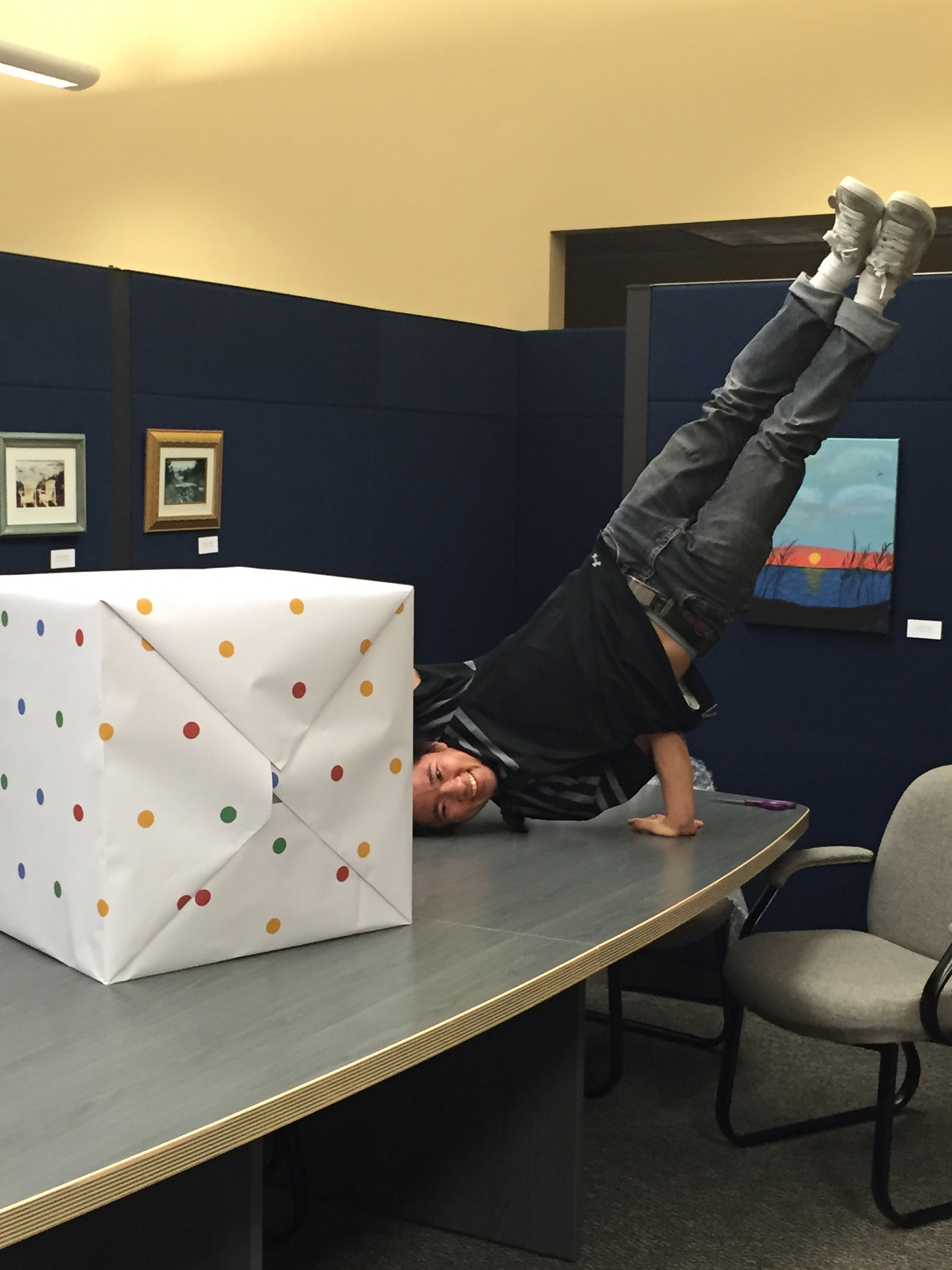
And just like that, that was it. 7 weeks. 7 products. 24 pounds without products, 35 pounds with products. Lots of hard work, and of course, a little bit of play…
IMG_5098

Watch the Unboxing for yourself below, or via these links: ShaySparklezAndrea and Maya.

Shay

Shay @ 7:33 – “That’s the best part, the packaging.”

Captain Sparklez

Captain Sparklez @ 1:55 – “What?! This is the coolest packaging I’ve ever seen in my entire life. I don’t even want to disassemble this.”

Andrea

Maya
 

The Finer Things: The Leading Hotels of the World

Most of us have hobbies or activities that we love that drive us to get out of bed every morning (other than a steamy cup of coffee). For some of us, it’s reading, others, it’s skiing… exercise, playing an instrument, cars… the list goes on.  For others, it’s travel, and for those of us that appreciate that finer things in life, a membership to a luxury hotel collection with travel perks is just the ticket.
Comprised of more than 400 hotels in 80 countries, The Leading Hotels is one of the largest luxury hotel collections in the world.

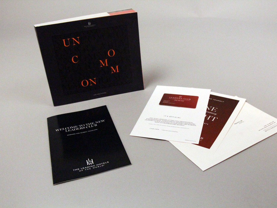
We weekly prepare and distribute nearly 2,000 member kits for new or renewing The Leading Hotels of the World members.

Woah.

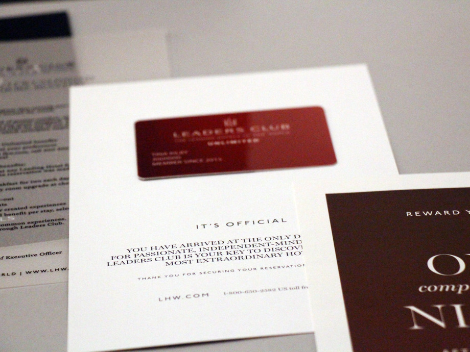
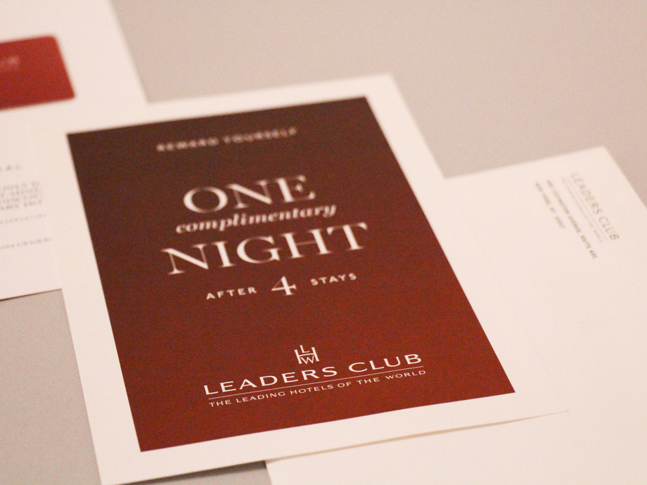
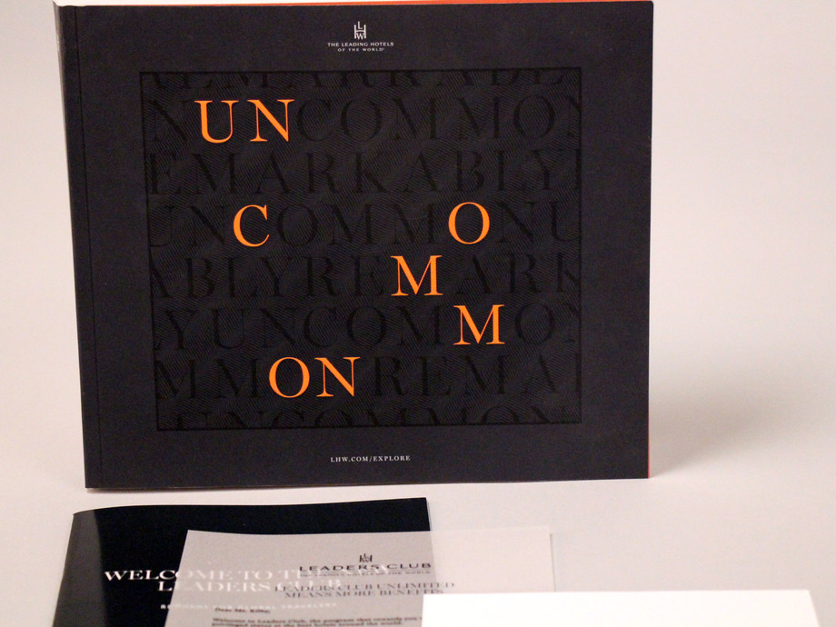
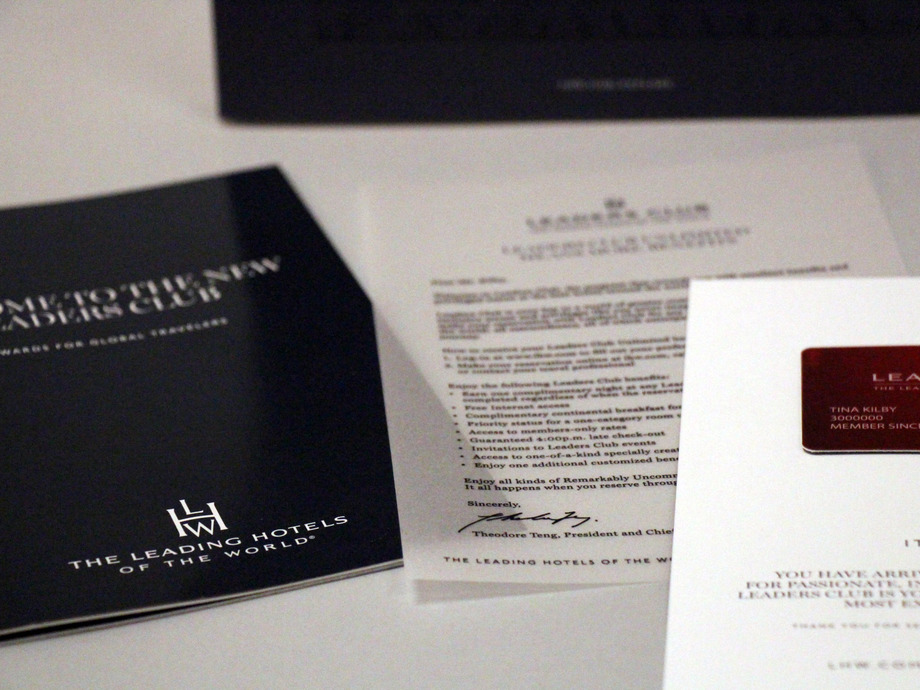
The new and renewing members have an taste for elegance, which is why we work hard to make sure that each member receives white-glove service in the form of a hand-crafted welcome kit. Let us show you…

 Leading_Hotels_of_the_World_2__0__136_resized

Leading_Hotels_of_the_World_11__0__136_resized

Leading_Hotels_of_the_World_12__0__136_resized

Leading_Hotels_of_the_World_15__0__136_resized

Leading_Hotels_of_the_World_16__0__136_resized

Structural Graphics prints in volume and stores in inventory all common components, seen above:

• Brochures
• Comp cards
• Envelopes
• Corrugate shipper
• Catalogs

The images speak for themselves. The details – each component, accompanied by variable data and images – are truly what make this kit so special.


“Structural Graphics has been a vital partner to the operations of our Loyalty Program in the wake of extreme membership growth. The onboarding process was thorough and we felt a strong commitment from the team to making the transition seamless and undisrupted from the get go. The team went above and beyond to satisfy our highly-personalized requirements with innovative ideas that saved us time and money in the end. One of which consisted of recreating an entire image library, assigning a unique image to each of our 400 hotels, which was formerly managed in-house. Because of their unique approach, we were able to start phasing operations earlier than scheduled. Over the last year we’ve experienced nothing but unwavering dedication to our partnership. The team I work with is highly-engaged and responsive; they even hosted me on a site visit to their fulfillment facility in Mexico and at their office in Essex, CT. Bringing on Structural Graphics as our fulfillment partner has been a fruitful business decision, I do not fear that they will not be equipped with the skills and knowledge to accommodate our changing business needs. I look forward to many rewarding years of partnership.”
– Julie Oleskiewicz, Senior Manager, Loyalty Marketing at The Leading Hotels of the World

We’re blushing! Hey Julie, we really like you, too.

Haptic Brain / Haptic Brand

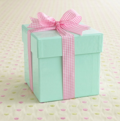
Most of us are lucky enough to know the rush of excitement we get from opening a package.  First, there’s the element of surprise.  But then there’s also that smell of new packaging (you know what I’m talking about), and the *swoosh* sound the box makes when you lift off the lid.  Ahhh.

A light blue box wrapped with a pink ribbon.

This is not a coincidence. Paper quality has been proven to have a significant effect on consumer response. Companies, such as Apple, put as much effort into their packaging as they do into their products.  More than 50% of the human brain is devoted to processing sensory experiences.  Touch, in particular, impacts how we make sense of the world. Therefore, how things feel influences our thoughts and behaviors, our comprehension and retention of information, and our emotional connections.

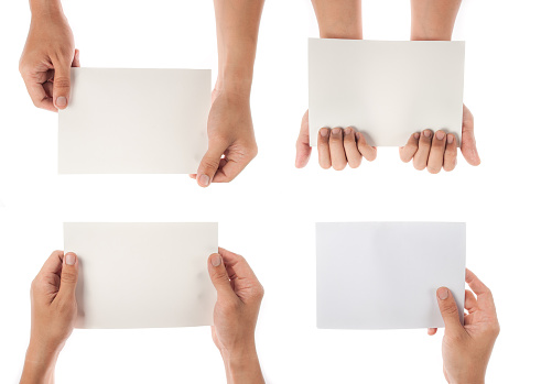
collection of hand holding paper isolated on white background

We were lucky enough to attend this year’s UCDA Conference in Orlando, Florida.  There were some extraordinary speakers, including Daniel Dejan, a widely respected, award-winning graphic designer, art/creative director, production manager and print buyer. His topic was “Haptic Brain, Haptic Brand”, which focused on communications through the lens of neuroscience.

Capture

Haptic Brain, Haptic Brand

‘Haptic Brain, Haptic Brand looks at communications through the lens of neuroscience, exploring how media shapes the brain and consequently the way a brand is perceived. This book examines haptics — the study of how what we touch shapes what we feel — and explores the science behind why our haptic brains respond so well to haptic brands. Case studies from three of the world’s best-known brands (Apple, BMW and World Wildlife Fund) highlight the communicative power of touch in action.

“Paper matters for brands that matter. The collective power of this research, along with Dr. Eagleman’s expert insights, show why marketing professionals and the publishers of high-end magazines and books continue to rely on paper as a key ingredient of the brand experience. They recognize, as we do, that consumers are wired to interact with paper like no other medium.”
–Jennifer Miller, EVP of Coated Business and Chief Sustainability Officer, Sappi Fine Paper North America.’


[Source – where you can also request a copy for yourself!]

Here are some main points from each of the three case studies presented in ‘Haptic Brain/Haptic Brand”:

Case Study #1 – Apple


Apple’s entire brand has a serene simplicity and elegance about it.  As mentioned in ‘The Communicator’s Guide to the Neuroscience of Touch”, “Critics say Apple’s iPhone seems more like a stone you might find in a stream than a device, similarly, the package it comes in defies traditional notions of what a box can be”.

They also pull a quote from The Gaurdian that makes so much sense, “Apple pays as much attention to its packaging as it does to its products… getting it just right as [an] obsession.”

It’s clear that a brand such as Apple has to be doing something right, and we have a hunch that creating that beautiful experience has something to do with it.

Case Study #2 – BMW


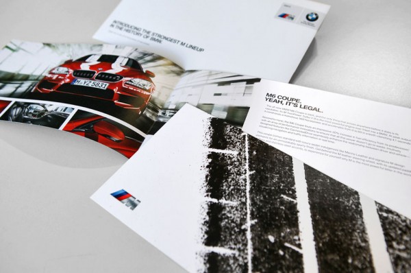
BMW wanted something special for fans if its M6 Coupe, so they had a professional driver take an aggressive, 560 horsepower car and do donuts on paper taped to the road, spraying ink onto the cars rear tires.  They used that paper with the tire marks for their upcoming direct mail campaign.

Manuel Sattig, Manager, Brand Strategy & Communication, said “We said, ‘there’s no way to capture the M performance on paper.’ And then we did it.”

Case Study #3 – World Wildlife Fund

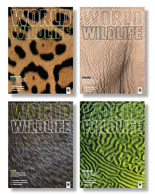
WWF_Covers2

In order to make world’s species and places more tangible, World Wildlife Fund created World Wildlife. This magazine includes thoughtful design, first-class printing, and fine paper to bring images to life. This provides a physical touch point to inspire readers to preserve the planet.


Needless to say, the best communicators incorporate touch into their brand experience.  How are you adding that extra special touch to your brand? To get some ideas, take a look at our packaging options here.

And the winner is…

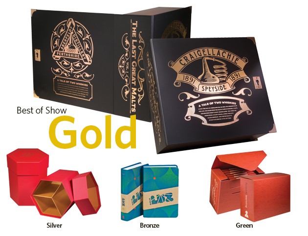
It’s no secret that when it comes to design and style with some extra POP, Structural Graphics takes the cake (or, in this case, the pizza).  Some extra validation never hurt anyone, which is why we are so thankful to have been named winners of the Fibermark’s 21st Annual Specifier Best of Show Gold Award for our Bacardi Limited Dewar’s Influencer Kit.

Fibermark Specifier Award

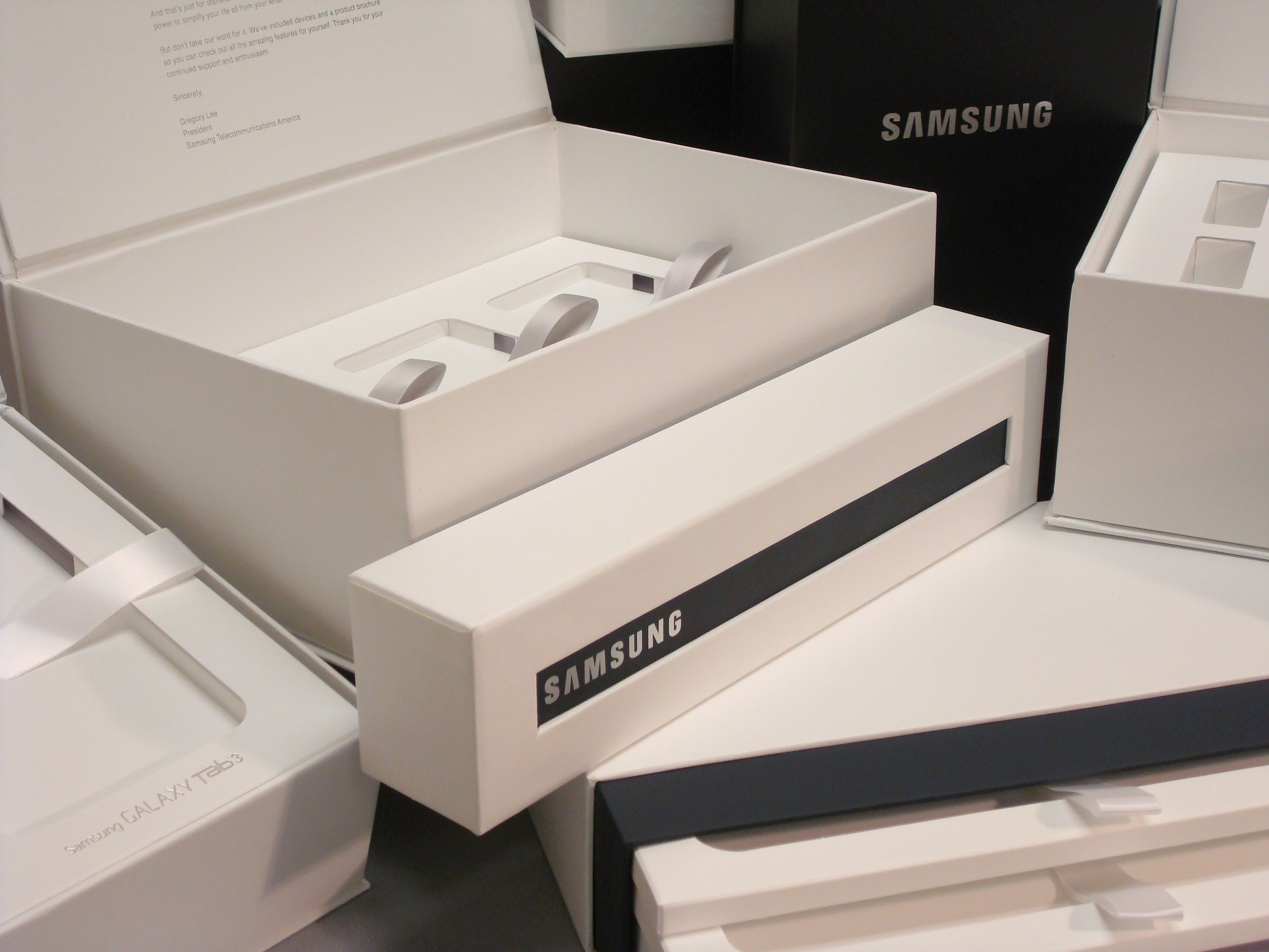
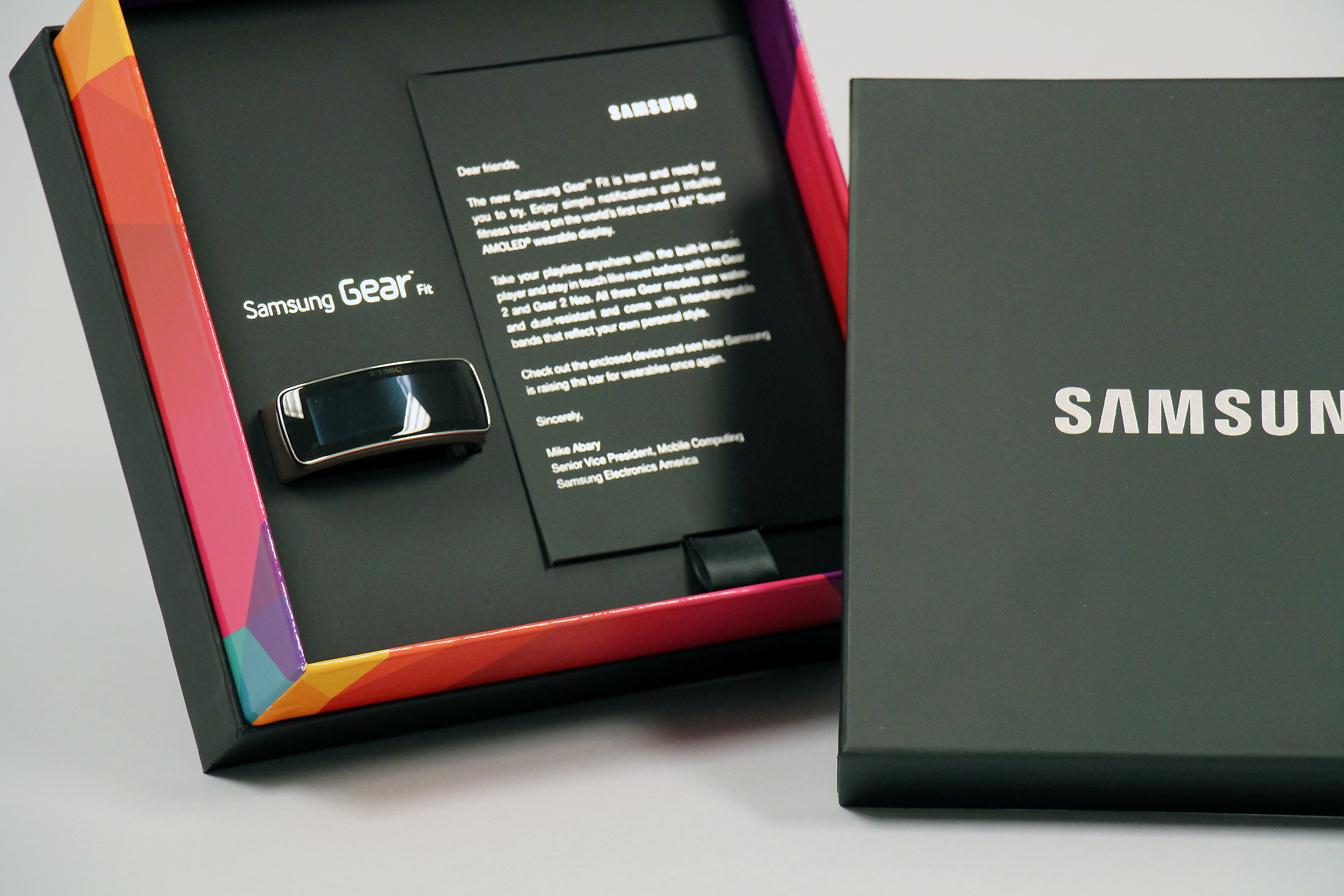
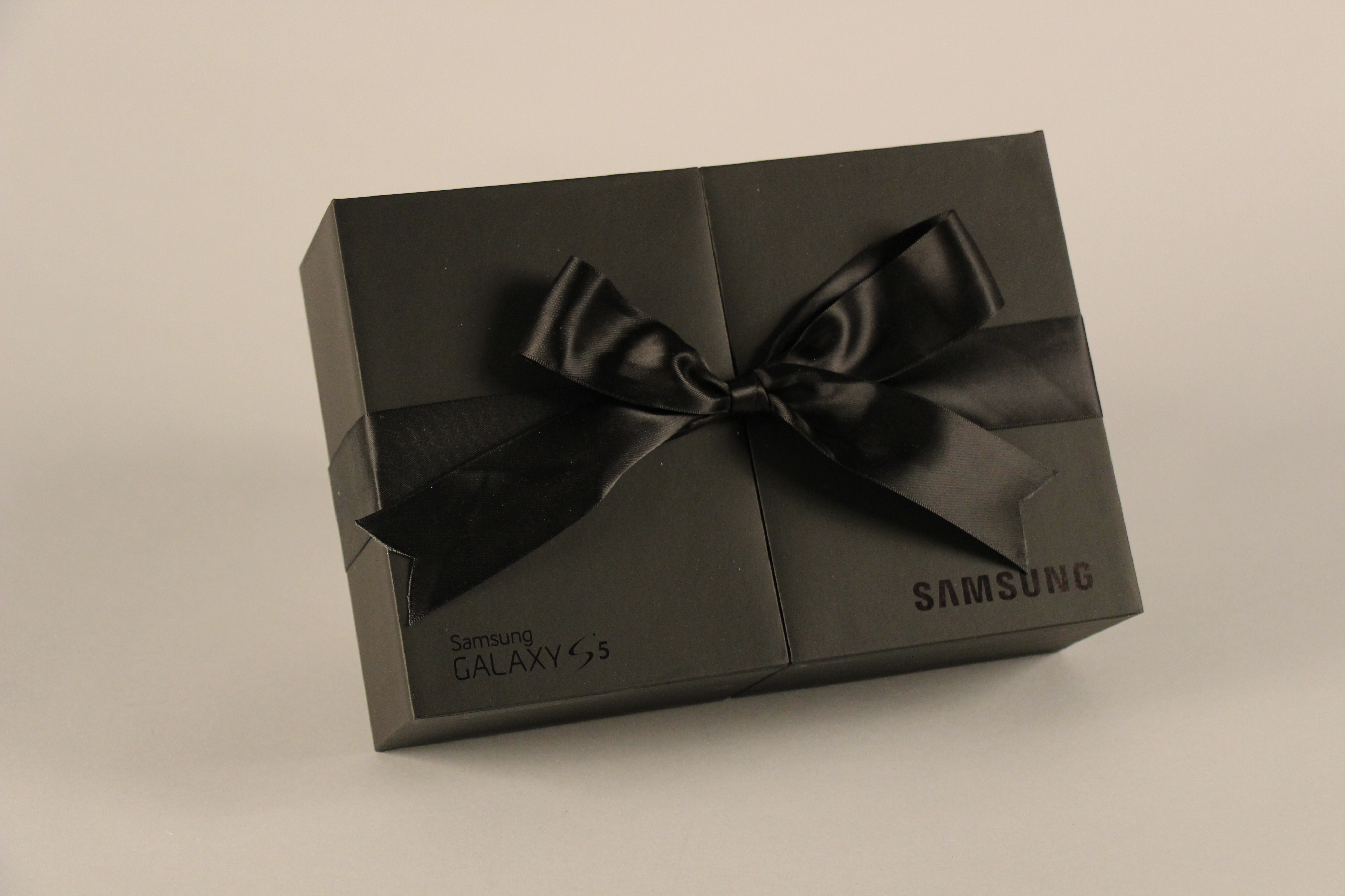
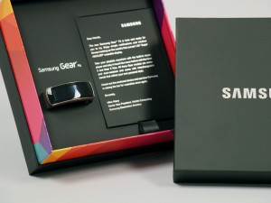
The awards didn’t stop there, either! We were also recognized for excellent for our Samsung GS3 Mini Small Book Launch Kit, Samsung GS5 Gold VIP Launch Kit, Samsung Gear Fit VIP Launch Kit (see these at TheBoxSmiths.com). A special shout out goes to TracyLocke, the agency who we collaborated with on all of the Samsung projects.

DSC03720
Samsung GS3 Mini Small Book Launch Kit
IMG_0036
Samsung Gear Fit VIP Launch Kit
IMG_3118
Samsung GS5 Gold VIP Launch Kit

And… also, we are very thankful for the pizza party brought to us by the Fibermark team themselves, yum!

Pizza Party
Pizza party!

This is the second award that our Dewar’s Influencer Kit has won this year, also winning a GDUSA American Package Design Award earlier this year.

Design Team
Structural Graphics design team with awards

So often, the response to Structural Graphics is “Oh, the people who do all the pop-up stuff?”

We live and breathe “pop-up stuff”, we practically invented it! Many people are surprised to hear that we are doing way more than that, and getting recognition for it, too.

So, whether you need some pop-up stuff or packaging, you can call on Structural Graphics – anything paper is possible!

Looking for packaging that’s a little more luxurious? Visit The BoxSmiths for luxury packaging that performs.

A Brief History of Packaging

It all began with some twigs and leaves…

For most of us, shopping is an integral part of our daily lives — food for our fridge, supplies for our offices, a new pair of shoes.  Chances are, whatever it is we may need will be wrapped up in a nice little bag or box.

Packaging is everywhere. But do you ever wonder where it all began?

Shopping list


Packaging as we know it today has been the result of a long development process.

Packaging is an industry that has been around since the beginning of man. In ancient times, packaging was used to transport, assist, store or protect items using natural materials such as leaves. In the Middle Age, wooden barrels were the most common way to store goods.  In the 1900’s, paper and cardboard became more important packaging materials.  As our world continued to evolve, so did packaging.

Ancient people

The Industrial Revolution sparked a tremendous change in the way that people lived their lives. Ultimately, hands were replaced with machines in the workforce, which lead to faster and higher levels of product production. This naturally created a higher demand for different types of packaging, such as:

1. Storage and transportation bins

2. Bags

3. Food packaging methods

4. Primary packaging materials

5. In-store packaging options

The Great Depression brought in the rise of the “self-service” culture where people began going to grocery stores more often.  This new trend changed the way that items were packaged.  The use of packaging turned into more of a sales tool, also known as the “silent salesman”, instead of a tool to simply hold items. After World War 2, new materials were explored, such as plastic and aluminum foil.  This offered the convenience of single use and “throw away” packaging, which was highly attractive to the supermarket culture.

In the later half of the 20th century came the rise of digital technologies, and the producing world became more competitive. Businesses now had a way to differentiate themselves on the shelf. The marketplace became more competitive as mass producing allowed businesses to venture globally.

Shopping icons

Today, packaging plays a primary role in consumers buying decision.  It’s a marketing tool that directly impacts point-of-purchase. Packaging is an industry that continues to be sculpted and molded to fit current trends.

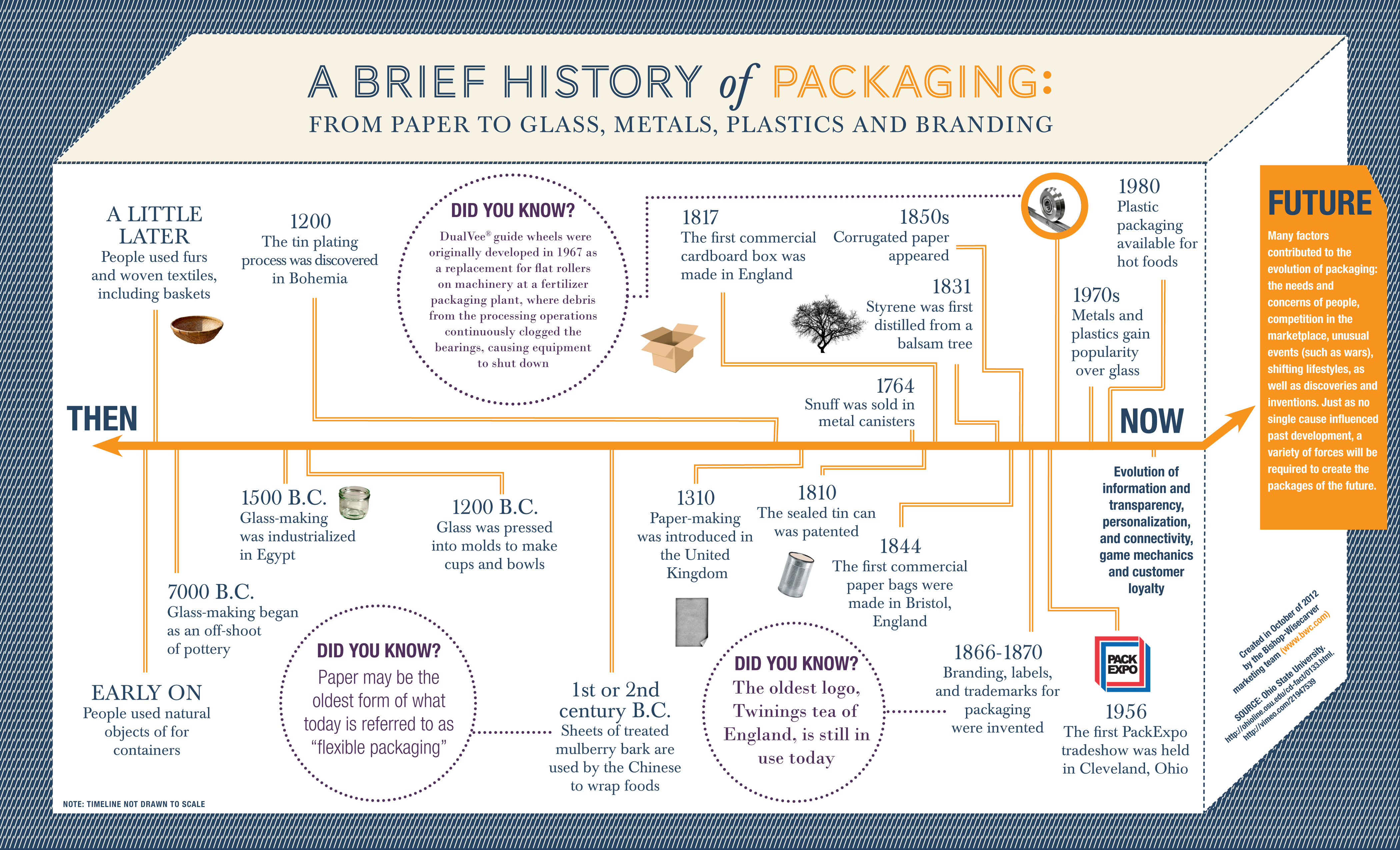
More of a visual person, or just can’t get enough of the history of packaging? Take a look at this infographic:

History of Packaging Flowchart


Whirlpool’s Marketing Gets the Right People Talking

Whirlpool’s 360-degree approach to marketing, incorporating web, TV and print, has made it’s brand presence more relevant and attractive to consumers in the home appliance marketplace.
Continue reading

Packaging Trends: What Your Consumers Love

“The details are not the details. They make the design.” – Charles Eames, American graphic designer

Structural Graphics takes a special interest in what retail consumers want to see on product packaging, so when we came across Deborah Ginsburg’s article, “Top Packaging Design Trends for 2015” we perked up, eager to see what insights the founder and CEO of Strategia Design had to offer. Turns out, we couldn’t agree more. Continue reading

Behind the Scenes: Samsung Chef Collection

Check out a behind-the-scenes peek from our own Alex Bates, VP, Paper Engineering & Design. He wrote about the process and inspiration behind one of our fave packaging projects done in collaboration with TracyLocke for Samsung’s Chef Collection, a suite of high-end appliances. Continue reading