Category: Direct Mail Marketing

5 Red Paper Plane Templates to Save You Hours of Work

Here’s the thing.

As a marketing professional, you know that a solid strategy is the key to any successful direct mail marketing campaign. But between the research, meetings with creative, and tracking ROI, it can often feel like there’s just not enough time in the day to think of something truly unique to send to your customers.

Until now.

We’ve teamed up with the experts at Red Paper Plane, Structural Graphics’ online division, to make your life (and your marketing) a whole lot easier. With an assortment of ready-made templates, Red Paper Plane gives marketers like you the opportunity to customize your favorite design at the click of a mouse, no training required.

Think Red Paper Plane might be right for you? Here are some templates to get you started.
The Pop-Up Cube
One of our most loved and most popular formats is the Pop-Up Cube. It’s a customizable direct mail template that ships flat and, when opened, springs to life literally popping up into the air. The high achievers of direct mail, Pop Up mailers are attention grabbing, leave a lasting impression and boost response rates.
The Flapper
The Flapper, one of Structural Graphics’ exclusive patented designs, is kind of like a book you just can’t put down. What makes it so unique is the way it folds continually into itself, revealing four separate layers of messaging ranging from text, photographs and even QR codes. Choose from sizes ranging from mini (3.5” x 2.5”) to tablet (9.5” x 7.25”).
The Video Brochure
Video in Print brochures offer an effective option when it comes to getting your company noticed. One of the biggest advantages of combining these two mediums is the ability to create a multi-sensory experience around your brand’s messaging. This can translate into better brand loyalty as well as more sales and leads.

The VR Viewer
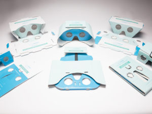
The introduction of inexpensive VR headsets has made it possible for brands to deliver the ultimate interactive experience to consumers, allowing them to literally walk a mile in someone else’s shoes. With our SleekPeeks, you can fully customize these viewers with your branding, logos and imagery. Not only are they cost-effective, but they ship flat and take seconds to assemble.
The Exploding Page
On the outside, the Exploding Page appears to be a standard looking direct mail piece, but when opened, it expands to twice its original size. Aside from creating nearly double the space for your brand’s messaging, the Exploding Page is an extremely powerful mailer which can be designed to incorporate coupons, QR codes and even a hidden pocket to hold brochures or a DVD.
Want to Better Track Your Direct Mail’s ROI? Here’s How.

There’s no denying it.

We’re living and working in an information revolution. Here, content is king and, as marketers, advertisers, PR professionals, and brand managers, if we can’t get the attention of our target audience immediately (often through social media or websites) it’s time for a new plan.

But in our constant pursuit of clicks, likes and retweets, successful marketers must look past relying solely on digital content to deliver their messaging. Instead, this “revolution” creates an opportunity to develop fully-integrated campaigns that blend print and digital.

This is why the web key is becoming a powerful marketing tool.

Web keys are unique in that they link both physical print and digital media. Aside from their size, which marketers can integrate into brochures, mailings or handouts, these small, palm-sized (or smaller) tools allow you to track who is actually interacting with your marketing.

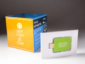
NetApp used the above pop-up cube to deliver information about its Flash FAS product. The bellyband, which held the cube in place, featured an embedded paper web key that users could insert into their flash drive to learn more about the product and to receive a demo.

So, how do they work?

Similar to a USB flash drive, a web key plugs into the USB port of a computer and is able to direct users to a specific landing page or company website, where you have the best chance of turning a prospect into a customer. Web keys are also incredibly cost-effective because they’re already built into your marketing. Plus, at Structural Graphics, we’ll provide you with campaign analytics to help you learn who is visiting your site, for how long and what they’re interested in.

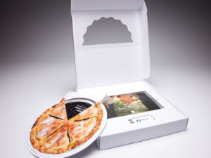
Nationwide Insurance used the above pie box mailer to deliver information about CareMatters, its long-term care product, to agents nationwide. Inside the box was a double-layered pie made out of paper that delivered different information as you turned the upper layer of the pie. There was also a brochure and a web key inside the box that drove agents to a unique landing page, specific to their agency, where they could learn more about this product.

In today’s digital space, there are so many messages competing with yours. Contact us to make sure yours isn’t getting lost.

Make Your Marketing Explosive: Meet the Exploding Page

Is your marketing team looking for an explosive way to deliver a message, introduce a product or build on its story?

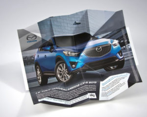
The Exploding Page, one of Structural Graphics’ customizable designs, appears to be a standard looking direct mail piece on the outside, but when opened up, it expands to twice its original size. Aside from creating nearly double the real estate of its closed size, the Exploding Page is an extremely powerful mailer or sales aid which can be designed to incorporate coupons, QR codes and even a hidden pocket to hold brochures or a DVD.
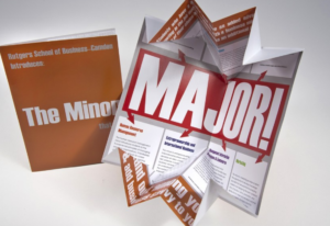
What’s great is that this design still retains that “wow” factor when opened.

Take this piece by Rutgers School of Business. The piece was created to deliver information about its business program to prospective students in a uniquely surprising way.

And how about this piece for Mazda? The automotive company decided to use the Exploding Page to introduce its new CX-5 vehicle in Canada. Not only does the image of the vehicle appear front and center, but Mazda’s marketing team was able to promote their Facebook, YouTube and Twitter pages by strategically leading them through the brand’s messaging.

Curious to try the Exploding Page for yourself? Get in touch with us and let’s figure out how to take your marketing to the next level.

The Power of Print Marketing

Written By Isabelle Bowden

The digital revolution has propelled society into a new era of engagement and creativity. This shift has significantly changed the marketing industry. Social media and technological innovation illustrate the power of digital marketing. However, in this fast-paced world of screens and computer chips, high-touch print collateral can, and does, have a surprisingly profound impact.

Interactive print marketing is a powerful tool which allows your brand or business to stand out from the competition. Various colors, dimensions, textures, and even lights, sounds, and video contribute to an effective multi-sensory experience with a lasting impact. Below are four reasons to choose print marketing for your next high-impact campaign:

  1. Effective recipient engagement

Paper has been a valuable resource since the earliest civilizations. The tactile fulfillment and sensory experience associated with print marketing is undeniably effective. The vast amount of online information dilutes the impact of digital messages. Standout from the digital clutter by choosing a dimensional print promotion from Structural Graphics!

  1. Creativity and personalization

With many options for print marketing, your business can stand out with unique and thoughtful designs. Think sizes, dimensions, finishes, and other fine details that will make your creation valuable. Visit Structural Graphics and Red Paper Plane to browse a variety of designs and examples.

  1. Promotes relationships

The value of a handwritten note is undeniable. This same value applies to print marketing which demonstrates an investment in business relations. Dedicating time and resources for print marketing will have more of a lasting impact than an email, already lost in the inbox. In fact, this 2018 FedEx survey reveals that “85% of participants said they were more likely to shop at a small business that had customer printed materials such as business cards, signs, and flyers.”

  1. A more established, unique brand/presence

Print marketing contributes to a more established and unique brand and/or presence in an industry. Consistent aesthetic elements on your print results in instant recognition! FedEx states that “80% of small business owners felt that professional printing services helped their business stand out from the competition.” Now is the time for your brand to be recognized!

Despite the growth of digital marketing, it is evident that print will continue to play a critical role in effective marketing mixes. Visit Structural Graphics online on our website or Youtube channel to learn about and see more of our work. We are constantly adding new designs, so make sure you check out all Structural Graphics has to offer. When it comes to dimensional print marketing, we are the 42 year leaders in the business, and we’re here to make your brand stand out!

Resources:

Fedex Office Survey Confirms that Consumers and Small Business Owners Prefer Print

7 Tips to Help Your Business Save on Postage (Infographic)

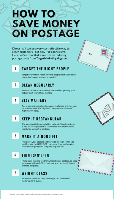
We’ve seen it firsthand; direct mail can be a wonderfully cost-effective way to reach targeted prospects and current customers with your brand’s marketing. But costs, like postage, can drive up the price if you’re not careful.

Inspired by the folks at TargetMarketingMag.com, we created this handy infographic showcasing some of our favorite tips on how to save money on postage. Enjoy!


Click here to read the full article by TargetMarketingMag.com.

Print Marketing and the Power of WOW with Ethan Goller, Structural Graphics President

Structural Graphics President, Ethan Goller, shares the “making of” story behind the ground-breaking Toyota Magazine Insert and how SG brings “WOW” to the masses on “Podcasts from the Printerverse”. Give it a listen here: 


Video Meet Print: How to Convince Customers to Remember Your Brand

What if a prospective client or customer could watch your brand’s story anytime and any place simply by turning a page or opening a brochure?

If this sounds like something from a Steven Spielberg film, you’re only half right.

Video in Print, though still a fairly novel concept, is completely attainable (and affordable) if you know where to look and what to look for. One of the biggest advantages of combining these two mediums is the ability to enhance your brand messaging. Video is highly visual and auditory, which means it’s easier for many people to remember than static, silent words and pictures. When consumers remember your video content, they, in turn, remember your brand. This can translate into better brand loyalty as well as more sales and leads.

Click here for some tips and tricks when it comes to using Video in Print for your marketing needs.

Here at Structural Graphics, we’re proud to have more than a decade-long relationship with our video component supplier. Even better? We’ve been to their factory and have personally certified their facility to ensure each component is of top quality and has met the standards for consumer safety, health and environmental requirements in the U.S. and Europe.

Interested in trying Video in Print for yourself? Click here to see why you should choose Structural Graphics for your project today.

Why Integrating Direct Mail with Digital Targeting Will Get You Noticed

At Structural Graphics we are the leaders of the dimensional print marketing industry, and we have been for over 40 years. We are constantly re-defining what print can be by providing our clients with attention-getting solutions that stop people in their tracks. Our formats are engaging on their own, but by adding a digital element such as a Web Key, Video in Print, Virtual Reality, NFC tag, or QR code the piece becomes even more effective.

Check out the following article from CBT Automotive Network, Integrating Direct Mail with Digital Targeting, to learn 5 tips on how to incorporate technology in print in your current marketing efforts.

Structural Graphics’ Look Back on 2017

As we delve into another year, Structural Graphics looks back at some of the most effective dimensional print projects we worked on in 2017, from SleekPeeks® to disco balls (and even a mini planetarium!).

SleekPeeks®

The introduction of SleekPeeks®, inexpensive virtual reality headsets created by Structural Graphics, made it possible for brands like Porsche and USPS to deliver the ultimate interactive experience to their audience.

Lincoln Video Mailer

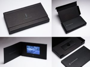
At the National Postal Forum in May 2017, our high-end video mailer for The Lincoln Motor Company’s “See it First” campaign was selected as the Grand Champion Award winner of the Irresistible Mail Awards trophy. The Irresistible Mail Awards is a USPS program that highlights mail pieces that increase engagement through innovative design, print or digital technologies. Structural Graphics structurally designed and hand assembled the piece.

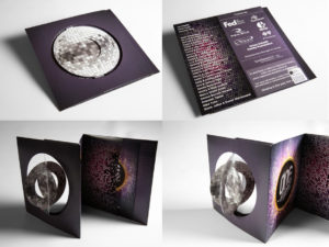
Disco Ball Invitation

Featured as the 60-second Super-cool Fold of the Week, our “Simply Cool Swinging Disco Ball Accordion Invitation” was designed and produced for the Regional One Health Foundation. They used this mailer to invite people to their annual ONE Night Fundraiser. The invitation shipped flat, but the paper die-cut spheres on the cover immediately twirl in succession when you open up the mailer to create the illusion of a dimensional disco ball.

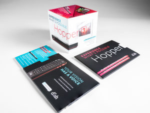
Dish Network Pop Up Cube

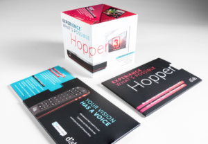
Used as a unique handout at the CES Show in Las Vegas, this pop up cube was delivered inside a half-sleeve, giving the recipient a sneak peek of what was on the inside. As the cube slides out, it immediately pops into shape delivering information about Dish Network’s award-winning DVR, The Hopper®. Click here to see it in action!

This Book is a Planetarium

In her newest book, “This Book is a Planetarium,” designer, innovator, and author Kelli Anderson takes commonly known mechanisms and replicates them through pop-up paper designs. Kelli came up with the initial engineering in her studio and then reached out to the team at Structural Graphics to make the Planetarium piece in the book production-ready. When you place the flashlight of your smartphone underneath the Planetarium dome, the constellations are displayed as if you were viewing them in the night’s sky.

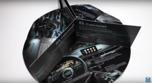
Audi Pop-Up Brochure

Our Circle Pop-Up Brochure Mailer that we designed for Audi and their printer, Hennegan, was awarded Silver in the “Dimensional Printing” category of the Gold Ink Awards. Presented by Printing Impressions, The Gold Ink Awards is the industry’s most prestigious print competition. It’s open to all creators and producers of printed materials, and encompasses nearly 50 categories within commercial printing, magazines, books, catalogs, digital printing and packaging.

The Pop-Up Cube: How Can I Make it My Own?

More than four decades ago, a simple fascination with pop-up books and paper led Structural Graphics to engineer a new advertising medium focused on dimensional print. Now, we help brands rise above their competition by thinking differently about paper and what it can do.

One of our most loved and most popular formats is the Pop-Up Cube. It’s a customizeable direct mail template that ships flat and features a 3D cube that springs into the air automatically when opened.

The high achievers of direct mail, Pop Up Mailers are attention grabbing, leave a lasting impression and boost response rates. Keep your audience interested longer so your message is front of mind with these simple tips:

Think outside the box (literally).

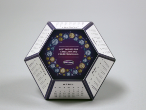
Cars.com Polygon Calendar

Aside from our standard cube, clients have also requested everything from pop-up houses, polygons and pyramids. Put your own stamp on this piece by choosing a shape that best illustrates your industry, your clients and your work.

Multiply your idea.

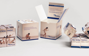
Essilor Rolling Cube

Looking for a chance to build on your brand messaging? Consider a Rolling Cube. While this format doesn’t have the same surprise and delight that a Pop-Up Cube does, it is still incredibly interactive and allows you additional space to feature your brand and/ or brand messaging.

Don’t forget the sleeve.

Dish Network Pop Up Cube

Though the Pop-Up Cube will likely be the most memorable part of this direct mail piece, it’s important to remember that it’s not the first thing your clients will see – the sleeve is. Make sure to include copy that will entice recipients to open it. Maybe consider including your brand logo. Whatever your decision, don’t forget that this is also valuable space to gain your audience’s attention and keep it.