Category: Dimensional Print Marketing

Thinking Outside the Inbox: Direct Mail for the Holidays

postbox
I always get excited when I receive mail.

One glimpse of the mail carrier, donning his USPS garb, and I wait anxiously to see whether there’s anything addressed to me. But on those days when I’ve got more than bills or credit card offers stuffed in my mailbox, that childlike excitement I felt earlier all too quickly disintegrates into something else: disappointment.
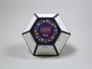
There are the flat mailers that have my name incorrectly printed on them. There are the catalogs with promo codes so buried I get exhausted from flipping through before even finding them. And there are the dreaded cards and the postcards that I barely even look at before throwing away.

Sound familiar?

These pieces all have one thing in common (besides meeting my recycling bin): they’re boring. And as businesses increase their efforts to vie for your attention this holiday season, as marketers you want to be anything but. So, if you’re not currently creating (or, at the very least, brainstorming) some ways to set your direct mail apart, you’re already missing out on the opportunity to make a memorable impression.
5

But don’t worry, it’s not too late to get your company or your products noticed in time for the holidays. Here, we’ve curated some of our most helpful tips on how to bring back that “wow factor” during the most magical time of the year.

      1. Go dimensional. Perhaps the easiest way to make a real impact with little-to-no-effort? Incorporate dimension. By incorporating pieces like our 3″ pop-up cube into your marketing, it’s easy to put forth your messaging in a way that takes advantage of 3D (but still ships flat).
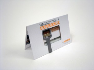
      2. Embrace technology. For better or for worse, we live in a digital world and it’s just going to get that much more – er – digitaler. Instead of rejecting this characteristic of modern life, we say embrace it! Want your print advertising to play your jingle? Want to incorporate virtual reality or LED lights into your messaging? Make your customers feel like a kid around the holidays by sending them something shiny AND bright in the mail.
      3. Video is your friend. Did you know that videos increase people’s understanding of a product or service by 74%? In case you’ve been living under a rock, video is super trendy right now. Combine video with one of our high-impact print solutions and you’ve got a powerful marketing tool.
      4. Surprise them. If a consumer is able to predict how a promotional piece is going to look or feel before they even get their hands on it, you can almost bet that it will get lost and maybe even thrown away. Make your brand as exciting as you are – that unexpected element will not only set you apart from your competitors, but it’ll leave a lasting impression in your recipients’ minds.
      5. Think Interactive. Print plays to the human senses in ways that digital tech is hard-pressed to match. By delivering a direct mail piece that recipients can engage with, you’re not only getting their attention, but you’re strengthening your brand’s longevity, too.

Feeling inspired? Have an idea for how your business can target the next generation of purchasers? Contact us to get started.

10 Commandments of Direct Mail Marketing

For your pleasure, 10 Commandments of Direct Marketing set in proverbial stone.

  1. Thou shalt include clear calls to action.
    Just as its name implies, it’s important to be extremely direct with direct mail marketing. As a business, your job is to motivate people to do something: visit your company website, request a free sample or even purchase a product you’re trying to sell. It’s important for your call to action to be concise and to the point.
  2. Know thy target like thy know thyself.
    The better you know your prospects – who they are and what they want – the more likely your message will resonate with them effectively. Not only will this help you better tailor your direct mail pieces, but you’ll also increase the likelihood of encouraging your prospects to react to your call to action (see point 1 above).
  3. Thou shalt use responsive design.
    Research indicates that nearly half of mobile phone users feel frustrated when they visit a site that’s not mobile-friendly – and who could blame them? In this day and age mobile phones, e-readers and tablets are the preferred way to access websites and email. So, if you and your business can’t keep up, you’ll probably be left behind.
  4. Thou shalt not fear staying true to thyself.
    How do you make your product or company stand out from the rest? Don’t be afraid to take inspiration from others and to make each direct mail piece your own. Use color schemes and logos unique to who you are. iBeacons, virtual reality headsets, LED lighting and pop-up books are a few ways our clients have set themselves apart in their marketing.
  5. Thou shalt track.
    In order to know which pieces get the best response, it’s essential to track the results from each and every direct mail marketing campaign. Not only will you be able to send your mailers with confidence, but you’ll also know who responds to your marketing and have an opportunity to follow up.
  6. Honor thy needs of thy customer.
    No matter how you spin it, the customer/ prospect’s needs always come first. Are they looking for a new heart medication or an organic make-up line? As a marketer, your job is to solve a problem that your customer has. Remember that.
  7. Thou shalt provide value.
    Can your direct mail piece be multi-functional? A great example of this is our pop-up cube pencil holder. Not only does the piece provide information of what a company is trying to sell or promote, but it also has longevity – recipients have kept these pieces on their desks for weeks or months because of their value. It’s a win for both.
  8. Remember to make mailers creative.
    Here at Structural Graphics and our online offering, Red Paper Plane, we use dimensional print to get people’s attention whether it’s a DIY snowman or an origami gift card holder. No matter what you’re looking to promote, we’ve got a fun, effective and creative way to do it.
  9. Thou shalt use proven techniques.
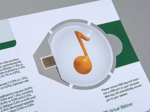
    Perhaps it’s a unique selling proposition. Or maybe it’s a web key that encourages recipients to visit your website. Whatever has worked for you in the past, use it.
  10. Thou shalt always tell a good, compelling and powerful story.
    Enough said.

Ready to get your direct mail on? Give us a call at 860-767-2661 or shoot us an email. Together we can make your direct marketing really pop.

Drink Me: Marketing in the Alcohol Industry

A few tips (on the house).

“Marketing” is a broad term that embodies a wide range of activities and disciplines that promote and sell a product. It casts a wide net that is open to interpretation; and when you throw alcohol into the equation, well things can get a little crazy.

(Wait, what happened last night?)

Cheers!

First thing’s first. When you are marketing in the alcoholic beverage industry, the same basic marketing rules still apply.

Your 4 P’s: Product, Price, Place, Promotion

So, how exactly do these relate to alcohol beverage marketing? Let’s break it down.

Product

At the risk of stereotyping, there are certain alcohols that appeal to a younger crowd that do not appeal to older folk, and vice versa. My dad loves his tried and true Tito’s (really, Tito’s, my dad is your biggest fan – going on 10 years strong which is some serious brand loyalty).  I, on the other hand, the millennial in all of my glory, am more likely to try something different simply because the packaging catches my eye.

It’s no secret that our generations shop differently: my dad has been going to the same mechanic for years, whereas I go wherever the deepest discount is, or wherever the most convenient location is.

A study in Australia determined that adolescents were more likely to gravitate towards ‘alcopops’, a.k.a. booze-y drinks that have very little actual booze in them – malt beverages, wine coolers, etc. – because the packaging is designed to look like a soft drink.

Colorful-Cans

Price

Everyone loves a good discount. It is common knowledge that if we will get a discount on buying more, we will buy more (see Sam’s Club, Costco, etc.) whether we really need it or not. And not to much surprise, when we buy more, we consume more. Shots, shots, shots shots, shots, shots, shots shots…

Price discounts and promotions can have a huge impact on volume of alcohol purchases. They can be a key marketing tool for producers and retailers.

A study conducted by Alcohol Focus Scotland found that supermarket promotions and discounts on alcohol increased sales by 20 – 25%. 

Place

Location, location, location. Anyone who has ever been in a liquor store knows that those places can get pretty crowded. So many brands are trying to promote their products on the shelves or even at the register, so it can be hard to stand out and get the consumer to pay attention and make them want to buy. Did you know that companies pay top dollar for prime shelf space in the stores?
But once you have that spot, how do you stand out among the rest of the bottles of the shelves surrounding it?

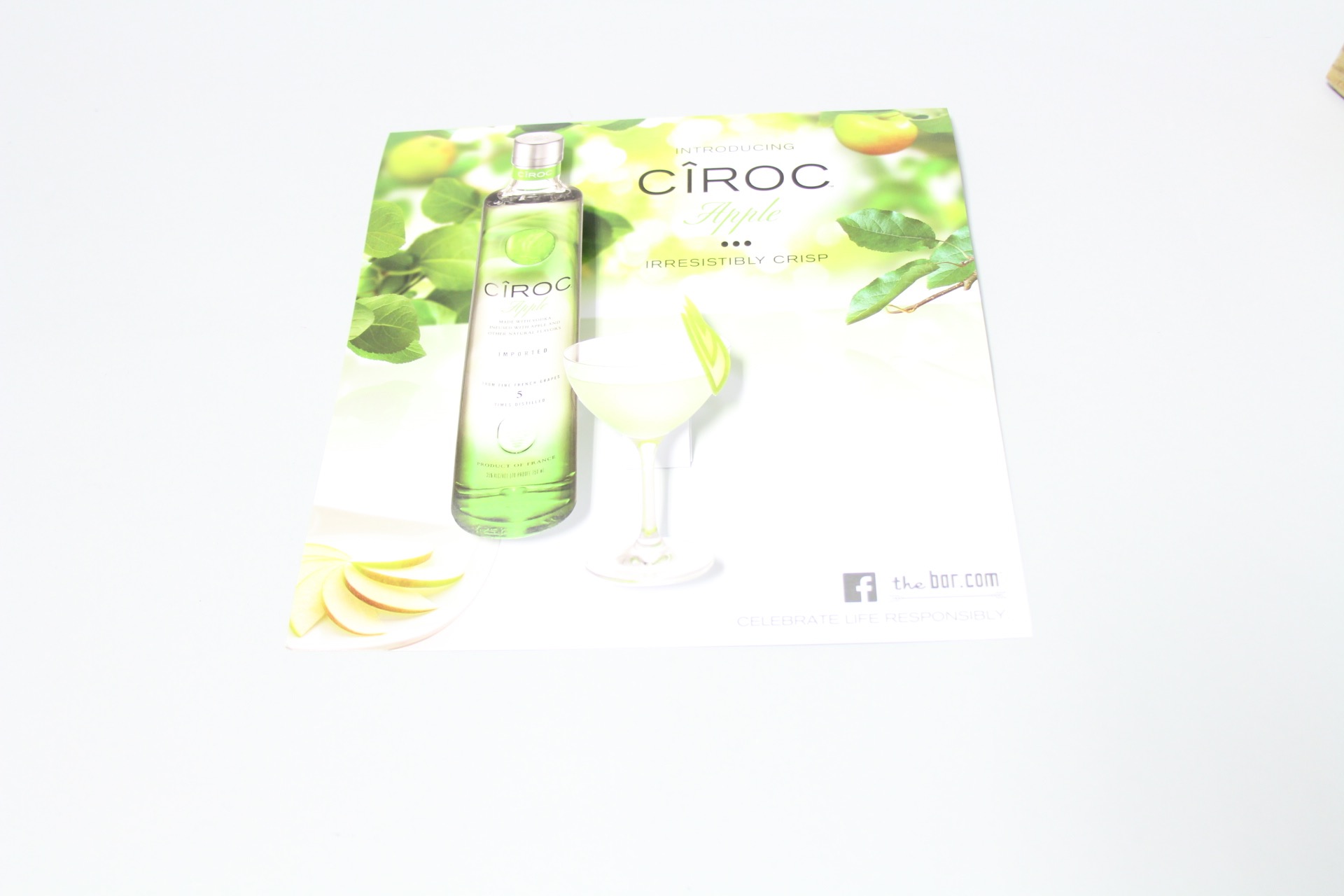
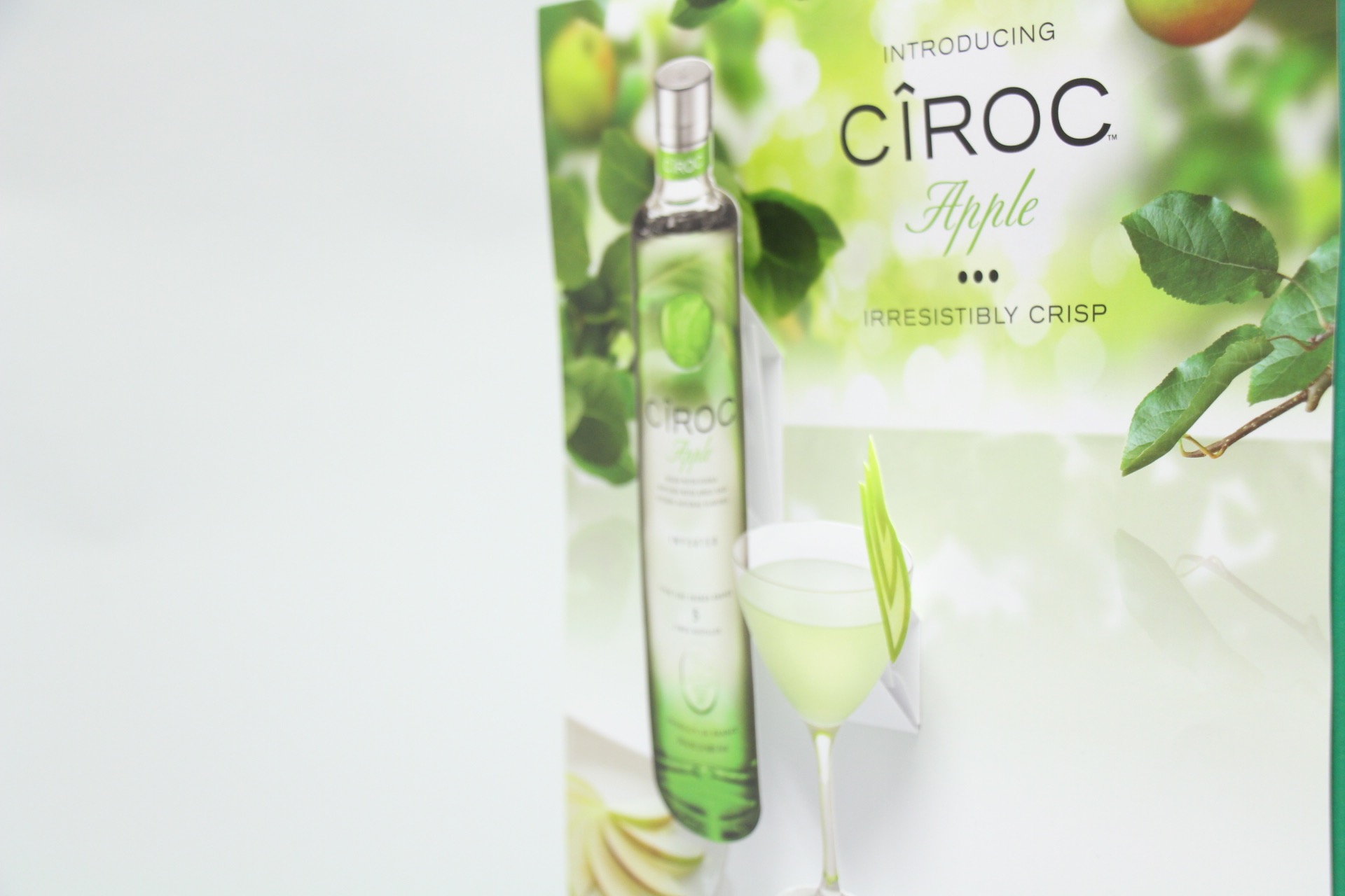
Diageo was wondering the same thing, so their agency came to us looking for new ideas of how they could boost sales in stores. This was the first time they have ever done anything like this – and viola, they were so successful, that they have already placed their second order!

Ciroc Case Tucker
Diageo/Marketing Agency & Structural Graphics // Ciroc Case Tucker

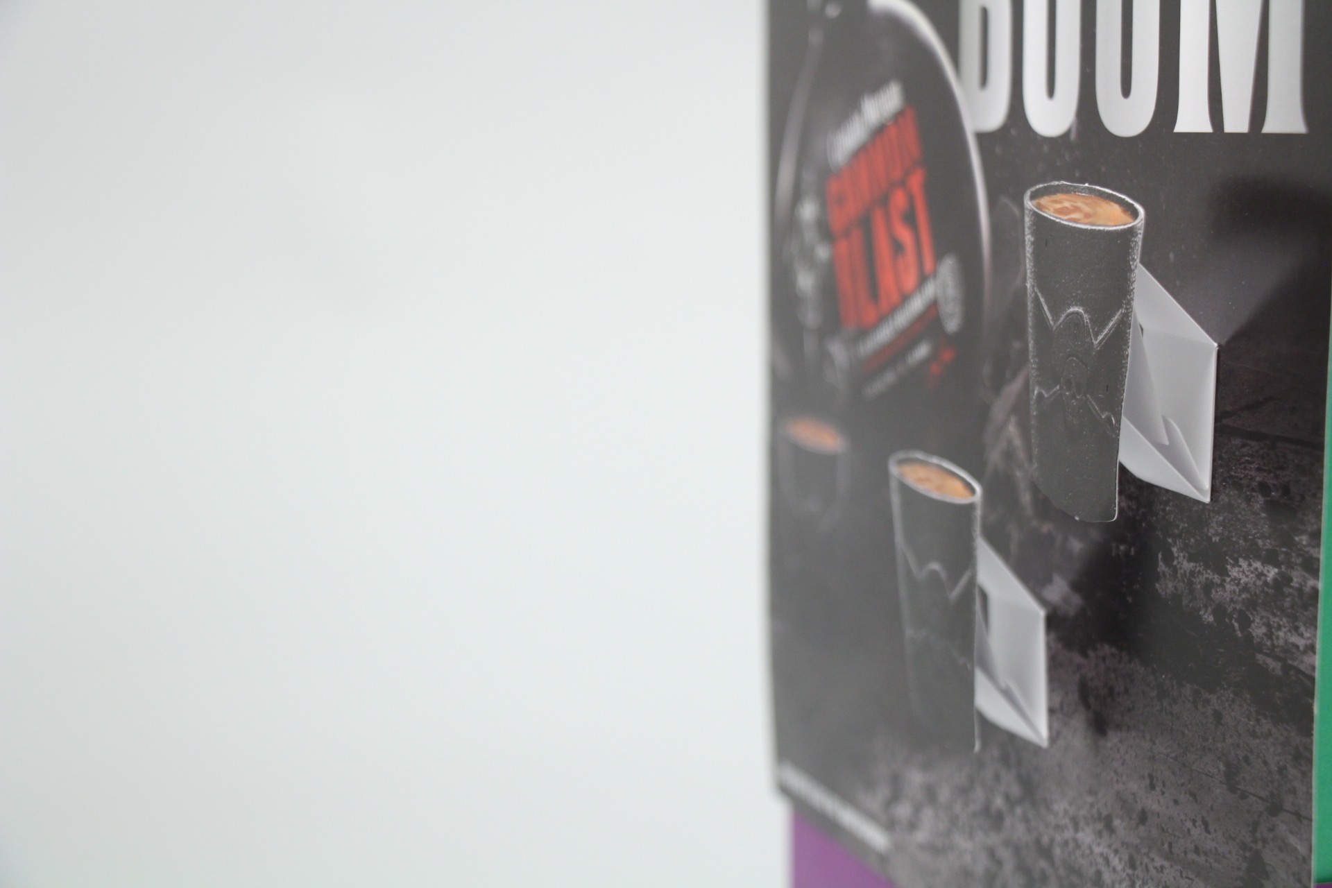
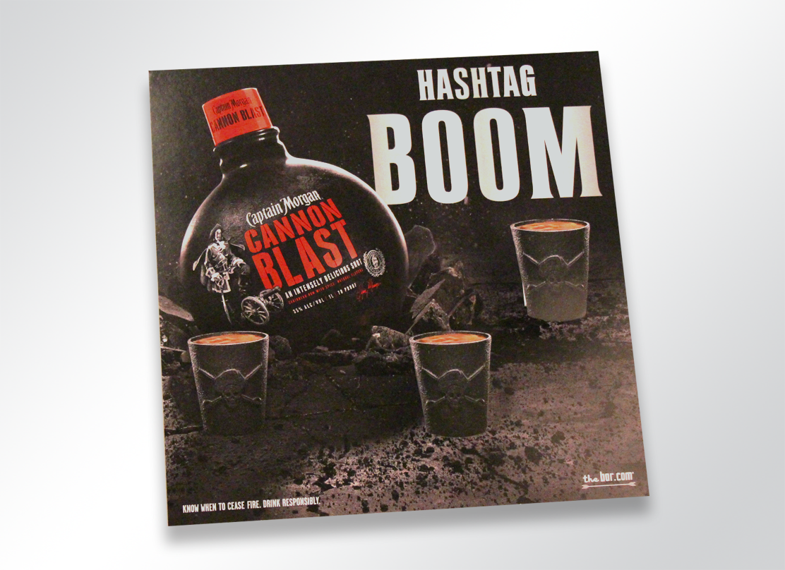
How exactly do they work? These case tuckers were tucked in between the shelves in between the bottles, promoting and drawing attention to their products.

Case Tuckers5
Diageo/Marketing Agency & Structural Graphics // Ciroc Case Tucker

Case tuckers are a unique way to sell your customer directly while they are shopping, begging for customers attention. These most certainly trump the Sharpie and neon signs you see on every shelf promoting cheap liquor and practically screaming, “DON’T DRINK ME.”

Case Tuckers3


2415-1266-captainmorgan-popup

Promotion

Alcohol promotions are everywhere. Sponsorships, advertisements,  commercials, events, the list goes on. Increasingly, alcohol is being promoted more and more via social media.

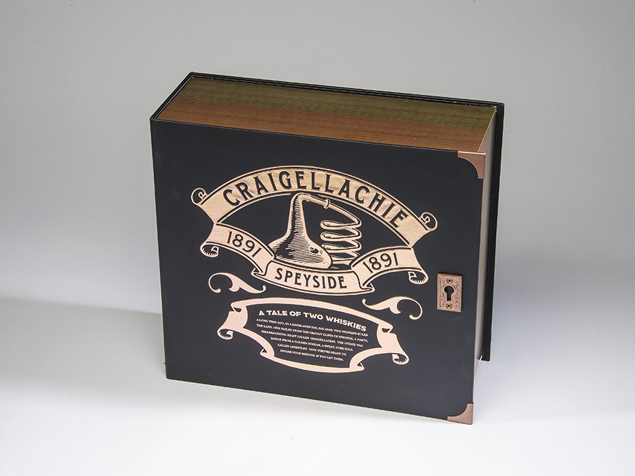
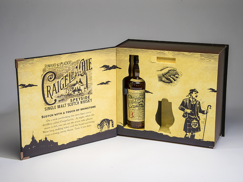
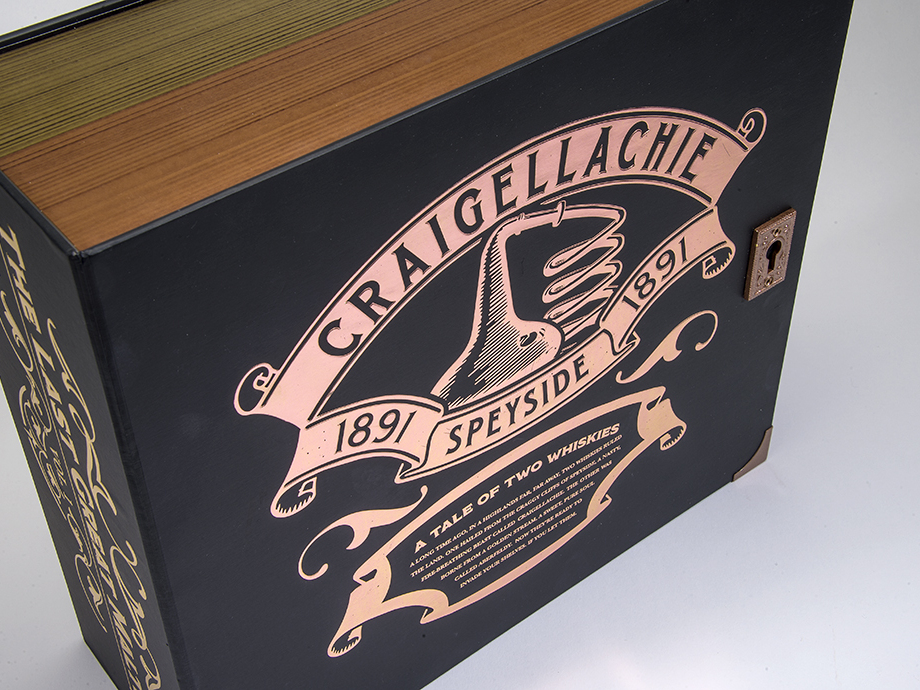
Do you need to promote your liquor brand, or unveil a new one? A truly exciting and creative way to do so is to host a PR event. And that’s exactly what Bacardi Brands did with when they came to Structural Graphics to create their Dewar’s Influencer Kit!

See below.

CRAIGELLACHI1_resized

CRAIGELLACHI2_resized

CRAIGELLACHIE7_resized

The Marketing Arm came to us to develop and design this beautiful Dewar’s influencer kit. The kit was for a PR event unveiling two new brands, Craigellechie and Aberfeldy, and showcases each in a storybook format appropriately titled “The Tale of Two Whiskies”.

To read more about this super cool launch, click here!


It’s no secret that no matter what you’re promoting, you need a way to stand out amongst the crowd. Need to reach your audience? Give yourself some height by adding a little dimension to your brand.
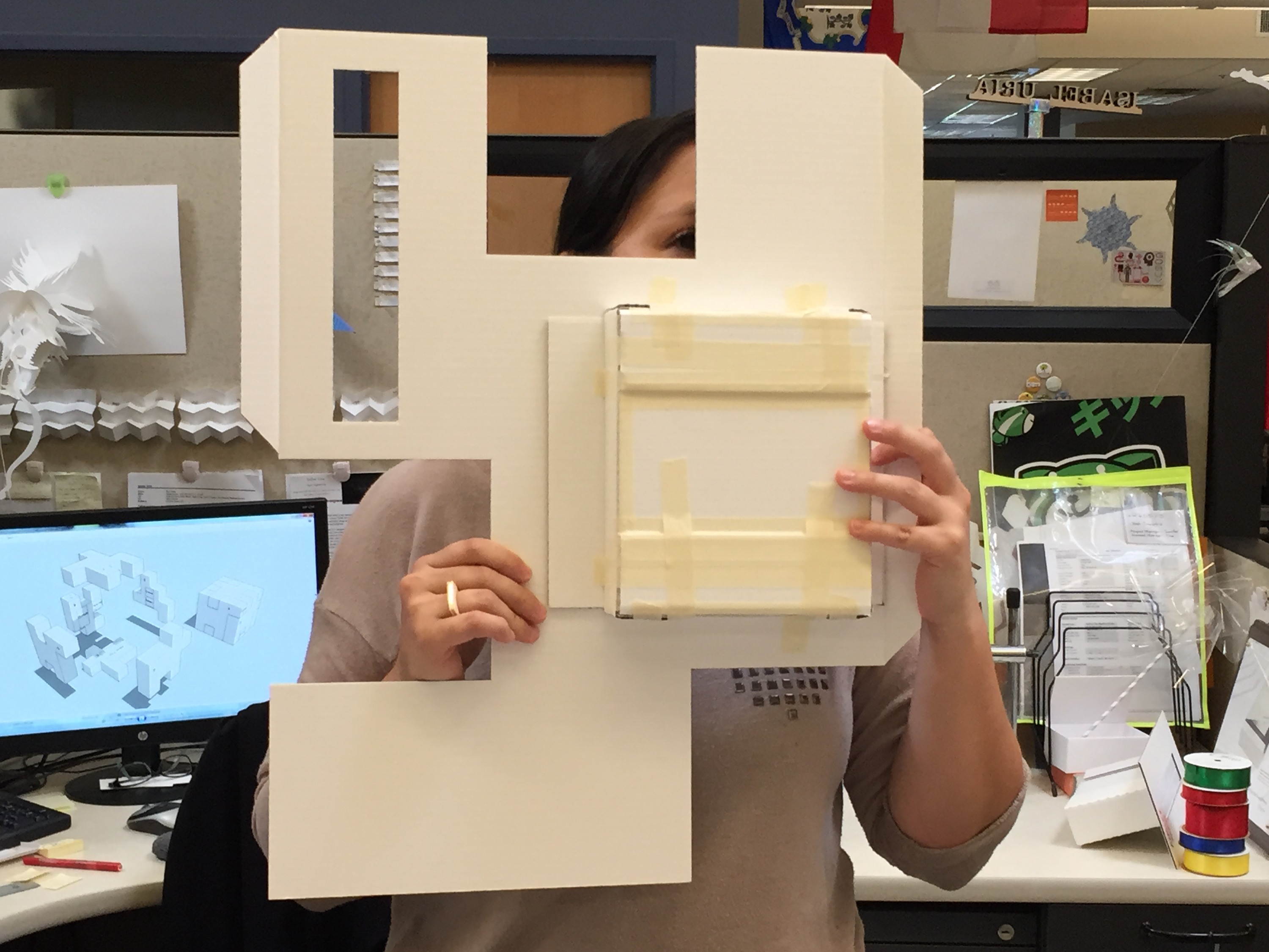
A Double Life: Meet the Flapper

What do Hyundai, Asbury University and Gillette all have in common? They all understand the high impact the Flapper can have on an audience.

The Flapper, one of Structural Graphics’ exclusive patented designs, is kind of like a book you just can’t put down. Kids love it. Adults do, too. What makes it so unique is the way it folds continually into itself, revealing four separate layers of messaging ranging from text, photographs and even QR codes.

Even better? They’re incredibly versatile. Not only can they be distributed as a flat self-mailer, but they range in sizes, too. We’ve produced Flappers that were very small (3” x 3”) as well as ones that are about the size of a standard piece of paper (8” x 11”). Clients have used them as magazine inserts, designed them to look like tablets, and have even included scratch-offs and coupons inside. The possibilities are endless!

But how exactly do you use a Flapper?

Here are a few tips to get you started:

If you’re using our French Door style (i.e. the one with a vertical front opening)…

1. Starting on the front side of the Flapper, fold open until the left and right flaps are folded back to display the second message panel.
2. Continue following the natural folds of the paper until you get back to your original panel.

If you’re using our Dutch Door style (i.e. the one with a horizontal front opening)…

1. Starting on the front side of the Flapper, fold open until the top and bottom flaps are folded back to display the second message panel.
2. Continue following the natural folds of the paper until you get back to your original panel.

Click here to visit our Instagram feed and see the Flapper in action.


Ready to design yours? Take a look at our Flapper How To Guide then let us send you one to play with and inspire you!

Pier 1 Pop-Up Holiday Catalog

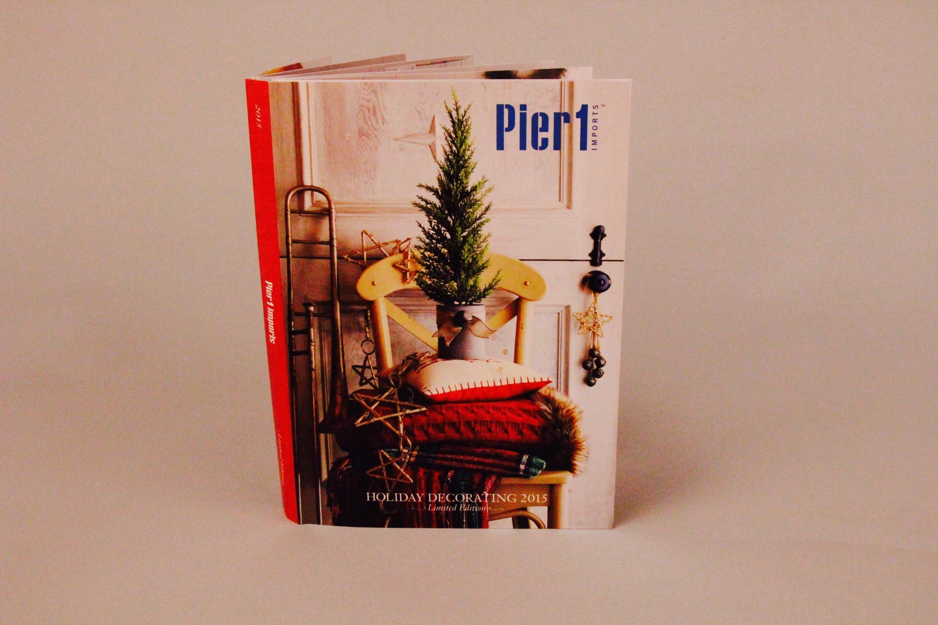
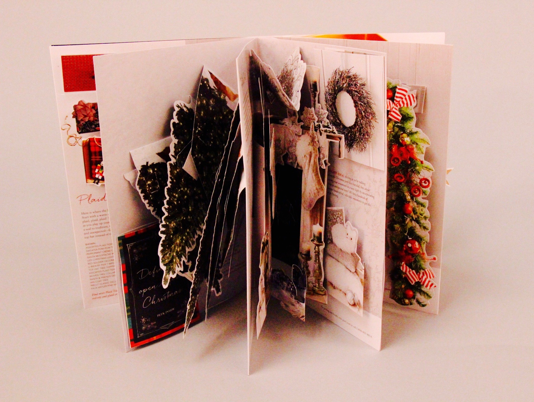
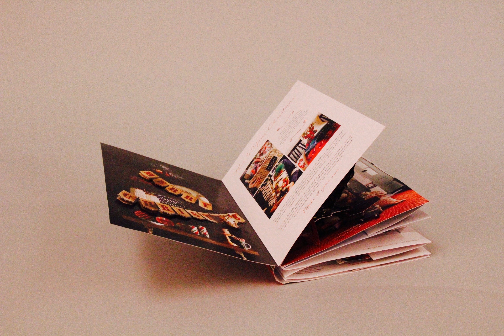
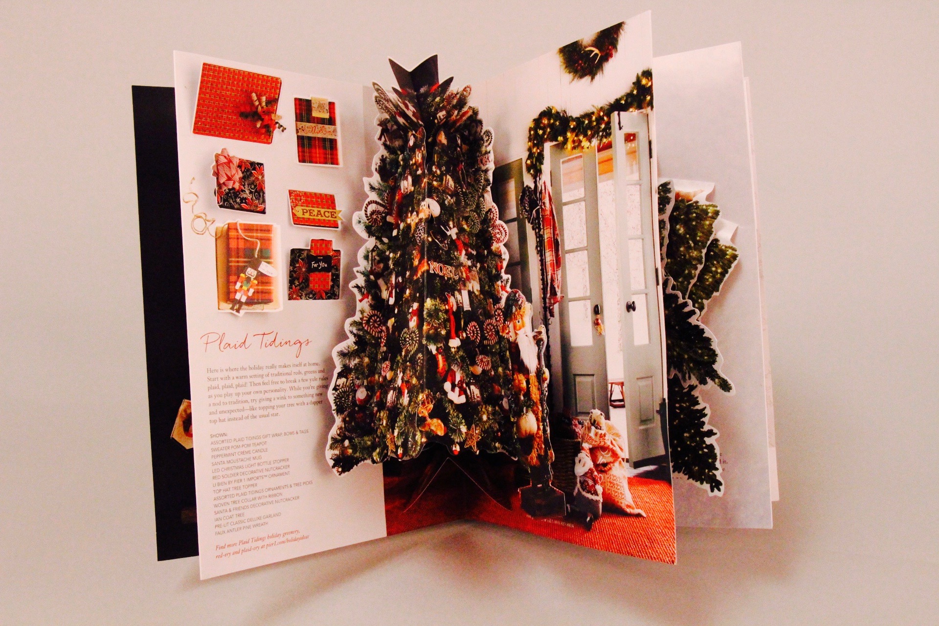
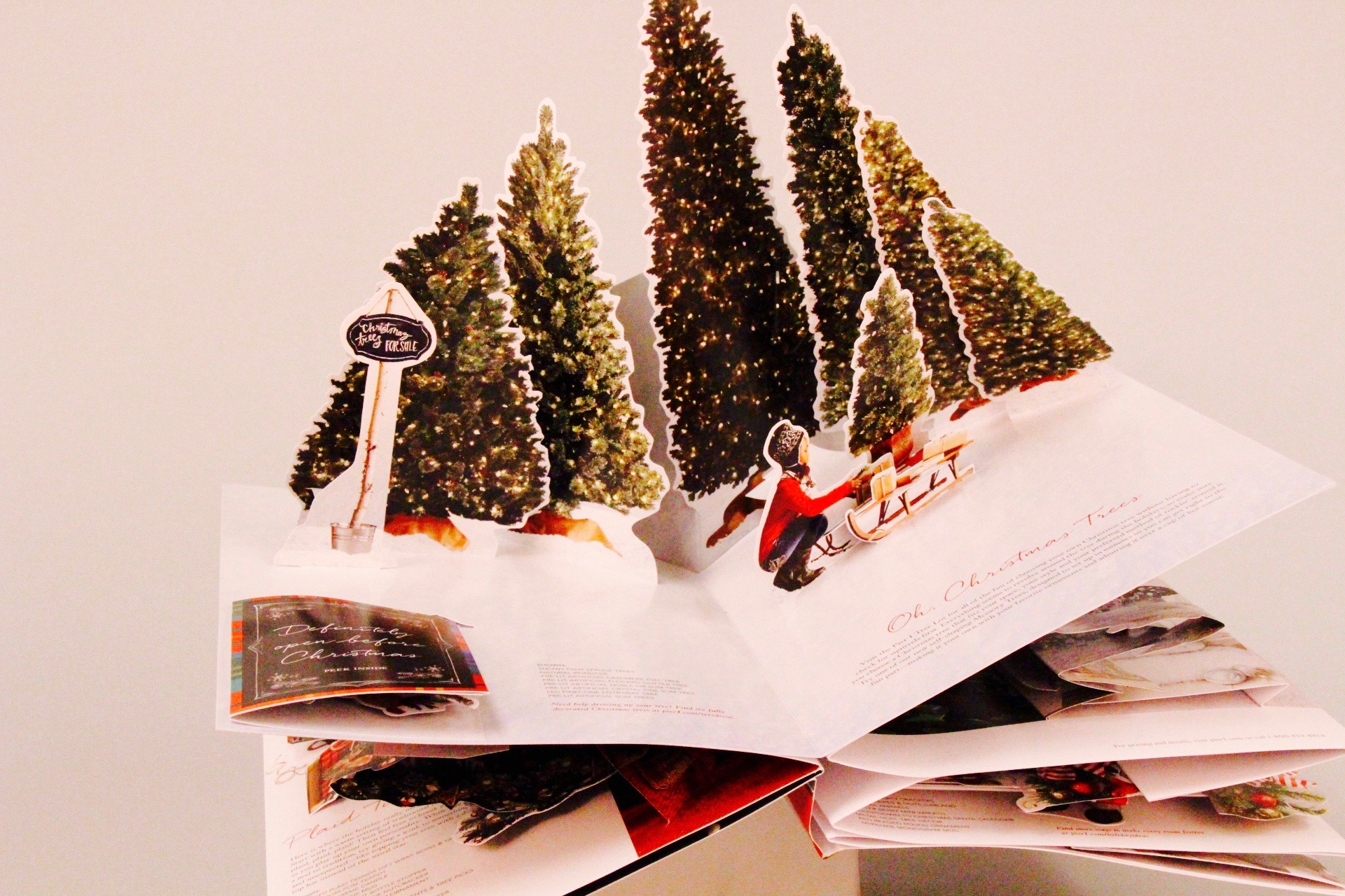
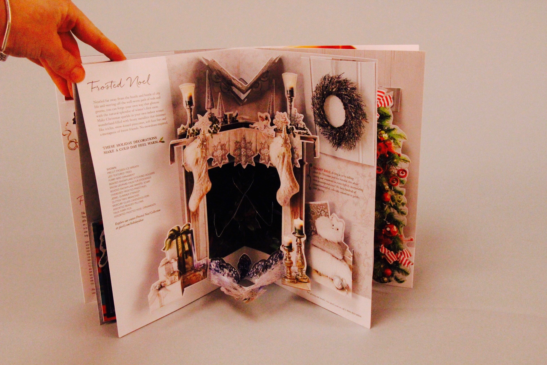
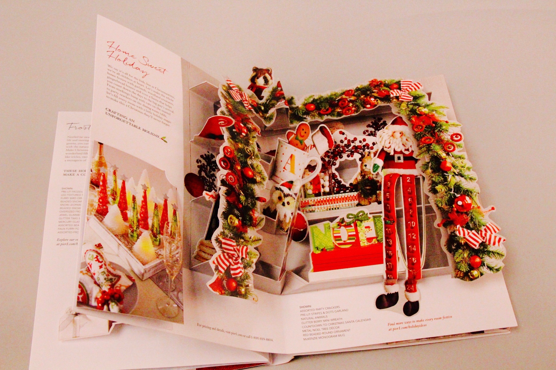
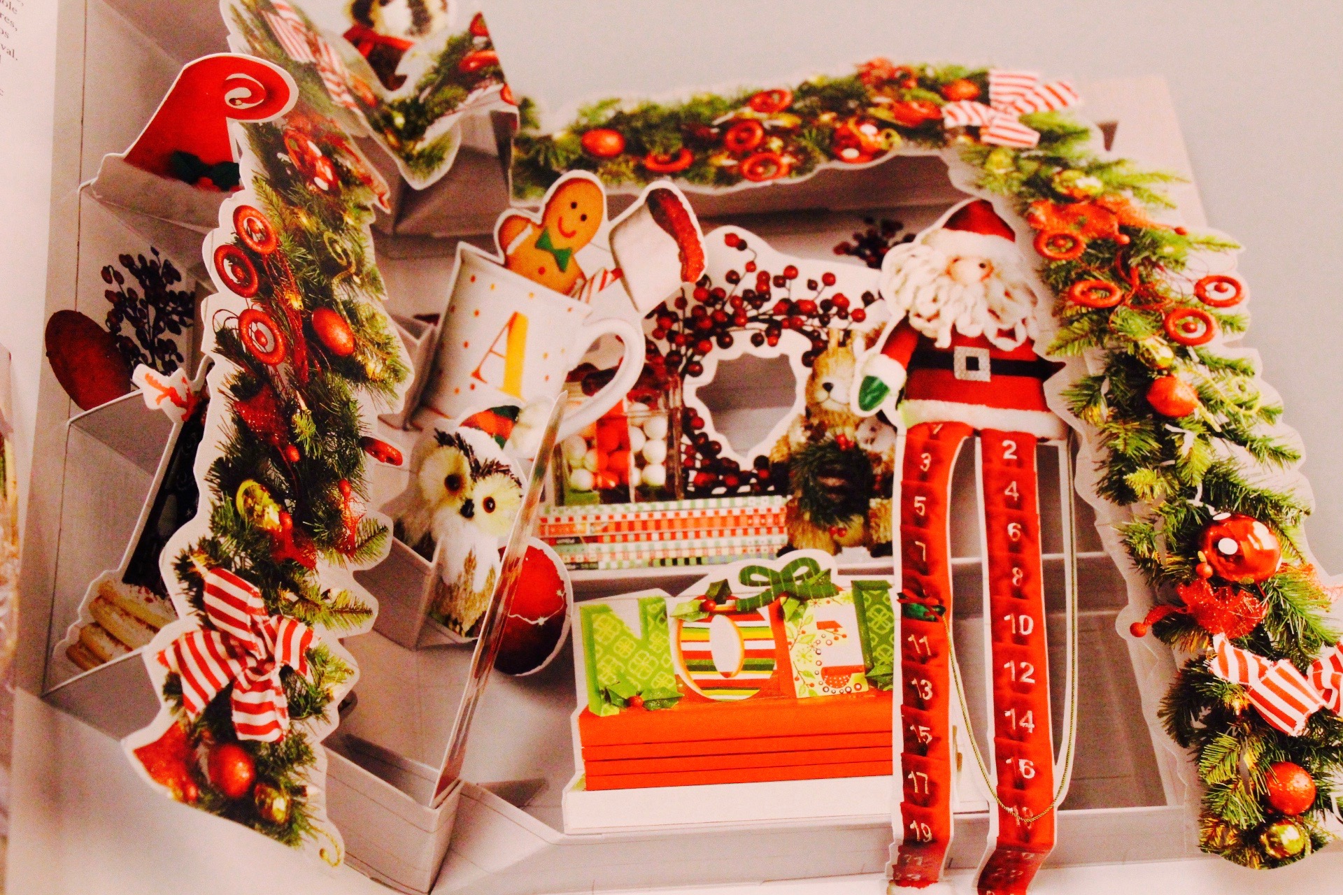
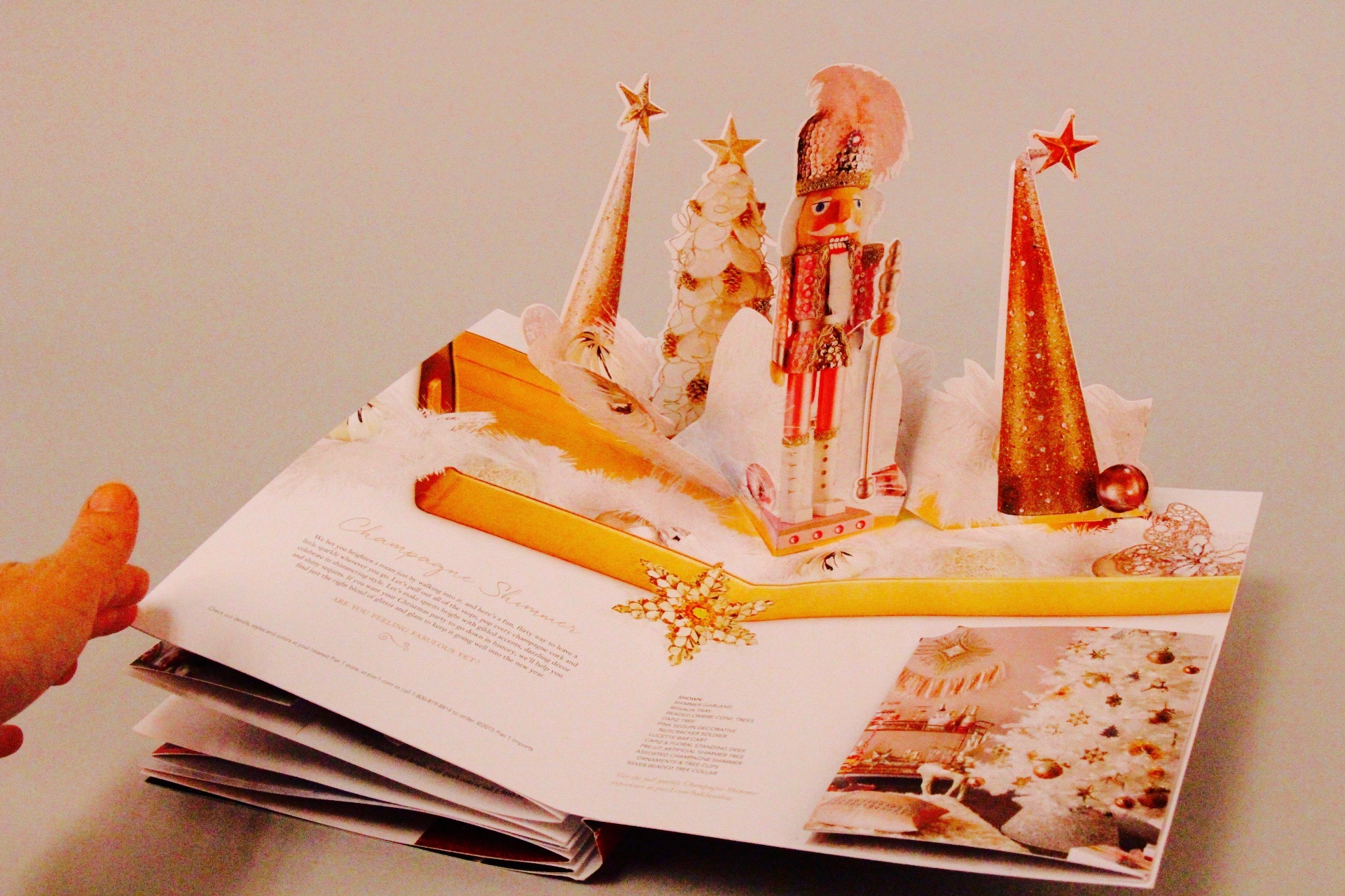
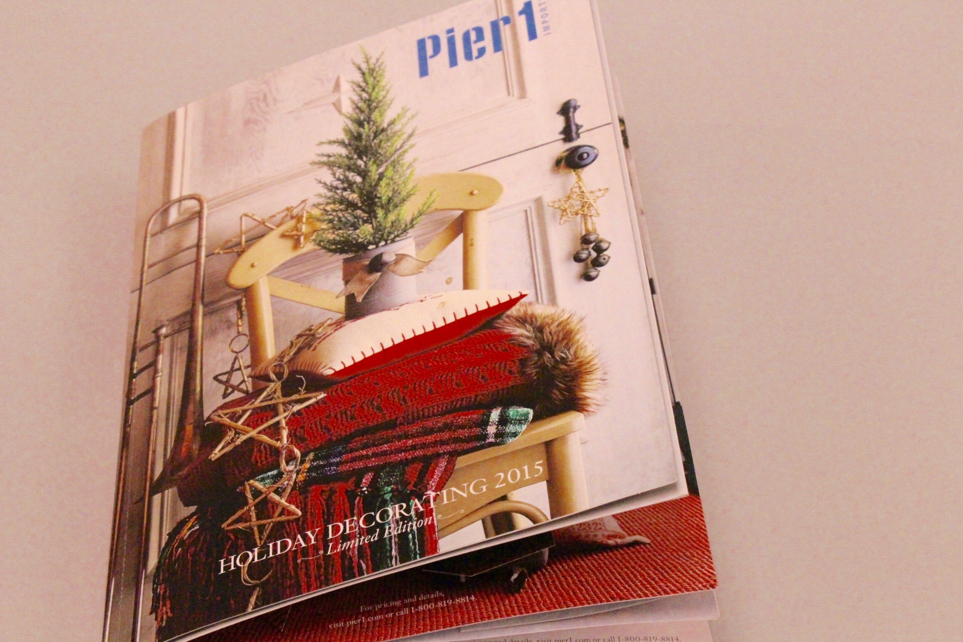
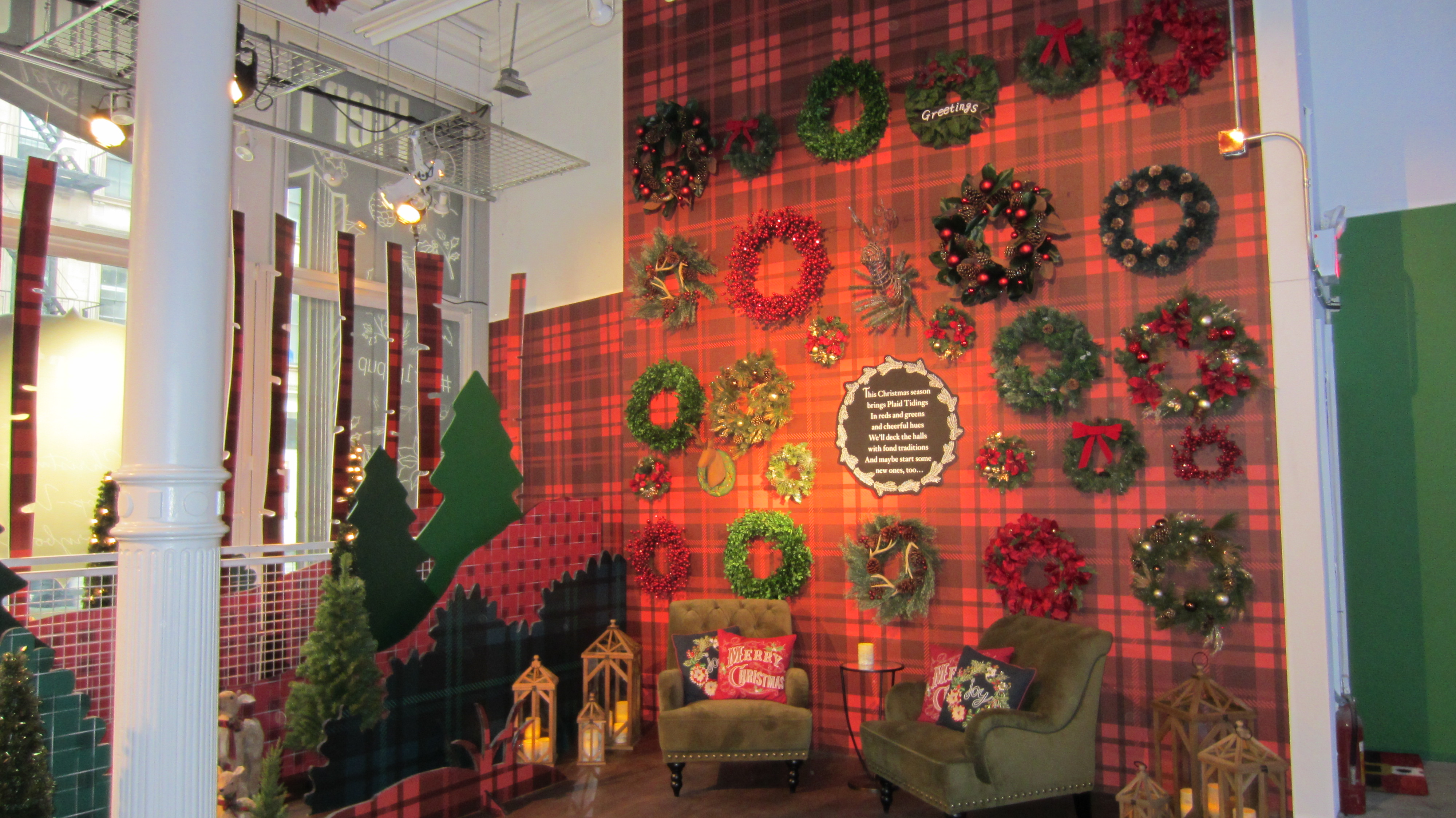
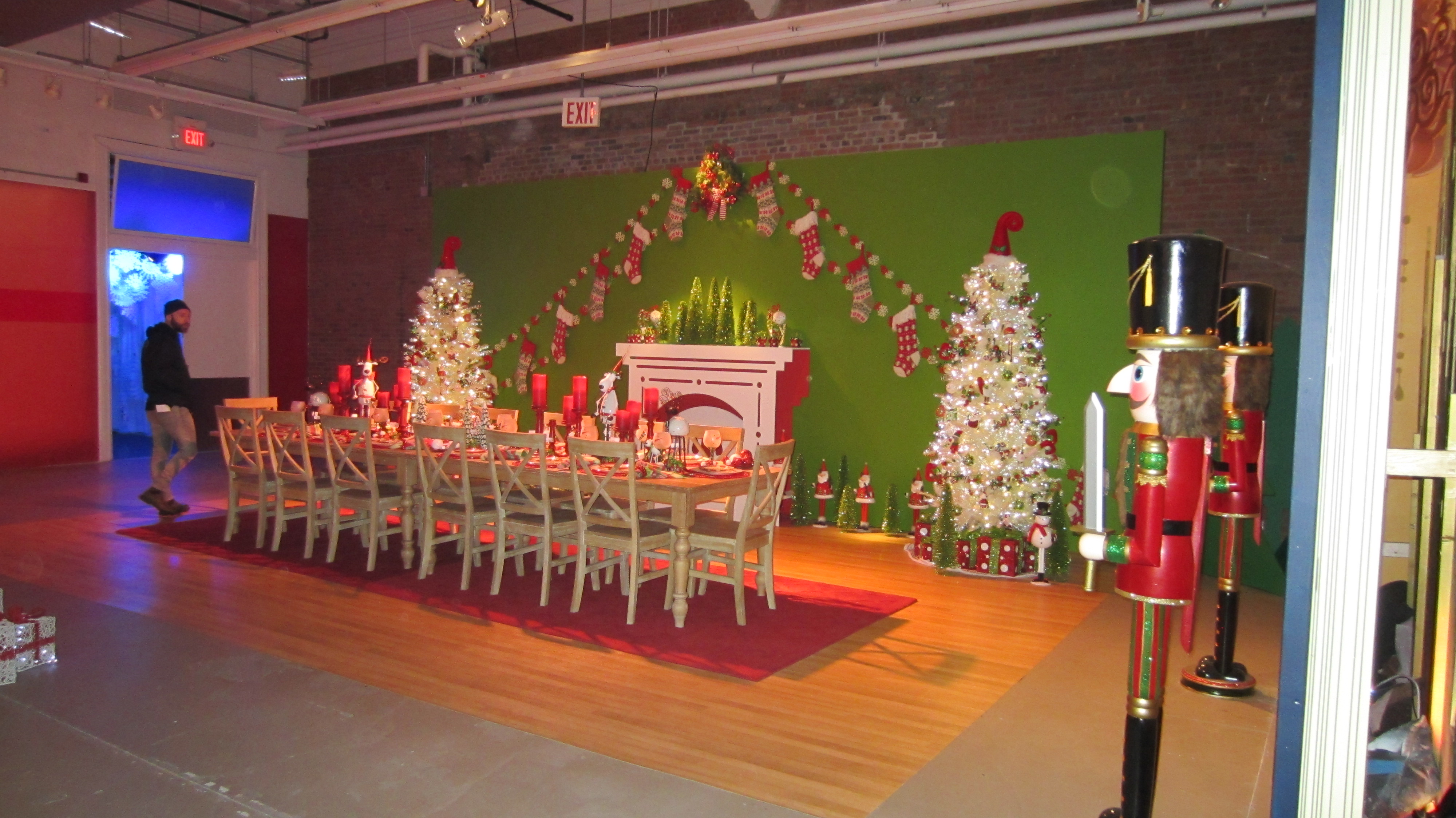
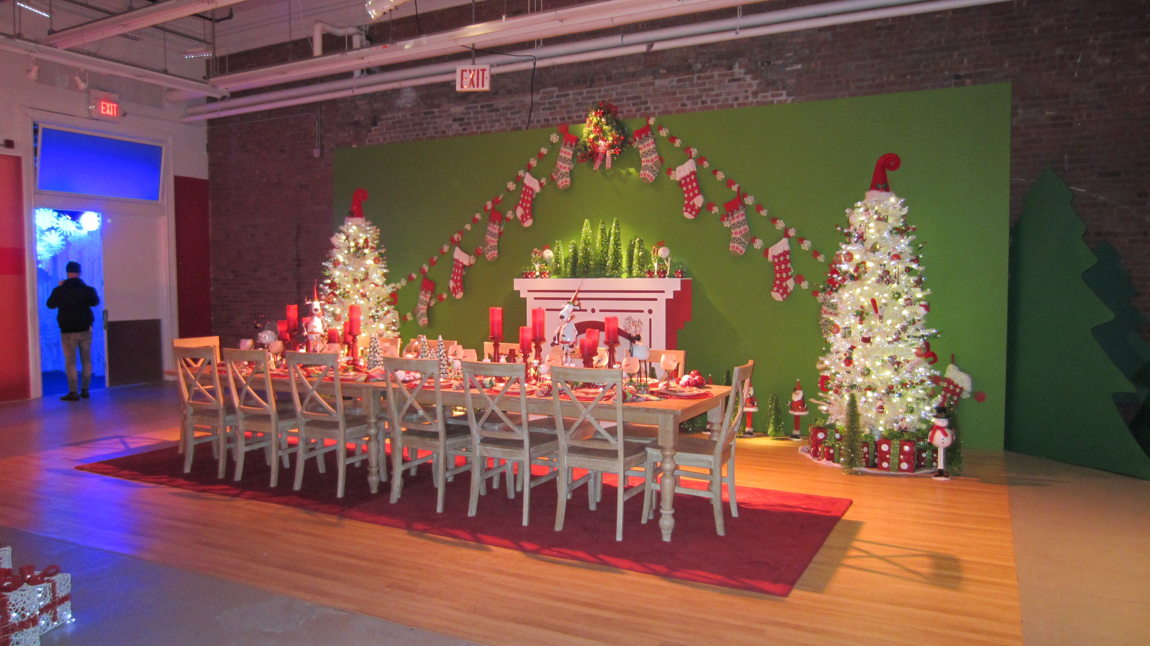
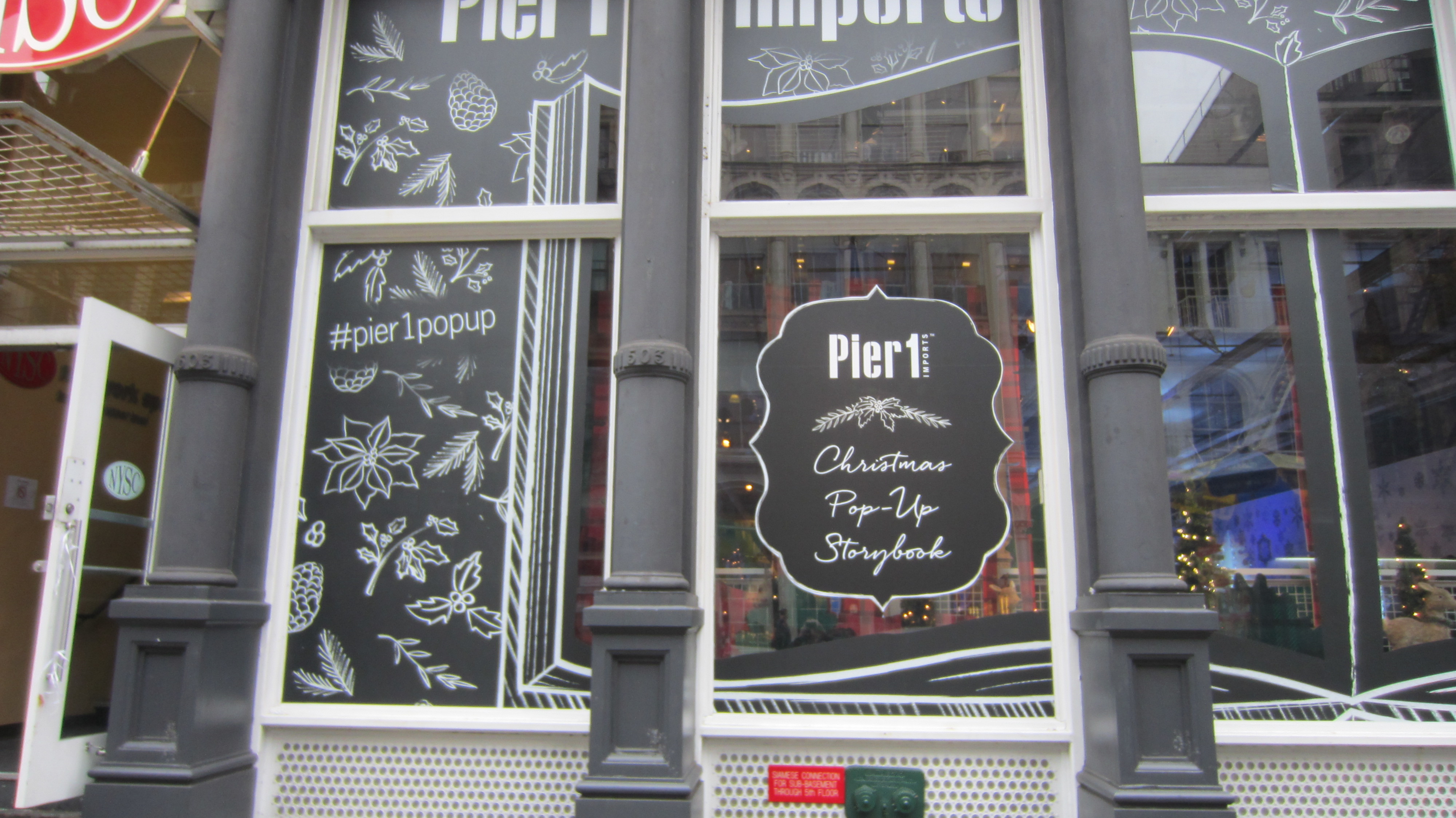
We love things that pop, bend, pull and are made of paper, so naturally we were thrilled to be a part of the creation of the Pier 1 holiday pop up catalog!

Pier 1 wanted a way to “craft an unforgettable holiday” by laying out their holiday catalogue differently. As you can see, each page opens up to a different room decorated with a holiday theme. Structural Graphics was involved in the final stages of design process and production engineering, manufacturing and hand assembly.

It didn’t stop at the catalog, though. See below…


IMG_6875
IMG_6876
IMG_6877
IMG_6878
IMG_6879
IMG_6881
IMG_6882
IMG_6884
IMG_6885
IMG_6888
IMG_6889
IMG_6890

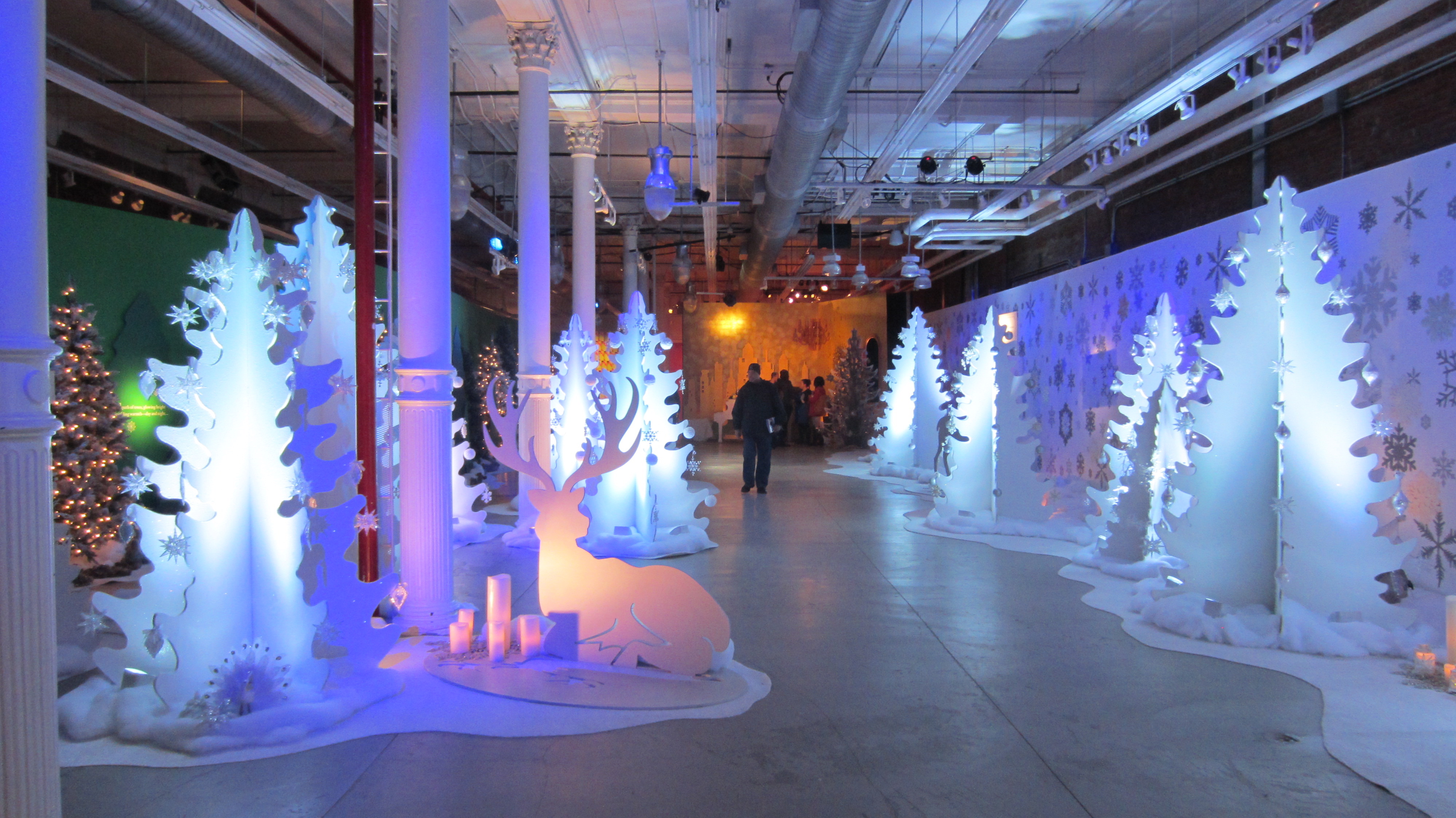
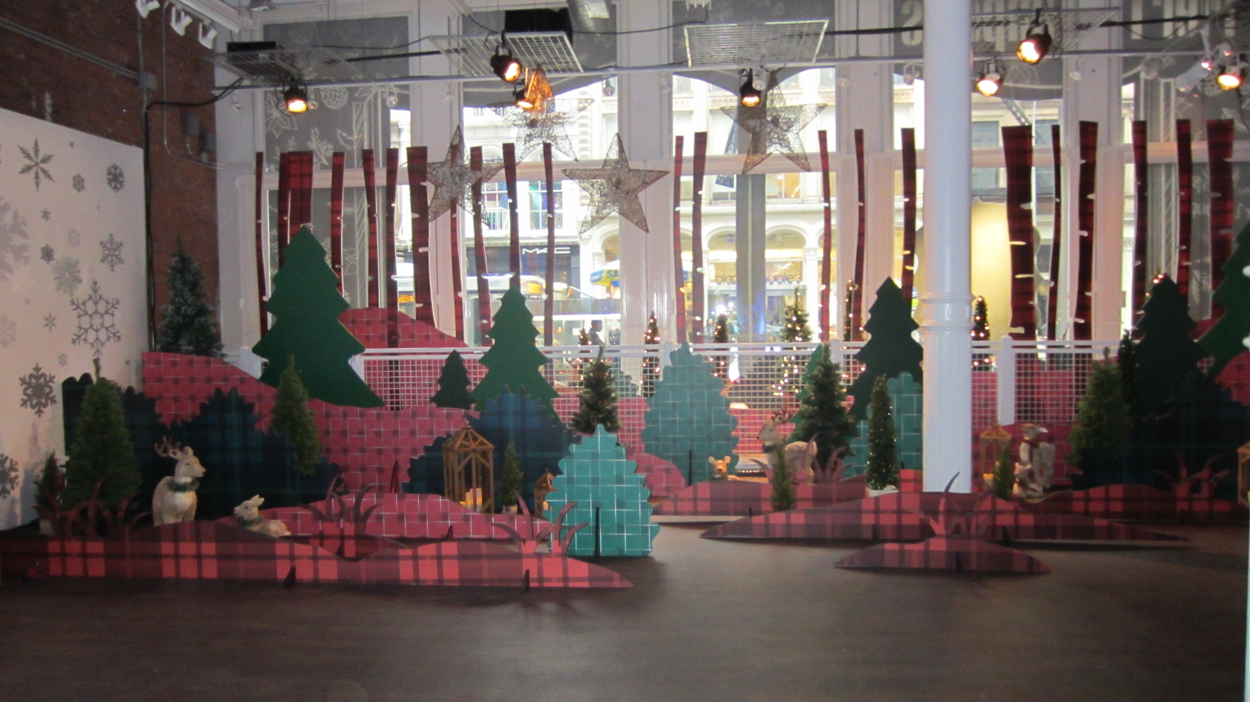
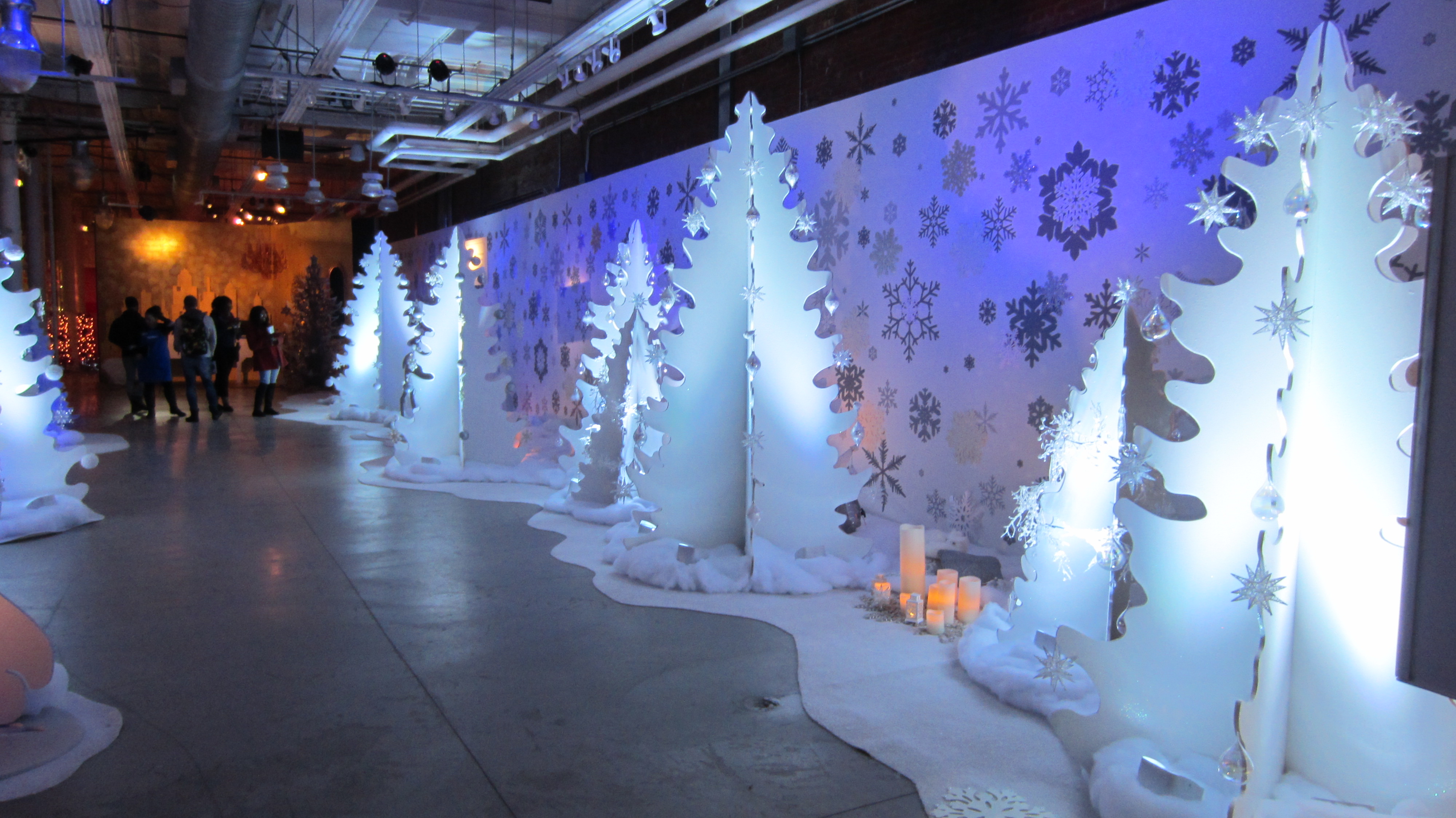
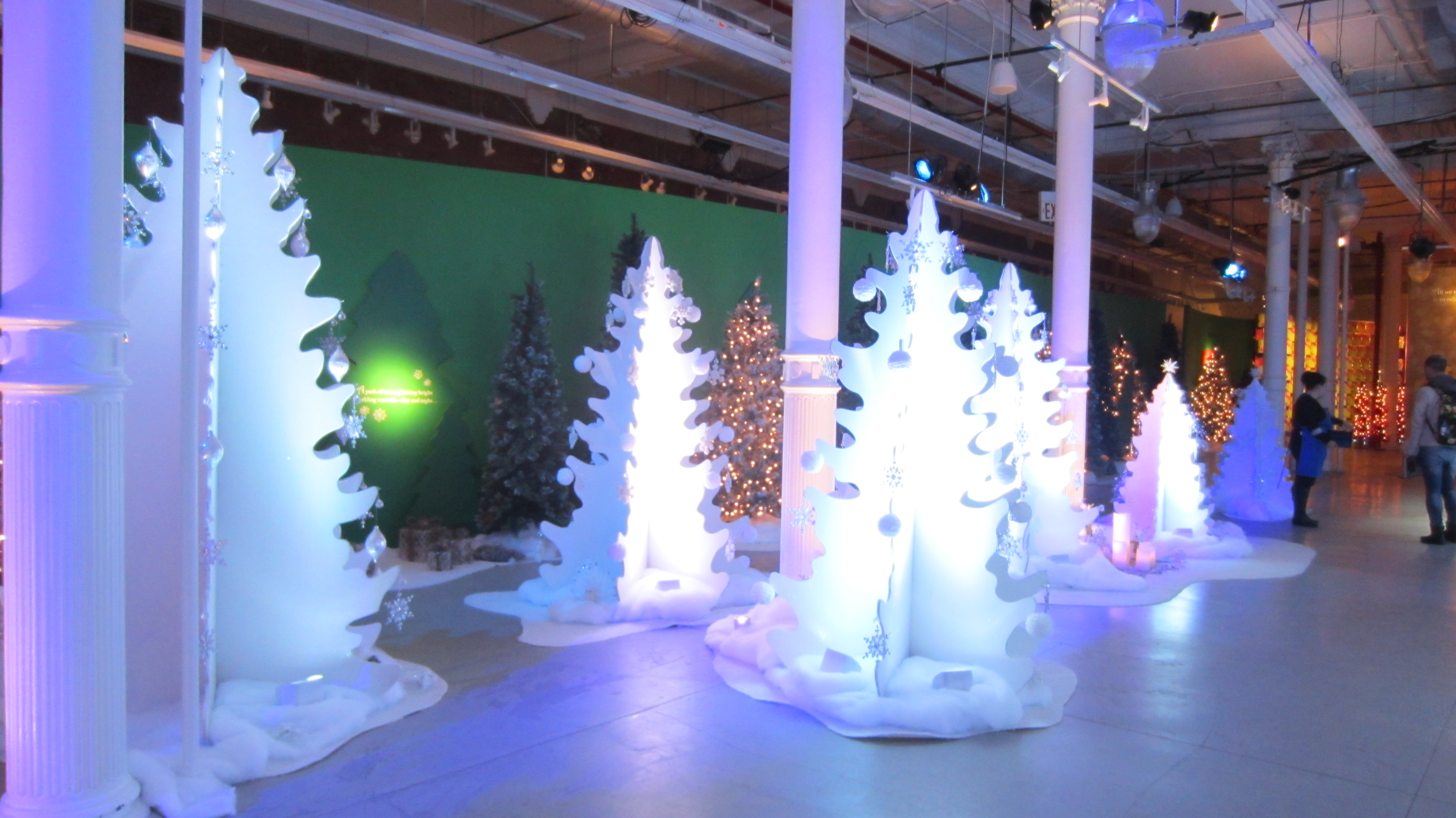
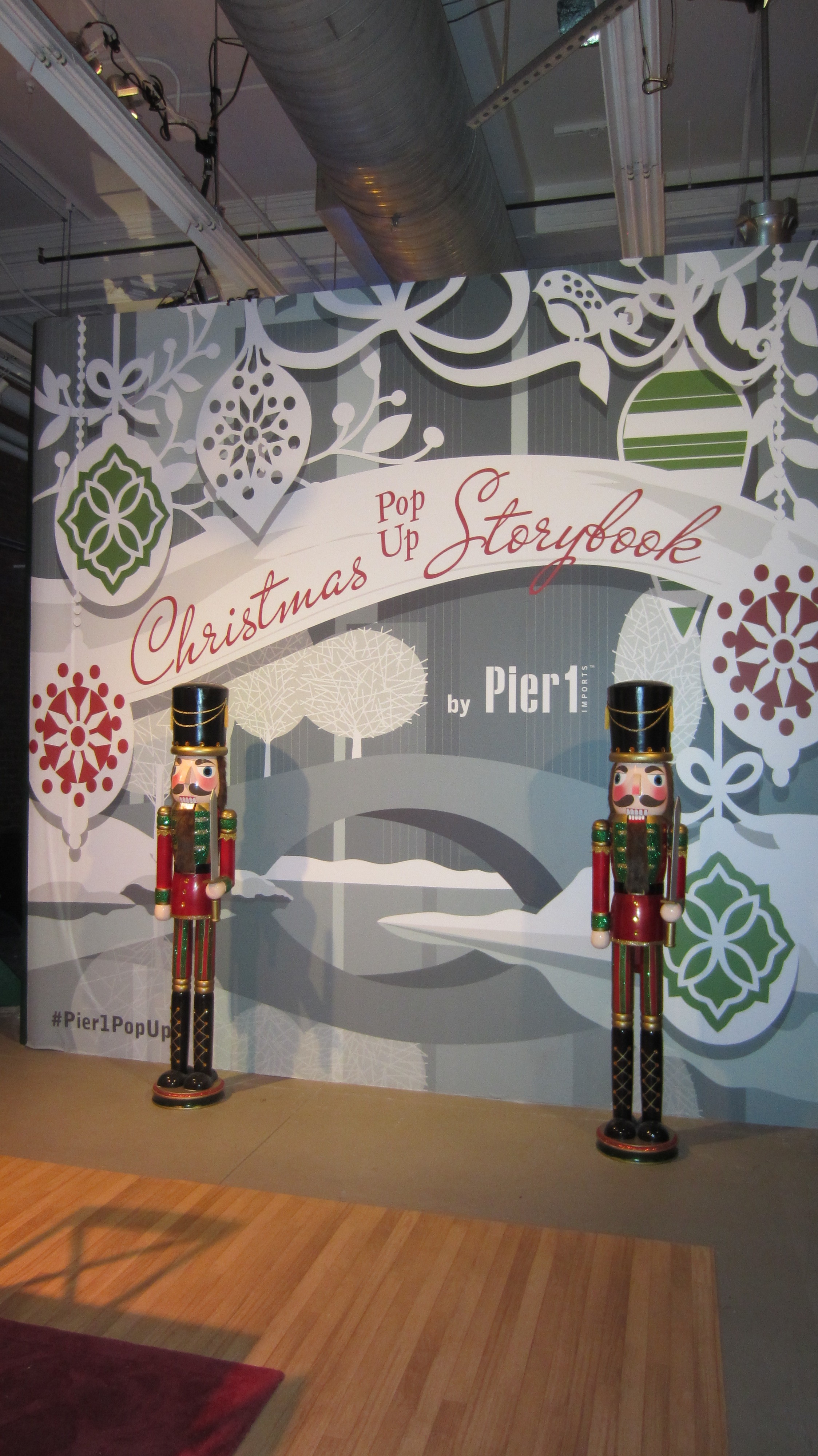
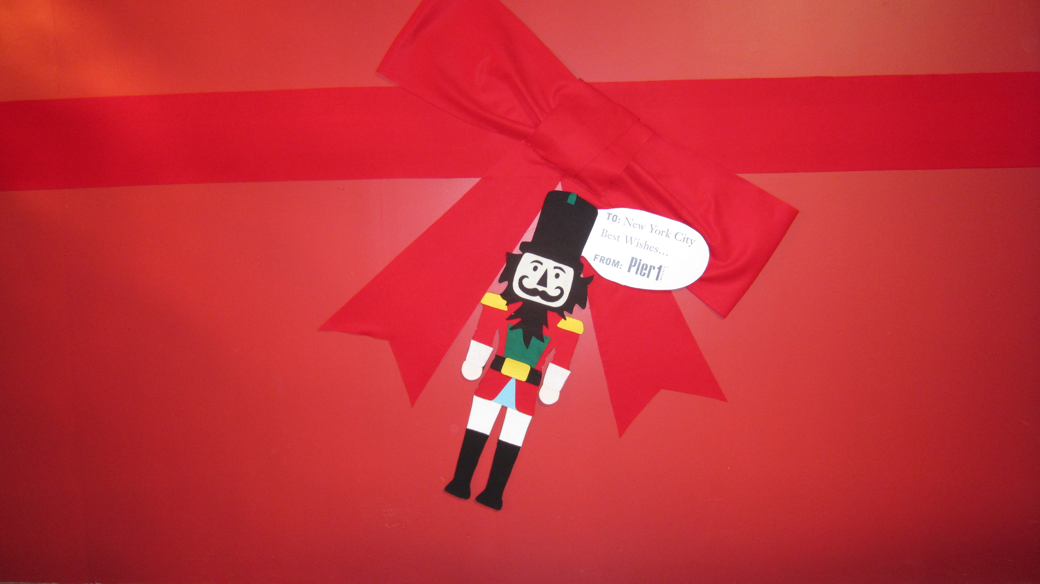
This catalog replicated, and was handed out, at the Pier 1 pop up store in Manhattan!

Pier 1 Collateral1 Pier 1 Collateral2 Pier 1 Collateral3 Pier 1 Collateral4 Pier 1 Collateral5 Pier 1 Collateral6 Pier 1 Collateral7 Pier 1 Collateral8 Pier 1 Collateral10 Pier 1 Collateral12


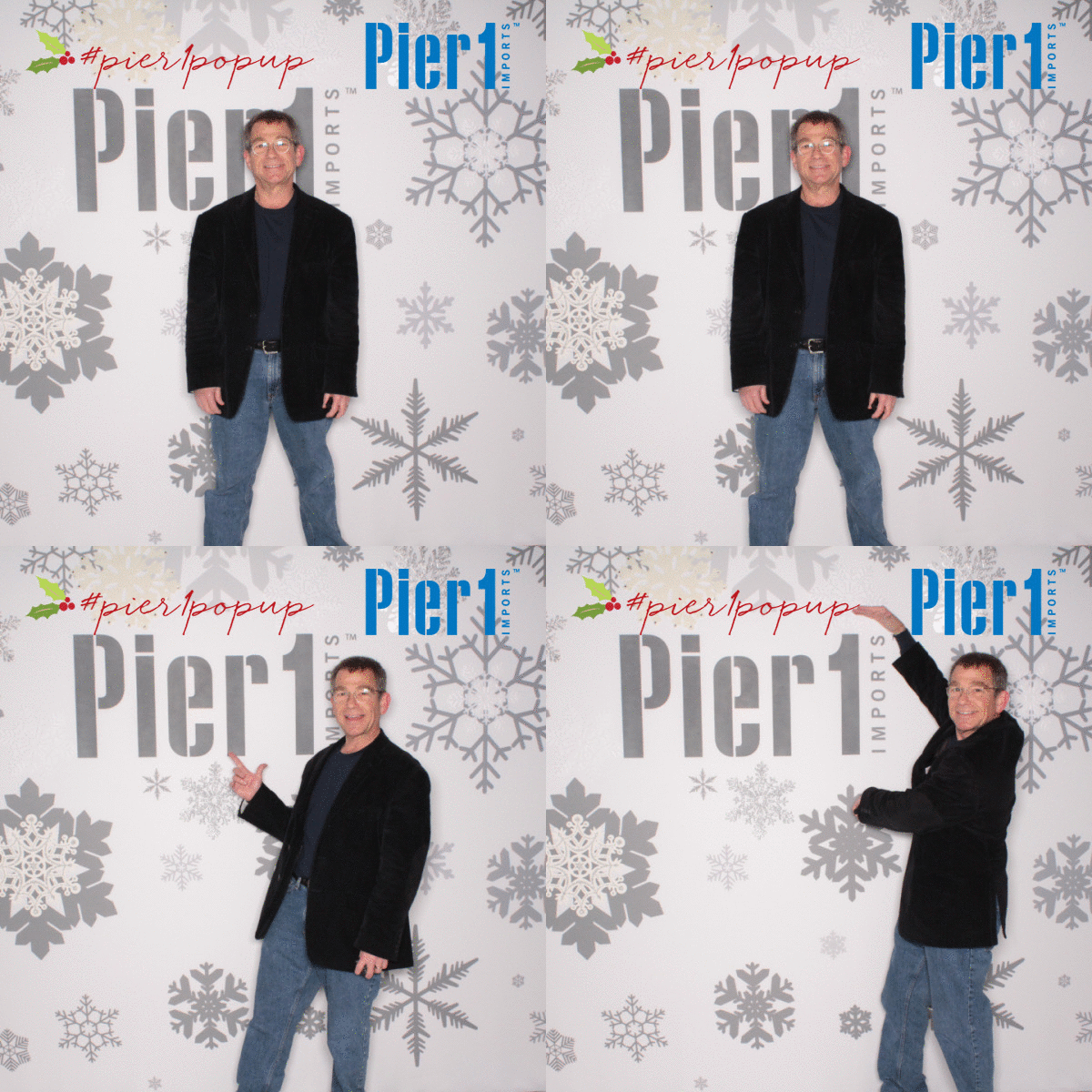
#Pier1popup


Pier 1
Structural Graphics President, Ethan Goller, visits the installation!

The Story of the Google Unboxing Launch

Screen Shot 2015-12-03 at 11.40.42 AM

The holiday season is in full swing, and hand-in-hand with that comes gift-giving fever. That fever has spread from our holiday hearts all the way to YouTube, with the increasingly popular unboxing videos. According to ThinkWithGoogle.com, 

Unboxing video views have grown 57% over the past year, and uploads have grown more than 50%. But it’s not just the growth in the unboxing genre that’s impressive—it’s the sheer volume, too. It would take more than seven years to watch all the videos on YouTube with “unboxing” in the title that have been uploaded so far just this year. And those videos have more than a billion views in this year alone.

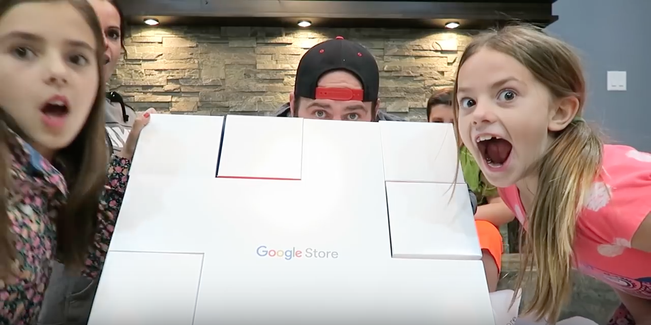
Thank you, ThinkWithGoogle. That’s just what we did – we “thunk with Google”, to design and produce their Unboxing box. This was sent to hand-selected YouTube celebrities to promote the Google Store, and designed to have an element of surprise when unveiling each featured technology product. And the response was simply outstanding:

4 million views, with 11 million projected by Christmas.


And also, some sweet comments straight from the Unboxing YouTube celebrities themselves:

 “That’s the best part, the packaging. ‘Gavin came in, and he’s like “This packaging is legit.’ And you know when Gavin thinks your packaging is legit, you’ve got a great product.”

Thanks, Gavin & Shay fam! And from Captain Sparklez…

“What?! This is the coolest packaging I’ve ever seen in my entire life. I don’t even want to disassemble this.”

We’re blushing! That’s the highlight, but let’s backtrack (spoiler alert: here’s where we start to talk about ourselves, boxes, and Google, a lot)…

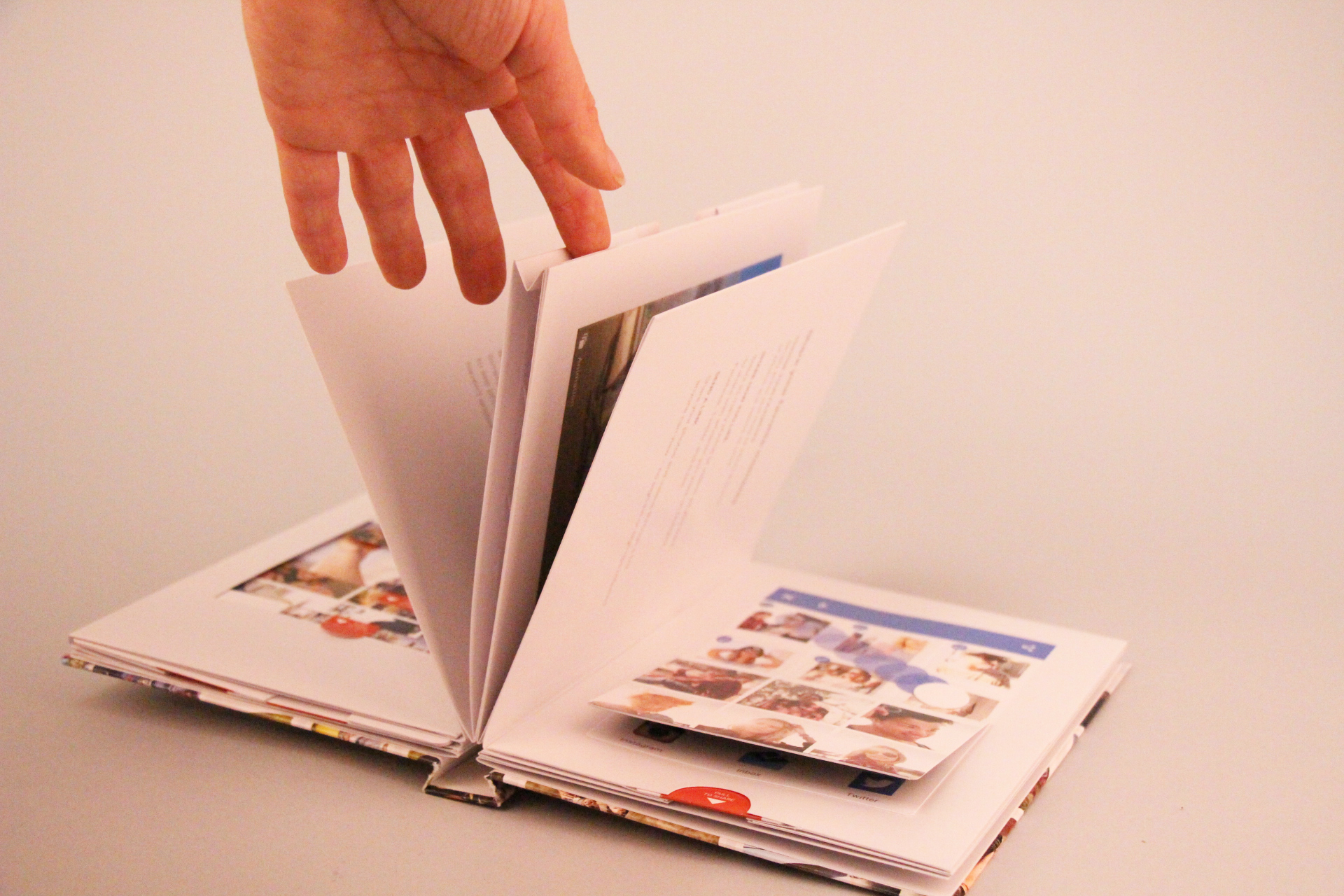
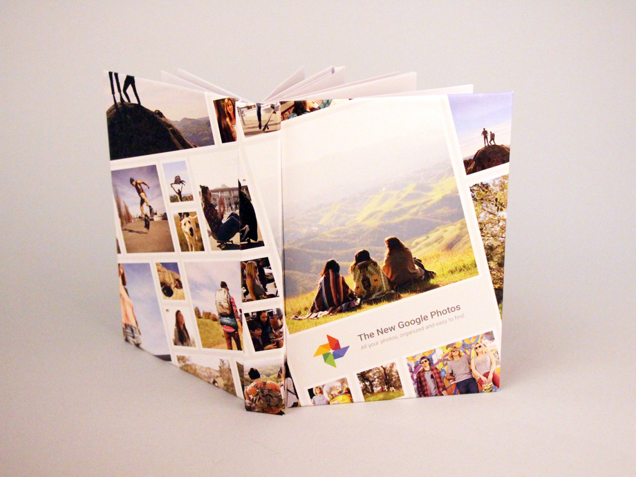
A few months back, during the development of the pop-up book with the agency Toaster for their Google Photos app, we were on a string of emails with Google brand. (NBD.)

Google_Popup_Book_12_resized

Fast forward to September, when it came time to develop the box for their Google Store Unboxing Launch, they asked us whether or not we do boxes. (Answer: look here, or even here for a bit more luxury.) I mean this is Google, and we’re Structural Graphics, so naturally, we said yes. We practically invented boxes.*

Open Gift Box - Top View

(That may or may not be true.)*

On September 16th was the initial kickoff call to discuss concepts. At first, the sole and simple goal we had to accomplish was, “we need a box to hold products”.

Originally, we started with a white box with clouds. All of these 7 technology products, which can be seen in the Google Store, could have easily been thrown into any old, standard, 8-sided-vanilla-box. But that’s not really our style.

We then started with what any sensible person does in this day and age: we Googled it. We googled the Google products to get grasp on what it would need to hold, specifically the size, and how we could package that up.

As time went on, the inspiration developed. We were given a few more things to chew on:

1. Google presented us with a ‘Mood Board’, basically a brain dump of what it needed to include, and 2. What not to do: not a traditional printing press or corrugate. I mean, let’s be honest here, creative freedom + super cool client = any designer’s dream. Our brainstorm session produced a list that looked like this: Rubik’s cubes, puzzle, with the idea to create more of an ‘experience’ than anything.

Mission: possible. Erik, one of our paper engineers, came up with the puzzle box concept, and that’s when things with the entire team really took off.

IMG_5070


IMG_5072


IMG_5073


IMG_5075


IMG_5076


IMG_5077

IMG_5079


IMG_5080


IMG_5093

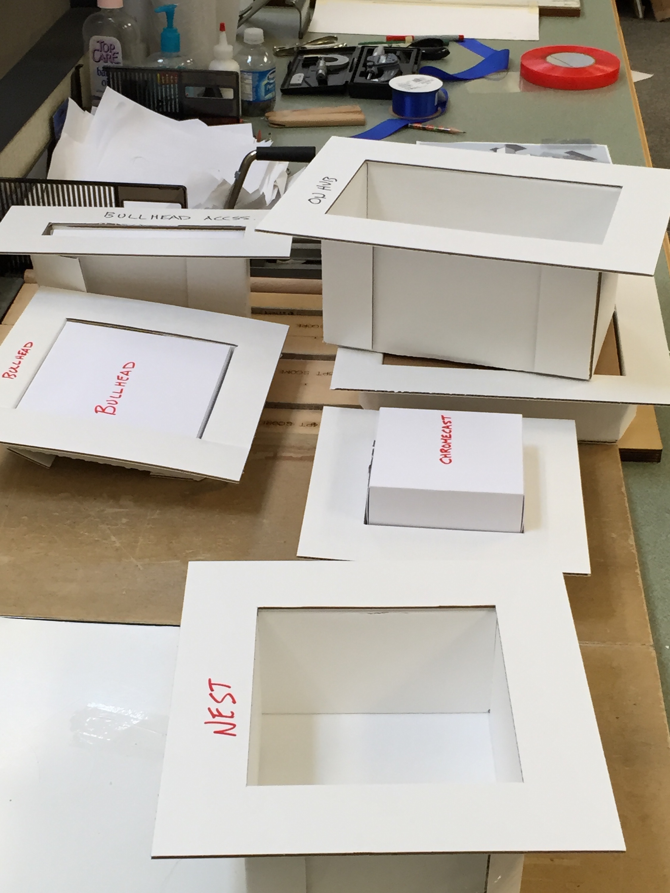
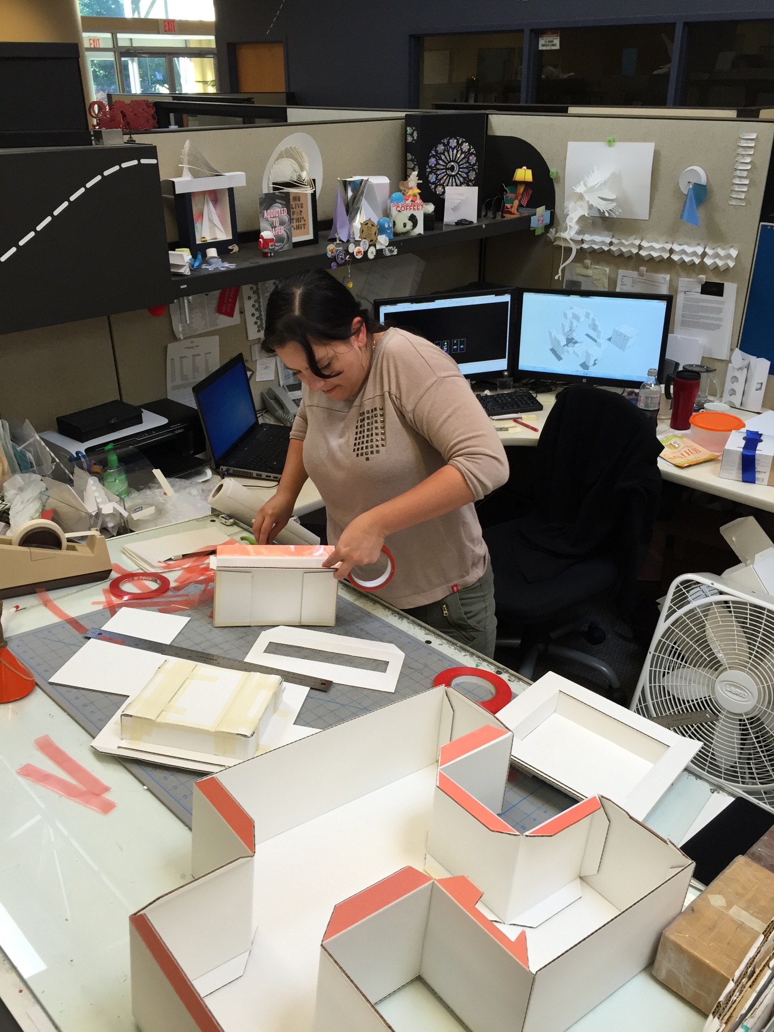
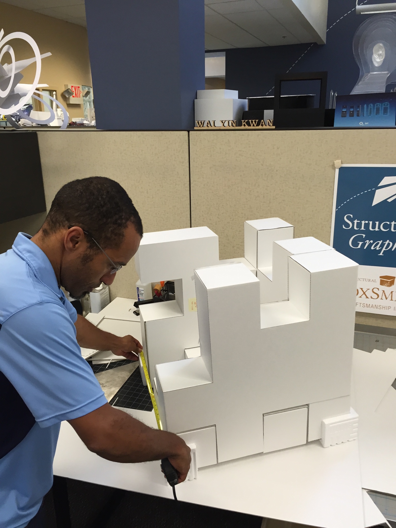
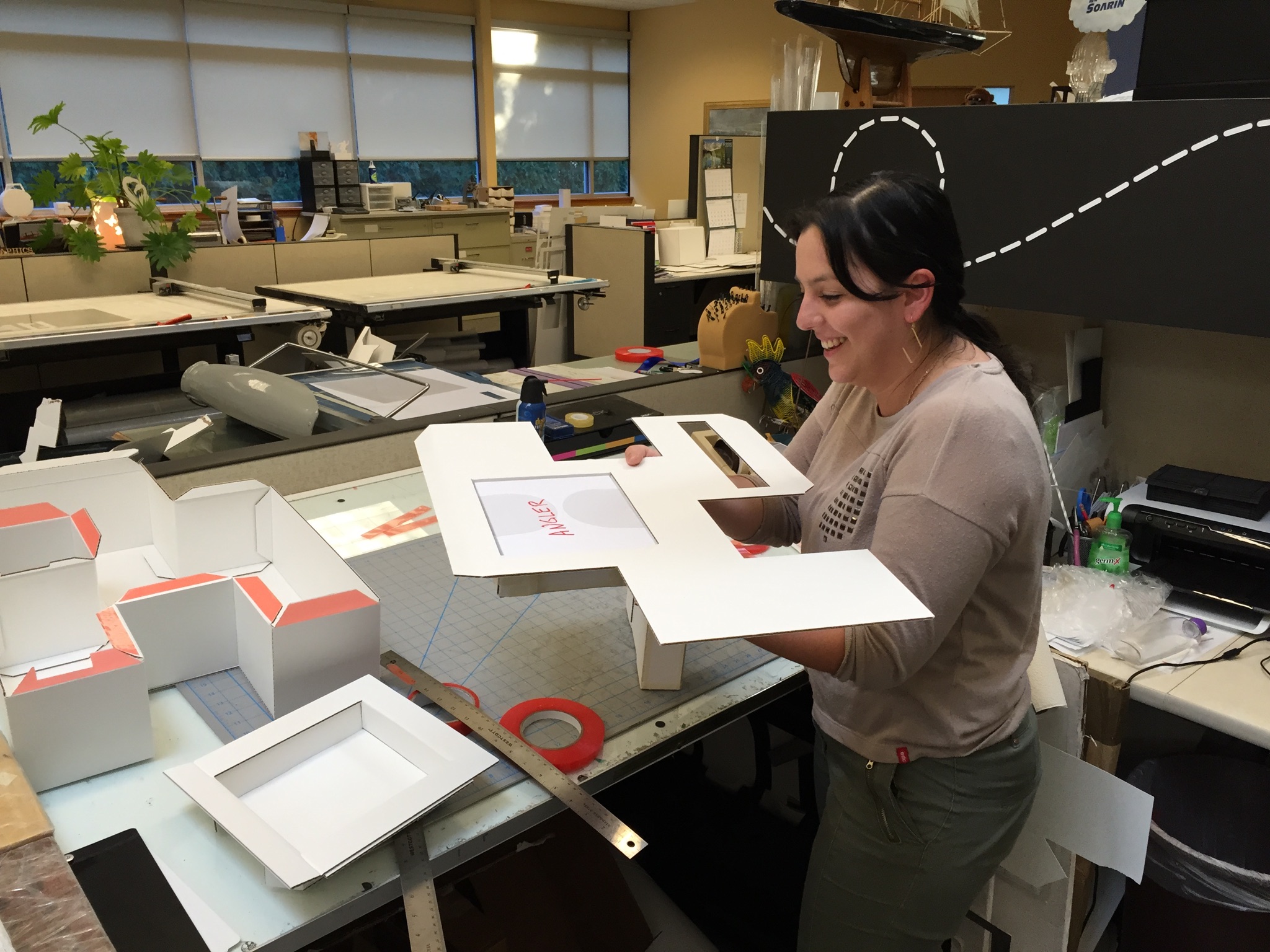
As you can see clearly, it was all hands on deck! From a design and materials standpoint, this box was pretty far out of the comfort zone for our group. The materials and scale of this project was foreign. Typically, we deal with folding cartons, but every single person had hands on this project in order to turn around 2 sets of comps and “push the limits of design & engineering”.

On November 6th, upon assembly of the puzzle box, this was their reaction:

“Hubba, hubba!”

“Sweeeeeet, it’s really coming along nicely!”

“Woohoo!”


Of course, we echoed that.

So, the design was complete, but the job wasn’t over. Once these people receive it, what was the user experience going to be like?

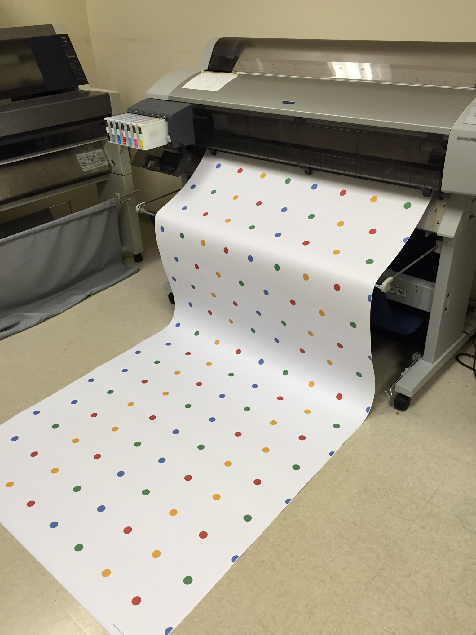
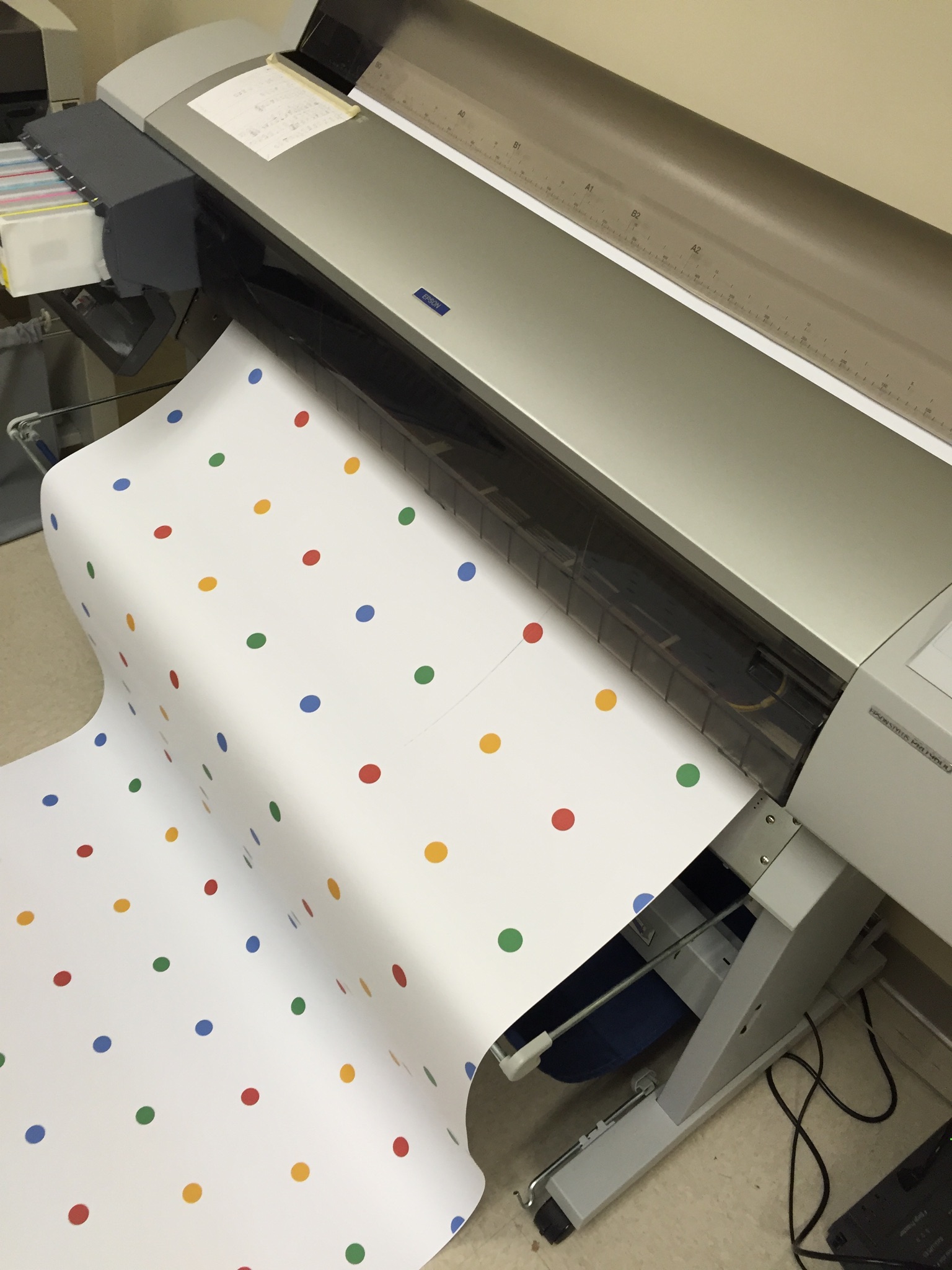
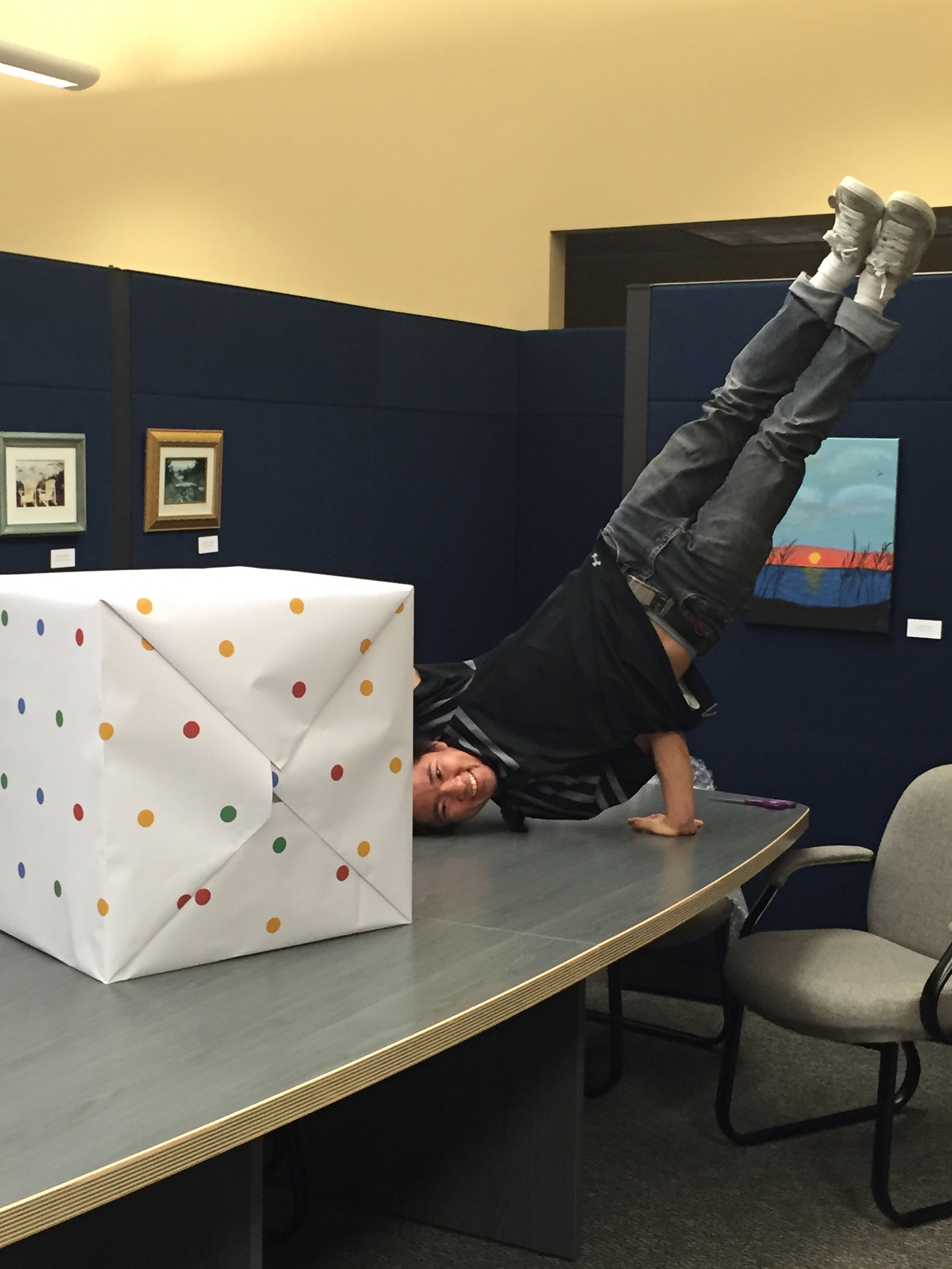
There were a few small, yet critical details. First, was a card insert from the Google brand team, personalized & hand done with black Sharpie. Second, there was a little issue with the puzzle pieces, they didn’t quite stay together during shipment. Okay, thought our design team: how can we fix this? Why don’t we put it in gift-wrapping paper? Develop custom Google wrapping paper, which was actually functional. Genius.

Timing was a huge component for this project, considering it needed to drop by Black Friday. The second comp turn-around time was 3 days, and because of timing, we sent a template without sending a second comp. They never received a final produced prototype (only the press proof) before shipping to the influencers.

The night before delivery was crunch time. Gustavo, Vice President, Operations, and Teresa, Director of Business Development, left Mexico at 1:45am for delivery. They had 2 hours and 15 minutes to make it. From there, it was Fed Ex same day shipped, with critical care, and a contract with independent TSA couriers. Anddddddd, *sigh* just in time.

You might notice, if you’ve been paying attention to the timeline, that one of the most impressive parts of this story was the timing it took from concept to influencer delivery: 7 weeks.

“Amazing work under a brutal timeline.”

And just like that, that was it. 7 weeks. 7 products. 24 pounds without products, 35 pounds with products. Lots of hard work, and of course, a little bit of play…

IMG_5098

Watch the Unboxing for yourself below, or via these links: ShaySparklezAndrea and Maya.

Shay

Shay @ 7:33 – “That’s the best part, the packaging.”

Captain Sparklez

Captain Sparklez @ 1:55 – “What?! This is the coolest packaging I’ve ever seen in my entire life. I don’t even want to disassemble this.”

Andrea

Maya


It All Began with A Pop-up Book

Most likely, you’ve heard our spiel (and if you haven’t, you’re in luck): “Structural Graphics is the pioneer of the dimensional print marketing industry.”

“Okay,” you might be thinking, “that’s great. But who decided to take a pop-up and turn it into an ad?” Which is a reasonable question — it’s a pretty genius idea.  Although it has been said that digital is taking over the marketing space, it’s undeniable that our work really POPS, gets attention and drives to digital.

Believe it or not, Structural Graphics did not start with an advertisement.  It all started with a fascination of pop-up books and paper that led us to engineer a new medium for the world of advertising.

Paper house in pop-up book

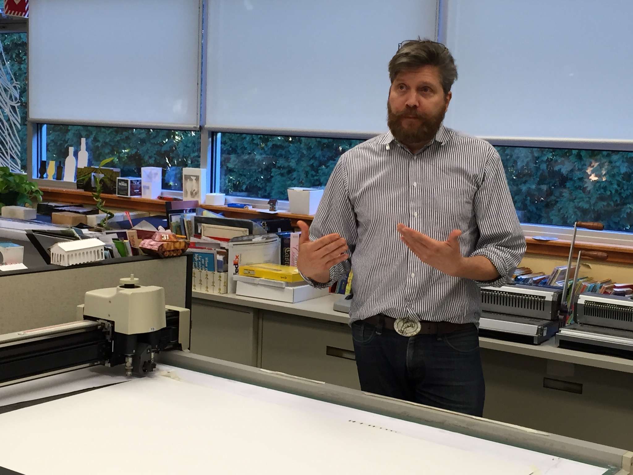
When asked about how the company got started, Ethan Goller, president of Structural Graphics, had this to say:

“Structural Graphics was the first company ever to introduce interactive print collateral for advertising and marketing on a commercial scale, and so can claim having “invented” the medium for use in that space.” he says.

“I’m often asked, ‘how did it all get started?’ Company founder, Chris Crowell, had a background in the graphic arts and advertising. He also had a passion for movable (“pop-up”) books, and the notion struck him:

‘If you could take the interactivity, engagement and whimsy of a pop-up book and apply it to advertising, it would perform better than traditional (“flat”) print collateral.’


That was in 1976! And as we prepare to celebrate our 40th anniversary next year, stronger than ever in a business that has transformed dramatically to be relevant in a digital environment, we are proud to boast about our place in advertising history.”

Ethan sums it up perfectly. Times change. So does Structural Graphics.  That’s why we were thrilled when Google came to us to produce a popup book for their new app, Google Photos. We can incorporate technology in print — videos, sound, web keys, NFC, you name it, or take it all the way back to our roots with our love for pop-up books.

Google Popup Book (18)


Whirlpool’s Marketing Gets the Right People Talking

Whirlpool’s 360-degree approach to marketing, incorporating web, TV and print, has made it’s brand presence more relevant and attractive to consumers in the home appliance marketplace.
Continue reading

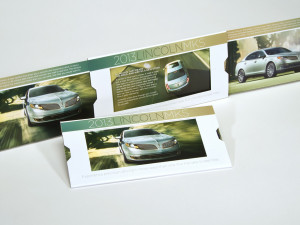
Direct Mailer for Lincoln MKS

Give Your Audience More to Be Happy About

Sometimes your audience just needs a little more. Meet the Extendo. Like its name suggests, it gives brands extra room for messaging and graphics and adds a level of participant interaction that rivals digital. Continue reading