Category: Dimensional Print Marketing

Structural Graphics Featured in Fold of the Week

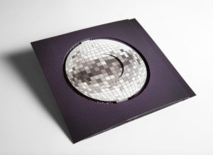
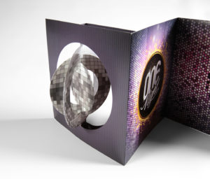
Check it out!  Structural Graphics’ piece was featured as the 60-second Super-cool Fold of the Week.  Trish Witkowski of Foldfactory showcased our “Simply Cool Swinging Disco Ball Accordion Invitation.”

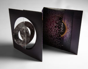
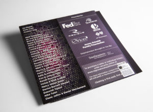
Structural Graphics designed and produced this disco ball invitation for RedRover Marketing in Tennessee for their client, the Regional One Health Foundation. They used this mailer to invite people to their annual ONE Night Fundraiser. The invitation shipped flat, but the paper die-cut spheres on the cover immediately twirl in succession when you open up the mailer to create the illusion of a dimensional disco ball.

Thanks for the shout-out Trish!

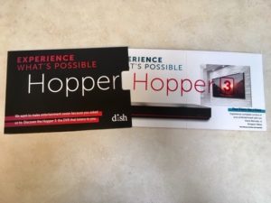
PROJECT SPOTLIGHT: Dish Network Uses Pop-Up Cube As Unique Handout

How does a company stand out at a trade show with a sea of many other vendors to compete with?

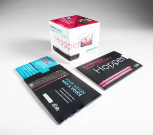
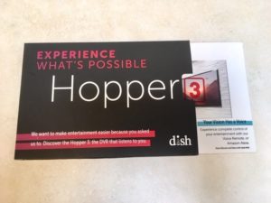
Dish Network used the pop-up cube as a unique handout at the CES Show in Las Vegas. They kicked it up a notch by delivering the cube inside a half-sleeve, giving the recipient a sneak peek of what was on the inside. As the cube slides out, it immediately pops into shape delivering information about Dish Network’s award-winning DVR, The Hopper®.  Click here to see it in action!

Are you ready to generate some buzz and awareness for your company?


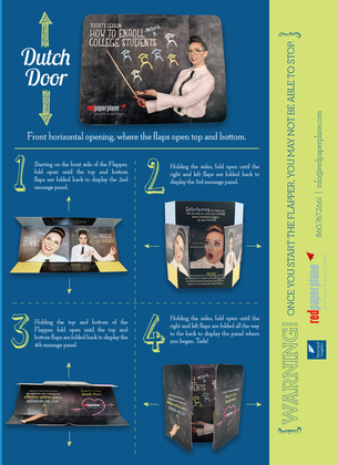
The Flapper How To Guide

The Flapper is one of our most popular and effective designs because of how interactive and engaging it is. Here are some quick tidbits about the Flapper:

  • It has increased campaign results for some clients by over 400% over previous campaigns
  • Gillette and others have used it as part of a magazine ad
  • It comes in multiple sizes
  • It produces mega results

Check out  Susie’s video that shows us just how easy and versatile The Flapper is to use.

You may also like take a look at our Flapper How To Guide.

Are you ready to design yours?

5 Unique (and Budget-Friendly) Ways to Thank Your Customers

It’s happened to all of us: You go to check your inbox and there to greet you are dozens of emails expressing thanks. “Thank you for your purchase.” “Thank you for subscribing.” “Thank you for participating in our event.”

But how effective are these email “thank yous” anyway?

As any good marketer knows, a simple “thank you” is all it takes to set your business or brand apart from the competition. But these days, with the overwhelming amount of digital communication available, saying it through email just isn’t enough. To help you get ahead and stand out from the pack, we’ve compiled some clever ways to thank your customers that are effective, impactful and have nothing to do with clicking send.

  1. Show, don’t tell. Instead of sending out a boilerplate email or even a standard “thank you” card, try showing recipients how much they mean to you by way of video. Not only do videos increase people’s understanding of a product or service, but it also allows you to showcase your brand’s personality and connect emotionally with your audience. Our Video-In-Print Brochures are a great place to start.
  2. Be engaging. Easier said than done, right? At Structural Graphics, we’re all about engagement, whether that means incorporating digital components into your direct mail or simply taking a unique approach to it altogether. From pop-up books and Telescoping Sliders to virtual reality head sets (ours are called SleekPeeks) and our iconic Flapper, we’ve got you covered.
  3. Give them something to remember you by. There’s no use in sending your customers marketing collateral if it doesn’t leave a lasting impression. Why not create a “thank you” that has some longevity by incorporating functional elements into your piece as well? Take this polygon calendar we created for Cars.com or a Pop Up Pen Holder like the one seen here.
  4. Surprise and delight. Emotions drive people to action. Consider including a little something unexpected in your “thank you” that will not only ensure that your brand is memorable to your intended recipient, it will also encourage them to interact with your brand in positive ways. Perhaps they’ll tell their friends about your brand or even read on in your “thank you” to purchase your product or service. Maybe it’s LED lights incorporated into your piece. Or maybe it’s sound to transport the recipient to your location. Interested in seeing some examples? Check out this video we did spotlight SKM Consumers Energy’s Pop Up House.
  5. Don’t stop there. Your thank you note should be more than just an expression of thanks. Think of Calls to Action to get the recipient to interact with your brand, whether that’s encouraging him to visit your website or asking her to share a photo of the piece on social media. This has two benefits: It’s fun for your recipient and it’s trackable for you. Our web keys are a perfect example of how to do this right.

PROJECT SPOTLIGHT: Seton Hall University Stands Out With Rolling Cube Mailer

The competition to increase the admissions yield in higher education is stiffer than ever, according to the University of College Designers Association.  Schools are looking for ways to stand out and differentiate themselves from everyone else.

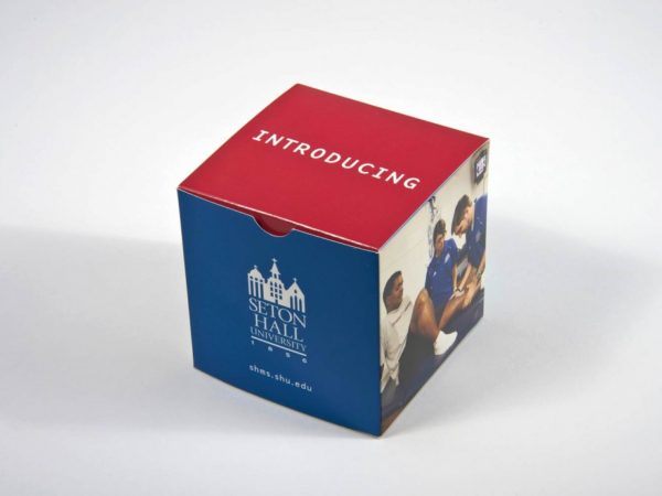
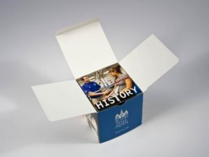
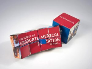
Seton Hall University chose our Rolling Cube to deliver information about their university to prospective students. This is one of our most interactive pieces. When you pull the cube from the mailer it keeps unfolding to reveal multiple cubes of information. Words don’t do it justice – be sure to click on the flash movie to see it in action!


7 Steps Chrysler Took to Promote Their Business at the NADA Convention

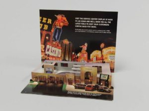
Today’s automotive industry moves fast and furious, so it’s important to showcase your vehicles in new and creative ways. But how do you show change and innovation on paper? You don’t. You show it WITH paper.

Like Chrysler did here.

The automotive company was looking to encourage people to visit their service center display at the National Automobile Dealers Association’s Las Vegas convention in 2003. To do this, they cleverly employed several marketing techniques that can apply to any brand or industry.

  1. Stay true to your roots. Chrysler, which has a strong brand identity, chose to showcase a miniature version of a Chrysler dealership right down to the cars, service desk and employees.
  2. Never underestimate the ‘WOW Factor’. Pop-up mailers are a really unique way to capture the attention of your audience. This particular one ships flat but, because of its interactivity, detail and uniqueness, it also surprises and delights.
  3. Less can be more – when it’s done right. Sometimes it’s just better to get to the point. To really maximize the space on this mailer, Chrysler chose to include short bursts of essential information instead of paragraphs of marketing speak. Rather than trying to convince attendees to visit its display, the team chose to let the excitement of the mailer speak for itself.
  4. Include a call to action. In this mailer, Chrysler is up front about what it wants – for people to visit the company’s service center display at the conference.
  5. Offer an incentive. We all know that people generally love to win free stuff. So, instead of just asking conference attendees to visit Chrysler’s display, they wanted to make the visit worthwhile. To make their call to action even more powerful, the company also advertised that they would be offering a chance to win a free year of ServiceVision.
  6. Don’t forget the basic information. Between the bells and the whistles, it’s easy for marketers to get caught up in the excitement of a piece and forget the most basic of information. Always include the date, time and location (if applicable) of any event you or your business are/ is attending.
  7. Catchy openings are key. Embracing the convention’s location, Chrysler took inspiration from Las Vegas’ neon lights and showgirls. The mailer’s cover is colorful and hints at the purpose for sending it out. It also beckons the recipient to open it up to see what’s inside.

Introducing SG Unfolded

Each year, businesses throughout North America choose Structural Graphics to produce thousands of dimensional projects customized to fit their individual needs. But what about the multitude of other designs our paper engineers have created but have never been produced?

Now, you can find them here.

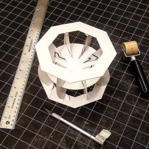
SG Unfolded, which launched this week, is intended to showcase one-of-a-kind inventions born of innovative thinking and precision engineering. We have such a large library of designs, that we wanted to shine a spotlight on some of the amazing work our paper engineers think up behind the scenes, which may have never made it into a client’s hands.

Our hope is not only to show off these designs, but also to help you get to know our paper engineers and their approach to crafting novel pieces for marketing professionals, Fortune 500 companies, universities and the like. Perhaps these pieces will even inspire you!

Currently, we have 16 designs on SG Unfolded (and our related Instagram account, with more queued up and ready to be posted for you to enjoy every week. Multiple images are posted for each design, including a short video to showcase how the mechanism works.

We hope you enjoy!

The Continued Rise of VR in 2017 – And What it Means for You

ford-australia-design-2

If you haven’t heard about VR by now, there’s a good chance you’re living under a rock.

The new technology seemed to really gain traction in 2016 with videos of Lil Wayne and LeBron James wearing Samsung’s Gear VR headsets and this emotional video released by Excedrin, which shows how it feels to experience a migraine — in real time.

But as VR and AR technology continue to gain traction in the new year, what are the implications of these products on marketers, businesses and the public?
screen-shot-2016-12-09-at-11-58-02-amHow are Virtual Reality Headsets Different Today?

Many of you might consider VR headsets to be the latest breakthrough in modern technology. Not exactly. Rather, it’s more like an upgraded gaming system with its 360-degree views and human-like avatars.

And while the original headsets were extremely clunky and not exactly wireless, they also carried a hefty price tag. This had two implications: 1. Developers had no desire to create headsets outside of gaming and 2. They didn’t make sense for businesses or consumers.

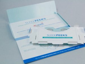
Now, nearly two decades later, these bulky, expensive products have evolved. Companies like Samsung and Google now offer their own versions of VR headsets and, here at Structural Graphics, we’ve created cost-effective versions called SleekPeeks that you’re able to customize to fit your business’ logo, color scheme and unique messaging. Plus they ship flat.
sleekpeeks_web_3_resized__3

So, How Exactly are Businesses Using VR to Market Their Products?

For everything from virtual product demonstrations and 360 video tours to training and prototyping. Here are a few examples:

  • Psychiatrists at the University of Louisville use VR to treat patients with social anxieties or phobias during cognitive behavior therapy. Because the patients are in a controlled environment, doctors are able to simulate the patient’s fear of, say, flying, and direct them on how to cope with that fear.
  • Ford currently uses VR in its Immersion Lab to get a better sense of how their customers experience their cars. Using headsets, they view high-def renderings of the interiors and exteriors of the cars before a prototype has been made available. To make this even more realistic, the company has developed prop-like tools like a flashlight that help their employees’ experience feel natural.
  • In an effort to increase bookings, Marriott Hotels created a “teleporter” which encouraged users to step inside a booth, put on a VR headset and visit a dream location. Not only could the wearer see a beach in Hawaii or the London Eye, but they could also feel the wind in their hair and the sun on their faces.
  • The US Postal Service used our SleekPeeks for their “Emerging & Advanced Technology” discount incentive program at the Association of National Advertisers (ANA) “Masters of Marketing” Conference. This piece delivered a powerful, yet lightweight virtual reality experience to conference attendees.

Interested in discovering how virtual reality can work for your business? Click here to request your FREE SleekPeeks sample.
What it Means to Say I’m A Creative: Isabel Uria

This is the second installment in our “What it Means to Say I’m a Creative” series, meant to focus on the inspiration and drive behind each one of our paper engineers. To read Part 1 of the series, click here.

  1. How did you know you wanted to create (in a professional sense)?
    I think at an unconscious level I always knew I was going to work in the arts. I played piano for five years, and was involved in the school choir, theater, musicals and extracurricular art classes since middle school. Back then, I loved colors and painting, primarily.However, my journey with paper probably goes back to when I was 6 or 7 years old. My older brother had been given origami books for Christmas. I saw how he would make all these little creatures out of paper and neatly display them on his shelf. As any little sister, I idolized my brother. I wanted to be just like him! But he wouldn’t lend me his origami books!So one day, when he wasn’t looking or wasn’t around, I snuck into his room, took the books and started to try to follow the instructions on how to make all these little creatures through increasingly difficult pleats and folds. I succeeded on the beginner’s book but I failed miserably on all the more advanced ones. It took a while before I would understand and successfully accomplish complex paper folding like that. But if I have to look back at where I began with paper, I think that might have been my first experience with this amazing material.
  2. What advice would you give to others who want to work in a creative industry/ position? 
    Work Hard. Work smart. Be true to your passions.

    Be consistent.

    Be persistent (without being stubborn).

    Be confident, but not cocky.

    Dream big, but also keep your feet grounded in reality (or at least keep a toe or two on the ground).

    Stay confident, even when you think you’re wavering at every turn. (We often think we’re not doing well enough, but sometimes that’s a good thing; it keeps us humble.)

    Go forth doing your thing (whatever that may be) with constancy and fortitude!

    I guess much of this “advice” can really apply to any profession. At the end of the day, whatever you do, practice your craft passionately. Wouldn’t that make for a happier you?

  3. What does creativity mean to you?
    Being creative is inside all of us. Creativity is looking at a world of possibilities and acknowledging all the ways a problem can be brought to light and all the ways it could be solved. Creativity opens your mind. It is a path to visualize the past, the present and the future. Creativity is the opposite of war. It is the future. Evolution has happened because human beings have been curious to know and understand how things work and take that understanding to CREATE new developments and innovative things that serve our needs and help us. Creativity makes the world go around!
  4. How do you feel when you tell others you’re a paper engineer?
    It’s always fun to explain what I do. Unless you’re “in” the industry or closely linked to it, people don’t automatically know what a “paper engineer” is.First of all, we have not necessarily studied engineering in school, yet we work with paper as our material of choice in the same way an engineer does. We use the material —cut, fold, and paste it—to create an entirely new construct. The thing about paper engineers is that we can toggle that blurry line between being an artist and being a designer. We can be both! And sometimes, some of us are.Personally, I feel that’s awesome! I also feel very fortunate to be one of the people who makes a living in this profession. There are only so many people that do, and I think we all know each other! Or at least we know of each other.
  5. What does it mean to say that you’re a “creative”?
    There’s a lot of responsibility that comes with being a designer because you’re the one that has to visualize the results, and make sure it works for the purpose that it is needed. As a creative I have to come up with a compelling, grand, aesthetically pleasing solution to the problem at hand. I have to design an eloquent way to express a message in 3D paper shapes and forms. I have to make things unique and innovative. Sometimes that comes easy, but sometimes it doesn’t. And criticism will always be there. Those are the struggles you deal with on a regular basis as a designer, as an artist and as a creative.

To learn more about Isabel, please click here.