Category: Audio / Video Marketing

How to Drive Increased Marketing Results with Video in Print Advertising

You’ve heard it from us before: Video in Print delivers a powerful multi-sensory experience. Because Video in Print Advertising combines the added context and tactile engagement of print with the compelling motion and sound of video, it’s no wonder more and more marketers are using it to sell products and build trust with their customer base.

After all, as Seth Godin once said, “Marketing is no longer about the stuff that you make, but the stories you tell.” So, why not make sure you’re telling the right one?

Consider these stats:

The top three most effective types of video content are: customer testimonials (51%); tutorial videos (50%) and demonstration videos (49%).Curata
Consider this a cheat sheet. Though video storytelling can be done in many ways, it’s important to be creative and allow your community of viewers, clients and potential customers to be a part of your brand’s story. Instead of giving them what you think they want, create video content that you know they will enjoy while still remaining true to your company and its values.

Companies who have integrated video into their marketing efforts enjoy 41% more web traffic from search than non-video users.SmallBizTrends
It’s not enough to create a video and post it to the web or include it in a Video in Print brochure. You have to nurture it. In marketing, where it’s historically difficult to track the success of campaigns, why not lead your audience to a specific landing page or encourage a clear call-to-action? Prioritize metadata, make sure to include appropriate tags and create enticing titles, too. Now, that’s a recipe for success.

Viewers retain 95% of a message when they watch it in a video, compared to 10% when reading it via text.Wirebuzz
We all know two things are generally better than one. But how about three? With Video in Print brochures, you’re engaging people’s sense of sight as well as their sense of touch and sound, giving them multiple touch-points and ways to engage with your brand.

90% of decision-makers say that product videos are helpful when deciding to purchase a product.Hubspot
Aside from reading reviews from other users on a specific company or product you’re looking to buy, people typically search for a related video. As consumers, people are interested in how a product works, how it looks or how it will make their lives easier.

5% of viewers will stop watching a video after 1 minute and 60% will stop watching after 2.Video Guru
The golden rule in video marketing: short and simple seals the deal (just don’t forget the Call to Action).

Clearly, using video has become a staple in marketing tactics. And, when it’s paired with a high-impact printed direct mail piece, it has double the impact. But, wait, what’s that? You aren’t implementing video yet? You want to expand the reach of your current video marketing efforts? Click here to get in touch.

In the meantime, take a look at our Video in Print offering on Structural Graphics and download our online ordering division, Red Paper Plane’s full Video in Print Catalog. With Video and Print combined, the possibilities are endless!

Let’s Get ‘Phygital’

Print and digital. Digital and print.

These two forms of marketing, once separate, are now (combined) the key to what could be a powerful integrated marketing strategy, especially as postal rates and paper costs continue to drive up companies’ budgets. While it’s instinctive that organizations looking to slash operational spend decrease print and postage costs, print is still preferred by 60 percent of customers.

How do you find perfect harmony between managing rising print and mail costs while still maintaining an excellent experience for the consumer?

The answer, according to Matt Swain from Broadridge, is choice.

He posits in this article that organizations are “in a position to create a more strategic alignment between their print and digital communications” by going “phygital” – combining print with digital.


As businesses look more favorably at incorporating integrated marketing campaigns into their strategic plans, many are redesigning their print communications in order for them to complement their digital counterparts. Part of this move includes bridging the gap with technology.

QR, AR, VR and more allow businesses to introduce themselves and their products in a “paperless” way. We’re seeing these technologies drive customer engagement and strengthen customer-business relationships. Plus, the use of this technology may qualify your business for an upfront 2 percent USPS postage promotion discount that is in effect for 2019. Not to mention, combined with a high-impact dimensional printed format, the engagement level of each marketing campaign which includes these technologies increases.

Structural Graphics & Sister Company, The Lift Factor, Take Home Top GDUSA Awards

Who designed the most innovative packaging of 2018? Graphic Design USA, the leading B2B resource for graphic design professionals, answered that question this month with the announcement of the winners of the 2019 GDUSA American Package Design Awards.

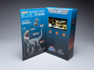
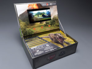
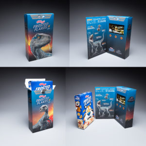
More than 1,000 marketers, designers and printers were challenged as never before to promote their brand in a way that would forge an emotional link with their customers. Out of those entrants, Structural Graphics took home two accolades: winner in the Luxury Packaging Category for Creata Kellogg’s Jurassic World Promotional Video Box and winner in the Food and Beverage Category for the GSD&M Popeyes Emotional Support Chicken Box.

Structural Graphics’ insurance marketing sister company, The Lift Factor, is also a winner in the Luxury Packaging Category for the Brighthouse Planter Mailer.

Think Outside the (In)Box: 5 Print Trends to Take Advantage Of

Where did January go?

As we continue to execute our 2019 marketing promotions and campaigns, there is no better time to revisit (and rethink!) your business’ print communications. Is your collateral giving people what they want? Does your team have clear priorities spelled out from the beginning?

If you answered “no” to either of these questions, keep reading for some tips on how you can ensure your brand communications aren’t missing any opportunities for business.

  1. Plan, plan plan. Is your warehouse overflowing with inventory? Or maybe you’re nervous to try dimensional print because of the barriers to entry? It helps to have a clear plan. By starting with the end in mind, you’ll be able to print only what your team needs, thus reducing inventory, waste and long-term costs.
  2. Get physical. Provide your customers with an immersive and interactive experience when they open your direct mail piece, invitation or campus flyer. More and more, the printing industry is getting increasingly creative with everything from packaging techniques to Virtual Reality. Use services like DX Print Group to delineate clearly the details of projects in your prints. Cut through the noise of overflowing inboxes and standard postcard mailers to not only capture your customers’ attention, but their hearts, too. 
  3. Don’t ignore the double dippers. These are the folks who receive both paper and digital communications. Statistically, many of these consumers are younger and, though they’re the most likely to go paperless eventually, are still open to the idea of receiving hard copies and snail mail. Take advantage of this market.
  4. Convenience is key. According to a poll by Keypoint Intelligence-Info Trends, customers said the best way for marketers to improve their print communications is to make them easier to understand. Instead of worrying about providing customers with every detail about your business, consider streamlining your marketing and focusing on one single “story” per piece. Not only does this cut out unnecessary detail, but it also makes your marketing easier to digest. Oh, and please, please remember to include a clear call to action.
  5. Prioritize, then execute. Perhaps a complete overhaul of your marketing strategy is in order, or maybe it just needs a fresh pair of eyes. Whatever the case, re-positioning your brand strategy allows businesses to start from scratch and execute on your priorities. How do you want customers to feel when they see your marketing communications? What action should they take after receiving it? These are all great questions to ask yourself and your team (if you’re not doing so already). They’ll encourage you to set clear goals for the year and inspire more detailed, thoughtful game plans to achieve them.

4 Things Innovative Marketers Will Do In 2019

You know it and we know it: Print is not dead. In fact, it’s more alive than ever before.

Not only can print help with building brand trust, but if done right, it can also help a brand reach a wider audience when part of a holistic marketing strategy.

So what’s a marketer to do?

To help you out, we’ve compiled four tips to run with in the year ahead.

  1. Let History Be Your Guide. Remember that holistic marketing strategy we mentioned above? It can prove to be invaluable, especially when you’re trying to create your next print ad or campaign. Comb through your brand’s social media analytics to see your best performing posts. Do you see any patterns? Find that common thread and use it to inform your print work.
  2. Take Note. So, you’ve purchased ad space in the perfect publication, but now the only question is how to make your ad stand out. Take a look at the magazine or newspaper, itself: Does it feature mostly text? Bold colors and little negative space? Whatever it is, try to deviate from that path to ensure you’ll stand out. Just make sure you don’t deviate from your other print and digital campaigns – you still want customers to recognize you.
  3. Don’t Give Away The Whole Story. Otherwise, what’s the point? When you’re developing a print campaign, it’s important that each piece thoughtfully tells a piece of the story you want to tell. The idea is to take customers on a journey with a clear call-to-action at the end. Tease and hook your audience. Don’t let too much out of the bag at once.
  4. Embrace Technology. Take some inspiration from Departures or InStyle, publications which both featured magazine ads that included ground-breaking technologies. From a pulse reader for Toyota to an expertly choreographed lighting experience for Audi, the marriage of traditional and modern media successfully created a multi-sensory experience that captured prospects’ attention.

Entering 2019: Our Marketing Predictions for the Year Ahead

In the lead up to the New Year, we put our heads together to share our vision for the year ahead. Here are a few trends we think will be shaping our marketing in 2019.

Video Marketing

Let’s face it: humans are visual creatures. Colors, graphics, movement and story lines capture our attention, especially when it comes to marketing. Take Facebook, for example. With the unveiling of their new Facebook Portal, we’re seeing commercials and ads that showcase the product as a small, but essential, character in people’s lives. And it isn’t the only one. Brands like HP, Google, Airbnb, Nike and Everlane, to name a few, have all jumped on the bandwagon that is authentic video storytelling.

But video creation is no longer only for brands with big budgets. Any good marketing campaign should be designed to trigger an emotional response, and video has consistently proven itself as an effective way to do this. According to this report by Cisco, video will make up more than 85% of all consumer internet traffic in the USA by 2020. What’s more, video marketing has zero signs of slowing down.

So what’s a brand to do? Whether you’re just getting started with video marketing or you want to up your video marketing’s “wow factor”, give our Video-in-Print Brochure a try.

The Netflix Effect

OK, so this may not be a real thing (yet), but what we’ve dubbed “The Netflix Effect” will continue to inform content and brand marketing into 2019. Four parts. Ten episodes. What’s working for streaming services like Netflix, Amazon and Hulu will work just as effectively for branded content if done right.

Strategically planning out and delivering your brand’s story in a way that plays to consumers’ interests and attention spans isn’t just great for them, it’s great for your company’s bottom line. To do this, leverage micro-targeting and new content delivery platforms and technologies.

Artificial Intelligence

Content will be more and more automated. Text aside, brands like Sephora, Starbucks and Apple are already automating their marketing using mapping, facial recognition and chatbots to aide in handling customer service interactions. As consumers crave increasingly more personalized and contextual messaging from the brands, publications and companies they support, this trend will continue to extend beyond marketing into automated news reporting, customer service, business intelligence, etc.

Engaging Audiences

We’ve really loved to see the evolution of how brands are engaging with their audiences. From Audi to the US Postal Service, virtual reality and augmented reality have proven themselves as important tools that bridge traditional print with evolving forms of media and technology. They’re so effective, in part, because of their immersive qualities – AR and VR have a unique ability to involve consumers in brand’s storytelling, creating a faster (and often stronger) sense of connection between the two.

Merging Old School + New School

Believe it or not, what’s tried and true are staples for a reason. That’s why direct mail still has value.

Here’s the thing: everyone likes getting mail. That is, when it’s personalized, unique, relevant and valuable to the recipient (not a bill…). With all of the technological advancements in automation and digital marketing, direct mail has actually proven to be more valuable if done right. In fact, response rates for direct mailers have risen to as high as 5%, more than four times that of digital.

So, don’t shy away from old school marketing like postcards, brochures and catalogs. Rather, use these formats (if they work for your brand) in an intentional way that is both relevant and valuable to the recipient. Use data to inform your content and think outside the box when it comes to choosing a design.

Don’t know where to start? We recommend taking a look at our Flapper, Pop Up Cube and Extendo.

Give Your Brand the Edge with Dimensional Print

Imagine for a second: You open up a seemingly ordinary envelope and a 3D cube pops out at you. Or a video, housed in a paper brochure, begins playing at the touch of a button. How about a printed paper jukebox that actually plays music.

These are just a few of the things we do at Structural Graphics that re-define print.

Dimensional print is a unique and effective way to tell your brand’s story by capitalizing on marketing that surprises and delights. Pull a tab and things move. Open a direct mail piece and have it pop out at you.

Three Reasons to Consider Dimensional Mail:

Appeal: The magic of dimensional mail lies in its uniqueness. Not only will your intended recipient open it, but in most cases, he or she will likely pass it along to friends, family and colleagues, who can also share in on the excitement.

Response: Dimensional mail has proven to be about three times more effective than traditional flat print. In fact, our direct mail designs break through the clutter and deliver average response rates of 8.5%.

Longevity: In many cases, dimensional mail pieces are kept to be used over and over again. For instance, Montana’s Fish, Wildlife & Parks recently designed a Pop-up Pen Holder for staff members that showcased the agency’s four guiding principles. Because of the unique functionality of the piece, many have elected to keep it on their desks, thus keeping the brand top of mind each time they see it.

Structural Graphics introduced the world to dimensional print marketing in 1976 and has been leading the charge ever since. And as the world changes, our capabilities and service offerings continue to evolve.

For over four decades, we’ve helped market many of the most influential brands. And we’ve done this by delivering attention-getting solutions that stop people in their tracks.

2018 Trends: Print in a Digital World

Shame on you if you’re still thinking of print as “traditional” marketing! It is the same as consider web design to be just about beautiful exterior. Hop over to this website for details.

Beyond the fact that print is not dead, we’re firm believers that paper and ink can be as limitless as your imagination. Nowadays, consumers can access bedtime stories by scanning wallpaper, quit smoking by way of virtual reality and track their heart rate just from touching a magazine ad.

As brands continue to rethink their marketing, it’s important not to count print (or paper) out just yet. For many, it can aid in creating multi-sensory experiences, bringing together craftsmanship, creativity and design in a way that resonates with consumers.

Taking inspiration from the trends mentioned in St. Joseph Communications’ Print in a Digital World 2018 report, we’ve compiled a list of some of the most innovative projects we’ve been a part of to show you just how interesting paper can be.

TREND 1: Art, not ads.

“From smartphones to desktops and tablets to wearables, we cannot escape real-time digital experiences. Real disruption goes beyond swipes and taps. It comes from creating a wider sensory and immersive experience.” – St. Joseph Communications

SONY

Sony chose our Magic Window design for a direct mail campaign. The results? The average time spent with this mailer – 41 minutes. The rate of recall among recipients – 90%. The average time this piece was retained by recipients – 4 months.

VELUX SKYLIGHTS

We worked with full service agency Wray Ward Marketing to promote the commercial use capabilities of their client VELUX Skylights. They wanted to portray that VELUX Skylights was superior to its competition. The design they chose to do this was our table tent video box. The video screen is contained within the box. When you open up the box, the piece stands and locks into place displaying the informational video front and center. The video box also included play/pause and volume controls.

TREND 2: Beyond the page.

“The emergence of new channels and technologies are creating new opportunities for marketers. Virtual reality and augmented reality are bridging the gap between print and digital like never before. Downloadable apps can be easily introduced to campaigns, while more sophisticated brands are integrating these technologies into their own mobile platforms.” – St. Joseph Communications

FOOD LION

Food Lion Grocery Stores used this press kit to deliver information about the new layout and new products offered at its stores. When you open up the press kit, a replica of the new store pops up in the middle of the kit with detailed information on the new layout laid out in the middle. Also upon opening, a sound chip was activated to deliver an auditory announcement of the new stores. Each panel featured colorful imagery and information about the exciting changes of the store, and the right-hand panel also featured additional tabs of information that could be easily pulled out. The locking mechanism on the inside allowed the panels to lock in place making this the perfect comprehensive press kit for Food Lion.

PORSCHE

We designed and produced this custom Virtual Reality Viewer for Porsche. They used it to give consumers an interactive experience with their brand.


STRYKER DIAGNOSTICS

Stryker Diagnostics, the makers of hip and knee medical devices, chose this V-Pop design as a tradeshow invitation. When you open the invitation, a postcard pops up in the center. The call to action on the postcard was to bring the postcard to the Stryker booth to experience a 3D demonstration of the hip and knee devices. When users held the postcard marker in front of the web cams set up at the Stryker kiosks they were able to view a live 360 degree 3D demonstration of these devices.

TREND 3: Far from traditional.

“Thinking of print as ‘traditional’ is an old way of thinking. Consumers can cook, monitor their own health, and connect physical and digital channels thanks to a printed piece. These are the types of interactions that are meaningful to consumers.” – St. Joseph Communications

TOYOTA

The request was for something that has “never been done before.” With an LCD heart monitor and two completely independent electronic units in one magazine unit, this spectacular for the Toyota Camry certainly meets the criteria.

Incorporating movement, interaction and technology, this first-of-its-kind Camry insert is the latest re-invention of what print can be.

NATIONWIDE INSURANCE

Nationwide Insurance used this pie box mailer to deliver information about CareMatters, its long-term care product, to agents nationwide. The outside of the box pie box featured a partial mylar window that allowed recipients to get a sneak peek inside the box. In this case, a piece of the pie. Inside the box was a double-layered pie made out of paper that delivered different information as you turned the upper layer of the pie. There was also a brochure and a web key inside the box that drove agents to a unique landing page, specific to their agency, where they could learn more about this product. This box was also the winner of a GDUSA American Package Design Award!

GOOGLE

When you’re the most widely used web-based search engine in the world, how do you communicate with your audience in a way that is equally as big? Google chose this puzzle piece mailer to introduce the features of Google Earth Pro, its 3D interactive globe. The pieces of the puzzle were mailed inside the envelope and recipients were asked to connect it all together. The results? A fully dimensional ball featuring the features and benefits of Google Earth Pro.

Let’s Talk EDU: 5 Unique Ways to Market to the Next Generation

Before you can accept the best and the brightest, you’ve got to get their attention.

That’s where we come in.

Institutions from Manchester University all the way to University of Washington Tacoma are moving beyond the brochures, magazines and billboards traditionally used to market to students. Instead, they’re pushing their resources toward interactivity and the digital landscape. By using these unique higher education marketing strategies, colleges and universities can raise awareness of courses and programs while, ultimately, bringing new students into the fold.

Below are five key methods that savvy higher education institutions can use to creatively market their programs and reach a wider audience of prospective students.

  1. Cater to your audience, virtually. With smartphones and virtual reality headsets like our SleekPeeks, virtual reality is more accessible than ever. Not only have we seen countless universities offering virtual in-class experiences to online students, but we’ve also seen the technology become a part of the admissions process. Now, parents and students can explore campuses from afar with panoramic virtual reality tours inside buildings and around campuses.
  2. Get animated. Part of getting a prospective student excited about your institution is making an emotional connection with him or her. Video is a proven way to do just that. Whether it’s popularizing courses, highlighting campus or introducing students and parents to faculty, strategically crafted videos can speak to your target demographic. Even better? These videos can be leveraged across digital and print, allowing marketing teams to track ROI metrics. Pair your video with text using our Video in Print brochures, and you can do double duty.
  3. Personalize to fit your audience. A baseball player seeking to play at a D1 school isn’t necessarily going to have the same interests as an honors student looking to study pre-med. So, a university seeking to attract both students shouldn’t seek a one-size-fits-all approach to its marketing efforts. Like with any industry, when developing your marketing plan, it’s important to understand your audience: What content resonates with them? How do they currently perceive your school? How are they accessing your current content? Ensure that what you’re producing adds value to each group you want to target.
  4. Surprise and delight. Going to college is such a pivotal moment in the lives of so many young adults, yet so much of the higher education marketing we see doesn’t convey that excitement. Our Pop Up Cubes are extremely popular with colleges and universities because of their ability to engage and stand out from other mail. Not only do they ship flat, but as soon as the belly band is removed, they spring into action, showcasing the school in six eye-catching squares.
  5. Don’t forget the alumni! Maybe it’s a holiday card. Or an invitation to an upcoming alumni mixer. Whatever the occasion, the story of your school and the students’ place in it shouldn’t stop once they’ve graduated. Alumni are fantastic: They’re already a captive audience with an emotional connection to the school. Aside from donating real dollars, they can also offer compelling testimonials and clout to a university or college.

The Story Behind InStyle’s Toyota Ad

If you’re one of the 50,000 targeted subscribers who received the March issue of InStyle magazine, there may have been one spread in particular that stood out. And it wasn’t an article.

Rather, it was an ad. A Toyoto ad, to be precise, and it’s being touted as the first-of-its-kind magazine insert.

With a pulse reader, speaker and flashing lights, the insert, created by Saatchi & Saatchi in partnership with Structural Graphics, expertly uses sight, sound, smell and touch, to take readers in an extrasensory tour of Toyota’s 2018 Camry sedan. The insert not only marks the first time an LCD heart monitor has ever been put into a magazine, but also the first time two completely independent electronic units have been combined into a synchronized magazine unit.

“It was something brand new; completely undone ever before,” said Ethan Goller, President of Structural Graphics. “It was RND, new technology.”

According to Creative Director Erik Hluchan, the team at Structural Graphics was approached by Toyota’s agency of record, Saatchi & Saatchi with an idea to create a pop-up based on something they’d seen on the Internet. Together, with the help of Shin Wakabayashi, Paper Engineer, Noel Boland, Director of Design, and Goller, the team was able to engineer a clean, reliable pop-up experience that fit seamlessly into the magazine.

“It’s challenging when it goes into a magazine because of the way it’s treated,” Hluchan said. “Magazines are bent, they’re curved, they’re put into mailboxes, they’re rolled up sometimes. So you have to go through a lot of testing.”

The entire team worked tirelessly for months to turn this dream into a reality. And their testing really did pay off.

The insert helped the publication exceed its March budget, a sales rep. told AdWeek.

To interact with the insert, first, readers grip the door handles, placing their thumbs on clearly labeled, built-in sensors. As they open the “doors” to either side, they’re immediately met with a heart icon on the embedded LCD screen and then a pulse line. A beep keeps time with the pulse line. To fully immerse the reader into the scene, a subtle leather scent was also added.

“In today’s advertising environment, you really need to find ways to break through the clutter and engage consumers,” said CEO Mike Maguire. “This magazine spectacular certainly accomplishes this.”