All posts by Susie Mehring

In Pharma, Education is Everything

When it comes to effectively educating patients and physicians with sales aids, training materials, detail aids and starter kits, presentation AND organization is everything! Cool graphics and artwork on the outside will most likely get your recipient to open up the box or sales aid, but how it’s all presented on the inside is just as important.

Pharmaceutical reps have been using detail aids, starter kits and sales aids for years to educate patients and leave important information behind because, often times, time is scarce and they only have a short time to deliver and explain often-complex information.

Recent statistics show that patients who get patient education content report better patient experience, while 68% said it increases the odds that they will return to that provider. Additionally, 94% confirmed that they would access patient education materials from their clinicians if they had access to them. source

The inclusion of digital components has also kicked these educational materials up a notch. QR Codes can drive to detailed videos featuring product demonstrations, Video Screens help to engage and educate patients and Augmented Reality can make different sections of your kit come to life.

The best leave-behinds are the ones that DON’T leave behind valuable information and deliver important details in an organized way. Here are some examples of Pharma companies that did this extremely well.

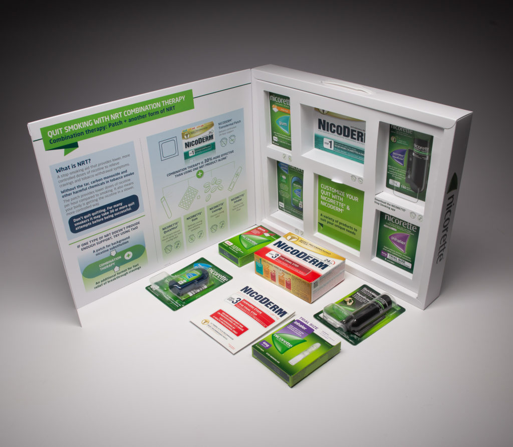
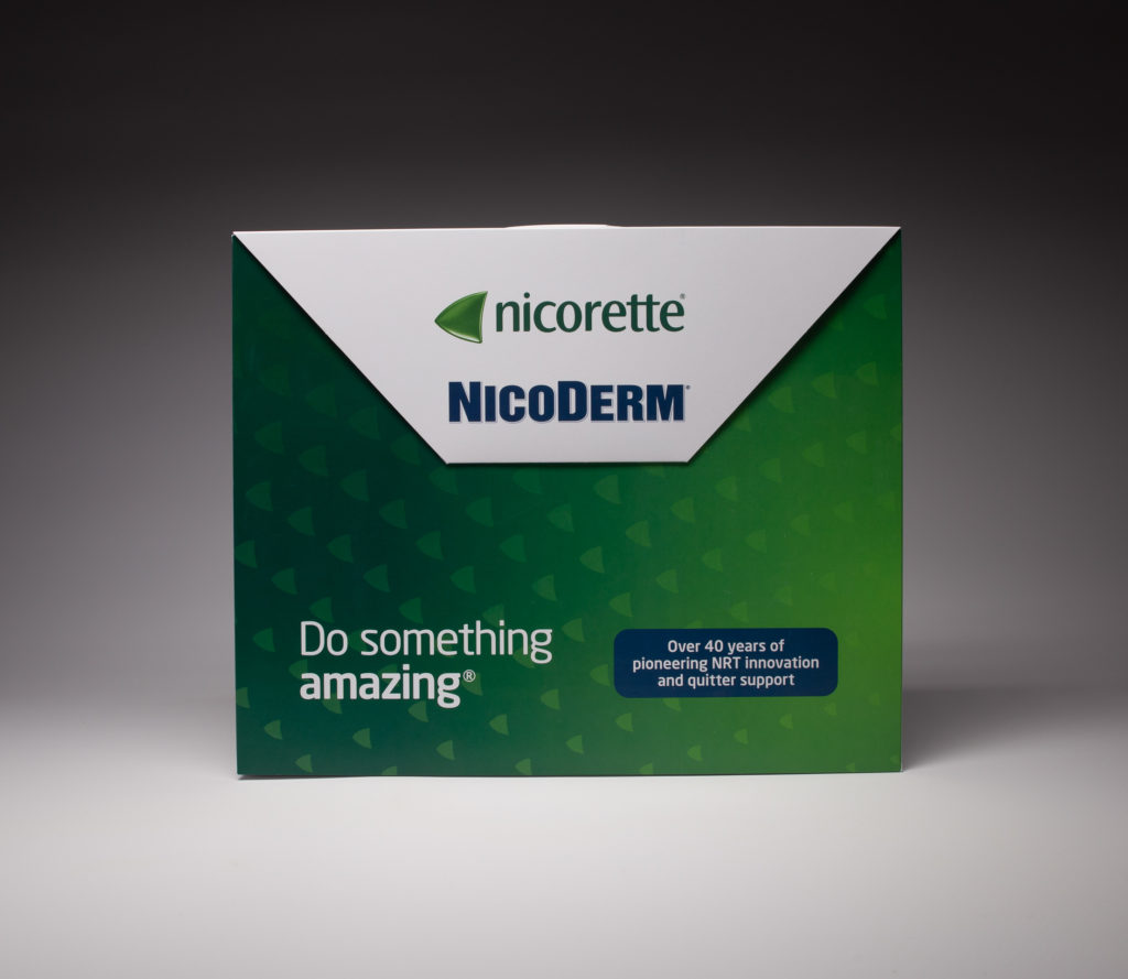
Nicorette NRT Kit

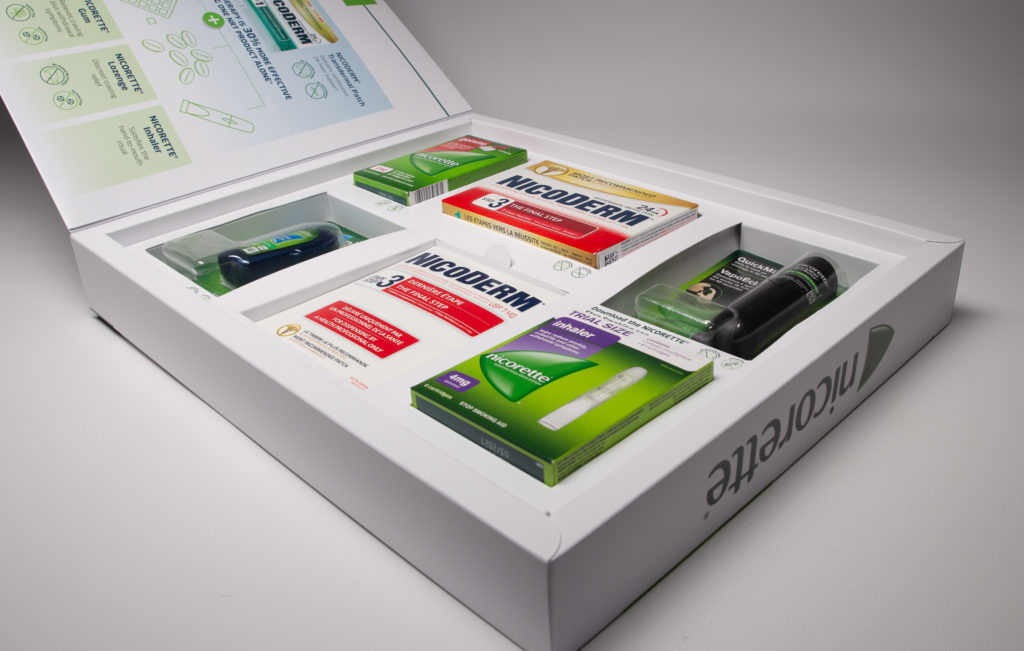
NicoDerm/Nicorette used this kit as an introduction to its smoking cessation products. The inside of the kit featured information on the benefits of combination therapy along with product details. The right-hand sleeve featured several wells that carried each of the different products ensuring all product samples remained in place. Learn more here.
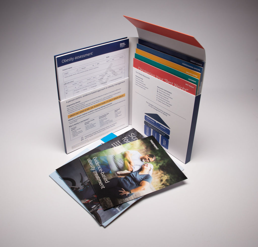
Obesity Resource Kit

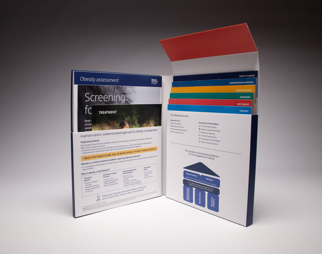
This resource kit for Novo Nordisk was used as a comprehensive resource guide for physicians to help accurately screen and treat obesity. The inside of the kit included information on evidence-based treatment as well as informational sheets about best weight, movement, healthy eating, understanding appetite and obesity science.
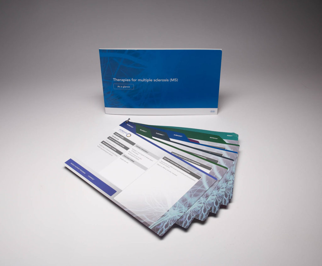
Hoffman-La Roche Pharmaceuticals Reference Guide

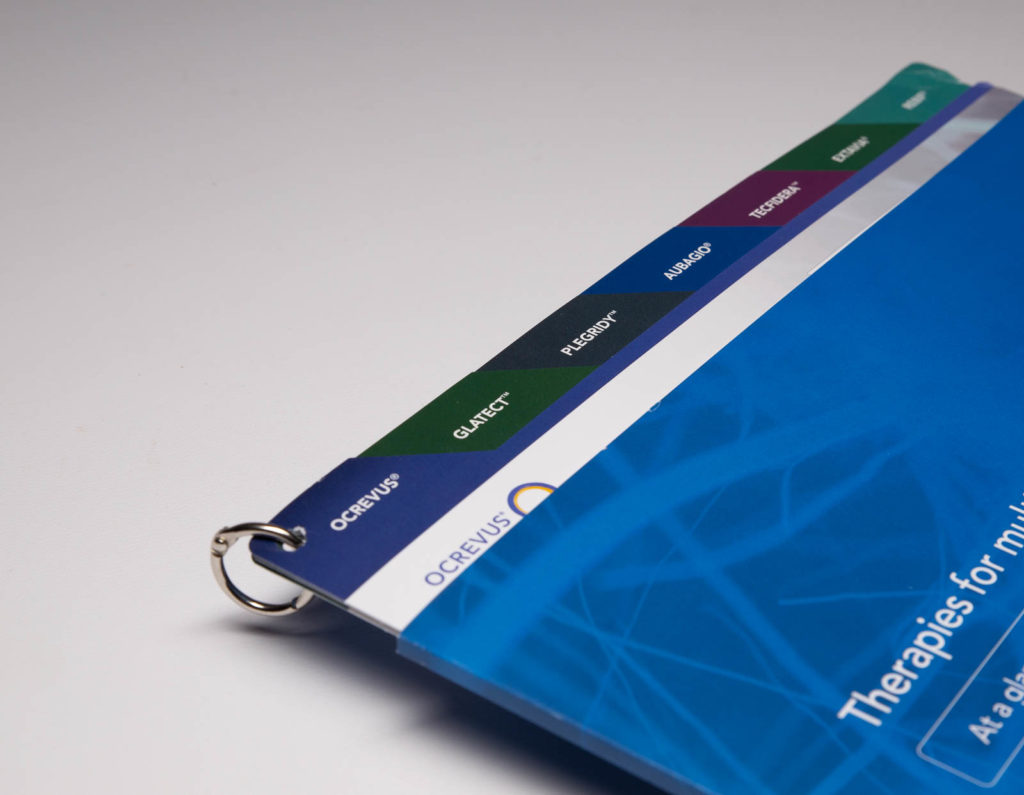
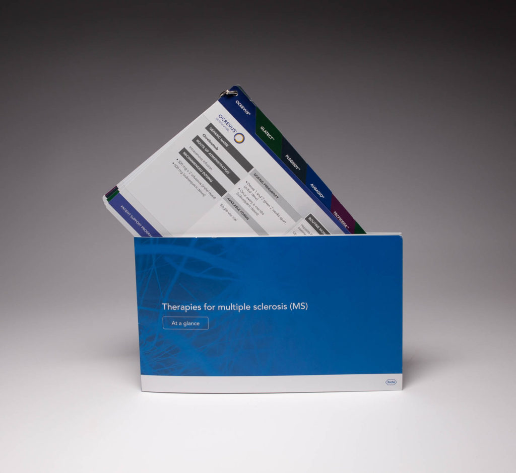
Hoffmann-La Roche used this reference guide to inform physicians about 8 different therapy options available for Multiple Sclerosis. Multiple panels were contained inside a sleeve with each double-sided panel featuring information on a different option. A metal ring affixed to the corner held all the panels together which allowed the recipient to easily rotate and read each one while keeping all the information in one place.
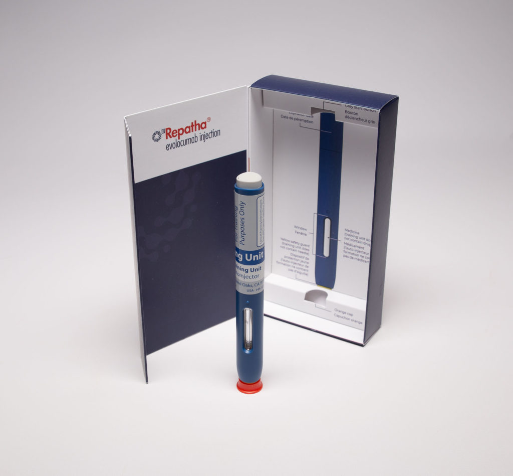
Repatha® Demonstration Kit

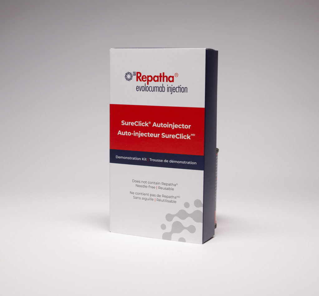
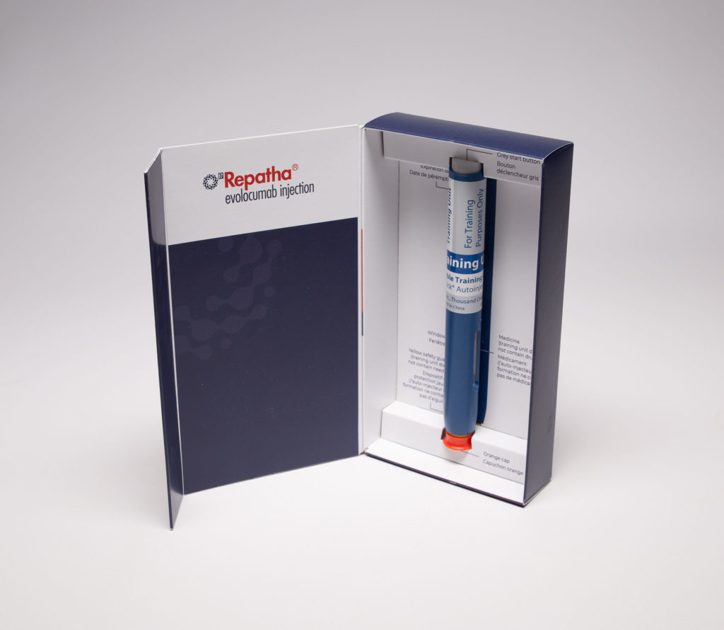
This kit was used to demonstrate Repatha’s injection options to physicians. The inside of the kit featured a sample unit contained inside a well with information about the medication while the hidden magnetic closure inside the lid allowed the contents to remain intact on the inside.
Salofalk Reference Guide

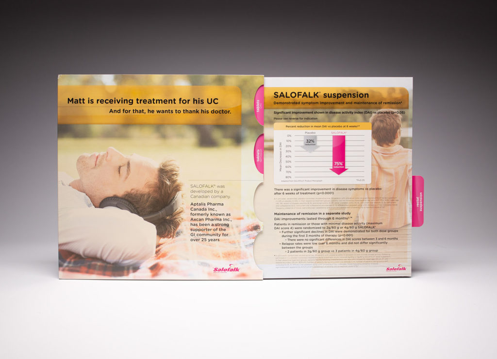
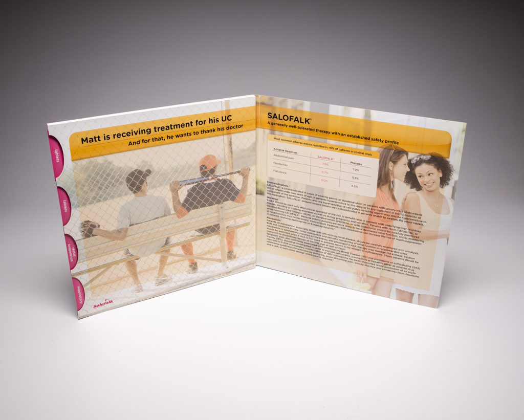
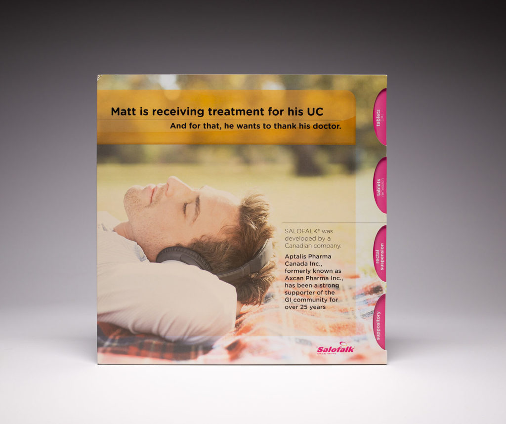
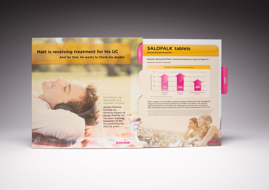
Aptalis Pharmaceuticals Inc. used this comprehensive reference guide to educate physicians on the features and benefits of Salofalk. The cover of the reference guide featured 4 tabs that slid out and locked to reveal information about each of topics on each panel. The panels were double-sided allowing ample space for imagery and details about the product. The locking mechanism allowed the information to securely stay in place while the double-sided panels were effective in breaking information down into specific detail.
In Conclusion

When it comes to patient compliance, education is key to increasing adherence to treatment plans and medications. Patients are more likely to stick to their treatment if they understand it. When it comes to physicians, continuing medical education is key to improving and effectively managing patient care.  63% of respondents say they routinely get sent educational materials from their providers while about a third say they aren’t offered any educational materials from their providers. To learn more about these statistics, click here.

To visit our Patient Education and Starter kit gallery, click here.

The Art of the Great “Unboxing” Experience

The rise of influencer marketing has led to another social media phenomenon – the “Unboxing Experience.” The definition of Unboxing is the act of documenting oneself, mostly on video, of opening a packaged product from a box and displaying, reviewing, and showing off its contents. The unboxing experience has become almost as exciting as what’s inside the box. Consider these stats:

  • Over 90,000 people type “unboxing” into YouTube every month
  • Search for “unboxing” on Instagram and approximately 3,776,111 posts come up
  • There are almost 40 unboxing videos with over 10 million views
  • 42.2% of customers find reviews to be helpful types of influencer content, with 13% looking to unboxing videos versus just 6.1% being influenced by images or videos of a product
  • 62% of marketers measure the success of their videos by the engagement they get

Elements of Delivering a Great Unboxing Experience

Unboxing videos by influencers and consumers have helped brands build brand loyalty, generate excitement and go viral. Unboxing is about generating enthusiasm beginning to end, telling your story, building excitement around it and getting others to shout it out loud. We are obviously suckers for great packaging, and we truly believe you can’t deliver an unforgettable unboxing experience without great packaging. They kind of go hand in hand. Companies like Apple, Sephora, Sony, Google and Birchbox know this. So what makes great packaging in our opinion? Here are some of our thoughts.

A Good First Impression

First impressions are everything, especially when it comes to unboxing. Make sure the colors, gradients, paper texture and the design on the outside scream “open me!” Branding on the outside also goes a long way in delivering a memorable experience from start to finish, not to mention it makes the entire packaging feel custom.

A Catchy #hashtag

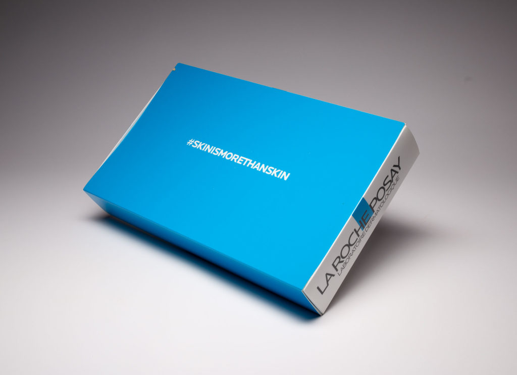
One way of encouraging recipients to talk about their unboxing experience is to pick a catchy and clever hashtag for your new product. Campaign-specific hashtags allow other consumers to join in on the conversation. We recommend prominently displaying it on the packaging itself. Here’s an example for La Roche-Posay.

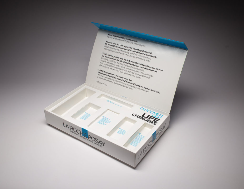
La Roche-Posay is the number 1 dermocosmetic brand worldwide and they used this kit to send samples of its “life-changing” skincare line to key beauty influencers. The cover on the box featured La Roche-Posay’s #skinismorethanskin hashtag to encourage influencers to join in on the conversation. The inside of the kit held various samples of the product line with each in its own well. Posts from key influencers related to each product were featured behind each product. The lid also included internal magnets that allowed the lid to stay securely shut.

Go BIG

The biggest gift under the tree is the one most likely to generate the most excitement and get opened first. The same is true for packaging. 

Years ago, our US strategic partners Structural Graphics, designed a launch kit for Google’s “Unboxing Event” which was used to promote their new store and products at the time. The boxes, which were designed like a puzzle with each piece carrying a different product, were sent to major influencers who then vlogged and posted videos of the box on YouTube. Google took it a step further by wrapping the box with branded gift wrap. 

The video currently has 4.6 million views. For comparison’s sake statistics show that almost 90% of video uploaded to YouTube generates fewer than 1,000 views.

You have to see it to believe it!

Add a Special Touch

Wrapping paper, ribbon, tissue paper, decorative bows, branded stickers and unique packing material all add that special touch. Here’s an example for Nokia.

Nokia used this box to highlight the phone that was featured in the Dark Knight movie. They used lime green ribbon on the site to hold it all together. When you untie the ribbon, all sides of the purple box fall open and the Joker says, “Let’s put a smile on that face!” then laughs maniacally.

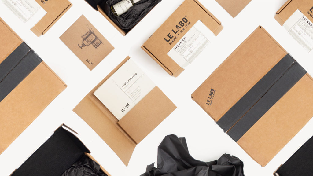
Fine fragrance brand Le Labo used black packing tape on the outside and black tissue paper on the inside for the special added touch and to tie it all together.

Build Anticipation

Having different components leading up the final reveal prolong the unboxing experience while building excitement. Kind of like having a box inside a box inside a box. It doesn’t have to be a series of boxes though. The different components inside could be made up of different materials, open in unique ways, unfold, expand and unwrap. Here’s how one company did it.

Roundel is Target’s modern media company. Their solutions find new ways to help brands connect with their perfect audiences. They used this incredible packaging to produce a unique unboxing experience designed to help drive brand sales. The center-split box opens to a tabbed panel that then lifts to reveal a booklet and a premium. The premium, Skullcandy earbuds, was wrapped in a promotional sleeve, while the booklet carried a QR code that launched “The Unboxing Moment” podcast.

Everything in Its Place

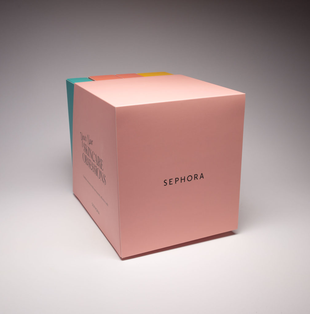
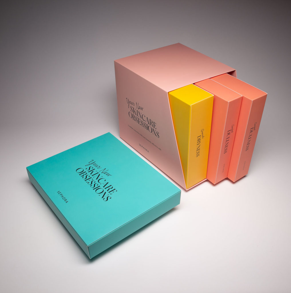
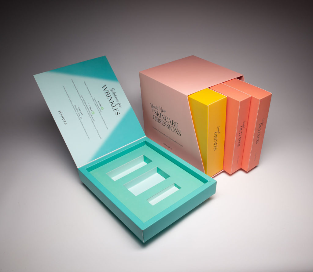
Organizing the contents of what’s inside the box is crucial especially if there are different products being highlighted within. This can be done by using individual boxes, sleeves to hold literature, miniature booklets or simply wrapping things individually. Here’s how Sephora did it. They used this promotional product kit to encourage influencers to unbox and learn more about their skincare solutions for dryness, dullness and wrinkles. The individual kits were contained in a slipcase for storage and easy access and dedicated to a different skin condition containing recommended product solutions. The design also allowed consumers to store and use it for future reference.

The Future of Unboxing

We believe unboxing is here to stay and that its future will continue to be bright. With so many unboxing videos competing with yours, standing out is paramount and so is upping the ante. Unique digital elements have made their way into the unboxing experience like Augmented Reality, Video and NFC tags. As with direct mail, brands are finding that bridging the gap between print and digital is instrumental in the success of the overall unboxing experience.

How To Elevate Your Virtual Conferences with Innovative Mailers

Listen — by now, we’re all pretty sick and tired of traditional old Zoom calls. Connectivity issues, disjointed conversations… It’s no wonder National Geographic is publishing studies on the effects of “Zoom fatigue.”

But this past year has also shown us just how useful and convenient virtual engagement can be. Whether it’s working from home or attending far-off gatherings, the benefits of video communications have never been clearer.

Juggling these two realities beckons a difficult question: How do we harness the power of online meetings without succumbing to Zoom gloom?

Perhaps no one needs such a virtual solution more than the trade shows industry

Unsurprisingly, Covid-19 had a serious impact on all sectors that rely on mass attendance and travel. And in the world of trade shows and business conferences, that impact was palpable.

In June 2020, for instance, over 70 percent of B2B executives stated that they’d canceled an event. Another report noted that the $15 billion trade show industry was likely to take its biggest financial hit of all time.

With their backs against the wall, conference organizers turned to video. In it, they found a solution that isn’t just a temporary stopgap; it’s a door to untapped possibilities.

Sure, virtual events sacrifice some networking ability… But that negative is offset by an exponential increase in accessibility. Remote capabilities negate the need for travel, and the ability to record is a godsend for anyone facing schedule conflicts. The bottom line here is greater reach and, in turn, wider impact.

Plus, early returns on virtual conferences are showing that they’re actually no less effective in creating leads. As such, it’s no stretch to imagine that new-age trade shows will be defined by a reduction in in-person attendance alongside a corresponding rise in online attendance.

… Especially when you have the tools to make those online experiences memorable.

At Structural Graphics, we’ve spent the past year-plus developing such tools

Our goal is simple: Transcend the monotony of your average Zoom conferences and forgettable collateral mailers. We want to create an interactive experience — one that does your brand justice.

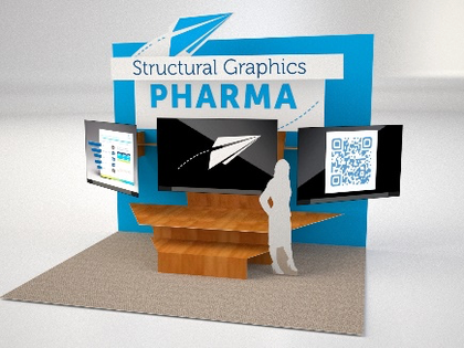
Most notably, we’ve developed virtual trade show booths that essentially mimic the in-person sensation. In some instances, such actually fold out with panels that hold small video screens with your chosen content. In others, those panels contain augmented reality tags, QR codes and NFC tags that launch the virtual experience right on your phone.

In either case, these unique dimensional mailers can immediately bring your viewers to relevant online resources. You get every benefit from a trade show interaction — without having to compete with neighboring booths for attention.

And that’s just the tip of the proverbial iceberg. Depending on your needs, we can tailor the virtual experience and accompanying materials to fit. For instance, we’ve recently partnered with a number of healthcare marketers on:

  • Interactive invitations — Eye-popping first impressions that cultivate curiosity in the short-term and transform into desktop mainstays that build brand recognition in the long-term.
  • Information kits — Helpful step-by-step guides to preparing for, logging into, and participating in any sort of virtual affair.
  • Interactive elements — Any sort of resources to accompany the main event, from quizzes to polls to follow-along materials.
  • Classic takeaways — All the goodies you’d normally accumulate at a trade show, including t-shirts, swag, snacks, and presentation materials.

See them in action here and give us a shout to see how we can make your next virtual conference come to life!

Dimensional Mail: Your Solution to the Rising Costs of Digital Marketing

With Digital becoming the standard marketing avenue, companies are pouring more of their resources into social, video, and written content to captivate their audiences. Even compared to last year, 2021 should see 12% more digital ad spend — up to 55% of all advertising spending.

As a result, we’ve reached a state of digital marketing overwhelm. What used to be a blue sea of opportunity has now become red with competition.

And on top of this market saturation, we also have to deal with steadily increasing ad costs. (Just consider how once-affordable Instagram has risen in ad cost since being acquired by Facebook). But with online click-through rates falling, wasted ad spend is crippling marketing budgets across industries.

Putting these factors together, we’re now at a point where we have to question the viability of digital marketing. So here’s our new marketing conundrum: How to effectively stand out from all the noise in an ROI-friendly manner?

Want high engagement? Then direct dimensional mail’s your best friend

Naturally, that’s our answer here — and with good reason. Traditionally, direct mail has pulled in considerably higher open rates and response rates than digital. 

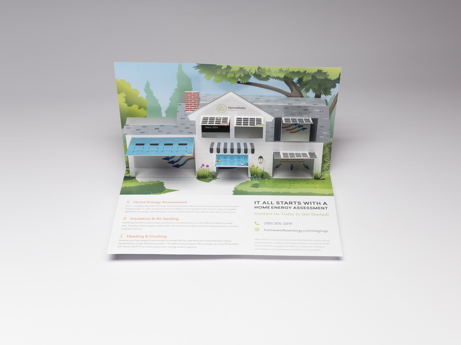
HomeWorks Energy Pop Up Mailer

The reality is that despite our increasingly digital tendencies, physical mailers tend to cultivate more trust and emotional reactions. (With the recent prevalence of data privacy issues online, perhaps this shouldn’t come as a surprise). When readers can hold something, experience it with multiple senses, and give it their undivided, non-scrolling attention, the result is a greater impact. Greater impact equals longer-lasting recall. And for our purposes, longer recall is what drives the sales we so covet.

And lest we forget, we’ve so far been concerned only with traditional direct mail — which has an average response rate of 4.4%. That’s impressive compared to email’s 0.12% figure, but it’s completely overshadowed by dimensional direct mail which sees a staggering average response rate of 8.5%! With its heightened focus on quality and engagement, dimensional mail undoubtedly lies at the top of the “effectiveness” food chain for direct mail.

And the kicker is, dimensional mail is only getting more effective

Consider USPS’s deep-dive study that pinpoints three notable areas of improvement in the direct mail landscape:

  1. Targeting well-defined audiences with relevant marketing
  2. Tracking the long- and short-term metrics of campaigns
  3. Working hand-in-hand with omnichannel campaigns (and even driving digital traffic!)

These three bullet points have traditionally been digital’s biggest advantages over print. But now, as intelligent innovations develop, that gap is closing.

At Structural Graphics, for our part, we’ve been integrating these industry-shifting innovations into high-impact dimensional mailers. The result is an unprecedented combination of new-age data capabilities and enticing visual and tactile designs. Here’s what they look like:

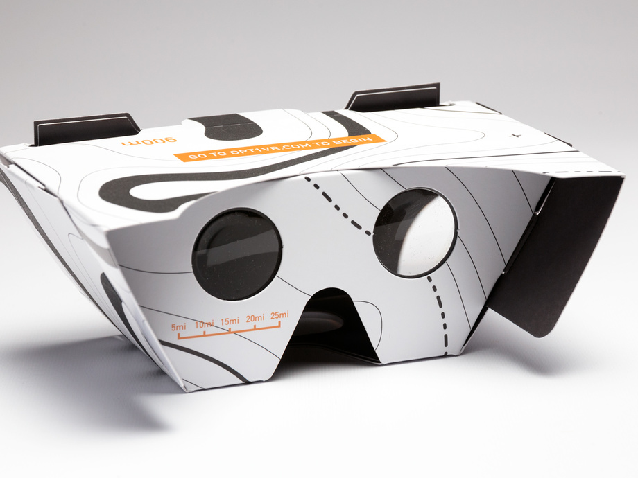
USPS SleekPeeks® VR Viewer

So here’s the bottom line: We’ve long known that dimensional mail is as powerful as it gets from an engagement standpoint. And its rapid integration of technological developments is only further boosting that effectiveness.

Meanwhile, digital channels are as crowded as ever, with returns diminishing at a steady pace. Marketing here is cheaper than via direct, sure, but the ROI simply isn’t what it used to be.

And that’s why we’re so high on dimensional direct mail: If you actually want to inspire engagement and cultivate meaningful customer relationships… It really is a no-brainer.

Keep Your Brand Top of Mind with Dimensional Print

The magic starts from the moment they open the mail. And it lasts until… well, even months into the future. 

That’s the power of creative dimensional mail — if done right. But here’s what “done right” looks like from start to finish:

It opens with an unforgettable first impression

The mail we receive on a regular basis doesn’t tend to inspire much excitement, right? That’s why we put such a premium on making that first impression unique — to capture attention and invite engagement.

Unsurprisingly, studies back this up: Direct mail is praised for delivering open rates as high as 90%. And under this direct mail umbrella, dimensional leads the first-impression pack; when people receive something that immediately appears out of the ordinary, they can’t help but indulge their curiosity.

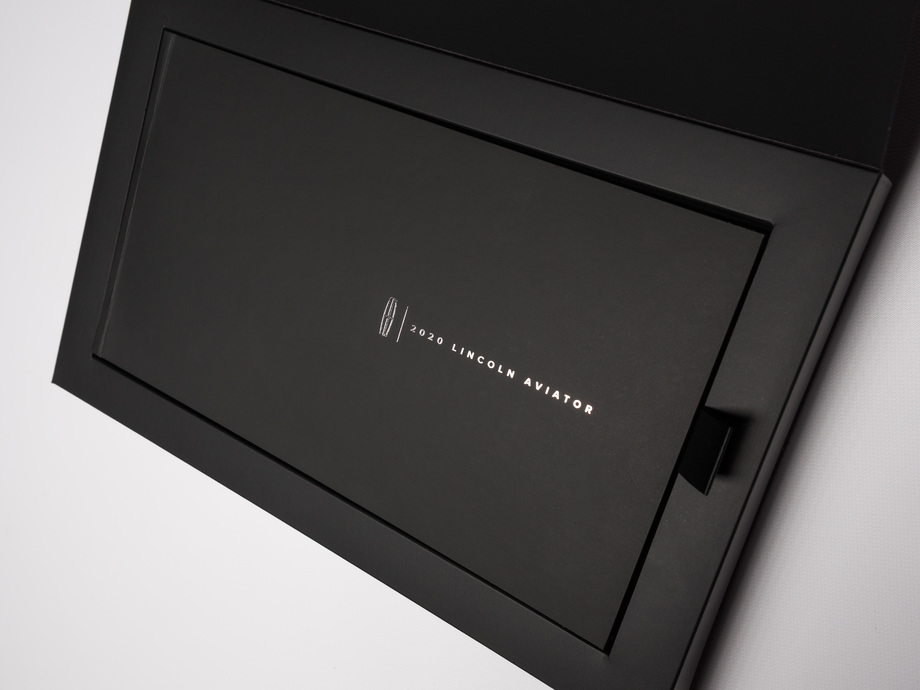
For instance, here at Structural Graphics, we partnered with global luxury brand agency Hudson Rouge, in collaboration with Maker House, to create a sleek foil-stamped package containing a hardcover welcome book for new Lincoln vehicles. To truly capture the Lincoln brand and wow the viewer, the books outer edge lit up in LED lights when opened — mimicking their cars lighting up when unlocked. Best yet, when the book is removed, thin speakers in the box automatically play a custom composition by the Detroit Symphony Orchestra.

Now, have you ever seen anything like that before? We’ll bet that those Lincoln customers hadn’t, and we’ll bet they weren’t quick to forget it.

Once they’re hooked, it’s all about engagement and response

The Lincoln book’s elegant, lit-up appearance may have been the invitation, but the music inside was the real party. So once they’re in, you want to continue cultivating an experience for the recipient. And the best experience is one that they participate in; dimensional mail’s greatest strength is that it’s not a one-way street.

For starters, people appreciate that direct mail lets them engage on their own time, at their own pace. One study found that direct mail remains in homes for 17 days on average. And in that 17 days, your mailer is much more likely to make an impression than any email; print ads can have recall rates 30% higher than digital. 

But we’re not just talking about any print ads. We’re talking about the most innovative designs, sent straight to the reader’s door. Get this: Average direct mail’s response rate of 4.4% easily trumps email’s 0.12%… But dimensional mail makes both look like child’s play, with a staggering 8.5% response rate of its own!

Point being: There’s no better tool for engaging your audience. And no tool is as safe a bet for high ROI.

And we’re not done yet: Dimensional mail has unmatched shelf life

People throw out mail. If you’re lucky, they skim through it and then toss it. What else would they do?

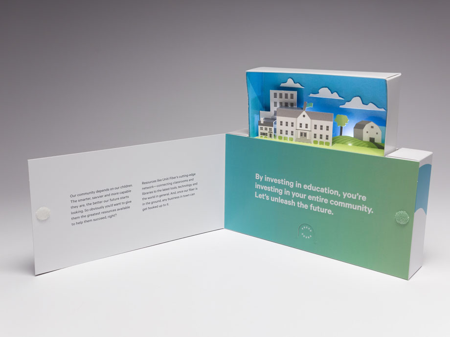
Well, if you give them a rare reason to keep it, they just might. Take this self-standing popper we made for Uniti. This nifty piece of dimensional mail shares a message promoting community education. And with its eye-catching diorama and light scheme, it’s quite easy to leave standing on one’s desk for long-lasting impact.

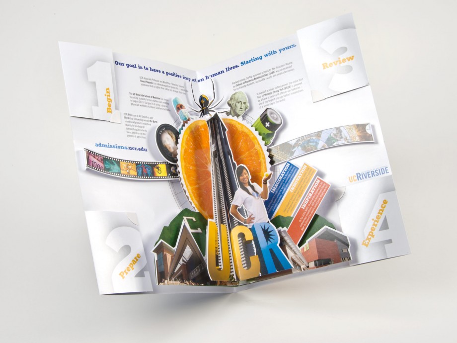
Or how about something that offers long-term value without a self-standing setup. Here’s a recruitment brochure we made for UC Riverside to share vital enrollment information. With pop-up graphics and fold-out panels containing useful resources, UC Riverside gave students every reason to keep the card for future reference and even share it with other friends applying to college.

And that’s yet another feather in dimensional mail’s cap! It creates an experience that’s not only memorable (and in some cases long-lasting), but it also begs to be shared.

Which brings us full circle: Dimensional mail “done right” is a branding home run — from the first impression, through the experience of the mailer, and into its next life as a desktop ornament.