All posts by Nick Loeser

Drink Me: Marketing in the Alcohol Industry

A few tips (on the house).

“Marketing” is a broad term that embodies a wide range of activities and disciplines that promote and sell a product. It casts a wide net that is open to interpretation; and when you throw alcohol into the equation, well things can get a little crazy.

(Wait, what happened last night?)
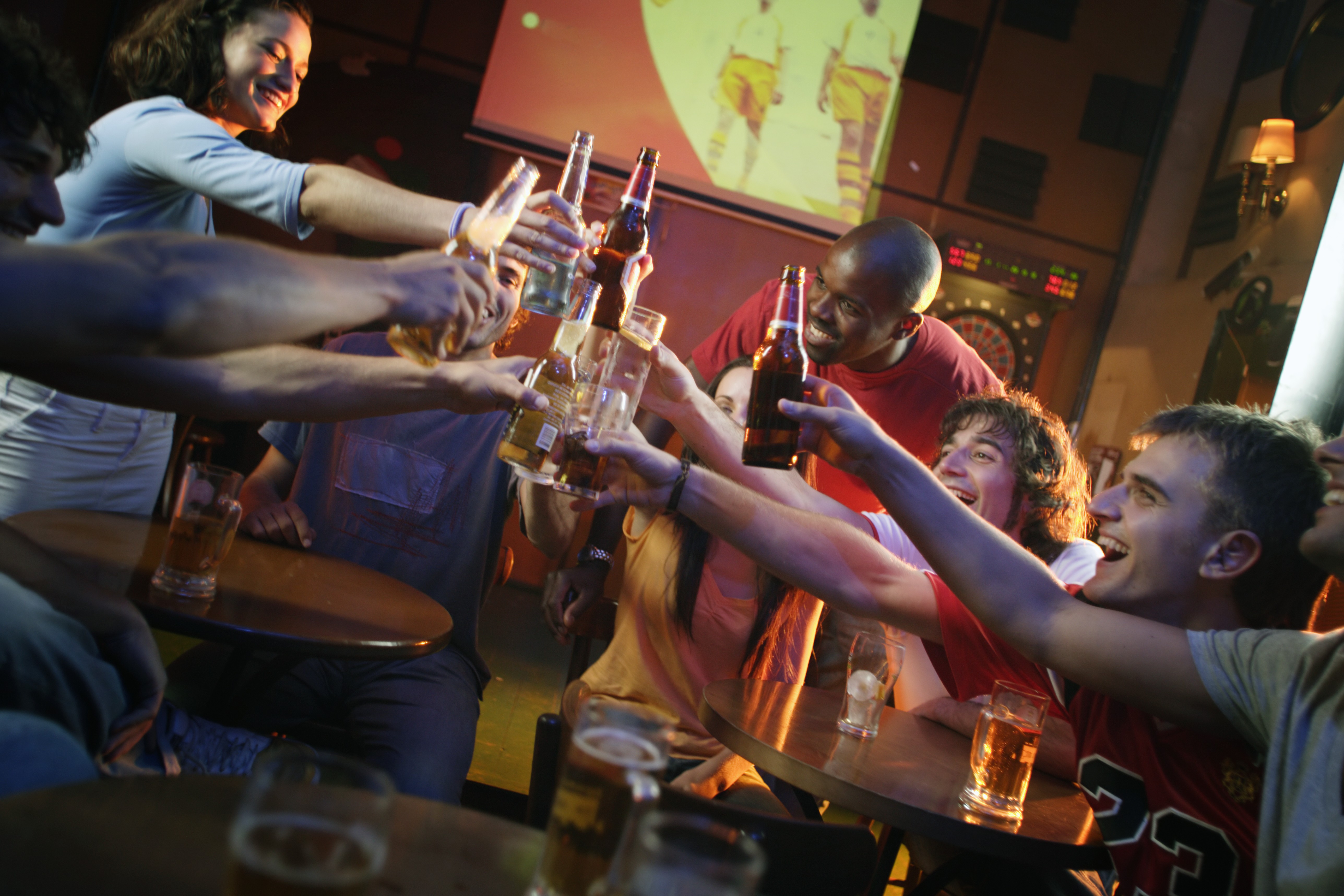
Cheers!

First thing’s first. When you are marketing in the alcoholic beverage industry, the same basic marketing rules still apply.

Your 4 P’s: Product, Price, Place, Promotion

So, how exactly do these relate to alcohol beverage marketing? Let’s break it down.

Product

At the risk of stereotyping, there are certain alcohols that appeal to a younger crowd that do not appeal to older folk, and vice versa. My dad loves his tried and true Tito’s (really, Tito’s, my dad is your biggest fan – going on 10 years strong which is some serious brand loyalty).  I, on the other hand, the millennial in all of my glory, am more likely to try something different simply because the packaging catches my eye.

It’s no secret that our generations shop differently: my dad has been going to the same mechanic for years, whereas I go wherever the deepest discount is, or wherever the most convenient location is.

A study in Australia determined that adolescents were more likely to gravitate towards ‘alcopops’, a.k.a. booze-y drinks that have very little actual booze in them – malt beverages, wine coolers, etc. – because the packaging is designed to look like a soft drink.

Colorful-Cans

Price

Everyone loves a good discount. It is common knowledge that if we will get a discount on buying more, we will buy more (see Sam’s Club, Costco, etc.) whether we really need it or not. And not to much surprise, when we buy more, we consume more. Shots, shots, shots shots, shots, shots, shots shots…

Price discounts and promotions can have a huge impact on volume of alcohol purchases. They can be a key marketing tool for producers and retailers.

A study conducted by Alcohol Focus Scotland found that supermarket promotions and discounts on alcohol increased sales by 20 – 25%. 

Place

Location, location, location. Anyone who has ever been in a liquor store knows that those places can get pretty crowded. So many brands are trying to promote their products on the shelves or even at the register, so it can be hard to stand out and get the consumer to pay attention and make them want to buy. Did you know that companies pay top dollar for prime shelf space in the stores?

But once you have that spot, how do you stand out among the rest of the bottles of the shelves surrounding it?

Diageo was wondering the same thing, so their agency came to us looking for new ideas of how they could boost sales in stores. This was the first time they have ever done anything like this – and viola, they were so successful, that they have already placed their second order!
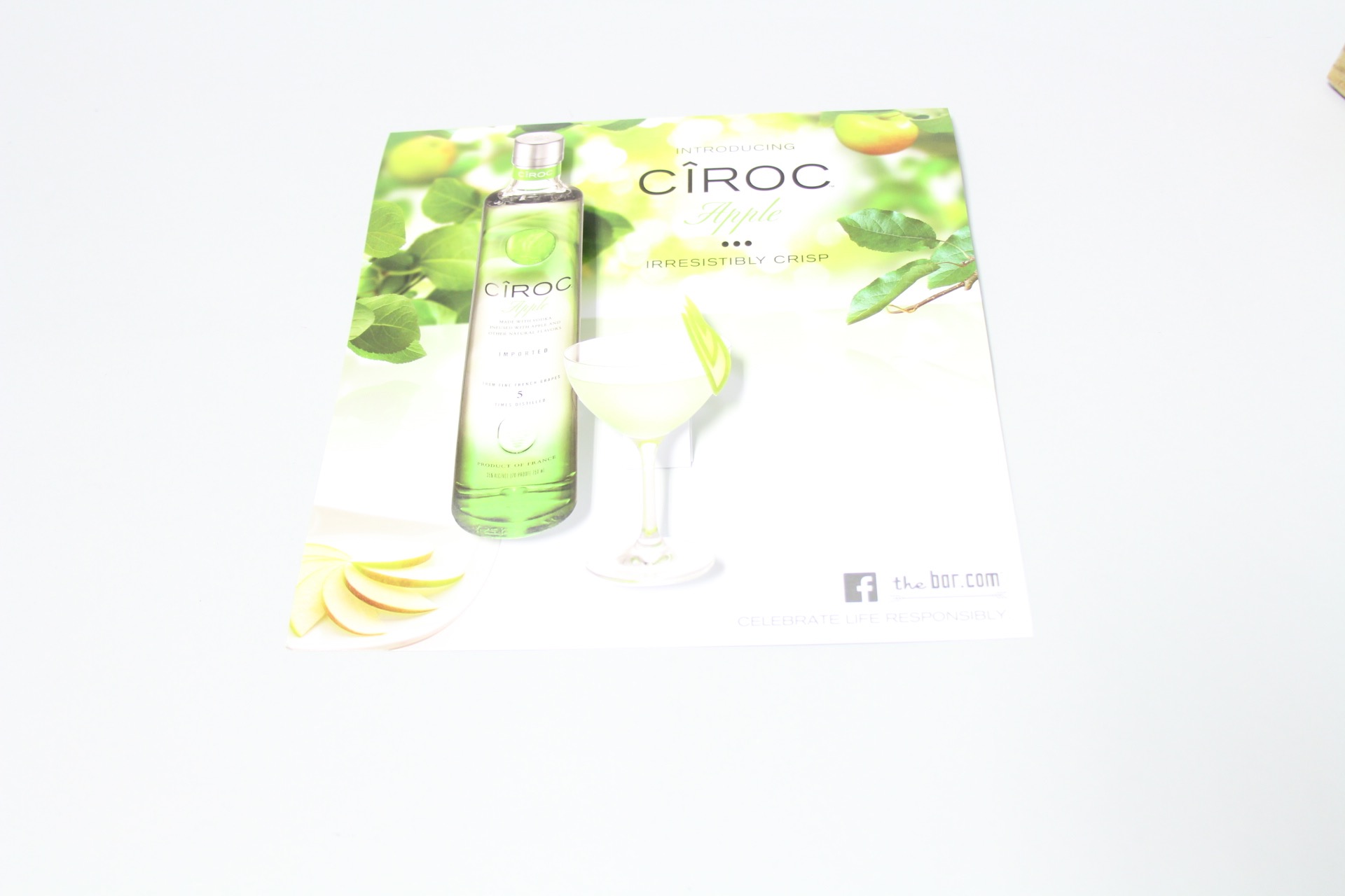
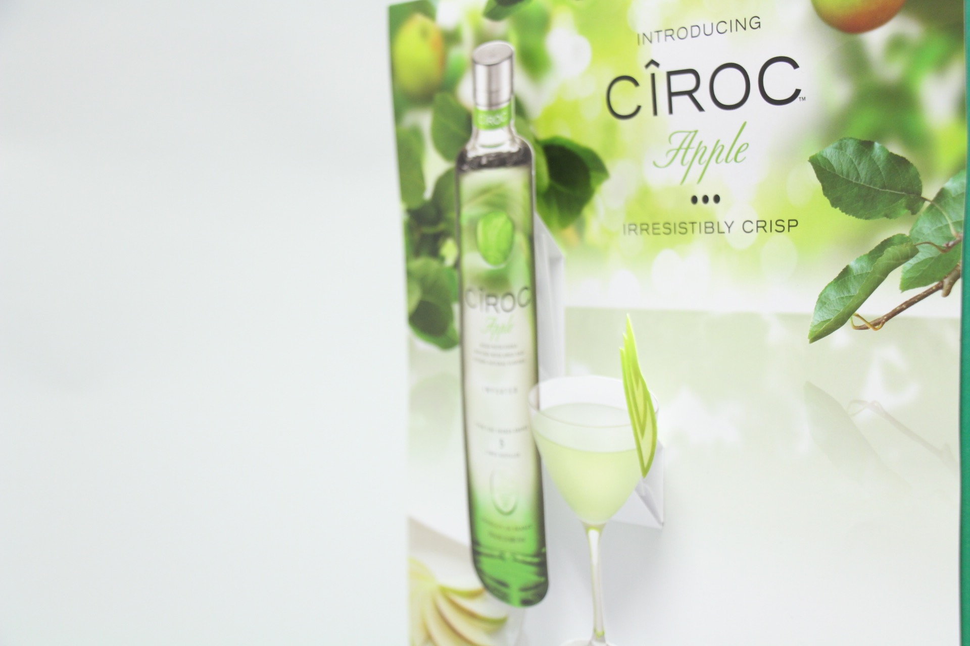
Ciroc Case Tucker
Diageo/Marketing Agency & Structural Graphics // Ciroc Case Tucker

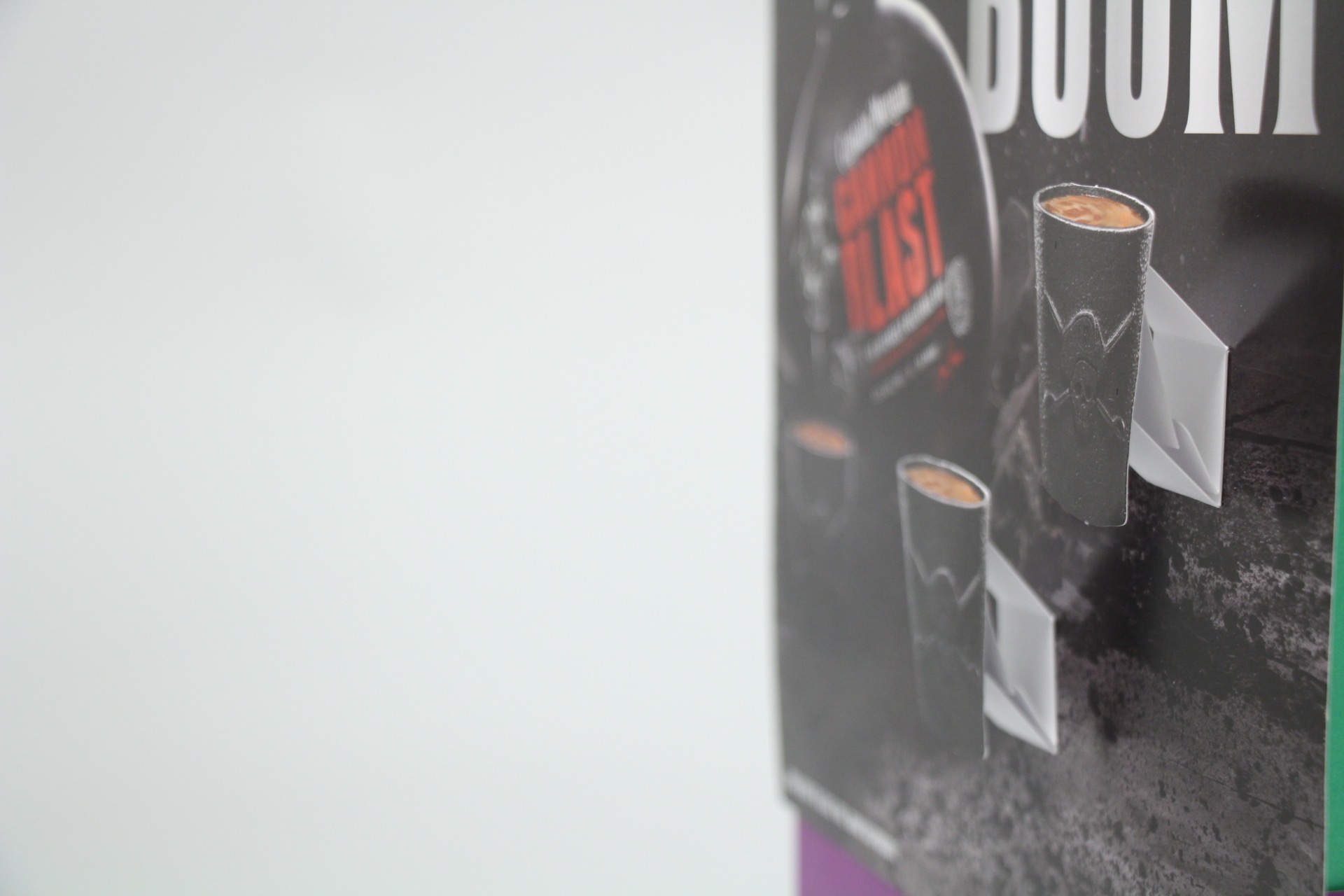
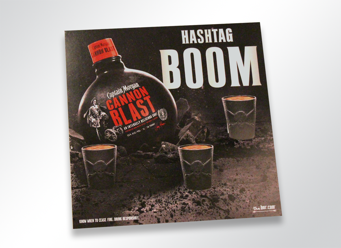
How exactly do they work? These case tuckers were tucked in between the shelves in between the bottles, promoting and drawing attention to their products.
Case Tuckers5
Diageo/Marketing Agency & Structural Graphics // Ciroc Case Tucker

Case tuckers are a unique way to sell your customer directly while they are shopping, begging for customers attention. These most certainly trump the Sharpie and neon signs you see on every shelf promoting cheap liquor and practically screaming, “DON’T DRINK ME.”
Case Tuckers3


2415-1266-captainmorgan-popup

Promotion

Alcohol promotions are everywhere. Sponsorships, advertisements,  commercials, events, the list goes on. Increasingly, alcohol is being promoted more and more via social media.

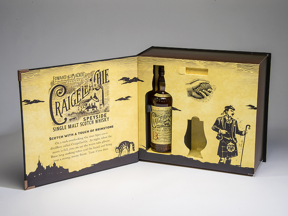
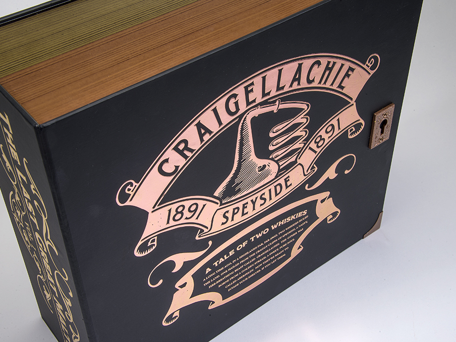
Do you need to promote your liquor brand, or unveil a new one? A truly exciting and creative way to do so is to host a PR event. And that’s exactly what Bacardi Brands did with when they came to Structural Graphics to create their Dewar’s Influencer Kit!

See below.

CRAIGELLACHI1_resized

CRAIGELLACHI2_resized

CRAIGELLACHIE7_resized

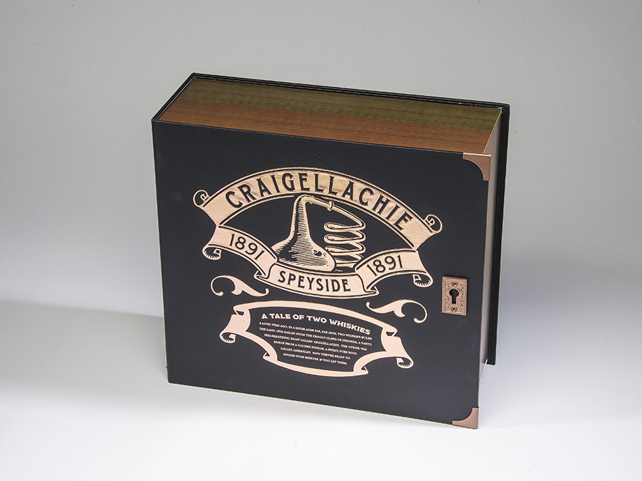
The Marketing Arm came to us to develop and design this beautiful Dewar’s influencer kit. The kit was for a PR event unveiling two new brands, Craigellechie and Aberfeldy, and showcases each in a storybook format appropriately titled “The Tale of Two Whiskies”.

To read more about this super cool launch, click here!


It’s no secret that no matter what you’re promoting, you need a way to stand out amongst the crowd. Need to reach your audience? Give yourself some height by adding a little dimension to your brand.
First Class News: Potential Postage Pricing Rollback


Piggy Bank on beach vacation

I think we can all strongly agree on one thing: saving money rocks. Whether it’s a 20% off coupon to J. Crew or a few cents off of a gallon of gas, we are all looking to save a little somewhere.

And if you love direct mail as much as we do, we have some extra good news. The first steps towards a rollback of postage pricing began with the USPS posting the new rates for this spring. While it’s still uncertain around the implementation date, this is awesome for mailers. Most commercial mailers will see rates drop around 4.1%, depending upon class of mail and level of sortation. Woo hoo!

We love direct mail, so, naturally, this gets our stamp of approval. To see a breakdown of the proposed postal rates, visit http://pe.usps.com.


Mailbox copy


Death of QR Codes Is Greatly Exaggerated

Have you have fallen prey to the urban myth that QR Codes are dead? There are plenty of designers and industry pundits who think these 2D mobile barcodes clunky and out of date, but if you look at the data, the death of QR Codes couldn’t be farther from the truth. Consumers are actively using QR Codes to get coupons, access detailed product information, watch promotional videos, and take other steps that move them toward a purchase. And the companies which are finding the right list of banner sizes and placing their QR-codes on them have seen a constant rise in the chatter and sale of the company product. If you’ve “moved on” from QR Codes, you’re abandoning a critical tool for building your business.

Let’s look at three facts about QR Codes that every marketer should know.

  1. QR Code scanning is on the rise.

According to ExactTarget, 34% of smartphone users in the United States have scanned a QR Code while shopping in-store (ExactTarget Mobile Behavior Report 2014). This rises to 46% of those who own tablets. This doesn’t include people scanning QR Codes on direct mail, posters, in-store displays, packaging, and magazines. In fact, when ExactTarget asked about scanning coupons or QR Codes, it found that 43% of consumers had done so.

Can we quote Mark Twain here? “The reports of my death have been greatly exaggerated.” As you watch the data, sure, the growth rate of QR Code adoption is slowing. But that’s not unusual for a maturing technology.

  1. QR Code scanning frequency is on the rise, as well.

In 2014, Scanbuy data showed 4.0 scans per person. In 2015, this rose to 4.3.  That’s growth of 7.5%.

  1. Among the most common uses for QR Codes are accessing coupons, downloading mobile apps, and accessing product information.

ExactTarget found that 56% of men and 39% of women have scanned QR Codes to gain quick access to information. Scanbuy found that when consumers are interested in a new product, 20% will scan a QR Code.

We could go on and on, but you get the point. QR Codes remain a cost-effective way to reach a high percentage of the mobile population. Here’s how to do it right:

  • Make the code highly visible on the direct mailer, in-store signage, packaging, or other channel.
  • Provide instructions on using the code, and perhaps more importantly, the value the consumer will gain from scanning it
  • Offer real, tangible on the back end.

Check out some examples of QR codes in our own clients’ print marketing campaigns.

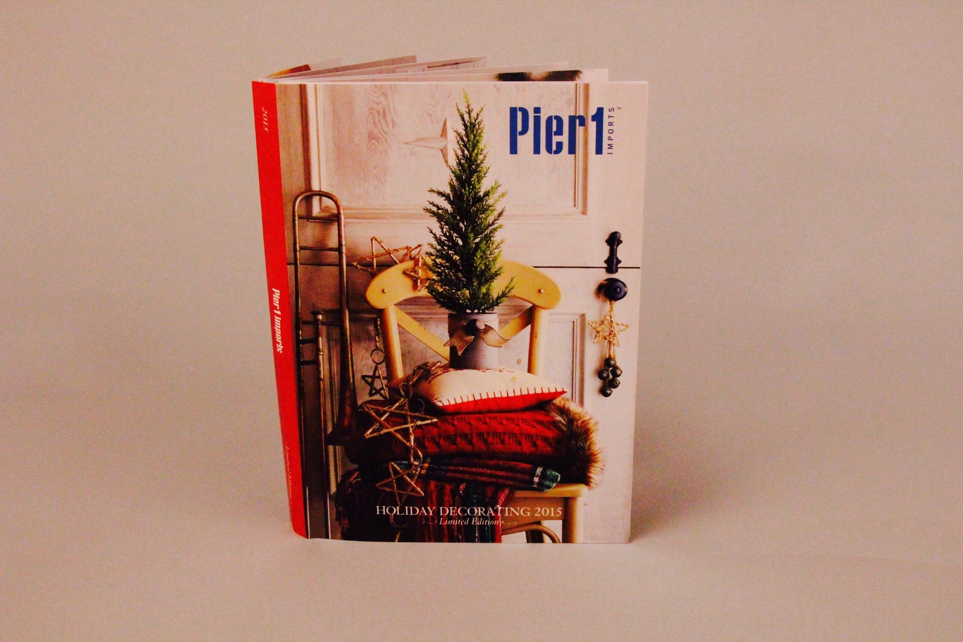
Pier 1 Pop-Up Holiday Catalog

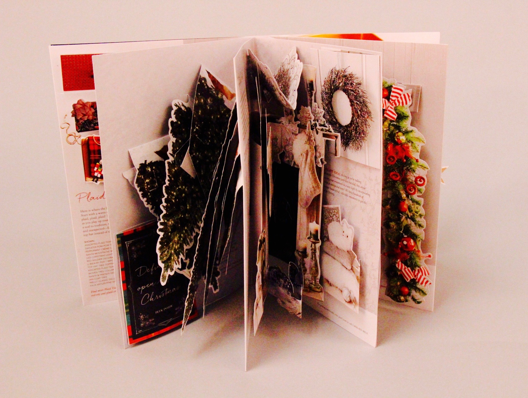
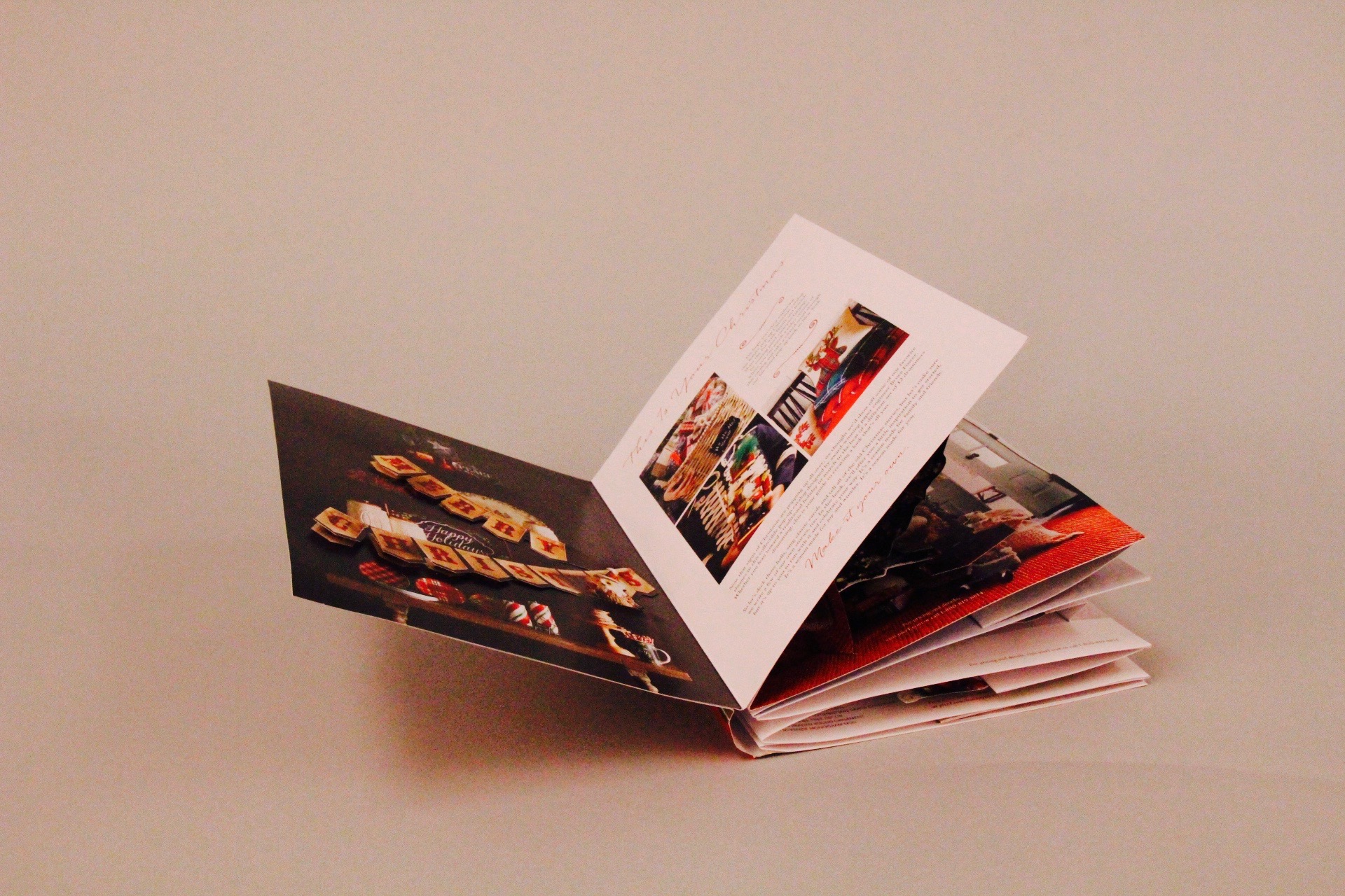
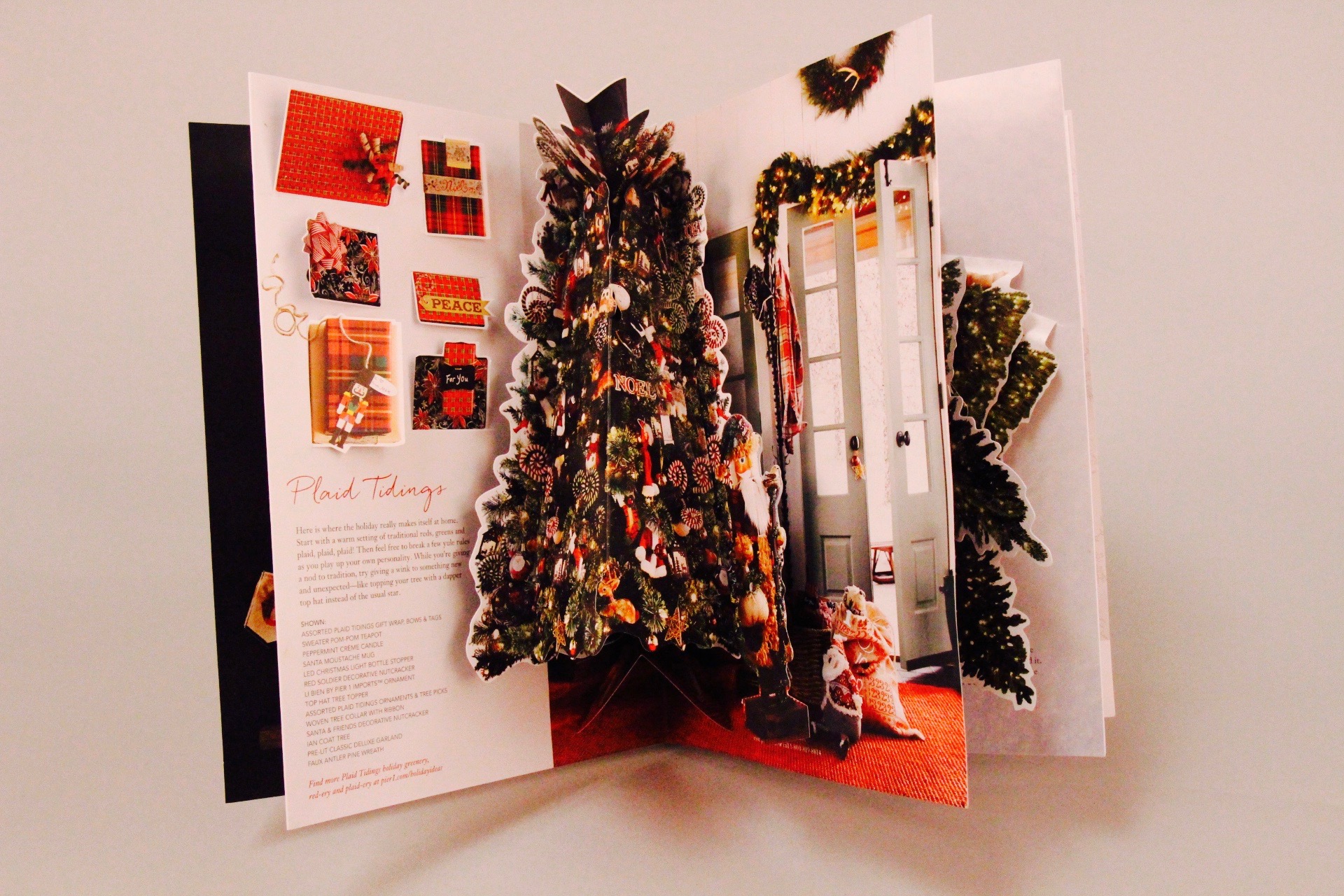
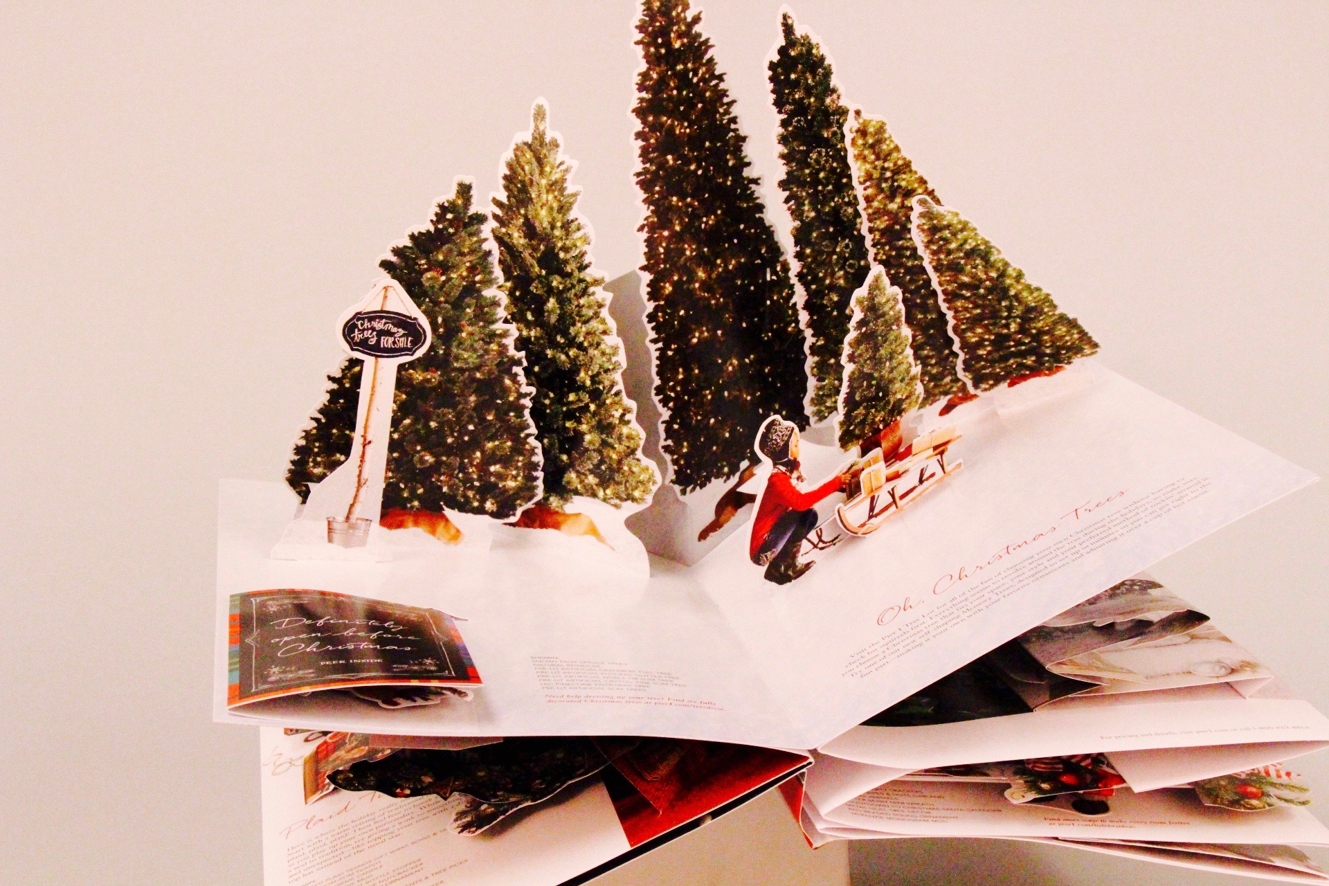
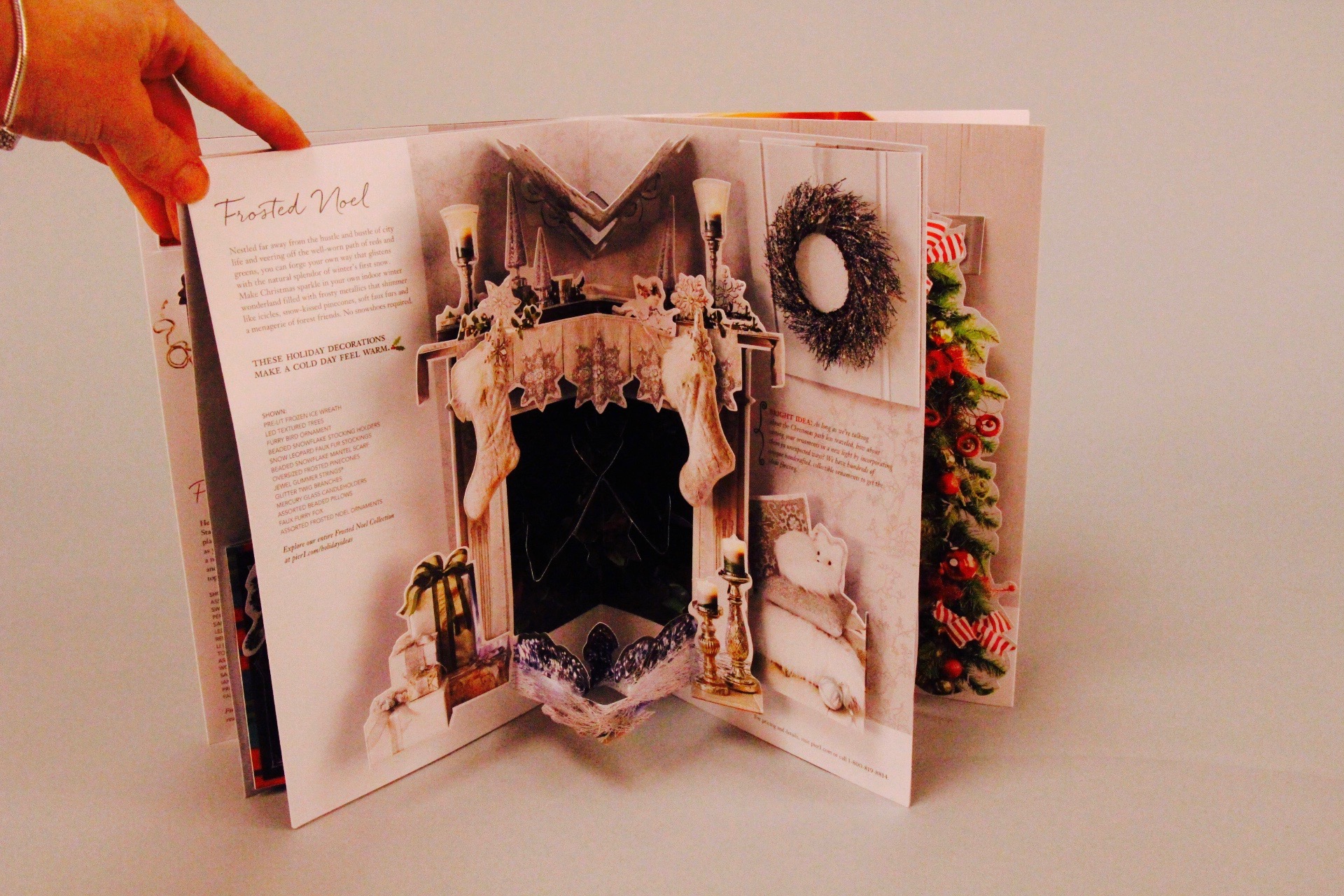
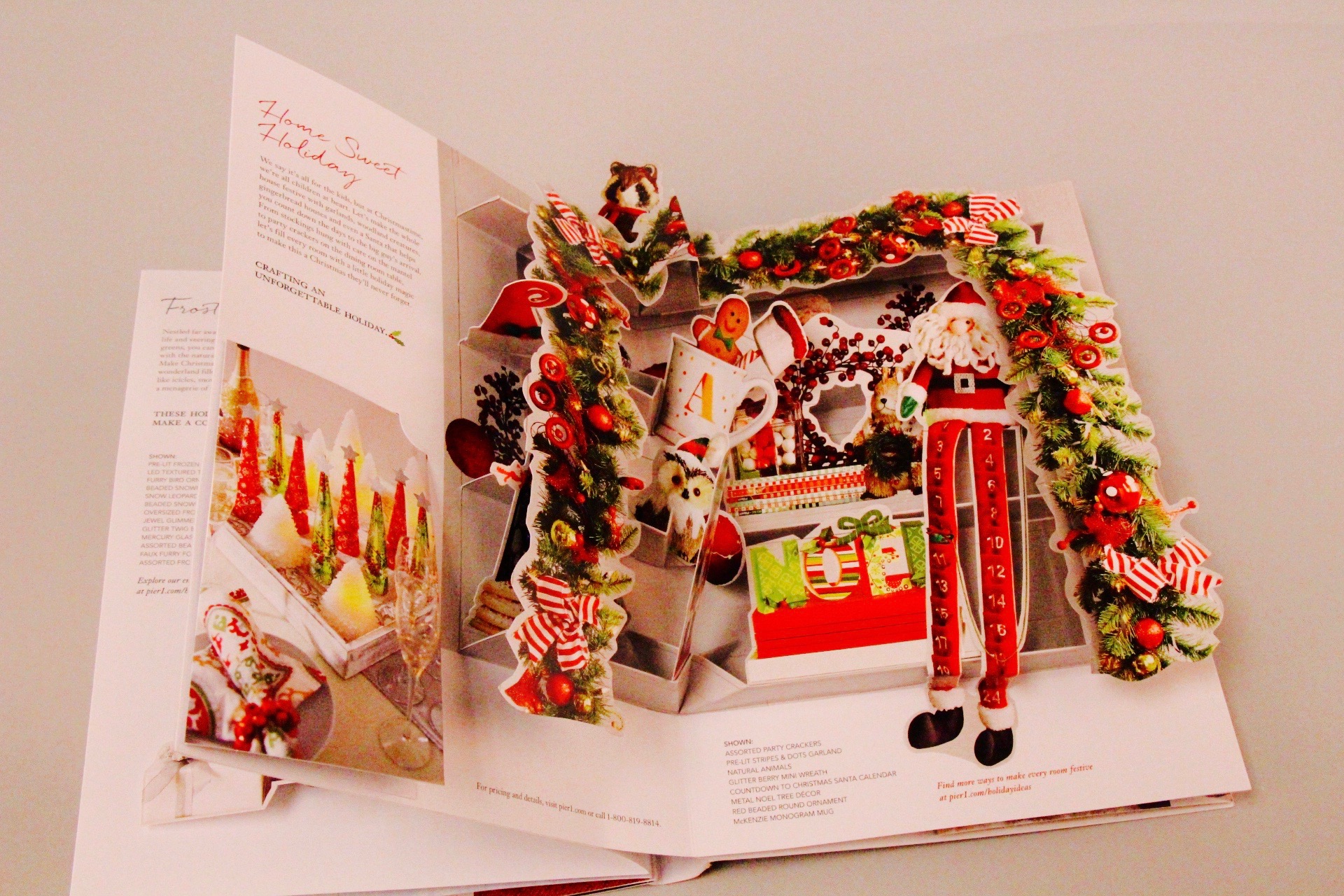
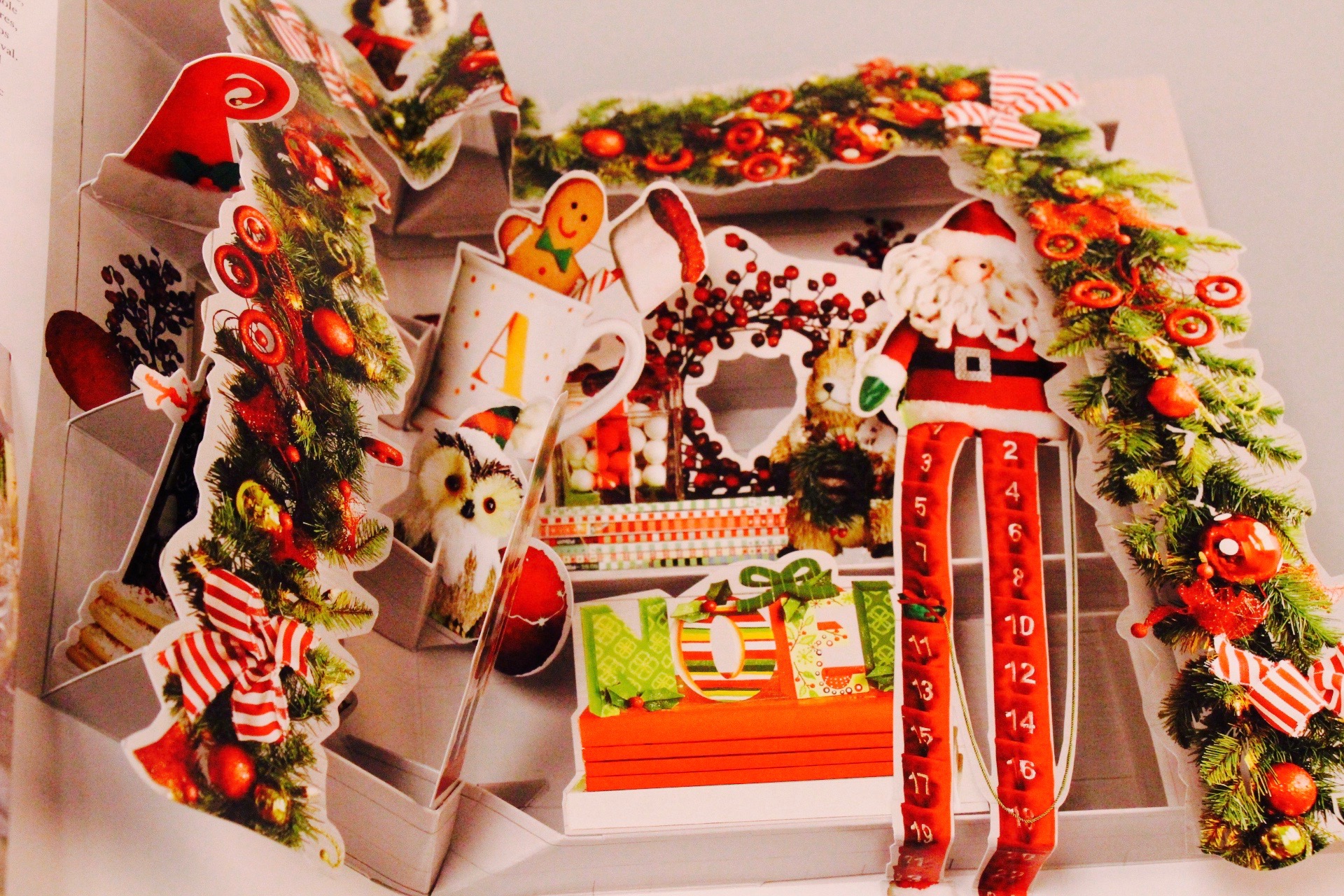
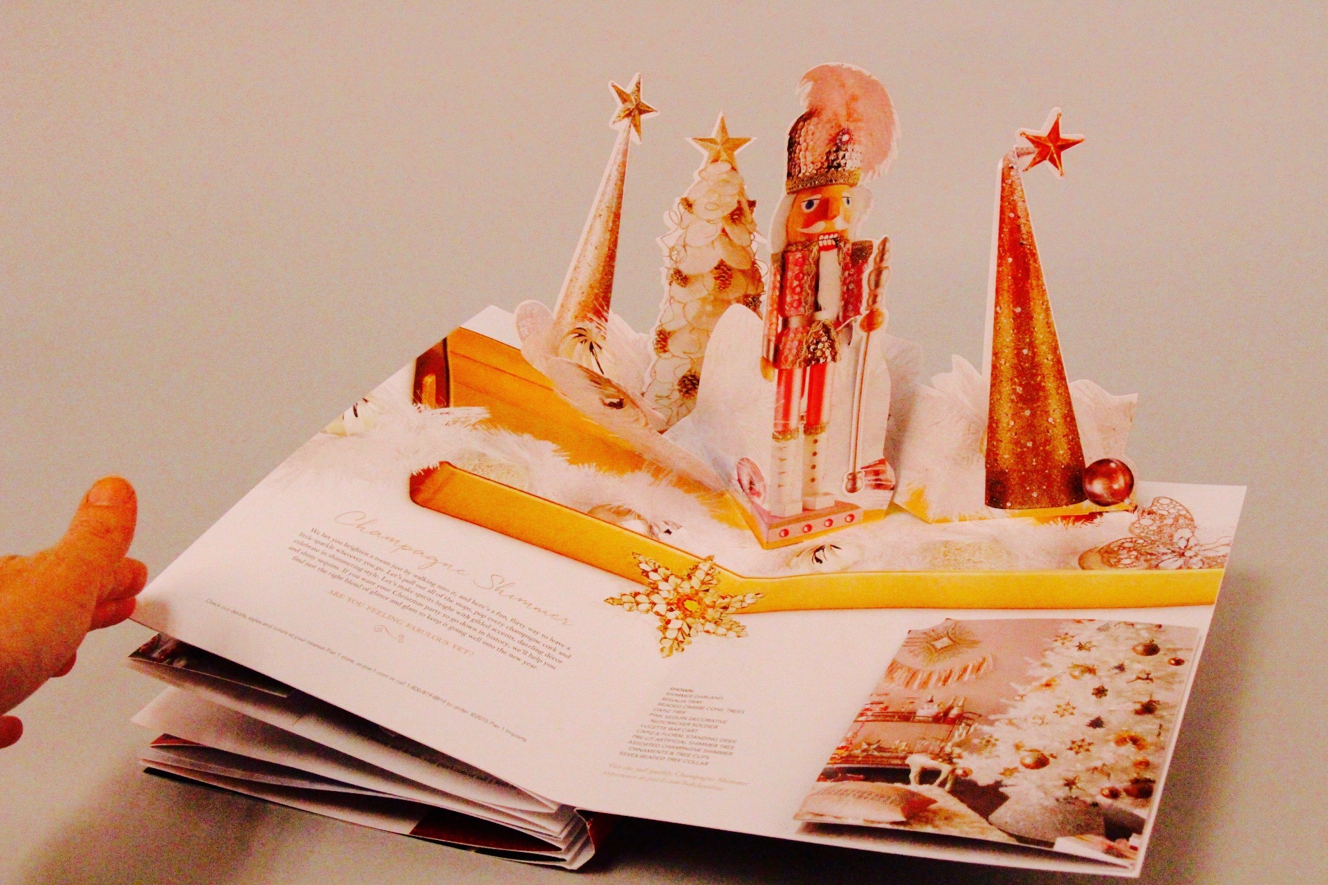
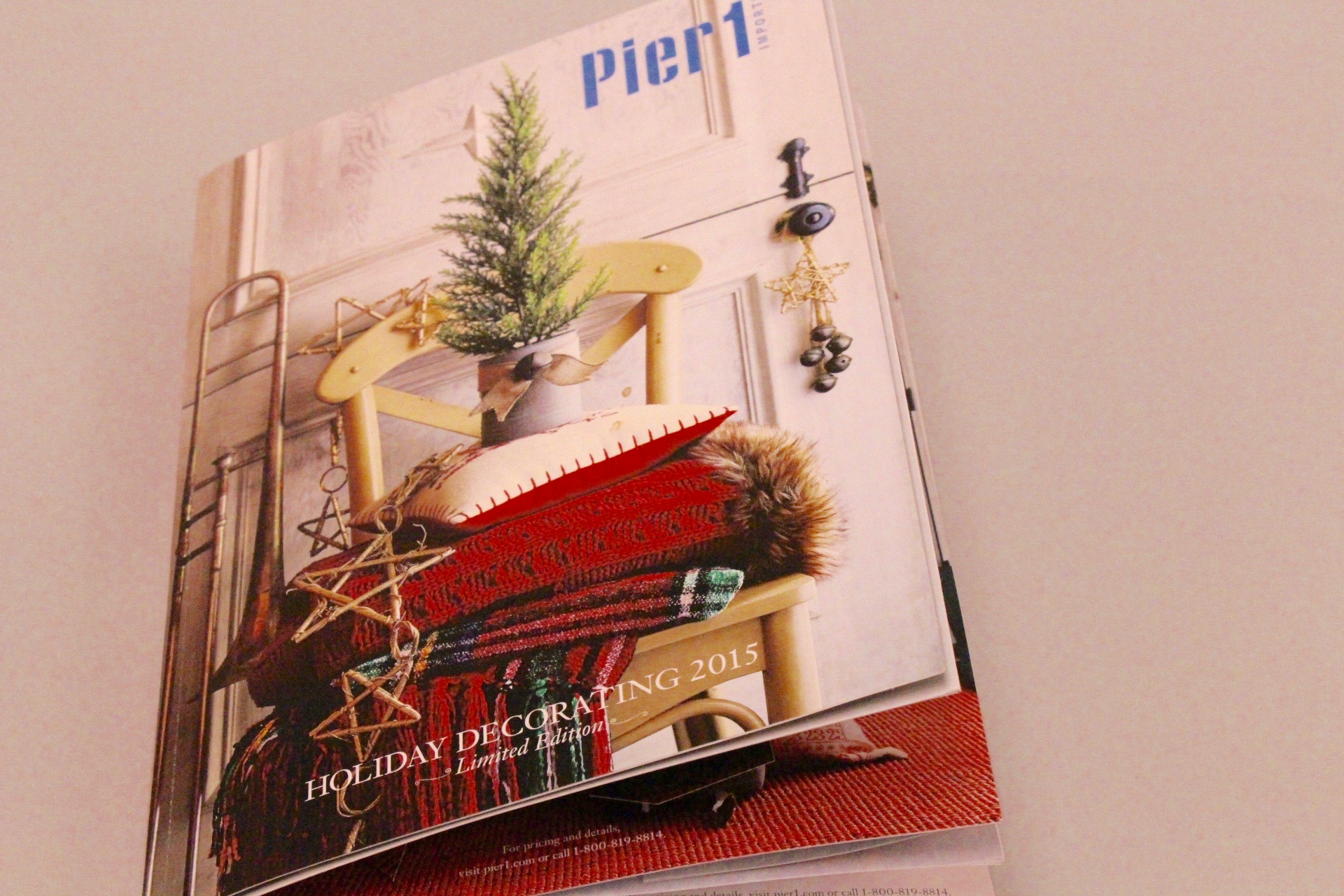
We love things that pop, bend, pull and are made of paper, so naturally we were thrilled to be a part of the creation of the Pier 1 holiday pop up catalog!

Pier 1 wanted a way to “craft an unforgettable holiday” by laying out their holiday catalogue differently. As you can see, each page opens up to a different room decorated with a holiday theme. Structural Graphics was involved in the final stages of design process and production engineering, manufacturing and hand assembly.

It didn’t stop at the catalog, though. See below…


IMG_6875
IMG_6876
IMG_6877
IMG_6878
IMG_6879
IMG_6881
IMG_6882
IMG_6884
IMG_6885
IMG_6888
IMG_6889
IMG_6890

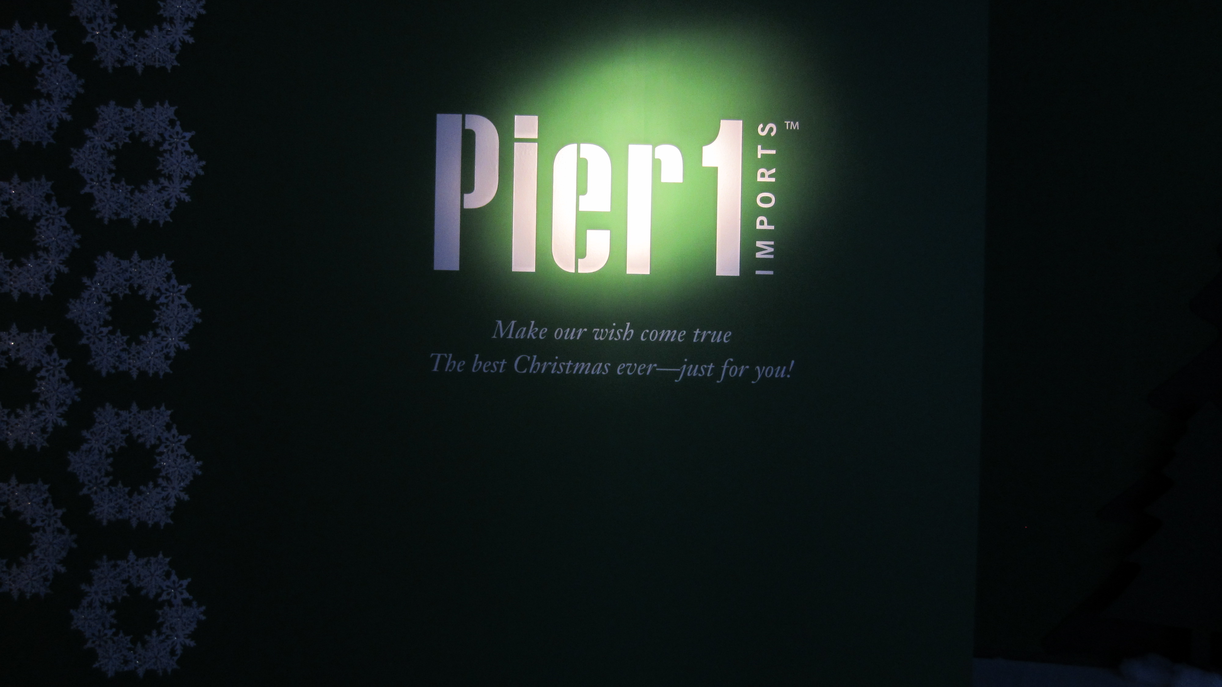
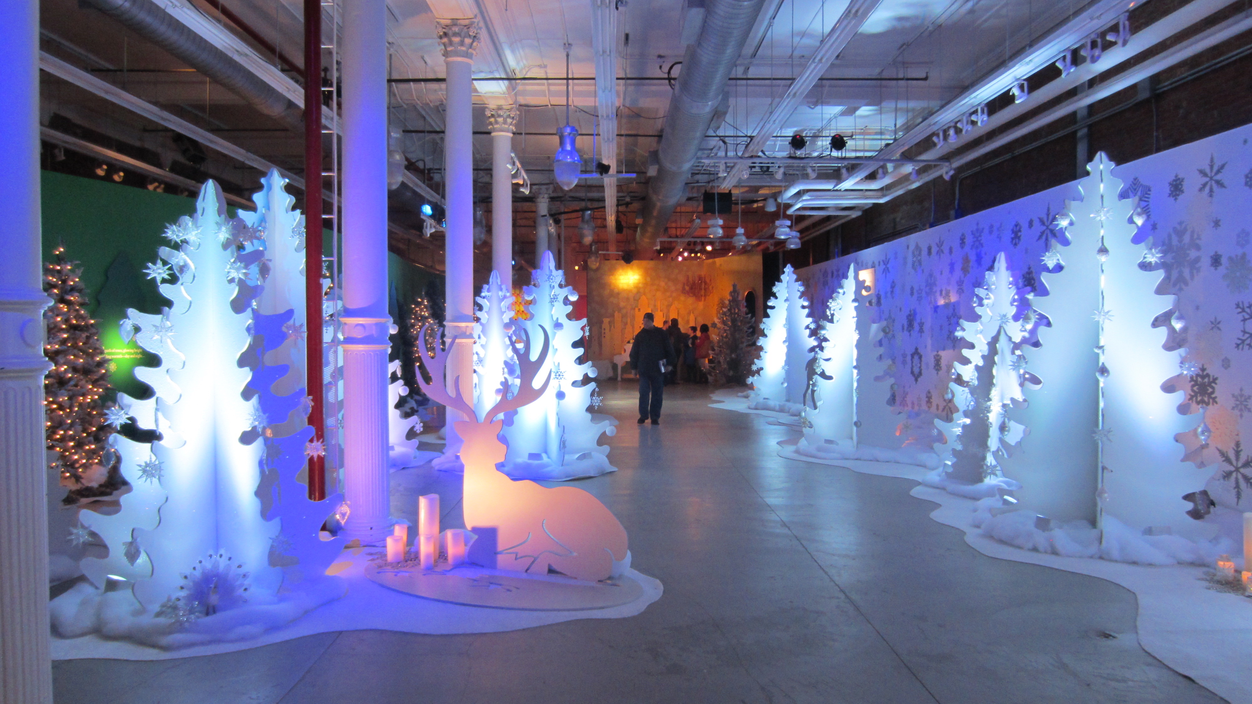
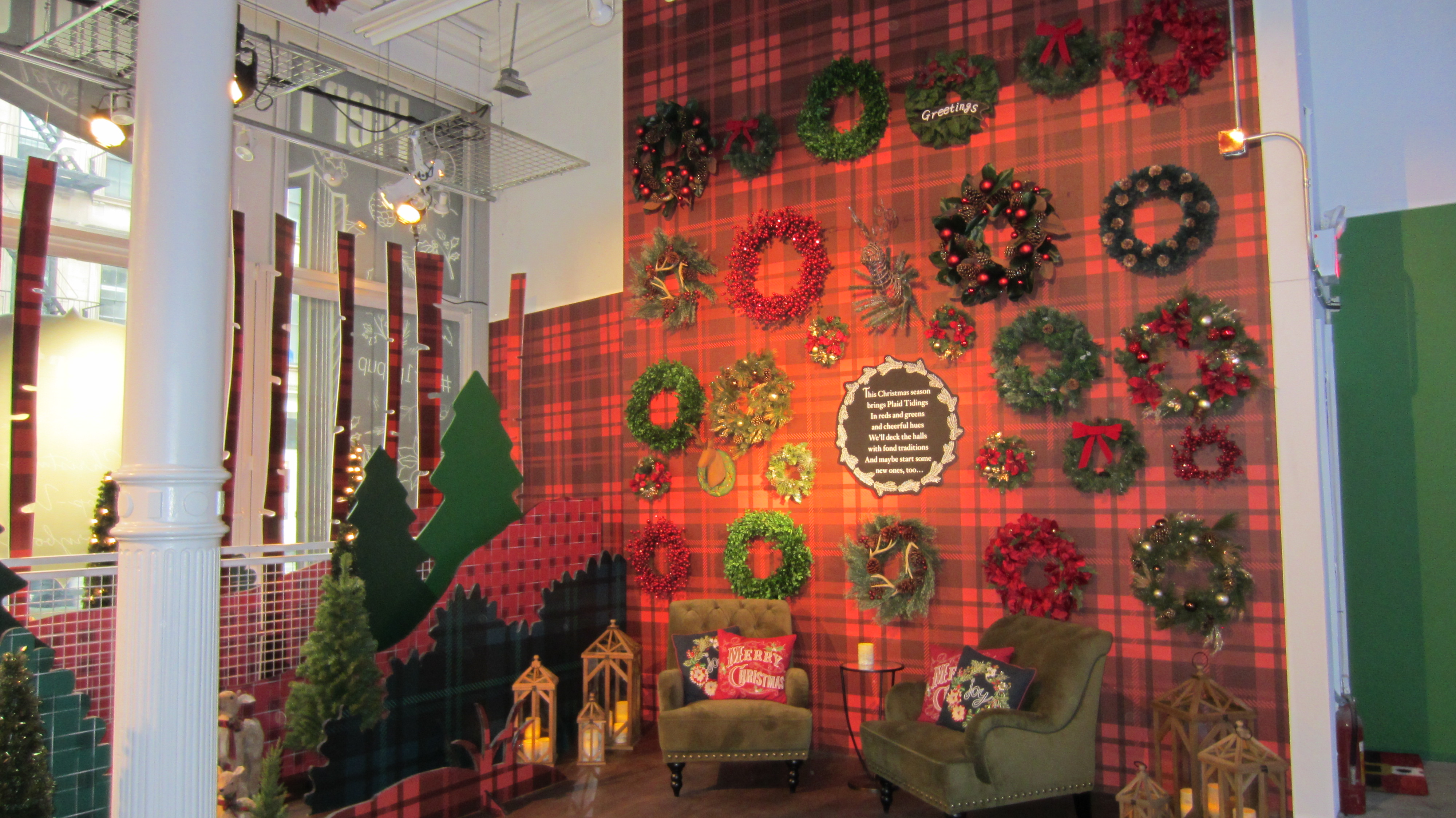
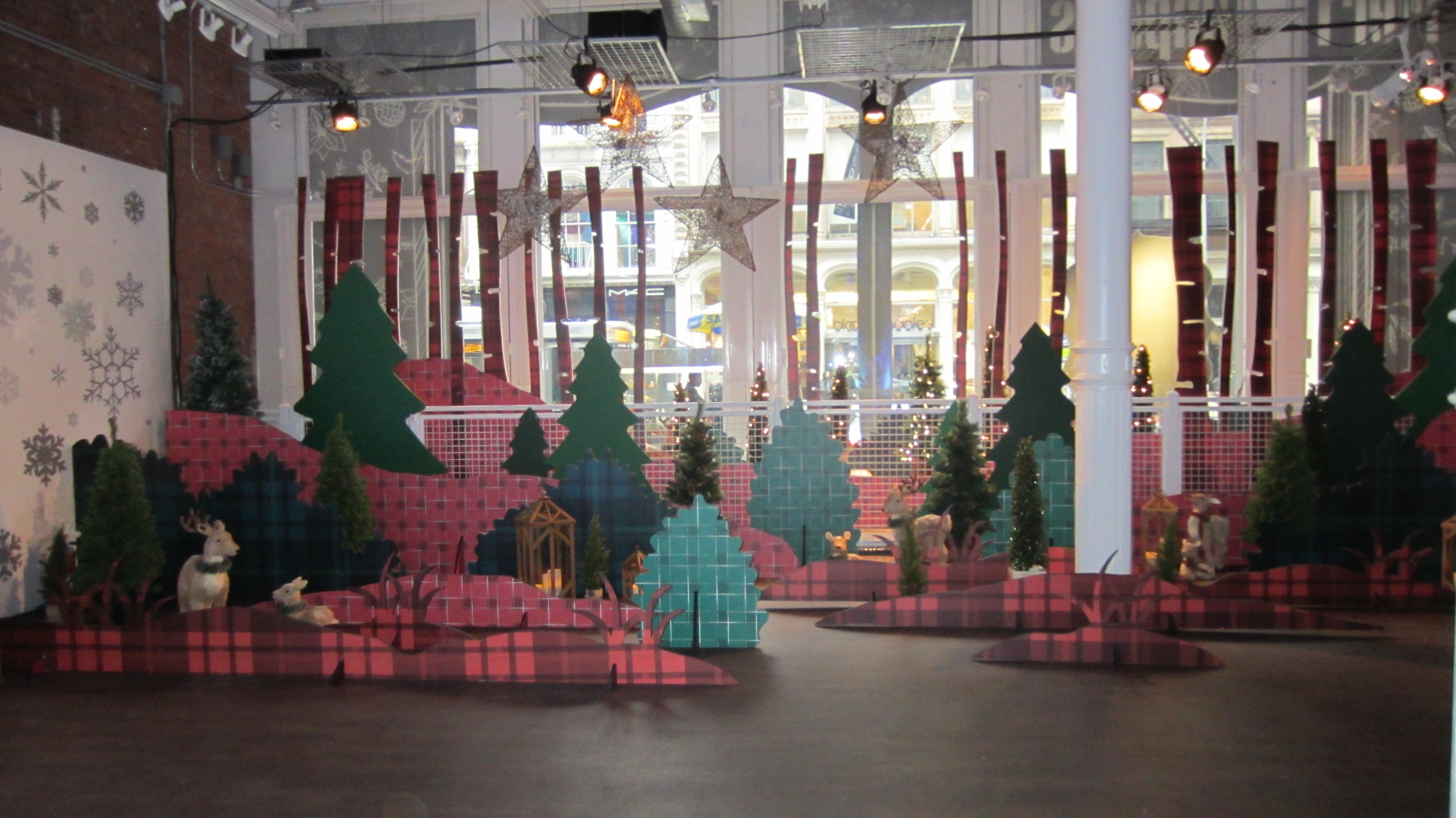
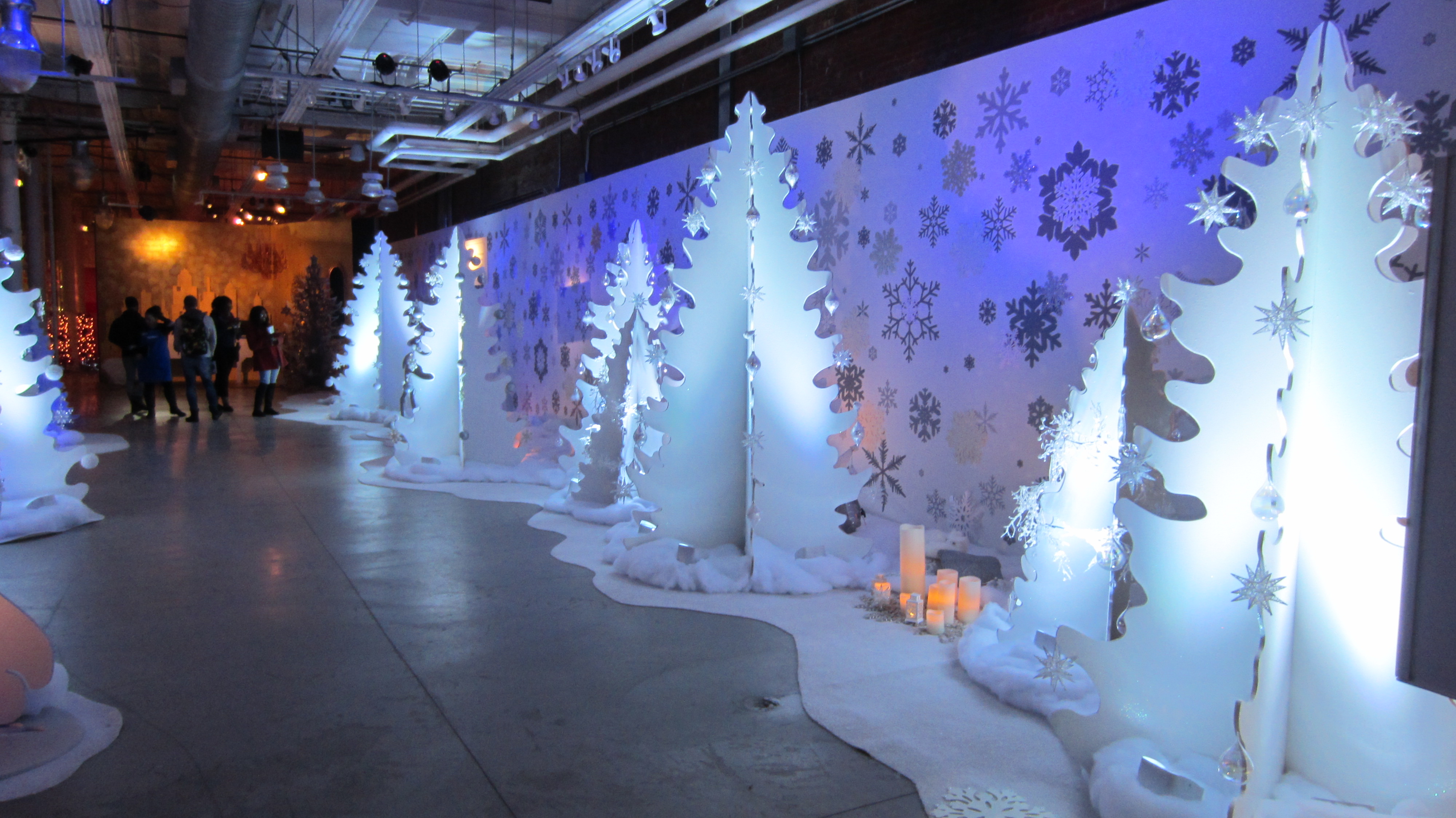
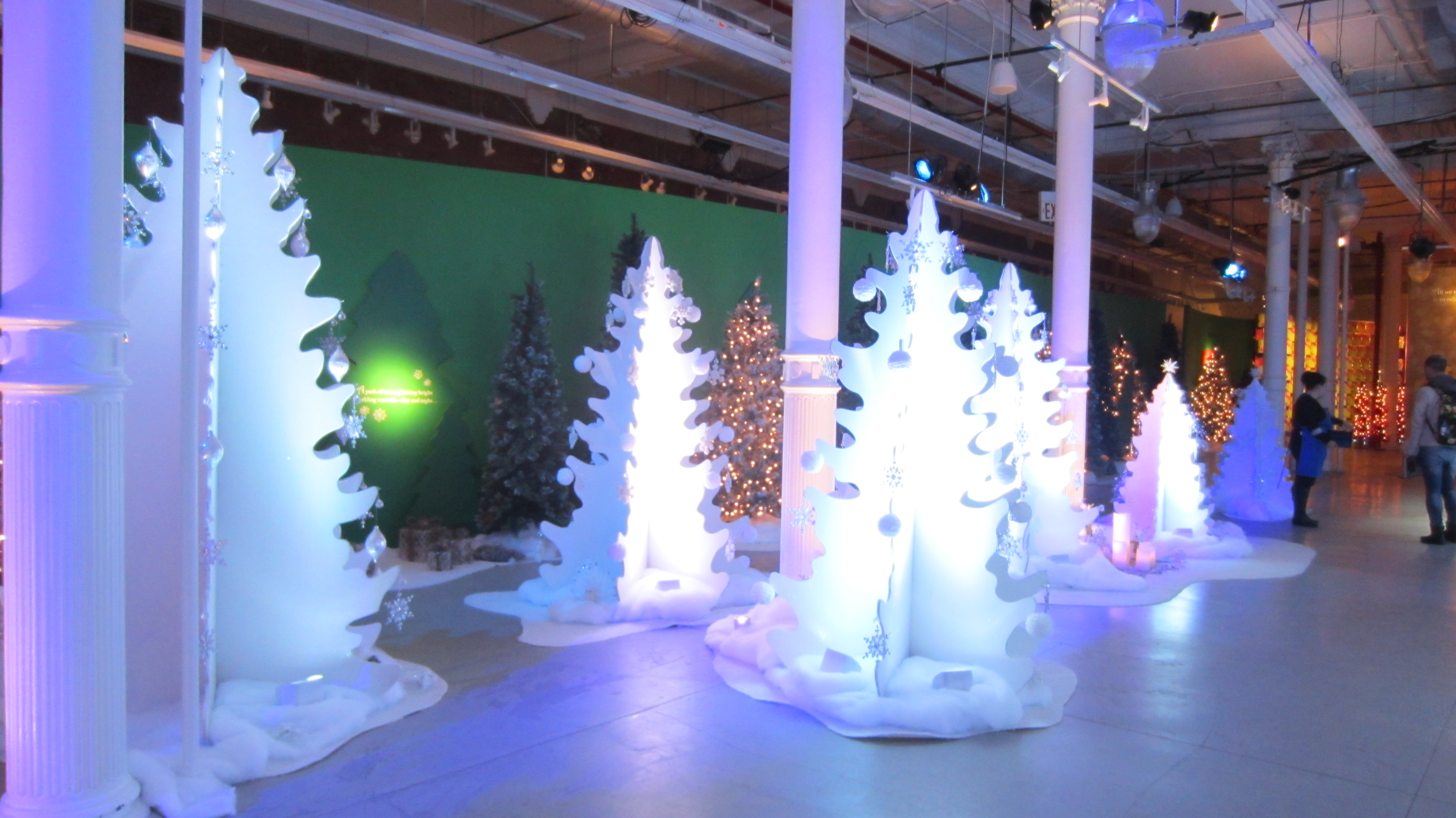
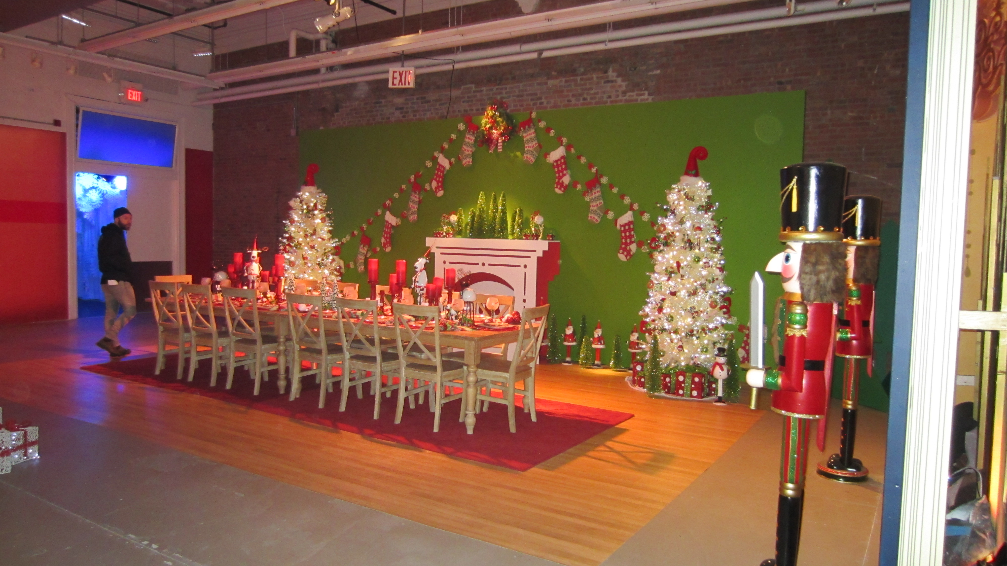
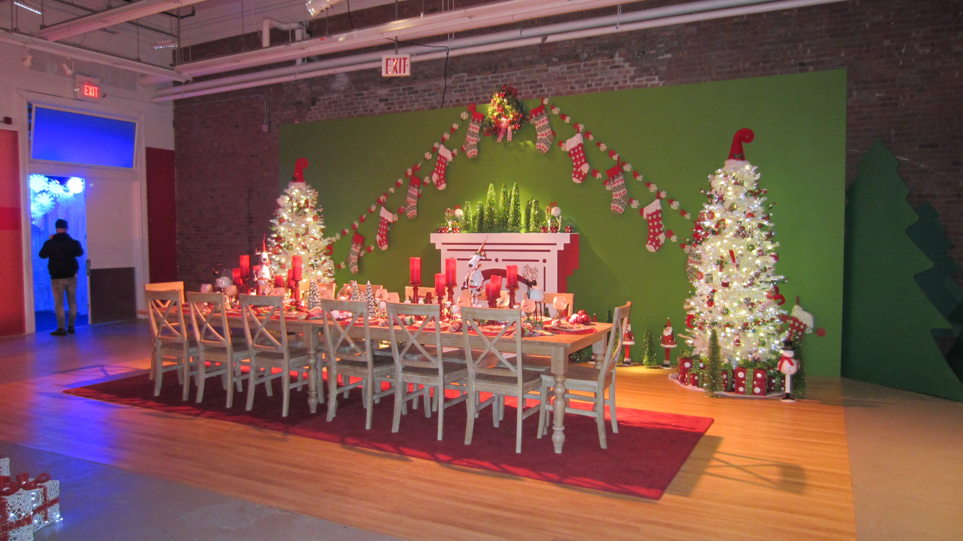
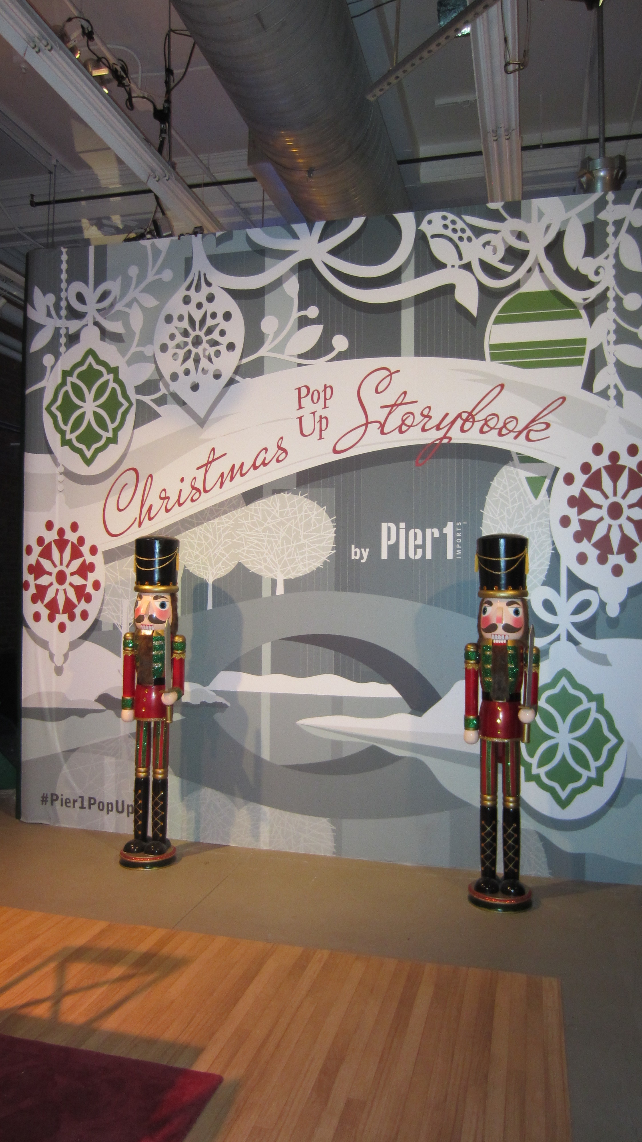
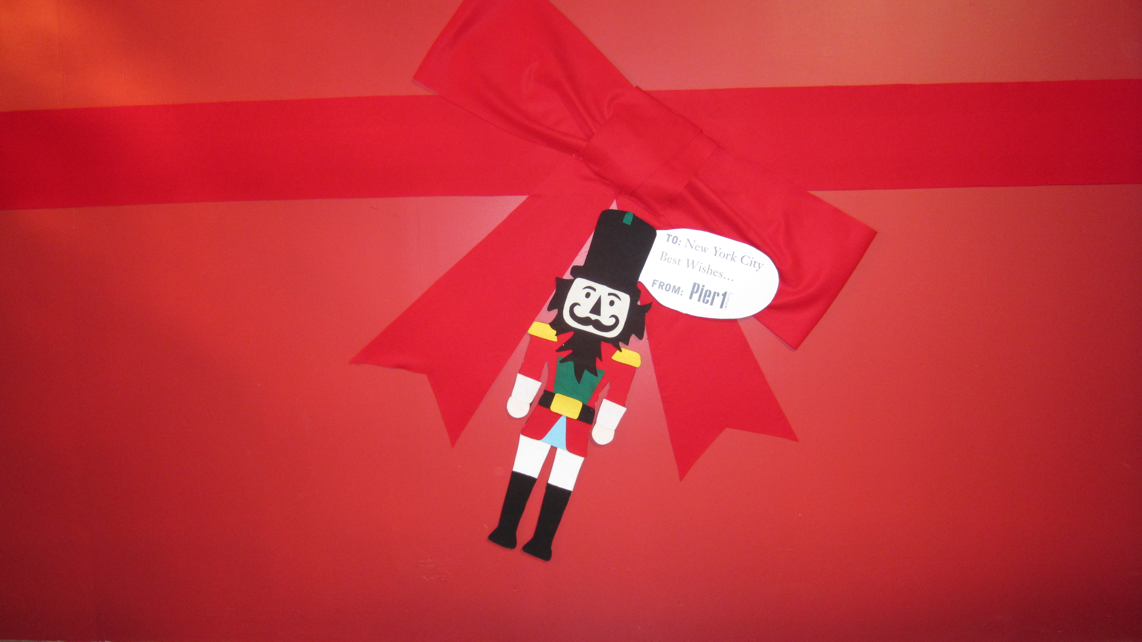
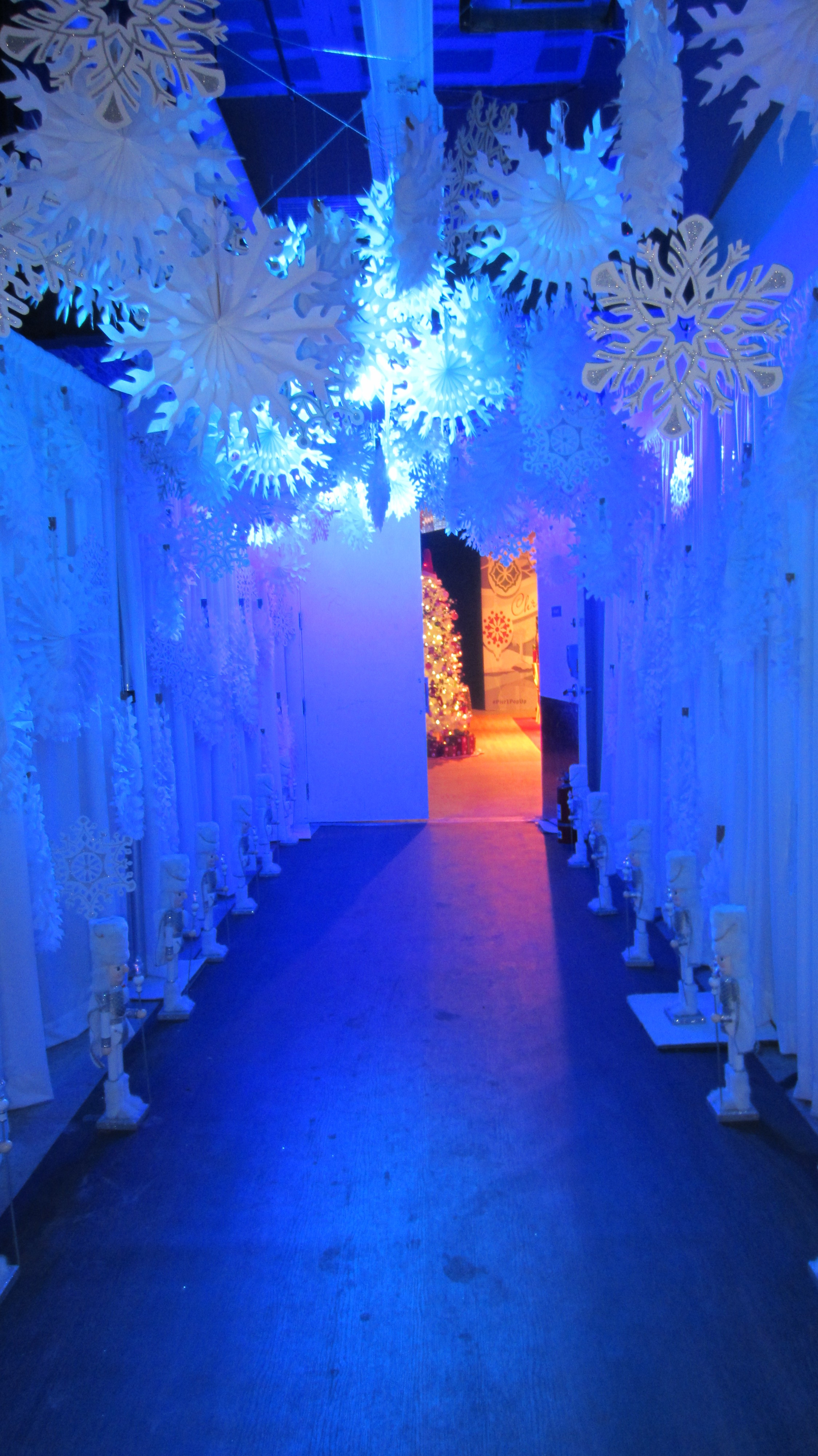
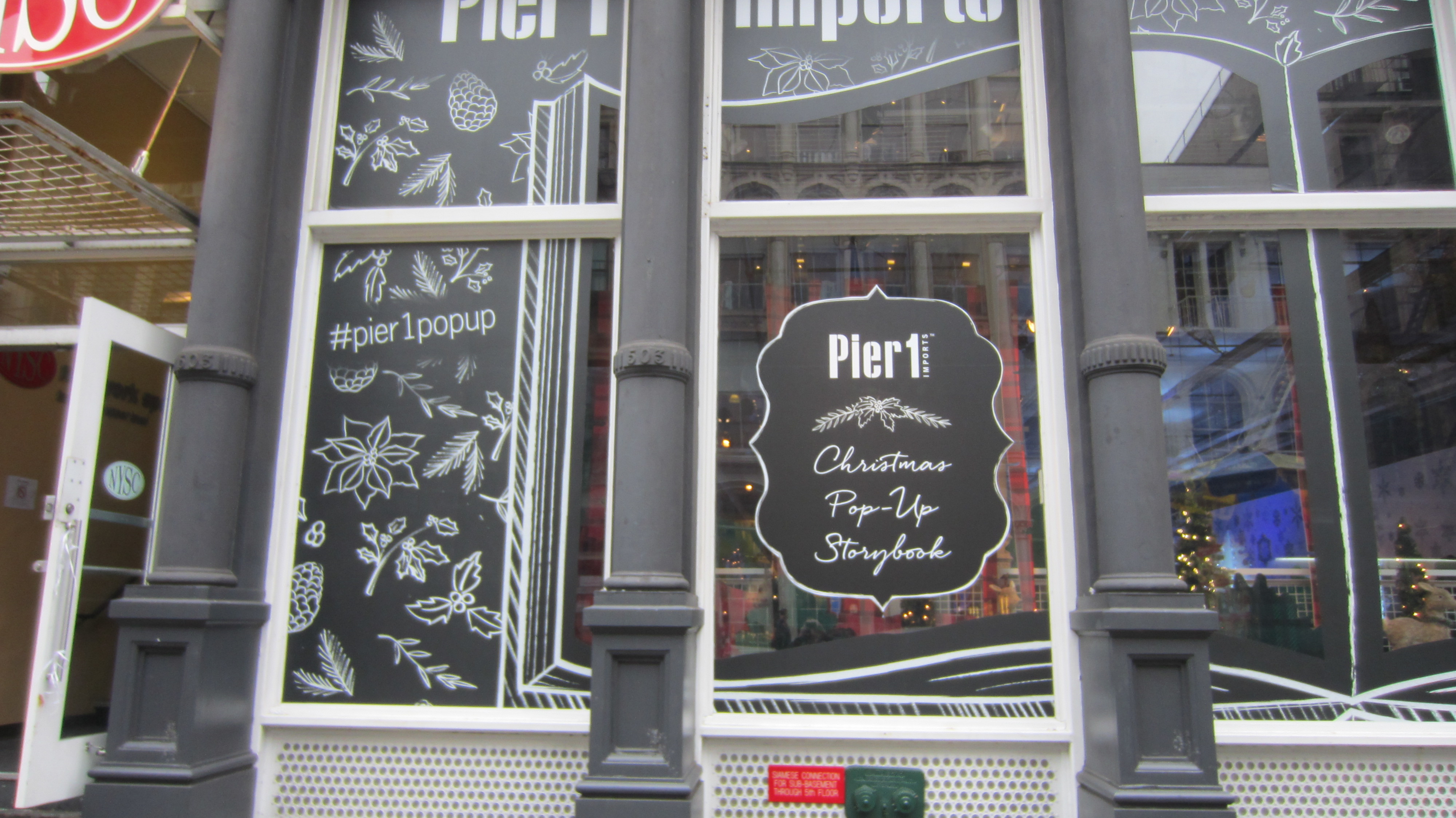
This catalog replicated, and was handed out, at the Pier 1 pop up store in Manhattan!

Pier 1 Collateral1 Pier 1 Collateral2 Pier 1 Collateral3 Pier 1 Collateral4 Pier 1 Collateral5 Pier 1 Collateral6 Pier 1 Collateral7 Pier 1 Collateral8 Pier 1 Collateral10 Pier 1 Collateral12


#Pier1popup


Pier 1
Structural Graphics President, Ethan Goller, visits the installation!

The Story of the Google Unboxing Launch

Screen Shot 2015-12-03 at 11.40.42 AM

The holiday season is in full swing, and hand-in-hand with that comes gift-giving fever. That fever has spread from our holiday hearts all the way to YouTube, with the increasingly popular unboxing videos. According to ThinkWithGoogle.com, 

Unboxing video views have grown 57% over the past year, and uploads have grown more than 50%. But it’s not just the growth in the unboxing genre that’s impressive—it’s the sheer volume, too. It would take more than seven years to watch all the videos on YouTube with “unboxing” in the title that have been uploaded so far just this year. And those videos have more than a billion views in this year alone.

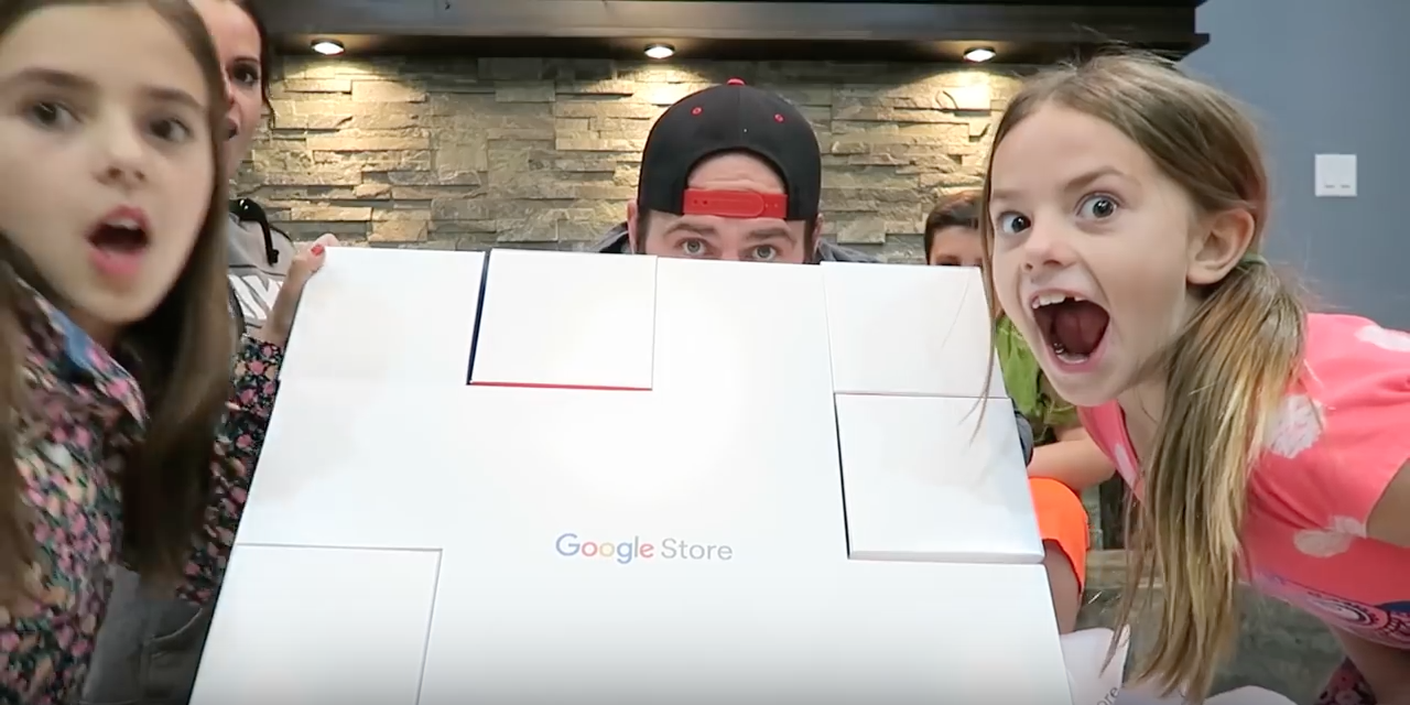
Thank you, ThinkWithGoogle. That’s just what we did – we “thunk with Google”, to design and produce their Unboxing box. This was sent to hand-selected YouTube celebrities to promote the Google Store, and designed to have an element of surprise when unveiling each featured technology product. And the response was simply outstanding:

4 million views, with 11 million projected by Christmas.


And also, some sweet comments straight from the Unboxing YouTube celebrities themselves:

 “That’s the best part, the packaging. ‘Gavin came in, and he’s like “This packaging is legit.’ And you know when Gavin thinks your packaging is legit, you’ve got a great product.”

Thanks, Gavin & Shay fam! And from Captain Sparklez…

“What?! This is the coolest packaging I’ve ever seen in my entire life. I don’t even want to disassemble this.”

We’re blushing! That’s the highlight, but let’s backtrack (spoiler alert: here’s where we start to talk about ourselves, boxes, and Google, a lot)…

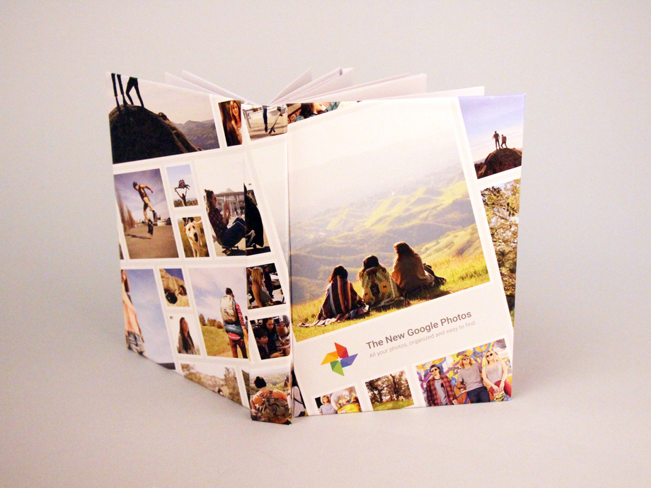
A few months back, during the development of the pop-up book with the agency Toaster for their Google Photos app, we were on a string of emails with Google brand. (NBD.)
Google_Popup_Book_12_resized

Fast forward to September, when it came time to develop the box for their Google Store Unboxing Launch, they asked us whether or not we do boxes. (Answer: look here, or even here for a bit more luxury.) I mean this is Google, and we’re Structural Graphics, so naturally, we said yes. We practically invented boxes.*

Open Gift Box - Top View

(That may or may not be true.)*

On September 16th was the initial kickoff call to discuss concepts. At first, the sole and simple goal we had to accomplish was, “we need a box to hold products”.

Originally, we started with a white box with clouds. All of these 7 technology products, which can be seen in the Google Store, could have easily been thrown into any old, standard, 8-sided-vanilla-box. But that’s not really our style.

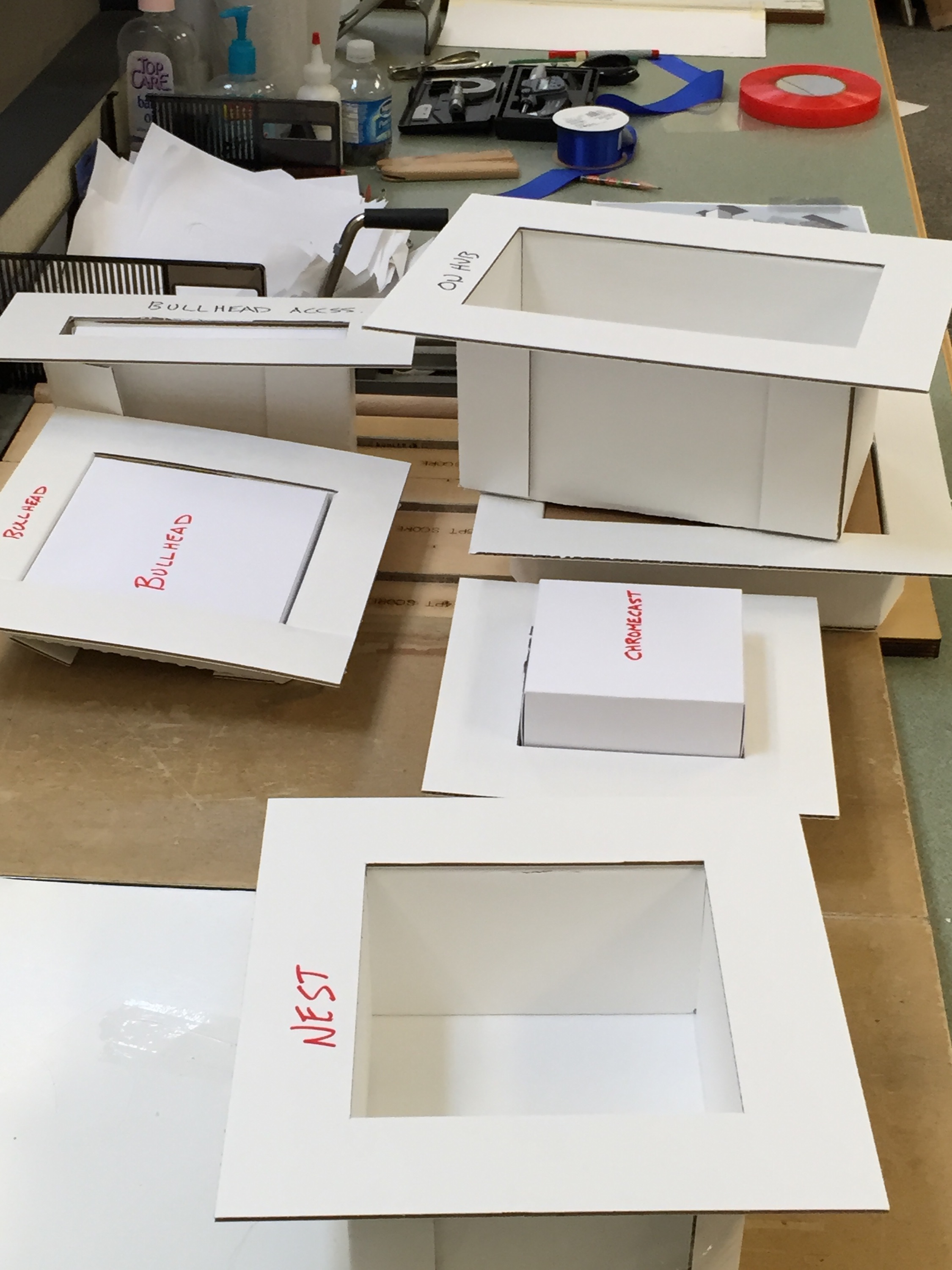
We then started with what any sensible person does in this day and age: we Googled it. We googled the Google products to get grasp on what it would need to hold, specifically the size, and how we could package that up.

As time went on, the inspiration developed. We were given a few more things to chew on:

1. Google presented us with a ‘Mood Board’, basically a brain dump of what it needed to include, and 2. What not to do: not a traditional printing press or corrugate. I mean, let’s be honest here, creative freedom + super cool client = any designer’s dream. Our brainstorm session produced a list that looked like this: Rubik’s cubes, puzzle, with the idea to create more of an ‘experience’ than anything.

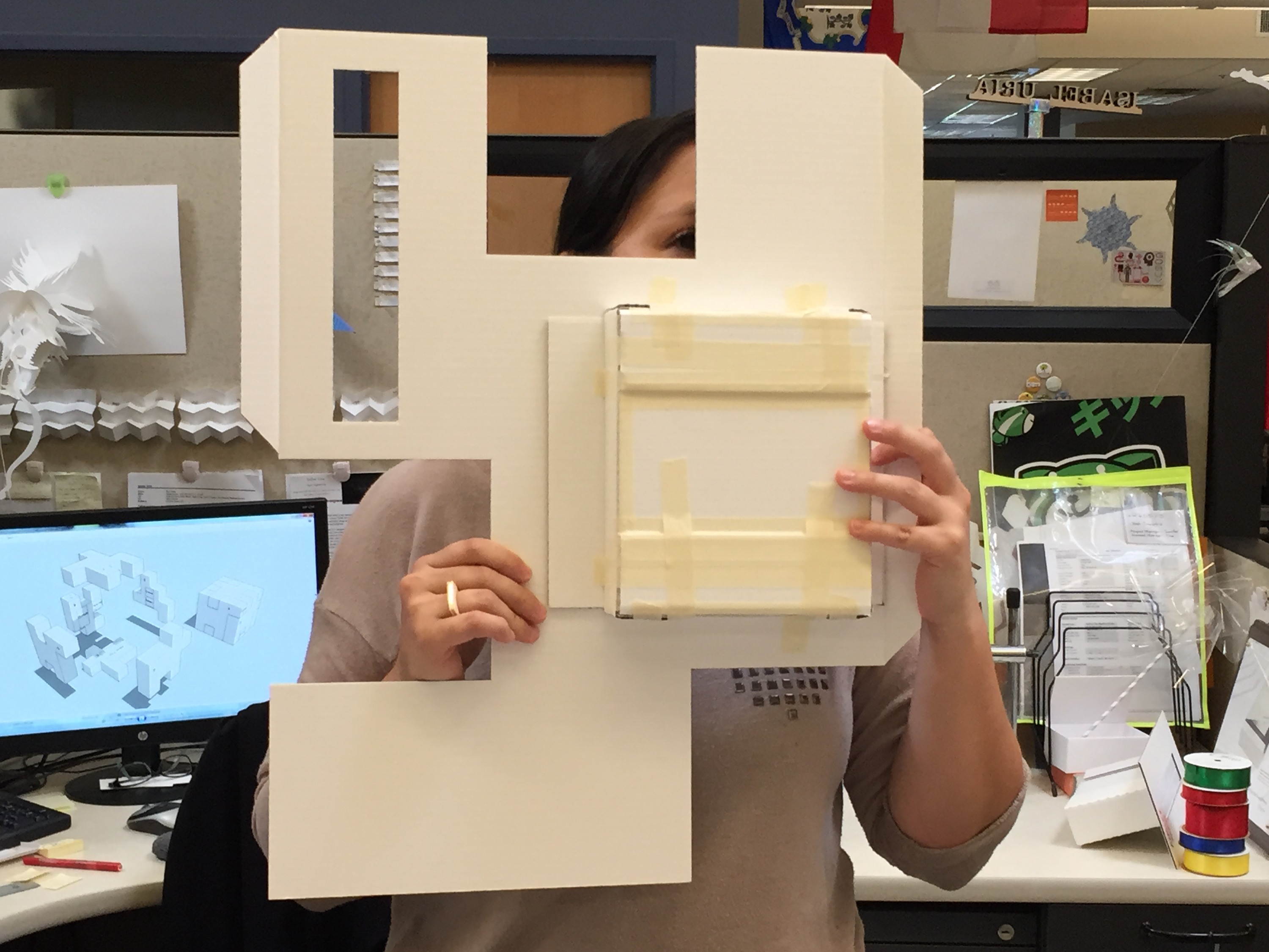
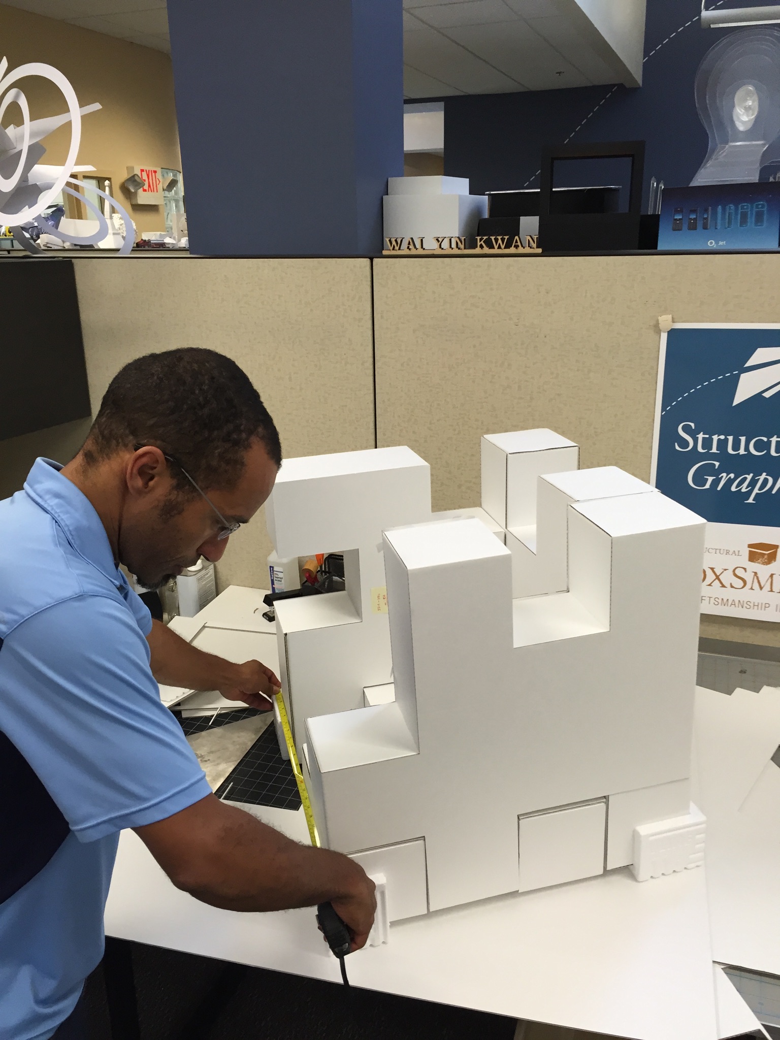
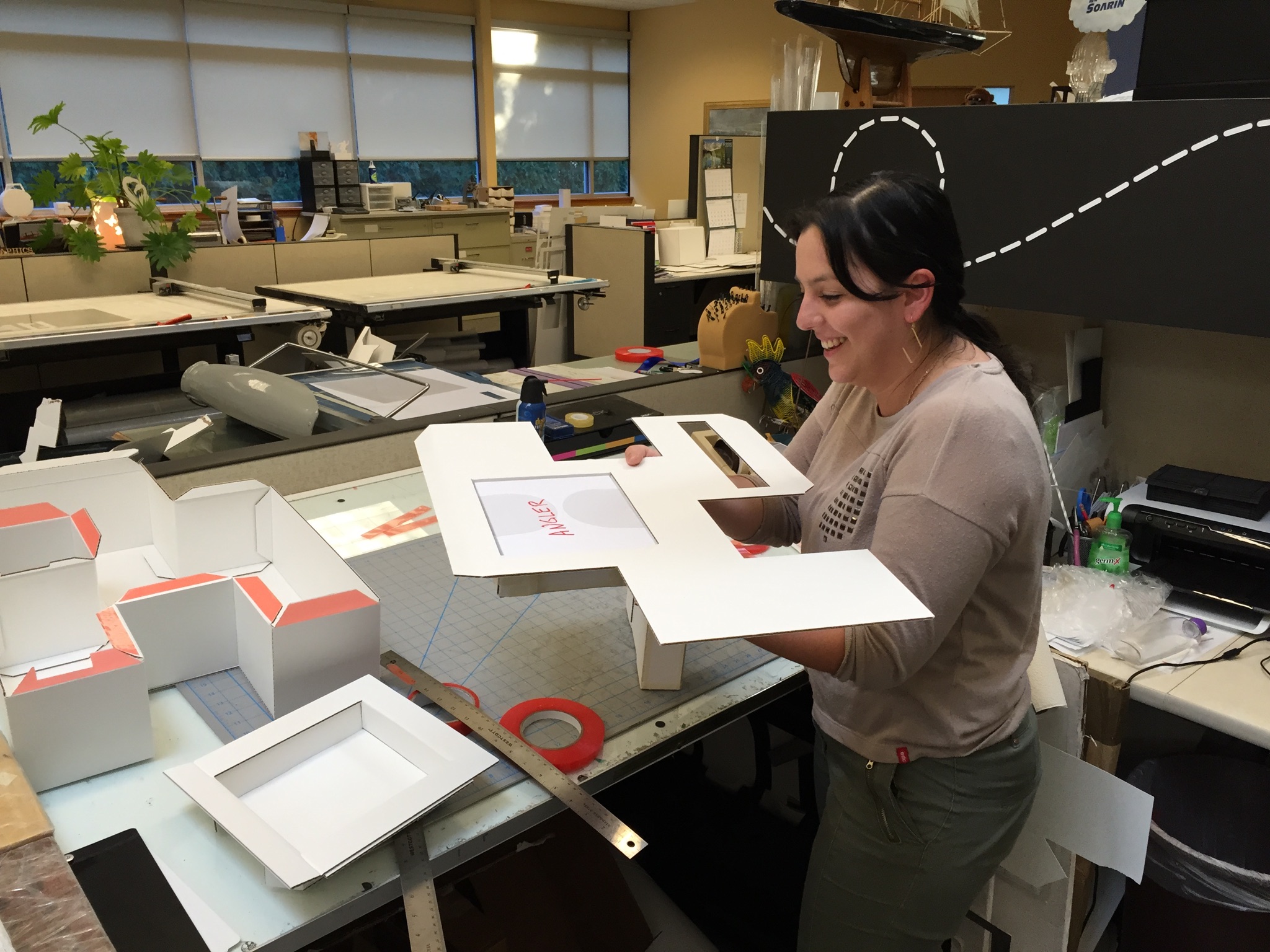
Mission: possible. Erik, one of our paper engineers, came up with the puzzle box concept, and that’s when things with the entire team really took off.

IMG_5070


IMG_5072


IMG_5073


IMG_5075


IMG_5076


IMG_5077

IMG_5079


IMG_5080


IMG_5093

As you can see clearly, it was all hands on deck! From a design and materials standpoint, this box was pretty far out of the comfort zone for our group. The materials and scale of this project was foreign. Typically, we deal with folding cartons, but every single person had hands on this project in order to turn around 2 sets of comps and “push the limits of design & engineering”.

On November 6th, upon assembly of the puzzle box, this was their reaction:

“Hubba, hubba!”

“Sweeeeeet, it’s really coming along nicely!”

“Woohoo!”


Of course, we echoed that.

So, the design was complete, but the job wasn’t over. Once these people receive it, what was the user experience going to be like?

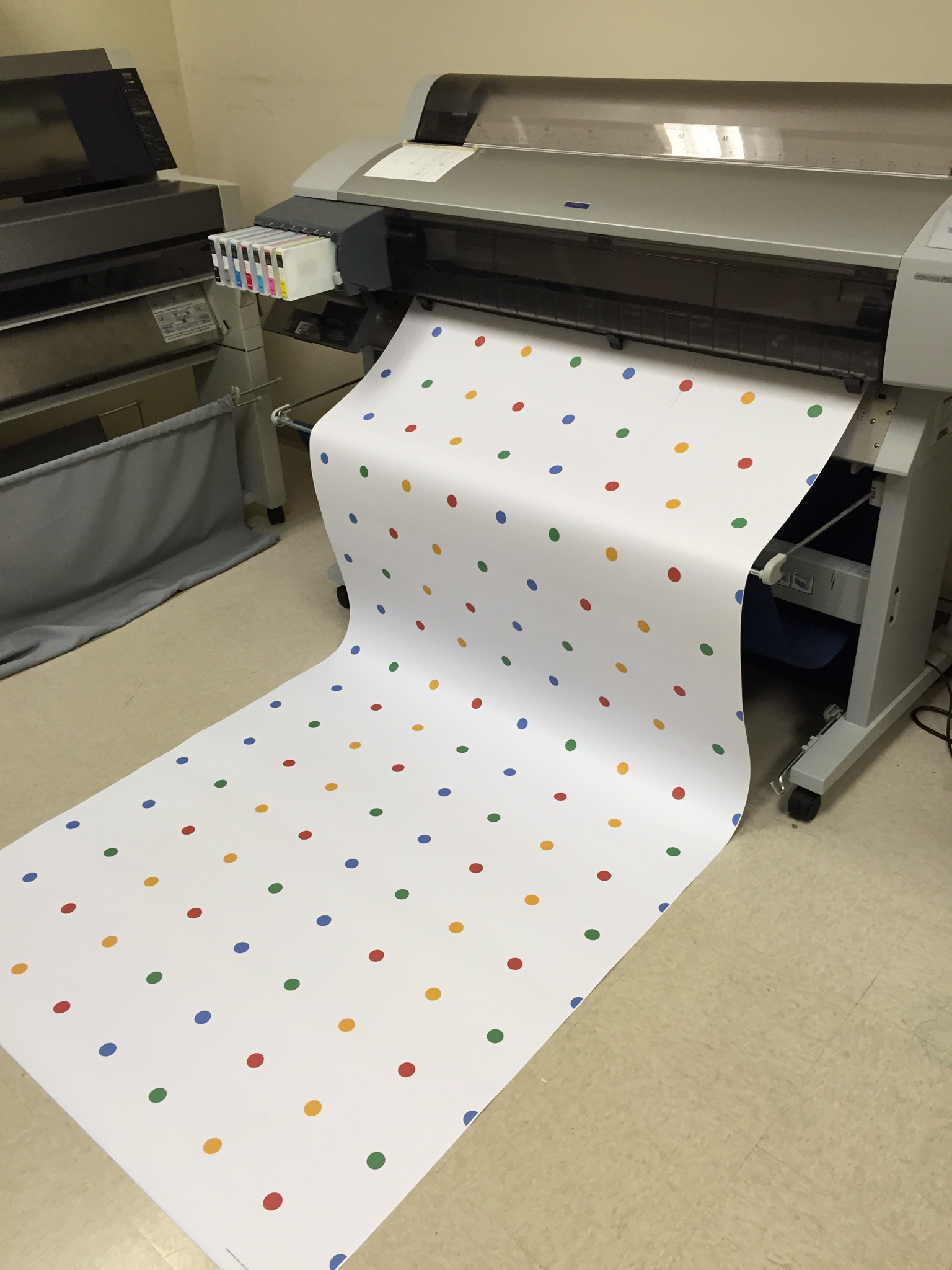
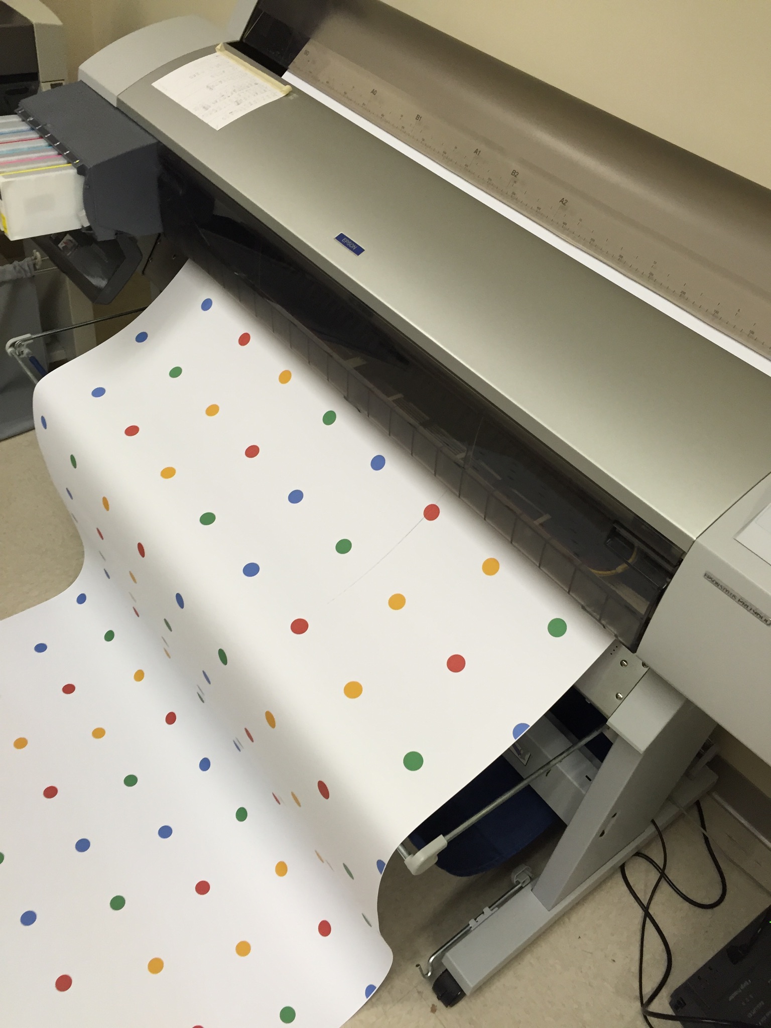
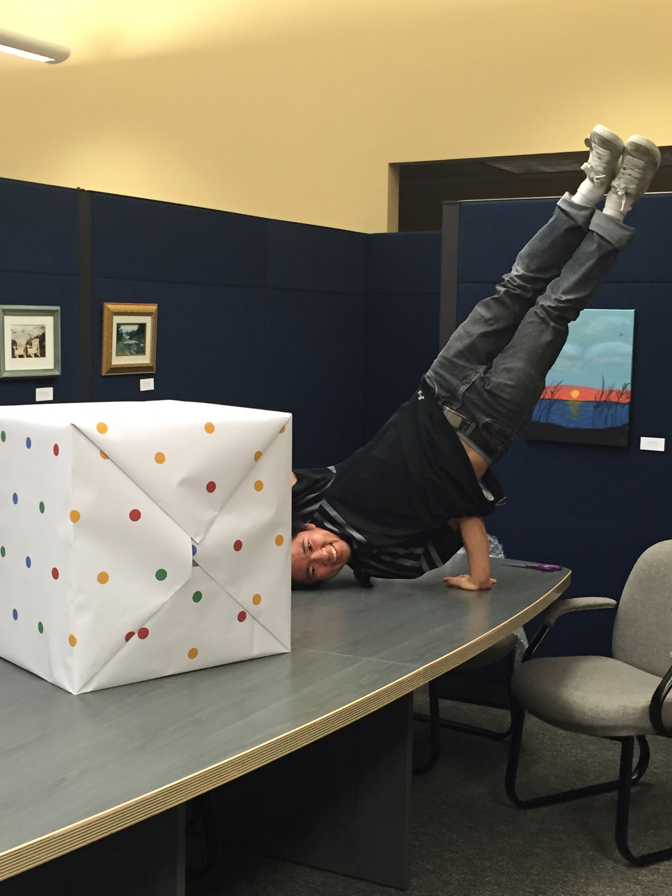
There were a few small, yet critical details. First, was a card insert from the Google brand team, personalized & hand done with black Sharpie. Second, there was a little issue with the puzzle pieces, they didn’t quite stay together during shipment. Okay, thought our design team: how can we fix this? Why don’t we put it in gift-wrapping paper? Develop custom Google wrapping paper, which was actually functional. Genius.

Timing was a huge component for this project, considering it needed to drop by Black Friday. The second comp turn-around time was 3 days, and because of timing, we sent a template without sending a second comp. They never received a final produced prototype (only the press proof) before shipping to the influencers.

The night before delivery was crunch time. Gustavo, Vice President, Operations, and Teresa, Director of Business Development, left Mexico at 1:45am for delivery. They had 2 hours and 15 minutes to make it. From there, it was Fed Ex same day shipped, with critical care, and a contract with independent TSA couriers. Anddddddd, *sigh* just in time.

You might notice, if you’ve been paying attention to the timeline, that one of the most impressive parts of this story was the timing it took from concept to influencer delivery: 7 weeks.

“Amazing work under a brutal timeline.”

And just like that, that was it. 7 weeks. 7 products. 24 pounds without products, 35 pounds with products. Lots of hard work, and of course, a little bit of play…

IMG_5098

Watch the Unboxing for yourself below, or via these links: ShaySparklezAndrea and Maya.

Shay

Shay @ 7:33 – “That’s the best part, the packaging.”

Captain Sparklez

Captain Sparklez @ 1:55 – “What?! This is the coolest packaging I’ve ever seen in my entire life. I don’t even want to disassemble this.”

Andrea

Maya


An Apple A Day… [Healthcare in the Ad Industry]

You know, sometimes the last kid to be picked for the volley ball team isn’t always the worst.


And lately, a similar thing is being said about healthcare agencies at the ad industry’s top award shows. 4A’s Partner Award has pushed healthcare agencies into the spot light. We love you, healthcare agencies! (We even liked you before you became cool.)

As Marylyn Donahue, with PharmExec.com, goes into further detail on the subject:

“While not close enough to rub elbows with the Don Drapers and Peggy Olsons of the ad world, at least they’re being invited. This wasn’t always the case.

Even just in 2013, Advertising Age asked: “Are healthcare agencies and their clients the last group in the ad world not to attend the Cannes Lions International Festival of Creativity (arguably the Oscars of the industry)?”

But times change. And now (drum roll, please) the titular head of the industry itself — the American Association of Advertising Agencies (AAAA or 4A’s), a 98-year old trade association has gone a step further. They’ve added a “Health & Wellness” category to their 2016 Partner Awards.

“And with this year’s Health & Wellness category we have the opportunity to honor the collaboration between agencies and organizations that promote health and wellness. Entries can include campaigns for corporate branding, education and awareness, and OTC, lifestyle, devices and pharmaceutical products.”

It’s a big market. In 2014, healthcare agencies garnered $4.3 billion in revenue up 10.3% from the year before. 

Whoa.

Marylyn goes on, “What doesn’t kill you makes you stronger, and the rebounded agencies were more innovative and more diverse than ever before. In the interim many shops had changed the dynamics of their traditional deliverables, branching out into areas that emphasized collaboration.”

Essentially, healthcare agencies are the underdog.

All-told, it made for a perfect fit for the new 4As’ Partner Awards. The brainchild of the 4As’ Chief Marketing officer Alison Fahey, the Partner Awards were intended to be a reflection of the times. “We realize there are unique challenges that occur when individuals and companies with different personalities and cultures collaborate to achieve a common goal on behalf of a client,” said Fahey. “We wanted to salute those who put their egos aside for the greater good of creating meaningful work. As evidenced by the 4As Partner Awards 2015 winners, the very act of collaborating can elevate creativity to new levels. The jury did a great job of choosing the best creative collaborations in the marketing and communications industry.”


To read more, visit the full post.


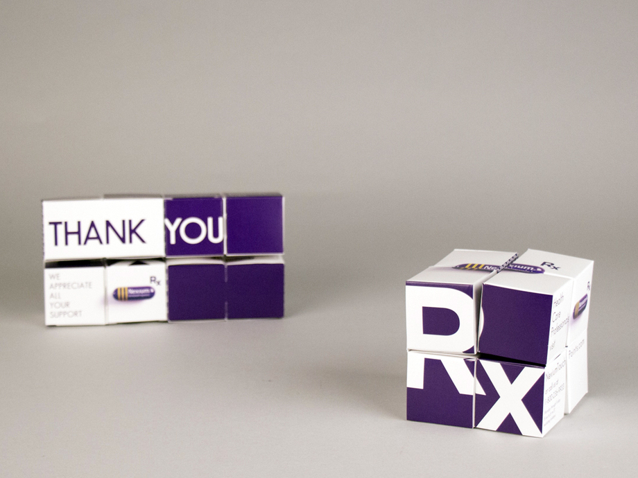
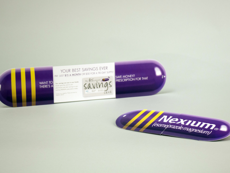
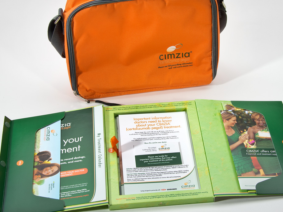
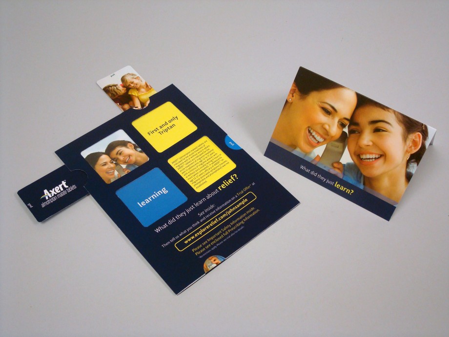
Stated before, we love you pharma, and we’re going to share some of that love. Take a look at some of the work we’ve done in the pharmaceutical industry below, and click this link to download our pharmaceutical success stats (PDF).

4514-496_Astra_Zeneca_Nexium_Rolling_Cube_3_resized

4515-762_Astra_Zeneca_Nexium_Center_Split_3_resized

CimziaKit3__0__136

DSC05784__0__148_resized

To enter the 2016 4A’s Partner Awards submit entries by Dec. 18, 2015. Winners will be revealed at the 4A’s Transformation Conference, March 22, 2016, in Miami, FL. For further details, please visit http://partnerawards.aaaa.org/

All About That Baste [Turkey Day 2015]

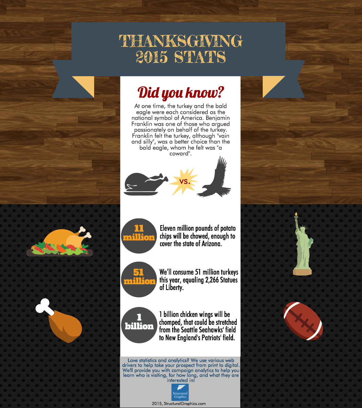
So, it’s that time of the year again… and even if you don’t love the chaos of the holiday season, there’s one thing we can all agree we love: food! In honor of the upcoming holiday, here are some juicy Thanksgiving food facts to chew on.

Thanksgiving Stats SG

SOURCE: Writer Access

For dessert: a little bit of holiday humor…

Why is a turkey similar to a ghost?

Because it’s a-gobblin.

*ba-dum tsh*


The Finer Things: The Leading Hotels of the World

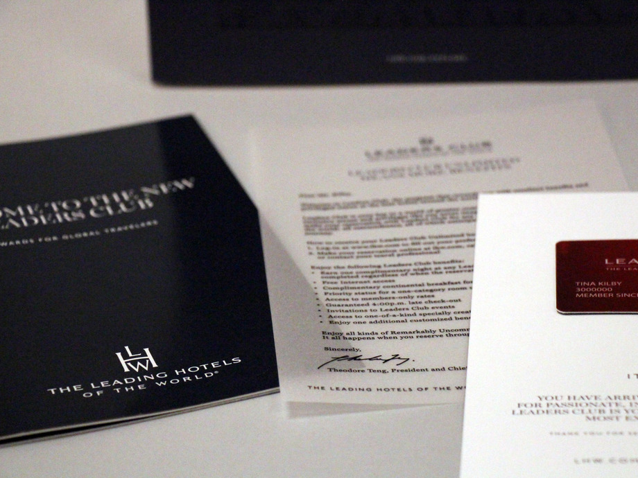
Most of us have hobbies or activities that we love that drive us to get out of bed every morning (other than a steamy cup of coffee). For some of us, it’s reading, others, it’s skiing… exercise, playing an instrument, cars… the list goes on.  For others, it’s travel, and for those of us that appreciate that finer things in life, a membership to a luxury hotel collection with travel perks is just the ticket.

Comprised of more than 400 hotels in 80 countries, The Leading Hotels is one of the largest luxury hotel collections in the world.

We weekly prepare and distribute nearly 2,000 member kits for new or renewing The Leading Hotels of the World members.

Woah.

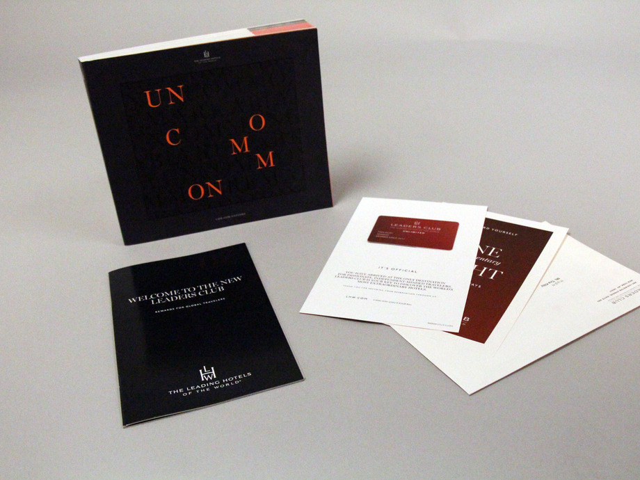
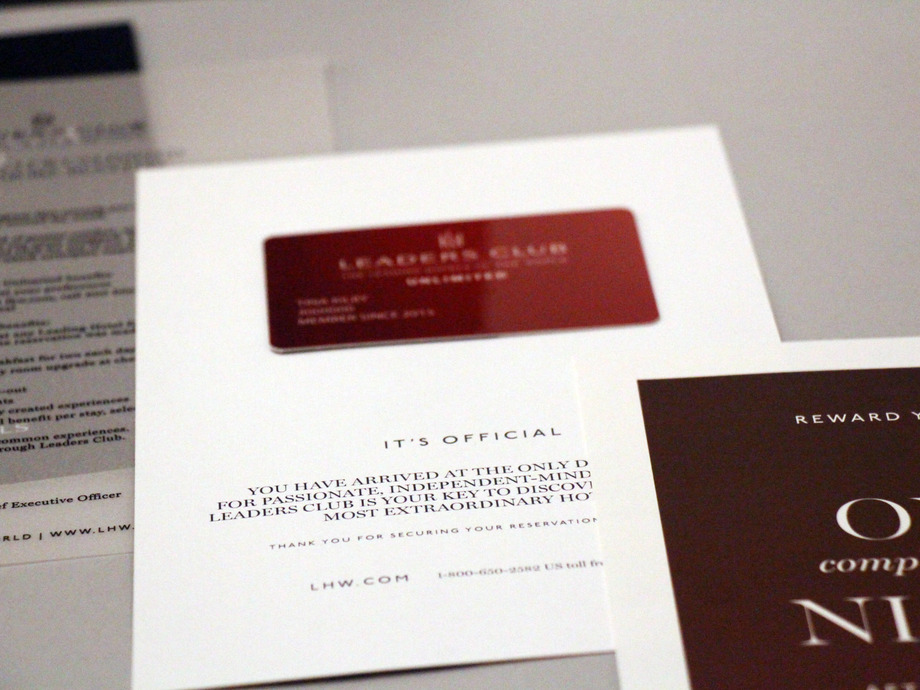
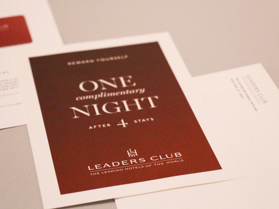
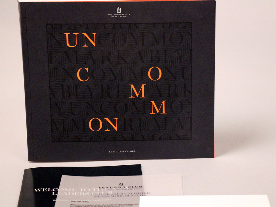
The new and renewing members have an taste for elegance, which is why we work hard to make sure that each member receives white-glove service in the form of a hand-crafted welcome kit. Let us show you…

 Leading_Hotels_of_the_World_2__0__136_resized

Leading_Hotels_of_the_World_11__0__136_resized

Leading_Hotels_of_the_World_12__0__136_resized

Leading_Hotels_of_the_World_15__0__136_resized

Leading_Hotels_of_the_World_16__0__136_resized

Structural Graphics prints in volume and stores in inventory all common components, seen above:

• Brochures
• Comp cards
• Envelopes
• Corrugate shipper
• Catalogs

The images speak for themselves. The details – each component, accompanied by variable data and images – are truly what make this kit so special.


“Structural Graphics has been a vital partner to the operations of our Loyalty Program in the wake of extreme membership growth. The onboarding process was thorough and we felt a strong commitment from the team to making the transition seamless and undisrupted from the get go. The team went above and beyond to satisfy our highly-personalized requirements with innovative ideas that saved us time and money in the end. One of which consisted of recreating an entire image library, assigning a unique image to each of our 400 hotels, which was formerly managed in-house. Because of their unique approach, we were able to start phasing operations earlier than scheduled. Over the last year we’ve experienced nothing but unwavering dedication to our partnership. The team I work with is highly-engaged and responsive; they even hosted me on a site visit to their fulfillment facility in Mexico and at their office in Essex, CT. Bringing on Structural Graphics as our fulfillment partner has been a fruitful business decision, I do not fear that they will not be equipped with the skills and knowledge to accommodate our changing business needs. I look forward to many rewarding years of partnership.”
– Julie Oleskiewicz, Senior Manager, Loyalty Marketing at The Leading Hotels of the World

We’re blushing! Hey Julie, we really like you, too.

Haptic Brain / Haptic Brand

Most of us are lucky enough to know the rush of excitement we get from opening a package.  First, there’s the element of surprise.  But then there’s also that smell of new packaging (you know what I’m talking about), and the *swoosh* sound the box makes when you lift off the lid.  Ahhh.

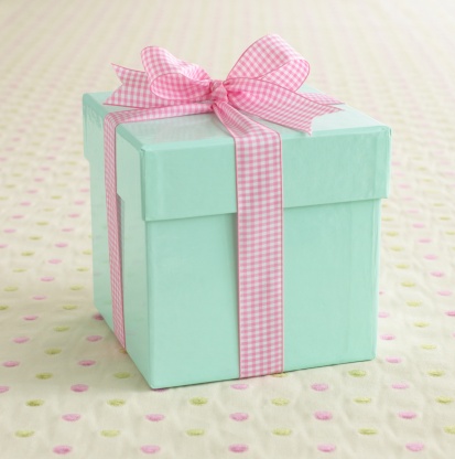
A light blue box wrapped with a pink ribbon.

This is not a coincidence. Paper quality has been proven to have a significant effect on consumer response. Companies, such as Apple, put as much effort into their packaging as they do into their products.  More than 50% of the human brain is devoted to processing sensory experiences.  Touch, in particular, impacts how we make sense of the world. Therefore, how things feel influences our thoughts and behaviors, our comprehension and retention of information, and our emotional connections.

collection of hand holding paper isolated on white background

We were lucky enough to attend this year’s UCDA Conference in Orlando, Florida.  There were some extraordinary speakers, including Daniel Dejan, a widely respected, award-winning graphic designer, art/creative director, production manager and print buyer. His topic was “Haptic Brain, Haptic Brand”, which focused on communications through the lens of neuroscience.

Capture

Haptic Brain, Haptic Brand

‘Haptic Brain, Haptic Brand looks at communications through the lens of neuroscience, exploring how media shapes the brain and consequently the way a brand is perceived. This book examines haptics — the study of how what we touch shapes what we feel — and explores the science behind why our haptic brains respond so well to haptic brands. Case studies from three of the world’s best-known brands (Apple, BMW and World Wildlife Fund) highlight the communicative power of touch in action.

“Paper matters for brands that matter. The collective power of this research, along with Dr. Eagleman’s expert insights, show why marketing professionals and the publishers of high-end magazines and books continue to rely on paper as a key ingredient of the brand experience. They recognize, as we do, that consumers are wired to interact with paper like no other medium.”
–Jennifer Miller, EVP of Coated Business and Chief Sustainability Officer, Sappi Fine Paper North America.’


[Source – where you can also request a copy for yourself!]

Here are some main points from each of the three case studies presented in ‘Haptic Brain/Haptic Brand”:

Case Study #1 – Apple


Apple’s entire brand has a serene simplicity and elegance about it.  As mentioned in ‘The Communicator’s Guide to the Neuroscience of Touch”, “Critics say Apple’s iPhone seems more like a stone you might find in a stream than a device, similarly, the package it comes in defies traditional notions of what a box can be”.

They also pull a quote from The Gaurdian that makes so much sense, “Apple pays as much attention to its packaging as it does to its products… getting it just right as [an] obsession.”

It’s clear that a brand such as Apple has to be doing something right, and we have a hunch that creating that beautiful experience has something to do with it.

Case Study #2 – BMW


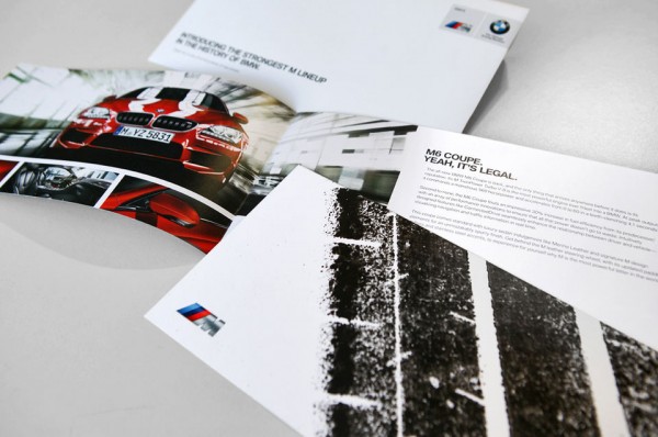
BMW wanted something special for fans if its M6 Coupe, so they had a professional driver take an aggressive, 560 horsepower car and do donuts on paper taped to the road, spraying ink onto the cars rear tires.  They used that paper with the tire marks for their upcoming direct mail campaign.

Manuel Sattig, Manager, Brand Strategy & Communication, said “We said, ‘there’s no way to capture the M performance on paper.’ And then we did it.”

Case Study #3 – World Wildlife Fund

WWF_Covers2

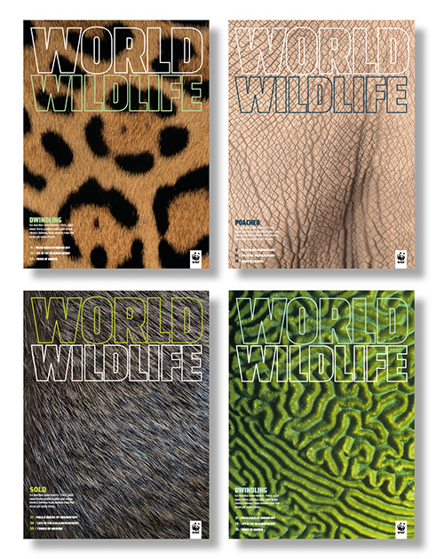
In order to make world’s species and places more tangible, World Wildlife Fund created World Wildlife. This magazine includes thoughtful design, first-class printing, and fine paper to bring images to life. This provides a physical touch point to inspire readers to preserve the planet.


Needless to say, the best communicators incorporate touch into their brand experience.  How are you adding that extra special touch to your brand? To get some ideas, take a look at our packaging options here.

Pop-Up Houses & Dimensional Buildings

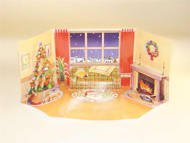
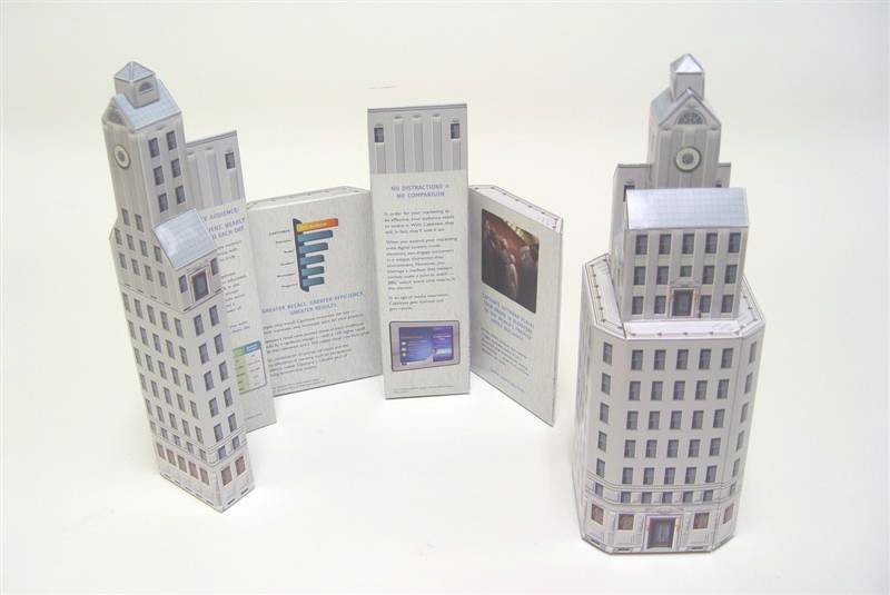
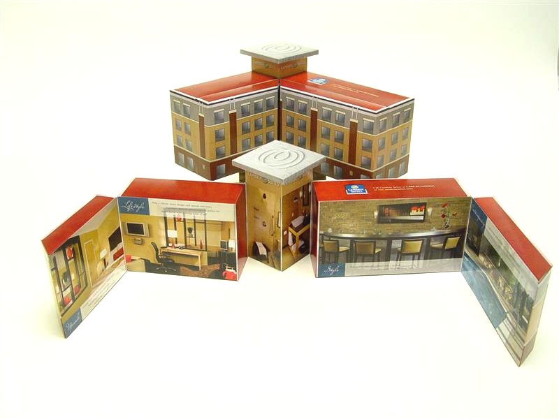
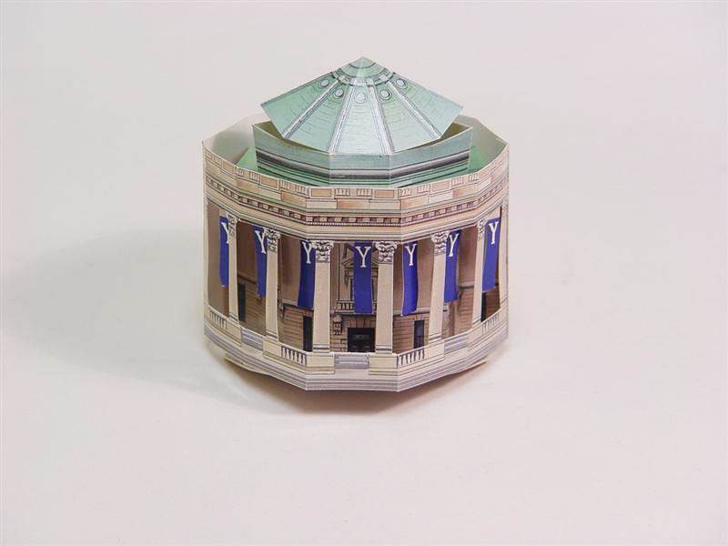
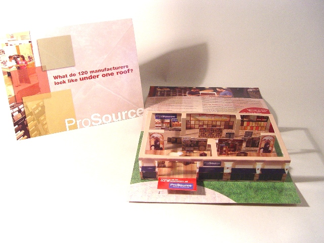
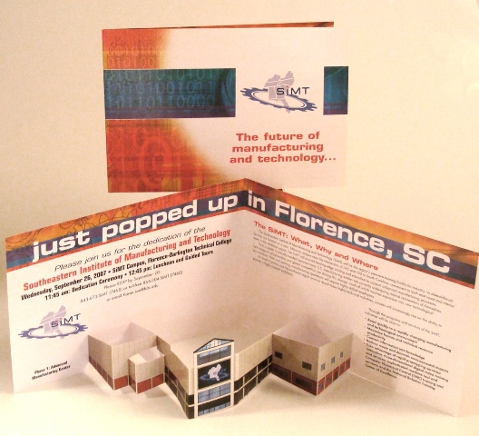
At Structural Graphics, we are well known for creating highly visually appealing, dimensional masterpieces out of paper.  One of our most popular requests are dimensional houses and buildings, which can be great for making an announcement of a new location (restaurant, business, school, etc.), announcing a renovation, creating a cozy holiday scene – the possibilities are endless!

Santa Snack Station


2_4505-537
Boston Group, Captivate Network, Fully Dimensional Skyscraper
2_4506-1039C
Choice Hotel, Fully Dimensional
Woosley Hall
Woolsey Hall
ProSource Popup Page
Fisher Communications, Pop Up Building


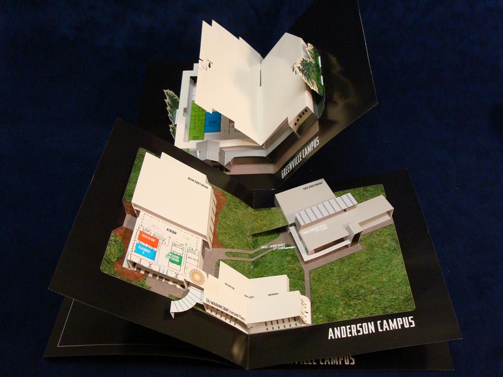
Pop Up Campus Layout


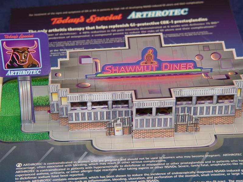
Pharmacia, Arthrotec. Fully Dimensional Restaurant.


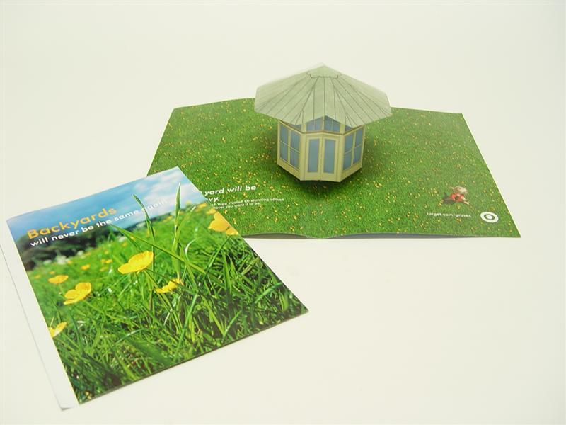
Intervisual, Target.


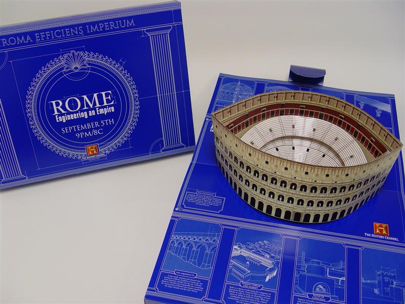
A&E, The History Channel.
A&E, The History Channel. Fully Dimensional.
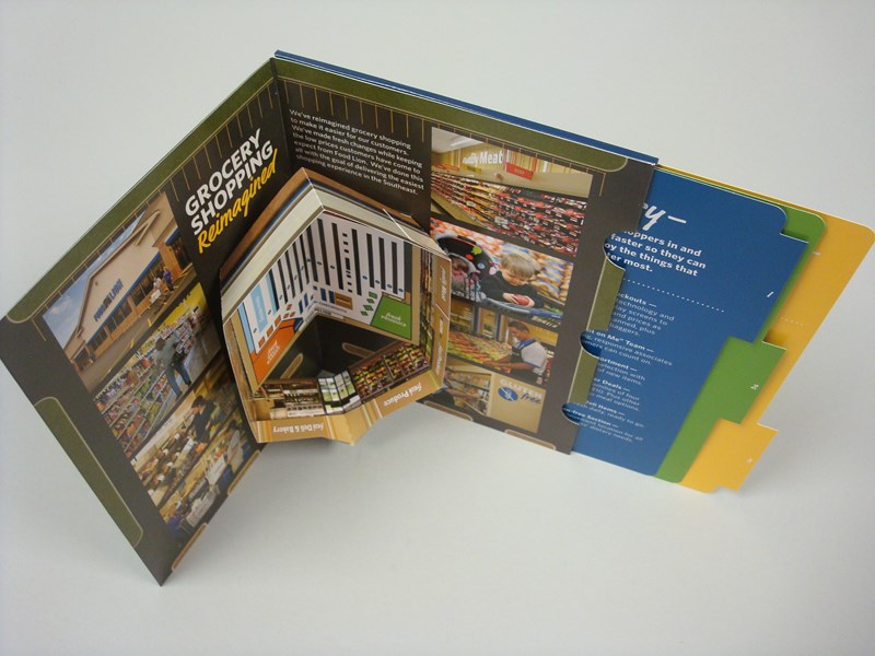
Food Lion, Pop Up store. Fully dimensional with reference guide.

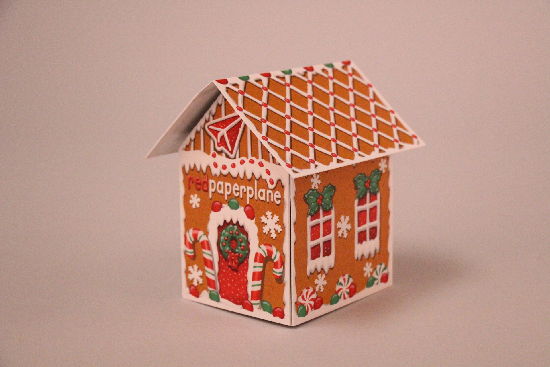
And with the holiday’s quickly approaching, consider the pop-up house format from Red Paper Plane.

Red Paper Plane Pop-up House Format