All posts by admin

Structural Graphics Video Mail Piece Grand Champion of 2017 US Postal Service Irresistible Mail Award

Some mail pieces are effective, some are engaging, some are beautiful. But very few can be called Irresistible Mail™” – the US Postal Service.
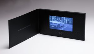
At the National Postal Forum in Baltimore, MD on May 23, 2017, The Lincoln Motor Company’s high-end video mailer, “See it First,” was selected as the Grand Champion Award winner of the “Irresistible Mail” trophy.  The Irresistible Mail Award is a USPS program that highlights mail pieces that increase engagement through innovative design, print or digital technologies.

Sharing creative credits on the winning mailer are Structural Graphics who printed and hand-assembled the piece, Lincoln Motor Company, Ford’s ad agency GTB (formerly Team Detroit), Hudson Rouge.

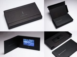
Used to give customers a sneak peek before the vehicle hit showrooms, this mailer presents a video screen embedded on the inside of a display folder.  Activating upon opening, the video delivers a story about Continental’s heritage and features, along with a tri-fold brochure describing the ownership experience, all delivered in a custom box. This piece was one of four finalists recognized at this year’s Forum, having been the winner of the 2nd quarter Irresistible Mail Award.

Additionally, you can find Structural Graphics on the 2017 USPS Irresistible site. Several of our pieces, created in partnership with MRM/ McCann and Sandy Alexander, are featured, including SleekPeeks VR Viewers, and OE, a slider design our paper engineers developed that features Near Field Communication and a “Twister” exploding page.

Be sure to check out Structural Graphics VPA Gallery.
Print Valued in a Diversifying B2B Audience

In “The Value of B‐to‐B: Quantifying the role of the business‐to‐business information and media industry in the buyer‐seller relationship” a report published by The Association of Business Media and Information Companies (ABM), surveyors revealed some interesting statistics demonstrating how diversified today’s B2B media users are – and that marketers aren’t necessarily getting the picture.

The report, which surveyed more than 6,000 media users from a range of industries, examines how trade media and information companies bring business buyers and sellers together; Among its findings, 96 percent of media users read both print magazines and websites followed by product information from the manufacturer (93 percent), e-newsletters (92 percent), conferences or trade shows (80 percent) and print newsletters (76 percent).

But the buck doesn’t stop at print. Other stats from the surveys show that 63 percent of users are also gathering business information from mobile websites and applications.

No surprise there, but what is surprising is that these users don’t have a loyalty to either digital or print, instead more than 70 percent of these professionals prefer a mix of digital and print media outlets.

Unfortunately, this is exactly what most marketers are refusing to see. A majority of publishers with growing audiences identified print as the most important revenue source to their bottom line.

Yet only 11 percent of marketers plan to increase their print budget in the next year.

Marketers, in their haste to digitize, have missed the boat on the effectiveness of print media. ABM’s report proves that there is still a definitive audience responding to the tactile approach of print media.

So if media audiences are still valuing print, why aren’t marketers?

Read ABM’s report here.

Image courtesy Association of Business Media and Information Companies


Danielle LaPortes’s “The story of Freddy & the iPhone — and 4 questions for Creatives”

DanielleLaPorte-resized-600.jpg

This blog, written by Danielle LaPorte, has been reposted – with permission – from LaPorte’s website (look for the link at the bottom). LaPorte is the creator of The Desire Map, a communicator and business strategist. 

If you’ve got an iPhone, grab it now. Or grab someone else’s iPhone (ask nicely). The home-screen function that says, “slide to unlock”… Pay attention. Slide it. Did you hear that “click” sound? That’s the sound of Freddy’s locker opening.

Freddy Anzures works with Apple. He helped develop the iPhone styling as we know it. In high school he recorded the sound of his locker opening and closing (on a cassette tape recorder, I presume.) And now, millions of us hear those two seconds of Freddy’s teen spirit multiple times a day. Slide and… ch-click.

(I did the James Victore Dinner Series workshop with Freddy and I asked him if I could tell this story. He said yes. I told him that I would think of him at least 52 times a day when I checked my phone and send him love. Freddy blushed.)

This got me thinking on the behalf of Creatives everywhere. I have some questions for us:

  1. What have you got in your archive that can be turned into art today? We’re so occupied with creating new and innovative that we can forget our past experiments or the ideas whose time hasn’t come yet. Remember that one idea you had…? Dust it off now and see if it’s got some glimmer to it. I’m just starting to pull together big ideas that occurred to me years ago — it feels like making a feast for old friends — very special.
  2. Analyze what interested you in your past. I’ve been obsessed with Jenny Holzer, Wim Wender’s Far Away So Close, Egyptian Hieroglyphics, information visualization, and every form of book-making, binding, gluing, sewing and designing. (And I went through an extensive obsession with Andy Gibb in my earlier years. That didn’t amount to much.) Point is, I can see how some of my past obsessions are culminating into what I now make in the world, and when I revisit them, I get new ideas about what to bring into my work. I also feel a deeper sense of belonging to my own life, since I can see how my interests brought me to where I am.
  3. Your life is content — what do you do well everyday that you might be taking for granted? The advice you give, the effortless problem solving, the way you see things, the artistry of how you live… What comes naturally to you is your greatest distinguisher. 
  4. How can you bring your personal story into your work? Not just your personal perspective, but your actual shared experienceThat’s putting your heart into it.
Visit Danielle’s blog at www.daniellelaporte.com.

Trish Witkowski Featured in Online Direct & Dimensional Presentations

Trish Witkowski, chief folding fanatic at foldfactory.com will be featured in two free live-streaming online presentations highlighting direct and dimensional mail at 9 a.m. and 10:30 a.m. on Tuesday, Aug. 20.

Dimensional & Direct mail online presentations

The presentations are part of  “Adobe Creative Cloud Design Week,” hosted by creativeLive, a fast-growing live, online classroom for creative entrepreneurs that was recently featured in TechCrunch and The New York Times.

Witkowski, an expert in folded solutions for print and mail, hosts a popular video series entitled “60-Second Super-Cool Fold of the Week” on her YouTube channel.

“I’m so excited to be a part of this event,” states Witkowski. “It’s an incredible opportunity to reach a global audience of creative professionals and to share my passion for direct mail and print. I’ve spent my entire career researching folding and, in recent years, mail – and I know I can help people get amazing results. It’s going to be a blast.”

The events will stream live at their scheduled times at creativeLIVE.com and will be rebroadcast within a 24-hour period. For more information and to RSVP for the free events visit creativeLIVE.com.

About the presentations

“Direct Mail to the MAX” (9:00am PT/12:00pm ET) The 90-minute presentation is focused on the process behind creating direct mail that performs. She will cover audience, strategy and planning, format choice and engagement techniques, testing, tracking and measurement. She plans to back up the information with powerful real-world case studies. Trish will also be launching her new publication series, “Direct Mail (simplified)”, during the event.

That’s Fold-tastic!” (10:30am PT/1:30pm ET) For this presentation, Trish will be sharing her best folding tips, tricks and formats from nearly 20 years of research on the topic. This fun and inspiring session will feature some of the most fascinating real-world folded solutions from her vast collection of print samples. She will also make a move to the desktop to share some production techniques for creating accurate Adobe InDesign files for folded materials.


Your Customer Wants to be Part of Something Bigger

“Value speaks directly to what benefits a product or service adds to a customer’s life. Some smart brands get this and are using packaging, design, sourcing strategies and technologies to entice consumers to get them to open their wallet a bit more, even in these tough times.”

– Maureen Morrison & Matthew Creamer, “How P&G, Ford and Wendy’s Are Redefining Value

For decades, marketers have prodded consumers to associate value with low cost. Today, this strategy is becoming increasingly irrelevant as consumers pay more for the value of peace of mind. As a result, the cheapest and easiest marketing tactics are not always the most effective ways to get your audience’s attention. Today’s marketers must find ways to get consumers to connect with their brands with other factors like convenience, quality, lifestyle and innovation.

In a recent Nielsen report, “Consumers Who Care” 50 percent of respondents reported that they would be willing to pay more for goods and services if the companies they purchased from made a commitment to give back to society.

This sentiment is widely shared among respondents under age 30, although consumers ages 40 to 54 are increasingly agreeing with them – 38 percent more consumers ages 40 to 44 are now willing to pay more for goods and services at companies that give back compared to results just two years ago.

What does this mean to marketers? In an article published Crain’s Chicago Business, Cheryl Guerin, senior VP at MasterCard summed it up well, explaining, “Consumers are very focused on experiences right now. It’s a movement from being a collector of things to being a collector of experiences and stories that last a lot longer than the purchase of an item.”

Increasingly, consumers value brands that have depth and a mission behind their messaging. Dawn dish soap has done a stellar job at communicating its own mission to protect wildlife. In a recent commercial, the brand ditched its usual efforts at promoting soft hands to instead talk about something people can connect to: protecting wildlife. The commercial reminded consumers of its role in helping to save animals following the Deepwater Horizon Spill. The spot features heart wrenching images of oil laden penguins being cleaned with the soap and concludes with an announcement that the brand is donating 1 million dollars to wildlife rescue efforts.

For consumers with a soft spot for animals, there’s an insinuation that their Dawn purchase will become a part of a bigger effort to save wildlife. With messaging like that, consumers will find it hard to scrimp on dish soap.

Dawn is proving that value is not just about cost. As Guerin said, consumers are increasingly looking to become part of an experience that resonates with who they are – or even who they want to be.

Smart marketers understand that purchases are about more than the consumer’s basic need for a product or service. It’s also about how that purchase defines them.

Dimensional Mail: Kicking B2B Marketing Into Gear

structural graphics dimensional mail

Record response rates of dimensional mail, which is anything but your typical flat envelope, are giving B2B marketers new and effective ways to reach out to their prospects.

Last year, the Direct Marketing Association reported that dimensional mail averaged the best marketing response rate at more than five percent compared to digital channels.

Highly targeted mailing lists are key to the success of dimensional mail campaigns. Other important factors include creating unique messages that expand upon your company’s existing marketing campaign and building manageable mailings that marketers can easily follow up on within one to three days.

Read more about the value of going dimensional here.

Samsung Galaxy S4 Launch Kits

Sometimes it’s not all about the design. It’s about the function too.

When Structural Graphics teamed up with advertising agency, TracyLocke to help produce Samsung’s Galaxy S4 launch kits, it produced important custom packaging components to help support the sleek, elegant design.

Samsung package design

The kits, which were delivered to cell phone carriers like AT&T, Verizon and T-Mobile targeted retail VIPs to introduce them to Samsung’s new product.

Samsung package design

Erik Hluchan, lead paper engineer at Structural Graphics recalls, “[Fit and] quality was paramount. The pieces had to fit perfectly within the box so that even upon being overturned the items would not come loose. Careful consideration was paid to the stock and how it wrapped the box’s exterior and interior.”

He added, “The careful work of the design was made possible by the work of our Mexico hand assembly team.”

Along with creative design services, Structural Graphics offers a complete line of hand assembly services from its warehouse facility in Piedras Negras, Mexico. From sortation and match mailings to kitting, gluing and labeling, SG’s scalable production and warehouse space provides additional design options for projects both large and small.


Marketing Trends to Watch for in 2013

Last week, CMO.com posted a slideshare called, “9 Marketing Trends for 2013’s Second Half” with predictions from marketers on what to keep an eye on for the next half of 2013.

marketing trends thebarrowboy resized 600

Among the picks were: interdigital harmony (or the crossover of different digital platforms like social, mobile and web), personalized and fan based marketing along with a new emphasis on multicultural marketing.

SG has a leg up on some of these already, since we’ve been preaching the marriage of direct mail and digital to drive high conversion rates for a while now, including customized PURLs and landing pages to show our target markets that, yes, we’ve been listening to what they want.

The insights are refreshing to read and innovative too – like marketing that reflects multicultural audiences and using kitchen appliances as new venues for digital ad placement.

CMO.com even shares some insight into online video, which we’ve been noticing is a great channel for niche marketing on many levels.

Mosey on over to their website and see the complete presentation here.

Image via: thebarrowboy.

Spotlight on Packaging: Nokia Launch Kit

Last week’s post got us thinking about some of the packaging products we’ve created over the last few years – and there have certainly been some fun ones.

Like this Nokia launch kit

Structural Graphics Nokia package design

To celebrate the release of the Nokia 5800 Xpress Music phone, Structural Graphics aided client, Tracy Locke with the construction of Nokia’s product launch kit, which was inspired by the phone’s appearance in the Batman film “The Dark Knight” and unveiled at the movie premiere.

Structural Graphics Nokia package design

The packaging, decked out in full Joker style is a misleading little gift – a quirky, purple gift box tied decoratively with lime green ribbon. When opened, the box swiftly deconstructs as all four sides collapse and a recording of The Joker’s maniacal laughter automatically plays (scroll down to the YouTube video below).

Structural Graphics Nokia package design

This design earned the bronze award at the Dallas DMA show.

We also created accompanying “popcorn” boxes, also launched at the premiere.

Structural Graphics Nokia package design


What does your design say?

Despite what your teenager may say, it’s hard to argue that today’s consumer has a lack of options when it comes to shopping for just about anything.

That’s why packaging – especially now – can play a huge part in a business’ success. Packaging sets products apart from each other and impacts buying decisions.

But it only serves a brand as well as the message behind it.

one a day structural graphics design resized 600

To create packaging that works, you have to know your customer. 

The Me Generation Meets Generation Me” a Nielson study released earlier this year, explores the differences between two interesting segments of the consumer market: millennials (19-36 year-olds) and baby boomers (49-67 year-olds).

Key changes in the brain as humans age make it harder for us to deal with a lot of distraction. This could be one reason why baby boomers appreciate simplicity.

Millennials on the other hand, grew up in an age saturated with technology and as a result they are fast adopting technologies of all kinds. They appreciate and look for multidimensional advertising that integrates with social media, especially since 76 percent of them own a smartphone.

Knowing what they want can be the key factor to standing out – and reaching – today’s shoppers in novel ways.

Design that reflects personality is helpful in targeting boomers and millennials. It’s no surprise that each of these demographics look for messaging that relates to their respective lifestyles and what’s relevant relies a lot on age.

Good natured, family friendly messages with a clever wit and positivity may catch the eye of a boomer while fun loving ads featuring celebrities or athletes with sarcastic, slapstick humor is what appeals to millennials.

Get it right and one look will get your brand in the door, all you’ll have to do is keep them there.

Source: Nielson Media Research

Image: One A Day prenatal vitamin packaging by Structural Graphics.