Your brand design–is it communicating your story and value too?
It’s something to think about for businesses that need to capture people’s attention in just seconds. Dimensional design incorporates structure, material, color, graphics and more, but the right typography bridges brands to people.
“Typography is the primary medium for the communication of the product’s name, function and fact to a broad consumer audience. Ultimately, the typography… becomes one of the most significant elements of the visual expression of the product,” – Marianne Rosner Klimchuk and Sandra A. Krasovec “Packaging Design Successful Product Branding from Concept to Shelf.“
Take a look at the five pieces we curated from our collection and see how different type styles influenced and enhanced these dimensional marketing campaigns.
1. The Glen Ellen Extendo
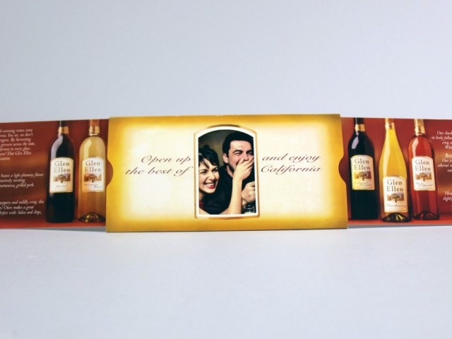
An old style script resembling hand lettering distinguishes a sophisticated wine product.
Glen Ellen reveals its wine and exclusive discounts through a custom Extendo mailer.
2. Higher Ed Mailer
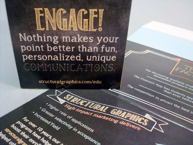
This in-house creation we produced features a trendy, retro, chalkboard-style type that uses scale and variety along with a dimensional pop-up form to emphasize the benefits of our marketing services to higher education institutions.
This higher education mailer uses on-trend designs that appeal to prospective college students. It combines with a digital landing page offering marketers free tips to attract prospective students.
3. Publix Cookie Box
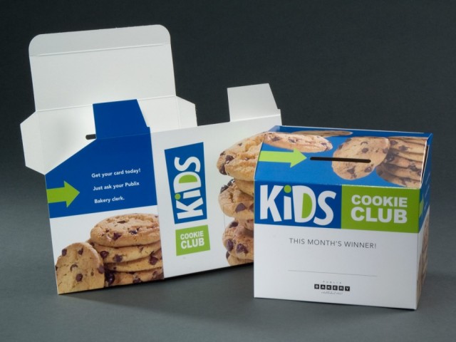
A large, playful and decorative type, that is easy-to-read and appealing to kids, enhances this promotional counter-top piece we produced for Publix Bakery.
This Publix Bakery counter-top display is simple, youthful and eye catching.
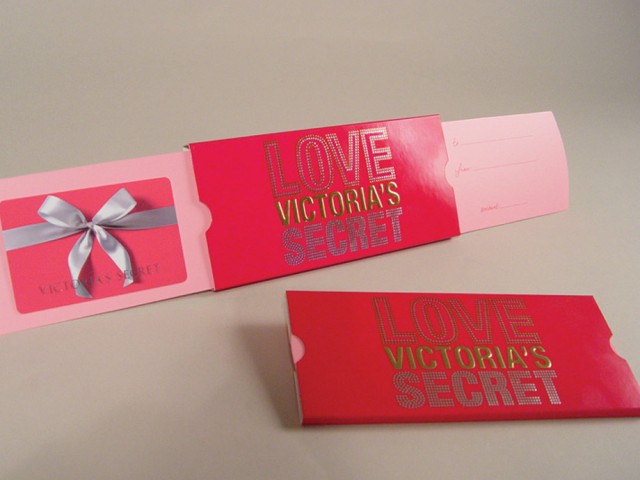
4. Victoria’s Secret Gift Card Holder
Decadent, embossed type in two tone silver and gold combines patterned and solid letter block styles to make this gift card holder feel lush and extravagant.
The embossed type used for this Victoria Secret marketing piece introduces tactile charm to this festive gift card holder with sliding panels.
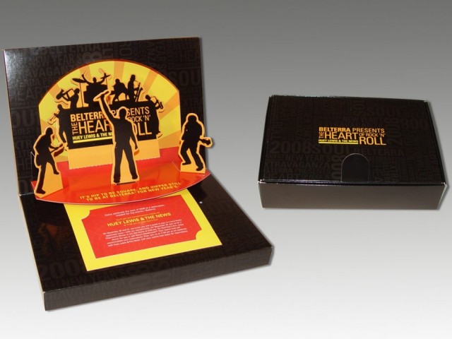
5. Huey Lewis New Year’s Invitation
This event invitation employs a creative type that uses positioning, contrast and negative space as dual graphic elements.
This Belterra Casino Resort VIP invite uses typographic patterning to add subtle interest to an otherwise solid black background.
